
In the previous chapter, we created a project that makes use of the LazyColumn layout to display a list of Card components containing images and text. The project also implemented clickable list items which display a message when tapped.
This chapter will extend the project both to include sticky header support and to use scroll detection to display a “go to top” button when the user has scrolled a specific distance through the list, both of which were introduced in the chapter entitled Jetpack Compose Lists and Grids.
Grouping the list item data
As currently implemented, the LazyColumn list is populated directly from an array of string values. The goal is now to group those items by manufacturer, with each group preceded in the list by a sticky header displaying the manufacturer’s name.
The first step in adding sticky header support is to call the groupBy() method on the itemList array, passing through the first word of each item string (i.e. the manufacturer name) as the group selector value. Edit the MainActivity.kt file, locate the MainScreen function and modify it as follows to group the items into a mapped list:
@Composable
fun MainScreen(itemArray: Array<out String>) {

    val context = LocalContext.current
    val groupedItems = itemArray.groupBy { it.substringBefore(' ') }
.
.Code language: Kotlin (kotlin)
Displaying the headers and items
Now that the list items have been grouped, the body of the LazyColumn needs to be modified. In terms of logic, this will require an outer loop that iterates through each of the manufacturer names, displaying the corresponding sticky header. The inner loop will display the items for each manufacturer. Within the MainScreen function, start by embedding the existing items() loop within a forEach loop on the groupedItems object:
 |
You are reading a sample chapter from an old edition of the Jetpack Compose Essentials book. Purchase the fully updated Jetpack Compose 1.7 Essentials edition of this book in eBook or Print format. The full book contains 67 chapters and over 700 pages of in-depth information. Buy the full book now in Print or eBook format. Learn more. |
@Composable
fun MainScreen(itemArray: Array<out String>) {
.
.
    LazyColumn {
        groupedItems.forEach { (manufacturer, models) ->
            items(itemArray) { model ->
                MyListItem(item = model, onItemClick = onListItemClick)
            }
        }
    }
.
.Code language: Kotlin (kotlin)
On each loop iteration, the forEach statement will call the trailing lambda, passing through the current selector value (manufacturer) and the items (models). Instead of displaying items from the ungrouped itemArray, the items() call now needs to be passed the models parameter:
items(models) { model ->
    MyListItem(item = model, onItemClick = onListItemClick)
}Code language: Kotlin (kotlin)
Before we add sticky headers, compile and run the app to confirm that all the items still appear in the list as before.
Adding sticky headers
For each manufacturer group, we now need to display the header. This involves a call to the LazyListScope stickyHeader function. Although the content of the header can be any combination of composables, an appropriately configured Text component is usually more than adequate for most requirements:
.
.
import androidx.compose.ui.graphics.Color
.
.
LazyColumn() {

    groupedItems.forEach { (manufacturer, models) ->

        stickyHeader {
            Text(
                text = manufacturer,
                color = Color.White,
                modifier = Modifier
                    .background(Color.Gray)
                    .padding(5.dp)
                    .fillMaxWidth()
            )
        }

        items(models) { model ->
            MyListItem(item = model, onItemClick = onListItemClick)
        }
    }
}Code language: Kotlin (kotlin)
If the code editor reports that stickyHeader is an experimental feature, mark the MainScreen function using the ExperimentalFoundationApi annotation as follows:
@OptIn(ExperimentalFoundationApi::class)
@Composable
fun MainScreen(itemArray: Array<out String>) {
.
.Code language: Kotlin (kotlin)
After building and running the app, it should now appear as shown in Figure 35-1 with the manufacturer name appearing in the headers above each group:
|
You are reading a sample chapter from an old edition of the Jetpack Compose Essentials book. Purchase the fully updated Jetpack Compose 1.7 Essentials edition of this book in eBook or Print format. The full book contains 67 chapters and over 700 pages of in-depth information. Buy the full book now in Print or eBook format. Learn more. |
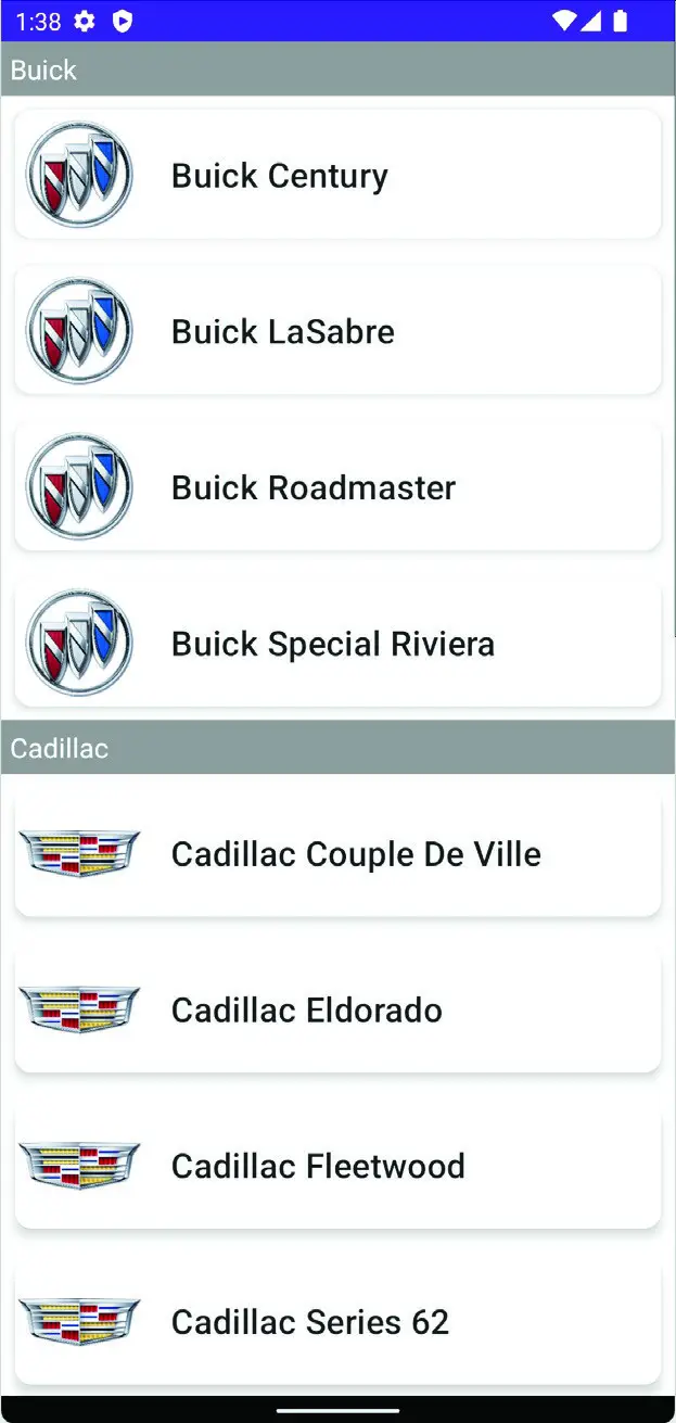
Figure 35-1
Reacting to scroll position
In this, the final step of the LazyListDemo tutorial, the project will be modified to make use of scroll position detection. Once these changes have been made, scrolling beyond the item in list position 4 will display a button that, when clicked, returns the user to the top of the list.
The button will appear at the bottom of the screen and needs to be placed outside of the LazyColumn so that it does not scroll out of view. To achieve this, we first need to place the LazyColumn declaration within a Box component. Within MainActivity.kt, edit the MainScreen function so that it reads as follows:
@Composable
fun MainScreen(itemArray: Array<out String>) {

    val context = LocalContext.current
    val groupedItems = itemArray.groupBy { it.substringBefore(' ') }
.
.
    Box {
        LazyColumn() {

            groupedItems.forEach { (manufacturer, models) ->
.
.
    }
.
.
}Code language: Kotlin (kotlin)
Next, we need to request a LazyListState instance and pass it to the LazyColumn. Now is also a good opportunity to obtain the coroutine scope which will be needed to perform the scroll when the button is clicked.
.
.
import androidx.compose.foundation.lazy.rememberLazyListState
import androidx.compose.runtime.rememberCoroutineScope
.
.
@Composable
fun MainScreen(itemArray: Array<out String>) {

    val listState = rememberLazyListState()
    val coroutineScope = rememberCoroutineScope()
.
.
    Box {
        LazyColumn(
            state = listState,
            contentPadding = PaddingValues(bottom = 40.dp)
        ) {

            groupedItems.forEach { (manufacturer, models) ->
.
.Code language: Kotlin (kotlin)
In addition to applying the list state to the LazyColumn, the above changes also add padding to the bottom of the list. This will ensure that when the bottom of the list is reached there will be enough space for the button.
|
You are reading a sample chapter from an old edition of the Jetpack Compose Essentials book. Purchase the fully updated Jetpack Compose 1.7 Essentials edition of this book in eBook or Print format. The full book contains 67 chapters and over 700 pages of in-depth information. Buy the full book now in Print or eBook format. Learn more. |
The visibility of the button will be controlled by a Boolean variable which we will name displayButton. The value of this variable will be derived using the firstVisibleItemIndex property of the list state:
@Composable
fun MainScreen(itemArray: Array<out String>) {

    val listState = rememberLazyListState()
    val coroutineScope = rememberCoroutineScope()
    val displayButton = listState.firstVisibleItemIndex > 5
.
.Code language: Kotlin (kotlin)
In the above declaration, the displayButton variable will be false unless the index of the first visible list item is greater than 5.
Adding the scroll button
Now that code has been added to detect the list scroll position, the button needs to be added. This will be called within the Box component and will be represented by the OutlinedButton composable. The OutlinedButton is one of the Material Design components and allows buttons to be drawn with an outline border with other effects such as border stroke patterns and rounded corners.
Add an OutlinedButton inside the Box declaration and immediately after the LazyColumn:
.
.
import androidx.compose.material.*

import kotlinx.coroutines.launch
.
.
    Box {
        LazyColumn(
            state = listState
        ) {
.
.
                items(models) { model ->
                    MyListItem(item = model, onItemClick = onListItemClick)
                }
            }
        }

        OutlinedButton(
            onClick = {
                coroutineScope.launch {
                    listState.scrollToItem(0)
                }
            },
            border = BorderStroke(1.dp, Color.Gray),
            shape = RoundedCornerShape(50),
            colors = ButtonDefaults.outlinedButtonColors(
                               contentColor = Color.DarkGray),
            modifier = Modifier.padding(5.dp)
        ){
            Text( text = "Top" )
        }
    }
.
.Code language: Kotlin (kotlin)
Next, we need to control the position and visibility of the button so that it appears at the bottom center of the screen and is only visible when displayButton is true. This can be achieved by calling the OutlinedButton function from within an AnimatedVisibility composable, the purpose of which is to animate the hiding and showing of its child components (a topic covered in the chapter entitled Jetpack Compose Visibility Animation Tutorial). Make the following change to base the visibility of the OutlinedButton on the displayButton variable and to position it using CenterBottom alignment:
|
You are reading a sample chapter from an old edition of the Jetpack Compose Essentials book. Purchase the fully updated Jetpack Compose 1.7 Essentials edition of this book in eBook or Print format. The full book contains 67 chapters and over 700 pages of in-depth information. Buy the full book now in Print or eBook format. Learn more. |
.
.
import androidx.compose.animation.AnimatedVisibility
.
.
       AnimatedVisibility(visible = displayButton,
                     Modifier.align(Alignment.BottomCenter)) {
            OutlinedButton(
                onClick = {
                    coroutineScope.launch {
                        listState.scrollToItem(0)
                    }
                },
                border = BorderStroke(1.dp, Color.Gray),
                shape = RoundedCornerShape(40),
                colors = ButtonDefaults.outlinedButtonColors(
                                      contentColor = Color.DarkGray),
                modifier = Modifier.padding(5.dp)
            ) {
                Text(text = "Top")
            }
        }
.
.Code language: Kotlin (kotlin)
If the editor reports that the AnimatedVisibility composable is experimental, add the ExperimentalAnimationApi annotation to the Mainscreen function before proceeding:
@OptIn(ExperimentalFoundationApi::class, androidx.compose.animation.ExperimentalAnimationApi::class)
@Composable
fun MainScreen(itemArray: Array<out String>) {
.
.Code language: Kotlin (kotlin)
Testing the finished app
Compile and run the app one last time and, once running, scroll down the list until the button appears. Continue scrolling until the bottom of the list to check that enough bottom padding was added to the LazyColumn so that there is no overlap with the button as shown in Figure 35-2 below:

Figure 35-2
Click on the Top button to return to the top of the list.
Summary
This chapter completed the LazyListDemo project by adding support for sticky headers and scroll position detection. The tutorial also introduced the Material Theme OutlinedButton and the use of lazy list content padding.
|
You are reading a sample chapter from an old edition of the Jetpack Compose Essentials book. Purchase the fully updated Jetpack Compose 1.7 Essentials edition of this book in eBook or Print format. The full book contains 67 chapters and over 700 pages of in-depth information. Buy the full book now in Print or eBook format. Learn more. |