
For adding animation effects to user interfaces, Jetpack Compose includes the Animation API. The Animation API consists of classes and functions that provide a wide range of animation options that can be added to your apps with relative ease. In this chapter, we will explore the use of animation when hiding and showing user interface components including the use of cross fading when replacing one component with another. The next chapter, entitled Jetpack Compose State-Driven Animation, will cover topics such as animating motion, rotation, and color changes, in addition to combining multiple animations into a single transition. Throughout this chapter, each animation technique will be demonstrated within an example project.
Creating the AnimateVisibility project
Launch Android Studio and create a new Empty Compose Activity project named AnimateVisibility, specifying com.example.animatevisibility as the package name, and selecting a minimum API level of API 26: Android 8.0 (Oreo). Within the MainActivity.kt file, delete the Greeting function and add a new empty composable named MainScreen:
@Composable
fun MainScreen() {

}Code language: Kotlin (kotlin)
Next, edit the onCreateActivity() method and DefaultPreview function to call MainScreen instead of Greeting. Also, enable the system UI option on the preview composable:
@Preview(showBackground = true, showSystemUi = true)
@Composable
fun GreetingPreview() {
    AnimateVisibilityTheme {
        MainScreen()
    }
}Code language: Kotlin (kotlin)
Animating visibility
Perhaps the simplest form of animation involves animating the appearance and disappearance of a composable. Instead of a component instantly appearing and disappearing, a variety of animated effects can be applied using the AnimatedVisibility composable. For example, user interface elements can be made to gradually fade in and out of view, slide into and out of position horizontally or vertically, or show and hide by expanding and shrinking.
The minimum requirement for calling AnimatedVisibility is a Boolean state variable parameter to control whether or not its child composables are to be visible. Before exploring the capabilities of AnimatedVisibility, it first helps to experience the hiding and showing of a composable without animation.
 |
You are reading a sample chapter from an old edition of the Jetpack Compose Essentials book. Purchase the fully updated Jetpack Compose 1.7 Essentials edition of this book in eBook or Print format. The full book contains 67 chapters and over 700 pages of in-depth information. Buy the full book now in Print or eBook format. Learn more. |
When the following layout design is complete, two buttons will be used to show and hide content using animation. Before designing the screen layout, add a new composable named CustomButton to the MainActivity.kt file as follows:
.
.
import androidx.compose.material.*
import androidx.compose.ui.graphics.Color
.
.
@Composable
fun CustomButton(text: String, targetState: Boolean,
       onClick: (Boolean) -> Unit, bgColor: Color = Color.Blue) {

    Button(
        onClick = { onClick(targetState) },
        colors= ButtonDefaults.buttonColors(backgroundColor = bgColor,
                         contentColor = Color.White)) {
        Text(text)
    }
}Code language: Kotlin (kotlin)
The composable is passed the text to be displayed on the button and both an onClick handler and the new state value to be passed to the handler when the button is clicked. The button also accepts an optional background color which defaults to blue.
Next, locate the MainScreen function and modify it as follows:
.
.
import androidx.compose.foundation.background
import androidx.compose.foundation.layout.*
import androidx.compose.ui.unit.dp
import androidx.compose.ui.Alignment
import androidx.compose.runtime.*
.
.
@Composable
fun MainScreen() {

    var boxVisible by remember { mutableStateOf(true) }

    val onClick = { newState : Boolean ->
        boxVisible = newState
    }

    Column(
        Modifier.padding(20.dp),
        horizontalAlignment = Alignment.CenterHorizontally
    ) {
        Row(
            Modifier.fillMaxWidth(),
            horizontalArrangement = Arrangement.SpaceEvenly
        ) {
            CustomButton(text = "Show", targetState = true, onClick = onClick)
            CustomButton(text = "Hide", targetState = false, onClick = onClick)
        }

        Spacer(modifier = Modifier.height(20.dp))

        if (boxVisible) {
            Box(modifier = Modifier
                .size(height = 200.dp, width = 200.dp)
                .background(Color.Blue))
        }
    }
}Code language: Kotlin (kotlin)
In summary, this code begins by declaring a Boolean state variable named boxVisible with an initial true value and an onClick event handler to be passed to instances of the CustomButton composable. The purpose of the handler is to change the boxVisible state based on button selection.
Column and Row composables are then used to display two CustomButton composables and a blue Box. The buttons are passed the text to be displayed, the new setting for the boxVisible state, and a reference to the onClick handler. When a button is clicked, it calls the handler and passes it the new state value. Finally, an if statement is used to control whether the Box composable is included as a child of the Column based on the value of boxVisible.
|
You are reading a sample chapter from an old edition of the Jetpack Compose Essentials book. Purchase the fully updated Jetpack Compose 1.7 Essentials edition of this book in eBook or Print format. The full book contains 67 chapters and over 700 pages of in-depth information. Buy the full book now in Print or eBook format. Learn more. |
When previewed in interactive mode, or tested on a device or emulator, the layout will appear as illustrated in Figure 36-1:
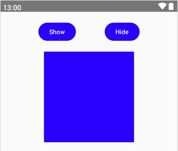
Figure 36-1
Clicking on the Show and Hide buttons will cause the Box to instantly appear and disappear without any animation effects. Default visibility animation effects can be added simply by replacing the if statement with a call to AnimatedVisibility as follows:
.
.
import androidx.compose.animation.*
.
.
    AnimatedVisibility(visible = boxVisible) {
        Box(modifier = Modifier
            .size(height = 200.dp, width = 200.dp)
            .background(Color.Blue))
    }
.
.Code language: Kotlin (kotlin)
If the code editor reports that AnimatedVisibility is an experimental feature, add the following annotation to the MainScreen composable:
@OptIn(ExperimentalAnimationApi::class)
@Composable
fun MainScreen() {
.
.Code language: Kotlin (kotlin)
When the app is now tested, the hiding and showing of the box will be subtly animated. The default behavior of AnimatedVisibility is so subtle it can be difficult to notice any difference. Fortunately, the Compose Animation API provides a range of customization options. The first option allows different animation effects to be defined when the child composables appear and disappear (referred to as the enter and exit animations).
|
You are reading a sample chapter from an old edition of the Jetpack Compose Essentials book. Purchase the fully updated Jetpack Compose 1.7 Essentials edition of this book in eBook or Print format. The full book contains 67 chapters and over 700 pages of in-depth information. Buy the full book now in Print or eBook format. Learn more. |
Defining enter and exit animations
The animations to be used when children of an AnimatedVisibility composable appear and disappear are declared using the enter and exit parameters. The following changes, for example, configure the animations to fade the box into view and slide it vertically out of view:
AnimatedVisibility(visible = boxVisible,
    enter = fadeIn(),
    exit = slideOutVertically()
) {

    Box(modifier = Modifier
        .size(height = 200.dp, width = 200.dp)
        .background(Color.Blue))
    }
}Code language: Kotlin (kotlin)
The full set of animation effects is as follows:
- expandHorizontally() – Content is revealed using a horizontal clipping technique. Options are available to control how much of the content is initially revealed before the animation begins.
- expandVertically() – Content is revealed using a vertical clipping technique. Options are available to control how much of the content is initially revealed before the animation begins.
- expandIn() – Content is revealed using both horizontal and vertical clipping techniques. Options are available to control how much of the content is initially revealed before the animation begins.
- fadeIn() – Fades the content into view from transparent to opaque. The initial transparency (alpha) may be declared using a floating-point value between 0 and 1.0. The default is 0.
- fadeOut() – Fades the content out of view from opaque to invisible. The target transparency before the content disappears may be declared using a floating-point value between 0 and 1.0. The default is 0.
- scaleIn() – The content expands into view as though a “zoom in” has been performed. By default, the content starts at zero size and expands to full size though this default can be changed by specifying the initial scale value as a float value between 0 and 1.0.
- scaleOut() – Shrinks the content from full size to a specified target scale before it disappears. The target scale is 0 by default but may be configured using a float value between 0 and 1.0.
- shrinkHorizontally() – Content slides from view behind a shrinking vertical clip bounds line. The target width and direction may be configured.
- shrinkVertically() – Content slides from view behind a shrinking horizontal clip bounds line. The target width and direction may be configured.
- shrinkOut() – Content slides from view behind shrinking horizontal and vertical clip bounds lines.
- slideInHorizontally() – Content slides into view along the horizontal axis. The sliding direction and offset within the content where sliding begins are both customizable.
- slideInVertically() – Content slides into view along the vertical axis. The sliding direction and offset within the content where sliding begins are both customizable.
- slideIn() – Slides the content into view at a customizable angle defined using an initial offset value.
- slideOut() – Slides the content out of view at a customizable angle defined using a target offset value.
- slideOutHorizontally() – Content slides out of view along the horizontal axis. The sliding direction and offset within the content where sliding ends are both customizable.
- slideOutVertically() – Content slides out of view along the vertical axis. The sliding direction and offset within the content where sliding ends are both customizable.
It is also possible to combine animation effects. The following, for example, combines the expandHorizontally and fadeIn effects:
AnimatedVisibility(visible = boxVisible,
    enter = fadeIn() + expandHorizontally(),
    exit = slideOutVertically()
) {
.
.Code language: Kotlin (kotlin)
All of the above animations may be further customized by making use of animation specs.
Animation specs and animation easing
Animation specs are represented by instances of AnimationSpec, (or, more specifically, subclasses of AnimationSpec) and are used to configure aspects of animation behavior including the animation duration, start delay, spring, and bounce effects, repetition, and animation easing.
|
You are reading a sample chapter from an old edition of the Jetpack Compose Essentials book. Purchase the fully updated Jetpack Compose 1.7 Essentials edition of this book in eBook or Print format. The full book contains 67 chapters and over 700 pages of in-depth information. Buy the full book now in Print or eBook format. Learn more. |
As with Rows, Columns, and other container composables, AnimatedVisibility has its own scope (named AnimatedVisibilityScope). Within this scope, we have access to additional functions specific to animation. For example, to control the duration of an animation, we need to generate a DurationBasedAnimationSpec instance (a subclass of AnimationSpec) by calling the tween() function and passing it as a parameter to the animation effect function call. For example, modify our example fadeIn() call to pass through a duration specification:
.
.
import androidx.compose.animation.core.*
.
.
AnimatedVisibility(visible = boxVisible,
    enter = fadeIn(animationSpec = tween(durationMillis = 5000)),
    exit = slideOutVertically()
) {
.
.Code language: Kotlin (kotlin)
Update the preview and hide and show the box, noting that the fade-in animation is now slow enough that we can see it.
The tween() function also allows us to specify animation easing. Animation easing allows the animation to speed up and slow down and can be defined either using custom keyframe positions for speed changes (a topic which will be covered in Jetpack Compose State-Driven Animation) or using one of the following predefined values: • FastOutSlowInEasing
- LinearOutSlowInEasing
- FastOutLinearEasing
- LinearEasing
- CubicBezierEasing
The following change uses LinearOutSlowInEasing easing for a slideInHorizontally effect:
AnimatedVisibility(visible = boxVisible,
    enter = slideInHorizontally(animationSpec =
                tween(durationMillis = 5000, easing = LinearOutSlowInEasing)),
    exit = slideOutVertically()
) {Code language: Kotlin (kotlin)
When the box is shown, the animation gradually slows as it reaches the target position. Similarly, the following change bases the animation speed changes on four points within a Bezier curve:
|
You are reading a sample chapter from an old edition of the Jetpack Compose Essentials book. Purchase the fully updated Jetpack Compose 1.7 Essentials edition of this book in eBook or Print format. The full book contains 67 chapters and over 700 pages of in-depth information. Buy the full book now in Print or eBook format. Learn more. |
AnimatedVisibility(visible = boxVisible,
    enter = slideInHorizontally(animationSpec = tween(durationMillis = 5000,
                       easing = CubicBezierEasing(0f, 1f, 0.5f,1f))),
    exit = slideOutVertically(),
) {Code language: Kotlin (kotlin)
Repeating an animation
To make an animation repeat, we also need to use an animation spec, though in this case the RepeatableSpec subclass will be used, an instance of which can be obtained using the repeatable() function. In addition to the animation to be repeated, the function also accepts a RepeatMode parameter specifying whether the repetition should be performed from beginning to end (RepeatMode.Restart) or reversed from end to beginning (RepeatMode.Reverse) of the animation sequence. For example, modify the AnimatedVisibility call to repeat a fade-in enter animation 10 times using the reverse repeat mode:
AnimatedVisibility(visible = boxVisible,
    enter = fadeIn(
        animationSpec = repeatable(10, animation = tween(durationMillis = 2000),
                                        repeatMode = RepeatMode.Reverse)
    ),
    exit = slideOutVertically(),
.
.Code language: Kotlin (kotlin)
Different animations for different children
When enter and exit animations are applied to an AnimatedVisibility call, those settings apply to all direct and indirect children. Specific animations may be added to individual children by applying the animateEnterExit() modifier to them. As is the case with AnimatedVisibility, this modifier allows both enter and exit animations to be declared. The following changes add vertical sliding animations on both entry and exit to the red Box call:
AnimatedVisibility(
    visible = boxVisible,
    enter = fadeIn(animationSpec = tween(durationMillis = 5500)),
    exit = fadeOut(animationSpec = tween(durationMillis = 5500))
) {
    Row {
        Box(Modifier.size(width = 150.dp, height = 150.dp)
                             .background(Color.Blue)
        )
        Spacer(modifier = Modifier.width(20.dp))
        Box(
            Modifier
                .animateEnterExit(
                    enter = slideInVertically(
                           animationSpec = tween(durationMillis = 5500)),
                    exit = slideOutVertically(
                           animationSpec = tween(durationMillis = 5500))
                )
                .size(width = 150.dp, height = 150.dp)
                .background(Color.Red)
        )
    }
}Code language: Kotlin (kotlin)
When the above code runs, you will notice that the red box uses both fade and sliding animations. This is because the animateEnterExit() modifier animations are combined with those passed to the parent AnimatedVisibility instance. For example, the enter animation in the above example is equivalent to fadeIn(…) + slideInVertically(…). If you only want the modifier animations to be used, the enter and exit settings for the parent AnimatedVisibility instance must be set to EnterTransition.None and ExitTransition.None respectively. In the following code, animation (including the default animation) is disabled on the parent so that only those specified by a call to the animateEnterExit() modifier are performed:
AnimatedVisibility(
    visible = boxVisible,
    enter = EnterTransition.None,
    exit = ExitTransition.None
) {
    Row {
        Box(
            Modifier
                .animateEnterExit(
                    enter = fadeIn(animationSpec = tween(durationMillis = 5500)),
                    exit = fadeOut(animationSpec = tween(durationMillis = 5500))
                )
                .size(width = 150.dp, height = 150.dp)
                .background(Color.Blue))
        Spacer(modifier = Modifier.width(20.dp))
        Box(
            Modifier
                .animateEnterExit(
                    enter = slideInVertically(
                           animationSpec = tween(durationMillis = 5500)),
                    exit = slideOutVertically(
                           animationSpec = tween(durationMillis = 5500))
                )
                .size(width = 150.dp, height = 150.dp)
                .background(Color.Red)
        )
    }
}Code language: Kotlin (kotlin)
Auto-starting an animation
So far in this chapter, animations have been initiated in response to button click events. It is not unusual, however, to need an animation to begin as soon as the call to AnimatedVisibility is made. To trigger this, AnimatedVisibility can be passed a MutableTransitionState instance when it is called.
MutableTransitionState is a special purpose state which includes two properties named currentState and targetState. By default, both the current and target states are set to the same value which, in turn, is defined by passing through an initial state when the MutableTransitionState instance is created. The following, for example, creates a transition state initialized to false and passes it through to the AnimatedVisibility call via the visibleState parameter:
|
You are reading a sample chapter from an old edition of the Jetpack Compose Essentials book. Purchase the fully updated Jetpack Compose 1.7 Essentials edition of this book in eBook or Print format. The full book contains 67 chapters and over 700 pages of in-depth information. Buy the full book now in Print or eBook format. Learn more. |
.
.
    val state = remember {  MutableTransitionState(false)  }
.
.
        AnimatedVisibility(visibleState = state,
            enter = fadeIn(
                animationSpec = tween(5000)
            ),
            exit = slideOutVertically(),

        ) {Code language: Kotlin (kotlin)
When tested, the Box composable will not appear until the show button is clicked because the initial state is set to false. To initiate the “enter” fade-in animation, we need to set the targetState property of the transition state instance to true when it is created. We do this by calling apply() on the state instance and setting the property in the trailing lambda as follows:
val state = remember { MutableTransitionState(true) }

state.apply { targetState = true } Code language: Kotlin (kotlin)
Now when the app is run the fade-in animation starts automatically without user interaction.
Implementing crossfading
Crossfading animates the replacement of one composable with another and is performed using the Crossfade function. This function is passed a target state value that is used to decide which composable is to replace the currently visible component. A fading animation effect is then used to perform the replacement.
In our example app, we currently display both the show and hide buttons. In practice, only one of these buttons needs to be visible at any one time depending on the current visibility state of the Box component. It is not necessary, for example, to display the show button when the content is already visible. This is an ideal candidate for using cross fading to transition from one button to the other. To do this, we need to enclose the two CustomButton composables within a Crossfade call, passing through the boxVisible state value as the target state. We can then add some logic within the Crossfade lambda to decide which button is to be visible. To implement this behavior, modify the MainScreen function so that it reads as follows:
fun MainScreen() {

    var boxVisible by remember { mutableStateOf(true) }

    val onClick = { newState : Boolean ->
        boxVisible = newState
    }

    Column(
        Modifier.padding(20.dp),
        horizontalAlignment = Alignment.CenterHorizontally
    ) {
        Row(
            Modifier.fillMaxWidth(),
            horizontalArrangement = Arrangement.SpaceEvenly
        ) {

            Crossfade(
                targetState = boxVisible,
                animationSpec = tween(5000)
            ) { visible ->
                when (visible) {
                    true -> CustomButton(text = "Hide", targetState = false,
                          onClick = onClick, bgColor = Color.Red)
                    false -> CustomButton(text = "Show", targetState = true,
                          onClick = onClick, bgColor = Color.Magenta)
                }
            }
        }
.
.Code language: Kotlin (kotlin)
To enhance the effect of the crossfade, the above code also changes the background colors of the two buttons. We also use a when statement to decide which button to display based on the current boxVisible value. Test the layout and check that clicking on the Show button initiates a crossfade to the Hide button and vice versa.
|
You are reading a sample chapter from an old edition of the Jetpack Compose Essentials book. Purchase the fully updated Jetpack Compose 1.7 Essentials edition of this book in eBook or Print format. The full book contains 67 chapters and over 700 pages of in-depth information. Buy the full book now in Print or eBook format. Learn more. |
Summary
This chapter has explored the use of the Compose Animation API to animate the appearance and disappearance of components within a user interface layout. This requires the use of the animatedVisibility() function which may be configured to use different animation effects and durations, both for the appearance and disappearance of the target composable. The Animation API also includes crossfade support which allows the replacement of one component with another to be animated.