
The Compose Pager composables allow users to page through content using horizontal and vertical swiping gestures. Paging may also be implemented programmatically, for example, by adding previous and next buttons to the layout.
This chapter introduces the VerticalPager and HorizontalPager composables and explores some configuration options before creating an example project to show paging in action.
The Pager composables
As the names suggest, the VerticalPager and HorizontalPager composables display content that users can “flip” through horizontally or vertically. The default behavior is to perform paging using swiping gestures (left and right for horizontal pagers and up and down for vertical pagers). The pagers also provide an interface to navigate to specific pages via the pager state. The pager state provides various options for managing and controlling a pager instance.
The VerticalPager composable uses the following syntax:
VerticalPager(
    state: PagerState,
    modifier: Modifier,
    contentPadding: PaddingValues,
    pageSize: PageSize,
    beyondBoundsPageCount: Int,
    pageSpacing: Dp,
    horizontalAlignment: Alignment.Horizontal,
    flingBehavior: SnapFlingBehavior,
    userScrollEnabled: Boolean,
    reverseLayout: Boolean,
    key: ((index: Int) -> Any)?,
    pageNestedScrollConnection: NestedScrollConnection,
    pageContent: @Composable PagerScope.(page: Int) -> Unit
) { -> page
	// Page content here
}Code language: Kotlin (kotlin)
The syntax for the HorizontalPager, on the other hand, reads as follows:
 |
You are reading a sample chapter from an old edition of the Jetpack Compose Essentials book. Purchase the fully updated Jetpack Compose 1.7 Essentials edition of this book in eBook or Print format. The full book contains 67 chapters and over 700 pages of in-depth information. Buy the full book now in Print or eBook format. Learn more. |
HorizontalPager(
    state: PagerState,
    modifier: Modifier,
    contentPadding: PaddingValues,
    pageSize: PageSize,
    beyondBoundsPageCount: Int,
    pageSpacing: Dp,
    verticalAlignment: Alignment.Vertical,
    flingBehavior: SnapFlingBehavior,
    userScrollEnabled: Boolean,
    reverseLayout: Boolean,
    key: ((index: Int) -> Any)?,
    pageNestedScrollConnection: NestedScrollConnection,
    pageContent: @Composable PagerScope.(page: Int) -> Unit
) { page ->
	// Page content here
}Code language: Kotlin (kotlin)
Although many options are available, only the state property is mandatory, and the other properties will default to sensible values if they are not declared. In both composables, the page content is declared within the lambda, which, in turn, is passed the current page number:
.
.
) { page ->
	// Page content here
}Code language: Kotlin (kotlin)
The pager state is created by calling rememberPagerState and passing the number of pages to be displayed, for example:
val pagerState = rememberPagerState { 15 }Code language: Kotlin (kotlin)Once the state has been created, it can be used to initialize a pager instance as follows:
val pagerState = rememberPagerState { 15 }

VerticalPager(
    state = pagerState
) { page ->
    // Page content here
}Code language: Kotlin (kotlin)
The pager content can consist of a layout of any complexity. Also, the pager state can be used to identify the current page and display different content on specific pages. The following code, for example, declares a horizontal pager containing a Text composable displaying the current page number:
VerticalPager(
    state = pagerState,
    modifier = Modifier.fillMaxWidth()
) { page ->
        Text(text = page.toString(), fontSize = 64.sp)
}Code language: Kotlin (kotlin)
When previewed, the pager will appear as shown below, and left and right swipe gestures will scroll through the pages:
|
You are reading a sample chapter from an old edition of the Jetpack Compose Essentials book. Purchase the fully updated Jetpack Compose 1.7 Essentials edition of this book in eBook or Print format. The full book contains 67 chapters and over 700 pages of in-depth information. Buy the full book now in Print or eBook format. Learn more. |

Working with pager state
The key to working with the pager composables is the pager state. For example, we can use the state to get information about the pager. Some examples are as follows:
// The total number of pages in the pager
val pageCount = pagerState.pageCount

// The number of the page closest to the pager "snap" point
val currentPage = pagerState.currentPage

// Whether the pager is currently scrolling between pages
val scrollStatus = pagerState.isScrollInProgress

// The page that the pager "settled" on after scrolling stopped
val settledPage = pagerState.settledPageCode language: Kotlin (kotlin)
The pager state is also used to navigate directly to a specified page from within code. The following code navigates to the 5th page:
pagerState.scrollToPage(5)Code language: Kotlin (kotlin)Alternatively, the page transition can be performed with animation:
pagerState.animateScrollToPage(10)Code language: Kotlin (kotlin)When you call scrollToPage() and animateScrollToPage(), make sure you do so from within a coroutine:
val coroutineScope = rememberCoroutineScope()

coroutineScope.launch {
    PagerState.scrollToPage(10)
}Code language: Kotlin (kotlin)
About the PagerDemo project
The remainder of this chapter will create a project that uses the HorizontalPager composable to display a series of book cover images. In addition to paging using swipe gestures, the example will include arrow buttons to manually move back and forth through the pages.
|
You are reading a sample chapter from an old edition of the Jetpack Compose Essentials book. Purchase the fully updated Jetpack Compose 1.7 Essentials edition of this book in eBook or Print format. The full book contains 67 chapters and over 700 pages of in-depth information. Buy the full book now in Print or eBook format. Learn more. |
Creating the PagerDemo project
Launch Android Studio and create a new Empty Activity project named PagerDemo, specifying com.example. pagerdemo as the package name and selecting a minimum API level of API 26: Android 8.0 (Oreo).
Within the MainActivity.kt file, delete the Greeting function and add a new empty composable named MainScreen:
@Composable
fun MainScreen() {

}Code language: Kotlin (kotlin)
Next, edit the OnCreate() method and GreetingPreview function to call MainScreen instead of Greeting.
Modifying the build configuration
The Pager composables are part of the Compose Foundation libraries, which must be added to the module-level build.gradle.kts file before we can proceed with the tutorial. These libraries, in turn, require that we change the SDK settings to API 34. Within the Project tool window, open the Gradle Scripts -> build.gradle.kts (Module: app) file and make the following changes:
plugins {
    id("com.android.application")
    id("org.jetbrains.kotlin.android")
}

android {
    namespace = "com.example.pagerdemo"
    compileSdk = 34

    defaultConfig {
        applicationId = "com.example.pagerdemo"
        minSdk = 26
        //noinspection EditedTargetSdkVersion
        targetSdk = 34
        versionCode = 1
        versionName = "1.0"

       testInstrumentationRunner = "androidx.test.runner.AndroidJUnitRunner"
        vectorDrawables {
            useSupportLibrary = true
        }
.
.
dependencies {
.
.
    implementation("androidx.compose.foundation:foundation:1.5.0")
    implementation("androidx.compose.foundation:foundation-android:1.5.0")
.
.Code language: Gradle (gradle)
After you have made the changes, click on the Sync Now link to apply the new configuration.
|
You are reading a sample chapter from an old edition of the Jetpack Compose Essentials book. Purchase the fully updated Jetpack Compose 1.7 Essentials edition of this book in eBook or Print format. The full book contains 67 chapters and over 700 pages of in-depth information. Buy the full book now in Print or eBook format. Learn more. |
Adding the book cover images
The image files for this project are contained in the images folder of the sample code archive. If you have not already done so, you can download the sample code using the following link:
https://www.ebookfrenzy.com/web/compose14/index.php
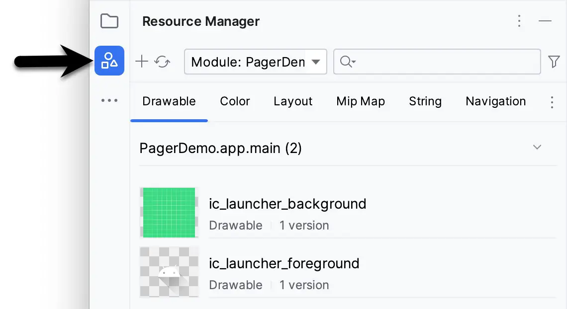
Once you have the sample code, display the Resource Manager tool window by clicking on the button highlighted in Figure 1-2:
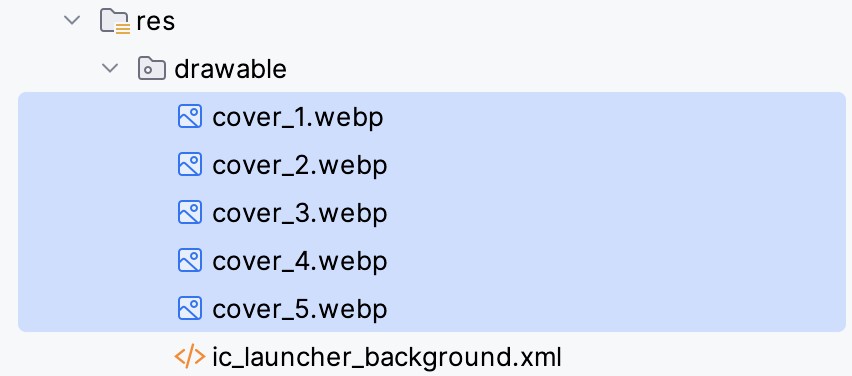
Locate the and select all of the cover_<n>.webp image files in the file system navigator for your operating system and drag them onto the Resource Manager tool window. In the resulting dialog, click Next, followed by the Import button, to add the image to the project.
The images should appear in the res -> drawables section of the Project tool window as shown below:
|
You are reading a sample chapter from an old edition of the Jetpack Compose Essentials book. Purchase the fully updated Jetpack Compose 1.7 Essentials edition of this book in eBook or Print format. The full book contains 67 chapters and over 700 pages of in-depth information. Buy the full book now in Print or eBook format. Learn more. |
Adding the HorizontalPager
The project is ready for us to begin creating the pager-based user interface. Begin by opening the MainActivity.
kt file and adding a list of the cover drawable resource identities for use later in the project:
package com.example.pagerdemo
.
.
val drawableIds = listOf(R.drawable.cover_1, R.drawable.cover_2,
    R.drawable.cover_3, R.drawable.cover_4, R.drawable.cover_5)

class MainActivity : ComponentActivity() {
.
.Code language: Kotlin (kotlin)
Remaining in the MainActivity.kt file, add a new composable named CoverPager as follows:
.
.
import androidx.compose.foundation.ExperimentalFoundationApi
.
.
@Composable
fun MainScreen() {
    CoverPager()
}

@OptIn(ExperimentalFoundationApi::class)
@Composable
fun CoverPager() {

}Code language: Kotlin (kotlin)
Next, add the pager state and HorizontalPager to the composable:
.
.
import androidx.compose.foundation.layout.*
import androidx.compose.foundation.pager.*
.
.
class MainActivity : ComponentActivity() {
.
.

@OptIn(ExperimentalFoundationApi::class)
@Composable
fun CoverPager() {

    val pagerState = rememberPagerState { drawableIds.size }

    HorizontalPager(
        state = pagerState,
        modifier = Modifier.fillMaxWidth()
    ) { page ->

    }
}Code language: Kotlin (kotlin)
Creating the page content
The last step before we can test the pager is to add the Image composable content to the HorizontalPager declaration as follows:
|
You are reading a sample chapter from an old edition of the Jetpack Compose Essentials book. Purchase the fully updated Jetpack Compose 1.7 Essentials edition of this book in eBook or Print format. The full book contains 67 chapters and over 700 pages of in-depth information. Buy the full book now in Print or eBook format. Learn more. |
.
.
import androidx.compose.foundation.Image
import androidx.compose.ui.res.painterResource
import androidx.compose.ui.unit.dp
import androidx.compose.ui.draw.clip
import androidx.compose.foundation.shape.RoundedCornerShape
.
.
@OptIn(ExperimentalFoundationApi::class)
@Composable
fun CoverPager() {

    val pagerState = rememberPagerState { drawableIds.size }

    HorizontalPager(
        state = pagerState,
        modifier = Modifier.fillMaxWidth()
    ) { page ->
        Image(
            painter = painterResource(drawableIds[page]),
            contentDescription = "cover",
             modifier = Modifier
                 .padding(10.dp)
                 .fillMaxWidth()
                 .clip(shape = RoundedCornerShape(10.dp))
        )
    }
}Code language: Kotlin (kotlin)
Note that we have used the page value that was passed to the content closure as an index into the drawableIds list to display the correct cover for the destination page as the user scrolls through the pages:
.
.
HorizontalPager(
    state = pagerState,
    modifier = Modifier.fillMaxWidth()
) { page ->
Image(
    painter = painterResource(drawableIds[page]),
.
.Code language: Kotlin (kotlin)
Testing the pager
Use the Preview panel in interactive mode to test that left and right swipe gestures move through the pages as shown in Figure 1-4:

Adding the arrow buttons
The final step in this example is to add the arrow buttons and configure them to move through the pages. Begin by modifying the CoverPager composable to embed the pager in a Column and to add a Row beneath the HorizontalPager:
.
.
import androidx.compose.ui.Alignment
.
.
@OptIn(ExperimentalFoundationApi::class)
@Composable
fun CoverPager() {

    val pagerState = rememberPagerState { drawableIds.size }

    Column(horizontalAlignment = Alignment.CenterHorizontally) {
        HorizontalPager(
            state = pagerState,
            modifier = Modifier.fillMaxWidth()
        ) { page ->
            Image(
                painter = painterResource(drawableIds[page]),
                contentDescription = "cover",
                modifier = Modifier
                    .padding(10.dp)
                    .fillMaxWidth()
                    .clip(shape = RoundedCornerShape(10.dp))
            )
        }

        Row {

        }
    }
}Code language: Kotlin (kotlin)
Instead of using Buttons, we will use Icon composables configured to display arrows. Add these to the Row layout as follows:
.
.
import androidx.compose.foundation.clickable
import androidx.compose.material3.Icon
import androidx.compose.material.icons.Icons
import androidx.compose.material.icons.filled.KeyboardArrowLeft
import androidx.compose.material.icons.filled.KeyboardArrowRight
import androidx.compose.runtime.rememberCoroutineScope
import kotlinx.coroutines.launch
.
.
       Row {
            Icon(
                imageVector = Icons.Default.KeyboardArrowLeft,
                contentDescription = "Next Page",
                modifier = Modifier
                    .size(75.dp)
                    .clickable {

                    }
            )

            Icon(
                imageVector = Icons.Default.KeyboardArrowRight,
                contentDescription = "Next Page",
                modifier = Modifier
                    .size(75.dp)
                    .clickable {

                    }
            )
        }
.
.Code language: Kotlin (kotlin)
The final step is to create a coroutine scope in which to launch animateScrollToPage() calls to move between the pages when the buttons are clicked:
|
You are reading a sample chapter from an old edition of the Jetpack Compose Essentials book. Purchase the fully updated Jetpack Compose 1.7 Essentials edition of this book in eBook or Print format. The full book contains 67 chapters and over 700 pages of in-depth information. Buy the full book now in Print or eBook format. Learn more. |
@OptIn(ExperimentalFoundationApi::class)
@Composable
fun CoverPager() {

    val pagerState = rememberPagerState { drawableIds.size }
    val coroutineScope = rememberCoroutineScope()

    Column(horizontalAlignment = Alignment.CenterHorizontally) {
.
.
       Row {
            Icon(
                imageVector = Icons.Default.KeyboardArrowLeft,
                contentDescription = "Previous Page",
                modifier = Modifier
                  .size(75.dp)
                  .clickable {
                     coroutineScope.launch {
                       pagerState.animateScrollToPage(pagerState.currentPage - 1)
                     }
                  }
            )

            Icon(
                imageVector = Icons.Default.KeyboardArrowRight,
                contentDescription = "Next Page",
                modifier = Modifier
                 .size(75.dp)
                 .clickable {
                    coroutineScope.launch {
                       pagerState.animateScrollToPage(pagerState.currentPage + 1)
                    }
                }
            )
.
.Code language: Kotlin (kotlin)
Use the Preview panel to check that the arrow buttons appear and that they move through the pages when clicked:

If the buttons do not work, select the Android Studio Build -> Clean Project menu option, followed by Build -> Rebuild Project, then restart interactive mode in the Preview panel.
Summary
The Pager composables provide a simple yet effective way to present multiple content elements in scrollable pages. When content is presented this way, users move between pages using swipe gestures. Code can also be written to navigate to specific pages based on actions such as button clicks. This chapter introduced the VerticalPager and HorizontalPager composables and outlined how these work with the pager state.