
The chapter Jetpack Compose Lists and Grids introduced the horizontal and vertical lazy grid composables and demonstrated how they could be used to organize items in rows and columns. However, a limitation of these layouts is that the grid cells are the same size. While this may be the desired behavior for many grid implementations, it presents a problem if you need to display a grid containing items of differing sizes. To address this limitation, Jetpack Compose 1.3 introduced staggered lazy grid composables.
This chapter will introduce the LazyVerticalStaggeredGrid and LazyHorizontalStaggeredGrid composables before creating an example project that puts theory into practice.
Lazy Staggered Grids
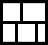
Horizontal and vertical staggered grid layouts are created using the LazyHorizontalStaggeredGrid and LazyVerticalStaggeredGrid composable, respectively. The columns parameter controls the grid’s appearance, which can be set to either adaptive or fixed mode. In adaptive mode, the grid will calculate the number of rows and columns that will fit into the available space, with even spacing between items and subject to a minimum specified cell size. Fixed mode, on the other hand, is passed the number of rows to be displayed and sizes each row or column equally to fill the available space. Configuration options are also available to reverse the layout, add content padding, disable scrolling, and define the spacing between cells. Figure 1-1 illustrates the arrangement of items in a vertical grid layout:

A typical staggered grid instance might be implemented as follows:
LazyVerticalStaggeredGrid(
columns = StaggeredGridCells.Fixed(2),
modifier = Modifier.fillMaxSize(),
contentPadding = PaddingValues(16.dp),
verticalItemSpacing: 16.dp,
horizontalArrangement = Arrangement.spacedBy(16.dp),
verticalArrangement = Arrangement.spacedBy(16.dp),
userScrollEnabled: true
) {
items(items) { item ->
// Cell content here
}
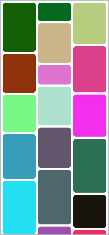
}Code language: Kotlin (kotlin)The above example creates a LazyVerticalStaggeredGrid consisting of two fixed columns with content padding and spacing between cells, the layout for which would resemble Figure 1-2:
The following is the equivalent code to create a horizontal staggered grid:
LazyVerticalStaggeredGrid(
    columns = StaggeredGridCells.Fixed(2),
    modifier = Modifier.fillMaxSize(),
    contentPadding = PaddingValues(16.dp),
    verticalItemSpacing: 16.dp,
    horizontalArrangement = Arrangement.spacedBy(16.dp),
    verticalArrangement = Arrangement.spacedBy(16.dp),
    userScrollEnabled: true
    ) {
    items(items) { item ->
        // Cell content here
    }
}Code language: Kotlin (kotlin)
In the rest of this chapter, we will create a project demonstrating how to use a staggered grid. The example will display a grid containing items configured with random heights and colors.
Creating the StaggeredGridDemo project
Launch Android Studio and select the New Project option from the welcome screen. Choose the Empty Activity template in the new project dialog before clicking the Next button.
Enter StaggeredGridDemo into the Name field and specify com.example.staggeredgriddemo as the package name. Before clicking the Finish button, change the Minimum API level setting to API 26: Android 8.0 (Oreo).
Within the MainActivity.kt file, delete the Greeting function and add a new empty composable named MainScreen:
LazyHorizontalStaggeredGrid(
    rows = StaggeredGridCells.Fixed(2),
    modifier = Modifier.fillMaxSize(),
    contentPadding = PaddingValues(16.dp),
    horizontalItemSpacing: 16.dp,
    verticalArrangement = Arrangement.spacedBy(16.dp),
    horizontalArrangement = Arrangement.spacedBy(16.dp),
    userScrollEnabled: true
    ) {
    items(items) { item ->
        // Cell content here
    }
}Code language: Kotlin (kotlin)
Next, edit the onCreateActivity() method and GreetingPreview function to call MainScreen instead of Greeting.
Adding the Box composable
The grid item in this project will be represented by a Box composable. Each instance of this box will be configured with random height and background color properties. Before we write the code for the Box, we first need a data class to store the color and height values, which we can pass to the Box composable. Within the MainActivity.kt file, declare the data class as follows:
@Composable
fun MainScreen() {

}Code language: Kotlin (kotlin)
Next, add a composable named GridItem to display a Box composable based on the values of a BoxProperties instance:
.
.
import androidx.compose.ui.unit.Dp
import androidx.compose.ui.graphics.Color
.
.
data class BoxProperties(
    val color: Color,
    val height: Dp
)
Next, add a composable named GridItem to display a Box composable based on the values of a BoxProperties instance:
.
.
import androidx.compose.foundation.background
import androidx.compose.foundation.layout.*
import androidx.compose.ui.draw.clip
import androidx.compose.foundation.shape.RoundedCornerShape
import androidx.compose.ui.unit.dp
.
.
@Composable
fun GridItem(properties: BoxProperties) {
    Box(modifier = Modifier
        .fillMaxWidth()
        .height(properties.height)
        .clip(RoundedCornerShape(10.dp))
        .background(properties.color)
    )
}Code language: Kotlin (kotlin)
Generating random height and color values
Now that we have a grid item and a way to store the current item properties, the next step is to write code to generate random height and color values. We will do this by creating a list of BoxProperties items, calling the Kotlin Random.nextInt() method for each instance to generate height and RGB color values. Edit the MainScreen composable to add the following code:
.
.
import androidx.compose.foundation.ExperimentalFoundationApi

import kotlin.random.Random
.
.
@OptIn(ExperimentalFoundationApi::class)
@Composable
fun MainScreen() {

    val items = (1 .. 50).map {
        BoxProperties(
            height = Random.nextInt(50, 200).dp,
            color = Color(
                Random.nextInt(255),
                Random.nextInt(255),
                Random.nextInt(255),
                255
            )
        )
    }
}Code language: JavaScript (javascript)
The above code configures 50 BoxProperties instances with random height values between 50 and 200 dp. Next, Color objects are created using random RGB values (0 to 255). In addition, the alpha Color property is set to 255 to ensure only solid, non-transparent colors are generated.
Note that the above code includes a directive to opt into experimental API features. At the time of writing, the staggered grid composables were still in the experimental development phase. Depending on when you are reading this book, this setting may no longer be required.
Creating the Staggered List
The final task before testing the app is to add the LazyVerticalStaggeredGrid to the layout. The goal is to create a staggered vertical grid using the items list containing three fixed-width columns with horizontal and vertical spacing between each cell. Edit the MainScreen composable once again and modify it as follows:
.
.
import androidx.compose.foundation.lazy.staggeredgrid.*
.
.
@OptIn(ExperimentalFoundationApi::class)
@Composable
fun MainScreen() {

    val items = (1 .. 50).map {
        BoxProperties(
.
.
    }

    LazyVerticalStaggeredGrid(
        columns = StaggeredGridCells.Fixed(3),
        modifier = Modifier.fillMaxSize(),
        contentPadding = PaddingValues(8.dp),
        horizontalArrangement = Arrangement.spacedBy(8.dp),
        verticalArrangement = Arrangement.spacedBy(8.dp)
    ) {
        items(items) { values ->
            GridItem(properties = values)
        }
    }
}Code language: JavaScript (javascript)
Testing the project
With the code writing completed, display the preview panel where the staggered grid layout should appear, as shown in Figure 1-3 (allowing, of course, for the random color and height properties). Assuming that the layout is rendered as expected, enable interactive mode and test that it is possible to scroll vertically through the grid items.
Switching to a horizontal staggered grid
To convert the example grid to use the LazyHorizontalStaggeredGrid layout, make the following changes to the MainActivity.kt file:
.
.
data class BoxProperties(
val color: Color,
val width: Dp
)
@Composable
fun GridItem(properties: BoxProperties) {
Box(modifier = Modifier
.fillMaxWidth()
.width(properties.width)
.clip(RoundedCornerShape(10.dp))
.background(properties.color)
)
}
@OptIn(ExperimentalFoundationApi::class)
@Composable
fun MainScreen() {
val items = (1 .. 50).map {
BoxProperties(
width = Random.nextInt(50, 200).dp,
.
.
}
LazyHorizontalStaggeredGrid(
rows = StaggeredGridCells.Fixed(3),
modifier = Modifier.fillMaxSize(),
contentPadding = PaddingValues(8.dp),
horizontalArrangement = Arrangement.spacedBy(8.dp),
verticalArrangement = Arrangement.spacedBy(8.dp)
) {
items(items) { values ->
GridItem(properties = values)
}
}
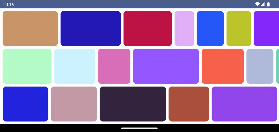
}Code language: Kotlin (kotlin)Horizontal staggered grid layouts are best tested on a device or emulator in landscape orientation, so run the app on a suitable target where the layout should appear as shown in Figure 1-4:
Once the app has launched, check that you can scroll horizontally through the grid.
Summary
In this chapter, we have introduced the vertical and horizontal lazy grid composables. These layouts are useful when items of varying sizes need to be shown in a grid format. Grids can be presented in either adaptive or fixed mode. Adaptive mode calculates how many rows or columns will fit into the available space, with even spacing between items and subject to a minimum specified size. Fixed mode, on the other hand, is passed the number of rows or columns to be displayed and sizes each to fill the available space.