
It is a common requirement when designing user interface layouts to present information in either scrollable list or grid configurations. For basic list requirements, the Row and Column components can be re-purposed to provide vertical and horizontal lists of child composables. Extremely large lists, however, are likely to cause degraded performance if rendered using the standard Row and Column composables. For lists containing large numbers of items, Compose provides the LazyColumn and LazyRow composables. Similarly, grid-based layouts can be presented using the LazyVerticalGrid composable.
This chapter will introduce the basics of list and grid creation and management in Compose in preparation for the tutorials in subsequent chapters.
Standard vs. lazy lists
Part of the popularity of lists is that they provide an effective way to present large amounts of items in a scrollable format. Each item in a list is represented by a composable which may, itself, contain descendant composables. When a list is created using the Row or Column component, all of the items it contains are also created at initialization, regardless of how many are visible at any given time. While this does not necessarily pose a problem for smaller lists, it can be an issue for lists containing many items.
Consider, for example, a list that is required to display 1000 photo images. It can be assumed with a reasonable degree of certainty that only a small percentage of items will be visible to the user at any one time. If the application was permitted to create each of the 1000 items in advance, however, the device would very quickly run into memory and performance limitations.
When working with longer lists, the recommended course of action is to use LazyColumn, LazyRow, and LazyVerticalGrid. These components only create those items that are visible to the user. As the user scrolls, items that move out of the viewable area are destroyed to free up resources while those entering view are created just in time to be displayed. This allows lists of potentially infinite length to be displayed with no performance degradation.
 |
You are reading a sample chapter from an old edition of the Jetpack Compose Essentials book. Purchase the fully updated Jetpack Compose 1.7 Essentials edition of this book in eBook or Print format. The full book contains 67 chapters and over 700 pages of in-depth information. Buy the full book now in Print or eBook format. Learn more. |
Since there are differences in approach and features when working with Row and Column compared to the lazy equivalents, this chapter will provide an overview of both types.
Working with Column and Row lists
Although lacking some of the features and performance advantages of the LazyColumn and LazyRow, the Row and Column composables provide a good option for displaying shorter, basic lists of items. Lists are declared in much the same way as regular rows and columns with the exception that each list item is usually generated programmatically. The following declaration, for example, uses the Column component to create a vertical list containing 100 instances of a composable named MyListItem:
Column {
    repeat(100) {
        MyListItem()
    }
}Code language: Kotlin (kotlin)
Similarly, the following example creates a horizontal list containing the same items:
Row {
    repeat(100) {
        MyListItem()
    }
}Code language: Kotlin (kotlin)
The MyListItem composable can be anything from a single Text composable to a complex layout containing multiple composables.
Creating lazy lists
Lazy lists are created using the LazyColumn and LazyRow composables. These layouts place children within a LazyListScope block which provides additional features for managing and customizing the list items. For example, individual items may be added to a lazy list via calls to the item() function of the LazyListScope:
|
You are reading a sample chapter from an old edition of the Jetpack Compose Essentials book. Purchase the fully updated Jetpack Compose 1.7 Essentials edition of this book in eBook or Print format. The full book contains 67 chapters and over 700 pages of in-depth information. Buy the full book now in Print or eBook format. Learn more. |
LazyColumn {
    item {
        MyListItem()
    }
}Code language: Kotlin (kotlin)
Alternatively, multiple items may be added in a single statement by calling the items() function:
LazyColumn {
    items(1000) { index ->
        Text("This is item $index");
    }
}Code language: Kotlin (kotlin)
LazyListScope also provides the itemsIndexed() function which associates the item content with an index value, for example:
val colorNamesList = listOf("Red", "Green", "Blue", "Indigo")

LazyColumn {
    itemsIndexed(colorNamesList) { index, item ->
        Text("$index = $item")
    }
}Code language: Kotlin (kotlin)
When rendered, the above lazy column will appear as shown in Figure 32-1 below:
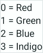
Figure 32-1
Lazy lists also support the addition of headers to groups of items in a list using the stickyHeader() function. This topic will be covered in more detail later in the chapter.
|
You are reading a sample chapter from an old edition of the Jetpack Compose Essentials book. Purchase the fully updated Jetpack Compose 1.7 Essentials edition of this book in eBook or Print format. The full book contains 67 chapters and over 700 pages of in-depth information. Buy the full book now in Print or eBook format. Learn more. |
Enabling scrolling with ScrollState
While the above Column and Row list examples will display a list of items, only those that fit into the viewable screen area will be accessible to the user. This is because lists are not scrollable by default. To make Row and Column-based lists scrollable, some additional steps are needed. LazyList and LazyRow, on the other hand, support scrolling by default.
The first step in enabling list scrolling when working with Row and Column-based lists is to create a ScrollState instance. This is a special state object designed to allow Row and Column parents to remember the current scroll position through recompositions. A ScrollState instance is generated via a call to the rememberScrollState() function, for example:
val scrollState = rememberScrollState()Code language: Kotlin (kotlin)Once created, the scroll state is passed as a parameter to the Column or Row composable using the verticalScroll() and horizontalScroll() modifiers. In the following example, vertical scrolling is being enabled in a Column list:
Column(Modifier.verticalScroll(scrollState)) {
    repeat(100) {
        MyListItem()
    }
}Code language: Kotlin (kotlin)
Similarly, the following code enables horizontal scrolling on a LazyRow list:
Row(Modifier.horizontalScroll(scrollState))  {
    repeat(1000) {
        MyListItem()
    }
}Code language: Kotlin (kotlin)
Programmatic scrolling
We generally think of scrolling as being something a user performs through dragging or swiping gestures on the device screen. It is also important to know how to change the current scroll position from within code. An app screen might, for example, contain buttons which can be tapped to scroll to the start and end of a list. The steps to implement this behavior differ between Row and Columns lists and the lazy list equivalents.
|
You are reading a sample chapter from an old edition of the Jetpack Compose Essentials book. Purchase the fully updated Jetpack Compose 1.7 Essentials edition of this book in eBook or Print format. The full book contains 67 chapters and over 700 pages of in-depth information. Buy the full book now in Print or eBook format. Learn more. |
When working with Row and Column lists, programmatic scrolling can be performed by calling the following functions on the ScrollState instance:
- animateScrollTo(value: Int) – Scrolls smoothly to the specified pixel position in the list using animation.
- scrollTo(value: Int) – Scrolls instantly to the specified pixel position.
Note that the value parameters in the above function represent the list position in pixels instead of referencing a specific item number. It is safe to assume that the start of the list is represented by pixel position 0, but the pixel position representing the end of the list may be less obvious. Fortunately, the maximum scroll position can be identified by accessing the maxValue property of the scroll state instance:
val maxScrollPosition = scrollState.maxValueCode language: Kotlin (kotlin)To programmatically scroll LazyColumn and LazyRow lists, functions need to be called on a LazyListState instance which can be obtained via a call to the rememberLazyListState() function as follows:
val listState = rememberLazyListState()Code language: Kotlin (kotlin)Once the list state has been obtained, it must be applied to the LazyRow or LazyColumn declaration as follows:
.
.
LazyColumn(
    state = listState,
{
.
.Code language: Kotlin (kotlin)
Scrolling can then be performed via calls to the following functions on the list state instance:
|
You are reading a sample chapter from an old edition of the Jetpack Compose Essentials book. Purchase the fully updated Jetpack Compose 1.7 Essentials edition of this book in eBook or Print format. The full book contains 67 chapters and over 700 pages of in-depth information. Buy the full book now in Print or eBook format. Learn more. |
- animateScrollToItem(index: Int) – Scrolls smoothly to the specified list item (where 0 is the first item).
- scrollToItem(index: Int) – Scrolls instantly to the specified list item (where 0 is the first item).
In this case, the scrolling position is referenced by the index of the item instead of pixel position.
One complication is that all four of the above scroll functions are coroutine functions. Coroutines are a feature of Kotlin that allows blocks of code to execute asynchronously without blocking the thread from which they are launched (in this case the main thread which is responsible for making sure the app remains responsive to the user). Coroutines can be implemented without having to worry about building complex implementations or directly managing multiple threads. Because of the way they are implemented, coroutines are much more efficient and less resource-intensive than using traditional multi-threading options. Coroutines also make for code that is much easier to write, understand and maintain since it allows code to be written sequentially without having to write callbacks to handle thread-related events and results.
Although a relatively recent addition to Kotlin, there is nothing new or innovative about coroutines. Coroutines in one form or another have existed in programming languages since the 1960s and are based on a model known as Communicating Sequential Processes (CSP). In fact, Kotlin still uses multi-threading behind the scenes, though it does so highly efficiently.
A problem with threads is that they are a finite resource expensive in terms of CPU capabilities and system overhead. In the background, a lot of work is involved in creating, scheduling, and destroying a thread. Although modern CPUs can run large numbers of threads, the actual number of threads that can be run in parallel at any one time is limited by the number of CPU cores (though newer CPUs have 8 cores, most Android devices contain CPUs with 4 cores). When more threads are required than there are CPU cores, the system has to perform thread scheduling to decide how the execution of these threads is to be shared between the available cores.
To avoid these overheads, instead of starting a new thread for each coroutine and then destroying it when the coroutine exits, Kotlin maintains a pool of active threads and manages how coroutines are assigned to those threads. When an active coroutine is suspended it is saved by the Kotlin runtime and another coroutine resumed to take its place. When the coroutine is resumed, it is simply restored to an existing unoccupied thread within the pool to continue executing until it either completes or is suspended. Using this approach, a limited number of threads are used efficiently to execute asynchronous tasks with the potential to perform large numbers of concurrent tasks without the inherent performance degenerations that would occur using standard multithreading.
|
You are reading a sample chapter from an old edition of the Jetpack Compose Essentials book. Purchase the fully updated Jetpack Compose 1.7 Essentials edition of this book in eBook or Print format. The full book contains 67 chapters and over 700 pages of in-depth information. Buy the full book now in Print or eBook format. Learn more. |
One of the key requirements of coroutine functions is that they must be launched from within a coroutine scope.
As with ScrollState and LazyListState, we need access to a CoroutineScope instance that will be remembered through recompositions. This requires a call to the rememberCoroutineScope() function as follows:
val coroutineScope = rememberCoroutineScope()Code language: Kotlin (kotlin)Once we have a coroutine scope, we can use it to launch the scroll functions. The following code, for example, declares a Button component configured to launch the animateScrollTo() function within the coroutine scope. In this case, the button will cause the list to scroll to the end position when clicked:
.
.
Button(onClick = {
    coroutineScope.launch {
        scrollState.animateScrollTo(scrollState.maxValue)
    }
.
.
}Code language: Kotlin (kotlin)
Sticky headers
Sticky headers is a feature only available within lazy lists that allows list items to be grouped under a corresponding header. Sticky headers are created using the LazyListScope stickyHeader() function.
The headers are referred to as being sticky because they remain visible on the screen while the current group is scrolling. Once a group scrolls from view, the header for the next group takes its place. Figure 32-2, for example, shows a list with sticky headers. Note that although the Apple group is scrolled partially out of view, the header remains in position at the top of the screen:
|
You are reading a sample chapter from an old edition of the Jetpack Compose Essentials book. Purchase the fully updated Jetpack Compose 1.7 Essentials edition of this book in eBook or Print format. The full book contains 67 chapters and over 700 pages of in-depth information. Buy the full book now in Print or eBook format. Learn more. |
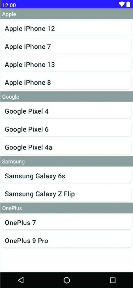
Figure 32-2
When working with sticky headers, the list content must be stored in an Array or List which has been mapped using the Kotlin groupBy() function. The groupBy() function accepts a lambda which is used to define the selector which defines how data is to be grouped. This selector then serves as the key to access the elements of each group. Consider, for example, the following list which contains mobile phone models:
val phones = listOf("Apple iPhone 12", "Google Pixel 4", "Google Pixel 6",
    "Samsung Galaxy 6s", "Apple iPhone 7", "OnePlus 7", "OnePlus 9 Pro",
         "Apple iPhone 13", "Samsung Galaxy Z Flip", "Google Pixel 4a",
            "Apple iPhone 8")Code language: Kotlin (kotlin)
Now suppose that we want to group the phone models by manufacturer. To do this we would use the first word of each string (in other words, the text before the first space character) as the selector when calling groupBy() to map the list:
val groupedPhones = phones.groupBy { it.substringBefore(' ') }Code language: Kotlin (kotlin)Once the phones have been grouped by manufacturer, we can use the forEach statement to create a sticky header for each manufacture name, and display the phones in the corresponding group as list items:
groupedPhones.forEach { (manufacturer, models) ->
    stickyHeader {
        Text(
            text = manufacturer,
            color = Color.White,
            modifier = Modifier
                .background(Color.Gray)
                .padding(5.dp)
                .fillMaxWidth()
        )
    }

    items(models) { model ->
        MyListItem(model)
    }
}Code language: Kotlin (kotlin)
In the above forEach lambda, manufacturer represents the selector key (for example “Apple”) and models an array containing the items in the corresponding manufacturer group (“Apple iPhone 12”, “Apple iPhone 7”, and so on for the Apple selector):
|
You are reading a sample chapter from an old edition of the Jetpack Compose Essentials book. Purchase the fully updated Jetpack Compose 1.7 Essentials edition of this book in eBook or Print format. The full book contains 67 chapters and over 700 pages of in-depth information. Buy the full book now in Print or eBook format. Learn more. |
groupedPhones.forEach { (manufacturer, models) ->Code language: Kotlin (kotlin)The selector key is then used as the text for the sticky header, and the models list is passed to the items() function to display all the group elements, in this case using a custom composable named MyListItem for each item:
items(models) { model ->
    MyListItem(model)
}Code language: Kotlin (kotlin)
When rendered, the above code will display the list shown in Figure 32-2 above.
Responding to scroll position
Both LazyRow and LazyColumn allow actions to be performed when a list scrolls to a specified item position. This can be particularly useful for displaying a “scroll to top” button that appears only when the user scrolls towards the end of the list.
The behavior is implemented by accessing the firstVisibleItemIndex property of the LazyListState instance which contains the index of the item that is currently the first visible item in the list. For example, if the user scrolls a
LazyColumn list such that the third item in the list is currently the topmost visible item, firstVisibleItemIndex will contain a value of 2 (since indexes start counting at 0). The following code, for example, could be used to display a “scroll to top” button when the first visible item index exceeds 8:
|
You are reading a sample chapter from an old edition of the Jetpack Compose Essentials book. Purchase the fully updated Jetpack Compose 1.7 Essentials edition of this book in eBook or Print format. The full book contains 67 chapters and over 700 pages of in-depth information. Buy the full book now in Print or eBook format. Learn more. |
val firstVisible = listState.firstVisibleItemIndex

if (firstVisible > 8) {
    // Display scroll to top button
}Code language: Kotlin (kotlin)
Creating a lazy grid
Grid layouts may be created using the LazyVerticalGrid composable. The appearance of the grid is controlled by the cells parameter that can be set to either adaptive or fixed mode. In adaptive mode, the grid will calculate the number of rows and columns that will fit into the available space, with even spacing between items and subject to a minimum specified cell size. Fixed mode, on the other hand, is passed the number of rows to be displayed and sizes each column width equally to fill the width of the available space.
The following code, for example, declares a grid containing 30 cells, each with a minimum width of 60dp:
LazyVerticalGrid(
    cells = GridCells.Adaptive(minSize = 60.dp),
    state = rememberLazyListState(),
    contentPadding = PaddingValues(10.dp)
) {
        items(30) { index ->
            Card(backgroundColor = Color.Blue,
                modifier = Modifier.padding(5.dp).fillMaxSize()) {
                Text(
                     "$index",
                     fontSize = 35.sp,
                     color = Color.White,
                     textAlign = TextAlign.Center)
            }
        }
}Code language: Kotlin (kotlin)
When called, the LazyVerticalGrid composable will fit as many items as possible into each row without making the column width greater than 60dp as illustrated in the figure below:
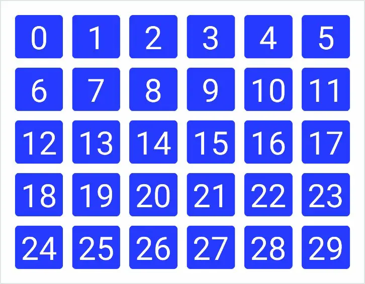
Figure 32-3
The following code organizes items in a grid containing three columns:
|
You are reading a sample chapter from an old edition of the Jetpack Compose Essentials book. Purchase the fully updated Jetpack Compose 1.7 Essentials edition of this book in eBook or Print format. The full book contains 67 chapters and over 700 pages of in-depth information. Buy the full book now in Print or eBook format. Learn more. |
LazyVerticalGrid(
    cells = GridCells.Fixed(3),
    state = rememberLazyListState(),
    contentPadding = PaddingValues(10.dp)
) {

        items(15) { index ->
            Card(backgroundColor = Color.Blue,
                modifier = Modifier.padding(5.dp).fillMaxSize()) {
                Text(
                    "$index",
                    fontSize = 35.sp,
                    color = Color.White,
                    textAlign = TextAlign.Center)
            }
        }
}Code language: Kotlin (kotlin)
The layout from the above code will appear as illustrated in Figure 32-4 below:
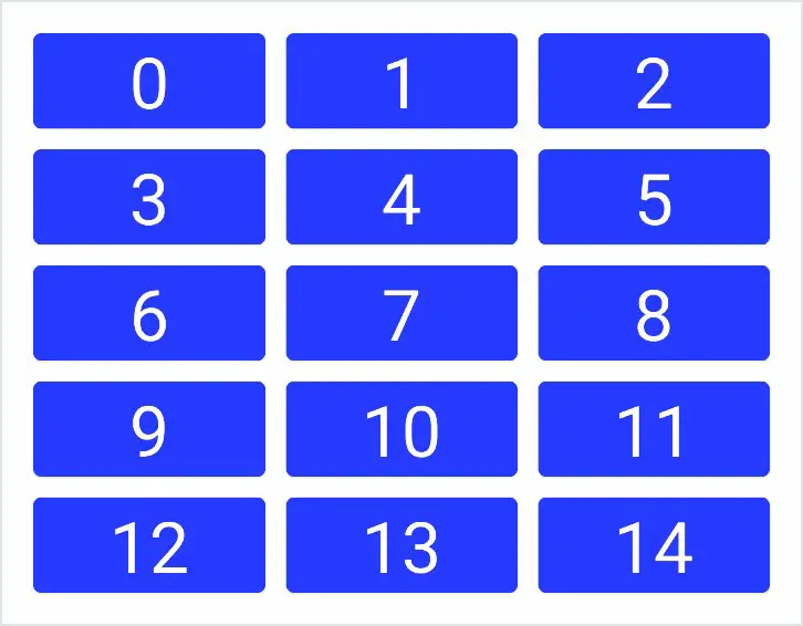
Figure 32-4
Both the above grid examples used a Card composable containing a Text component for each cell item. The Card component provides a surface into which to group content and actions relating to a single content topic and is often used as the basis for list items. Although we provided a Text composable as the child, the content in a card can be any composable, including containers such as Row, Column, and Box layouts. A key feature of Card is the ability to create a shadow effect by specifying an elevation:
Card(
    modifier = Modifier
        .fillMaxWidth()
        .padding(15.dp),
    elevation = 10.dp
) {
    Column(horizontalAlignment = Alignment.CenterHorizontally,
        modifier = Modifier.padding(15.dp)
    ) {
        Text("Jetpack Compose", fontSize = 30.sp)
        Text("Card Example", fontSize = 20.sp)
    }
}Code language: Kotlin (kotlin)
When rendered, the above Card component will appear as shown in Figure 32-5:
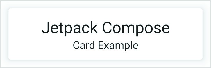
Figure 32-5
|
You are reading a sample chapter from an old edition of the Jetpack Compose Essentials book. Purchase the fully updated Jetpack Compose 1.7 Essentials edition of this book in eBook or Print format. The full book contains 67 chapters and over 700 pages of in-depth information. Buy the full book now in Print or eBook format. Learn more. |
Summary
Lists in Compose may be created using either standard or lazy list components. The lazy components have the advantage that they can present large amounts of content without impacting the performance of the app or the device on which it is running. This is achieved by creating list items only when they become visible and destroying them as they scroll out of view. Lists can be presented in row, column, and grid formats and can be static or scrollable. It is also possible to programmatically scroll lists to specific positions and to trigger events based on the current scroll position.