
Although the creation of lists using the standard compose Row and Column layout composables was covered in the previous chapter, in most situations you will be more likely to make use of the LazyColumn and LazyRow components. Not only do these provide a more efficient way to display long lists of items, but the lazy composables also include additional features such as sticky headers and responding to changes in scroll position.
This chapter will create a project which demonstrates some of the key features of both the LazyColumn and LazyRow components. In the next chapter, entitled Jetpack Compose Sticky Headers and Scroll Detection, the project will be extended to include support for sticky headers and scroll position detection.
Creating the LazyListDemo project
Launch Android Studio and select the New Project option from the welcome screen. When the new project dialog appears, choose the Empty Compose Activity template before clicking on the Next button.
Enter LazyListDemo into the Name field and specify com.example.lazylistdemo as the package name. Before clicking on the Finish button, change the Minimum API level setting to API 26: Android 8.0 (Oreo). Within the MainActivity.kt file, delete the Greeting function and add a new empty composable named MainScreen:
@Composable
fun MainScreen() {

}Code language: Kotlin (kotlin)
Next, edit the onCreateActivity() method and DefaultPreview function to call MainScreen instead of Greeting.
 |
You are reading a sample chapter from an old edition of the Jetpack Compose Essentials book. Purchase the fully updated Jetpack Compose 1.7 Essentials edition of this book in eBook or Print format. The full book contains 67 chapters and over 700 pages of in-depth information. Buy the full book now in Print or eBook format. Learn more. |
Adding list data to the project
Before designing the list we first need some data to provide the list item content. For this example, we will use an XML resource file containing the list items and read it into an array. The XML resource file for this project is included with the source code samples download within the XML folder. If you have not already done so, the sample code can be downloaded from the following web page:
https://www.ebookfrenzy.com/web/compose14/index.php
Once the sample code has been unpacked, use the file system navigator for your operating system (i.e. Finder on macOS or Windows Explorer in Windows), locate the car_list.xml file in the XML folder, and copy it. Return to Android Studio, right-click on the app -> res > values folder in the Project tool window, and select Paste from the resulting menu as shown in Figure 34-1:
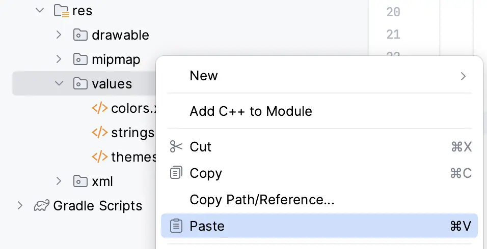
Figure 34-1
Finally, click the OK button in the “Copy” dialog to add the file to the project resources, making sure to keep the “Open in editor” option enabled:
|
You are reading a sample chapter from an old edition of the Jetpack Compose Essentials book. Purchase the fully updated Jetpack Compose 1.7 Essentials edition of this book in eBook or Print format. The full book contains 67 chapters and over 700 pages of in-depth information. Buy the full book now in Print or eBook format. Learn more. |
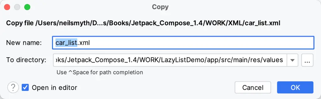
Figure 34-2
Once the file has been added and loaded into the editor, it should read as follows:
<?xml version="1.0" encoding="utf-8"?>
<resources>
    <string-array name="car_array">
        <item>Buick Century</item>
        <item>Buick LaSabre</item>
        <item>Buick Roadmaster</item>
        <item>Buick Special Riviera</item>
        <item>Cadillac Couple De Ville</item>
        <item>Cadillac Eldorado</item>
        <item>Cadillac Fleetwood</item>
        <item>Cadillac Series 62</item>
        <item>Cadillac Seville</item>
        <item>Ford Fairlane</item>
        <item>Ford Galaxie 500</item>
        <item>Ford Mustang</item>
        <item>Ford Thunderbird</item>
        <item>GMC Le Mans</item>
        <item>Plymouth Fury</item>
        <item>Plymouth GTX</item>
        <item>Plymouth Roadrunner</item>
    </string-array>
</resources>Code language: HTML, XML (xml)
Note that the data is declared as being of type string-array and given the resource name car_array. This is the name by which the data will be referenced when it is read from the file.
Reading the XML data
Now that the XML file has been added to the project it needs to be parsed and read into an array. This array will, in turn, provide the data in a format that can be used by the LazyColumn component. To achieve this, we will be using the getStringArray() method of the Android resources instance. Since the data needs to be initialized when the main activity is created, we can perform this task within the onCreate() method. Some changes are also required to pass the array through to our MainScreen function and to provide some sample data for the Preview composable.
Edit the MainActivity.kt file and modify it so that it reads as follows:
|
You are reading a sample chapter from an old edition of the Jetpack Compose Essentials book. Purchase the fully updated Jetpack Compose 1.7 Essentials edition of this book in eBook or Print format. The full book contains 67 chapters and over 700 pages of in-depth information. Buy the full book now in Print or eBook format. Learn more. |
.
.
class MainActivity : ComponentActivity() {

    private var itemArray: Array<String>? = null

    override fun onCreate(savedInstanceState: Bundle?) {

        itemArray = resources.getStringArray(R.array.car_array)

        super.onCreate(savedInstanceState)
        setContent {
            LazyListDemoTheme {
                Surface(
                    modifier = Modifier.fillMaxSize(),
                    color = MaterialTheme.colors.background
                ) {
                    MainScreen(itemArray = itemArray as Array<out String>)
                }
            }
        }
    }
}

@Composable
fun MainScreen(itemArray: Array<out String>) {

}

@Preview(showBackground = true)
@Composable
fun DefaultPreview() {

    val itemArray: Array<String> = arrayOf("Cadillac Eldorado",
                                      "Ford Fairlane", "Plymouth Fury")

    LazyListDemoTheme {
        MainScreen(itemArray = itemArray)
    }
}Code language: Kotlin (kotlin)
Handling image loading
The project now has access to a list of cars with each item containing the car manufacturer and model. In addition to this text content, each list item will also display an image containing the manufacturer’s logo. These logos are hosted on a web server and will need to be downloaded and rendered within an Image composable. There are many factors to take into consideration when downloading and displaying images within an app. For example, the images need to be downloaded asynchronously so that the app execution is not interrupted. The download process should also be able to recover from connectivity issues, and should also handle downsampling of the images to minimize memory usage. Instead of writing all the code to perform these tasks, this project will use an existing image loading library called Coil to automatically perform these tasks. If you would like to learn more about Coil, information can be found at the following URL:
https://coil-kt.github.io/coil/
To add Coil support to the project, open the module-level build.gradle file (located in the Project tool window under Gradle Scripts -> build.gradle (Module: LazyListDemo.app)), locate the dependencies section, and add the Coil library:
dependencies {
.
.
   implementation('io.coil-kt:coil-compose:1.3.2')
.
.
}Code language: Gradle (gradle)
After the library has been added, a warning bar (Figure 34-3) will appear indicating that the project needs to be re-synchronized to include the change:
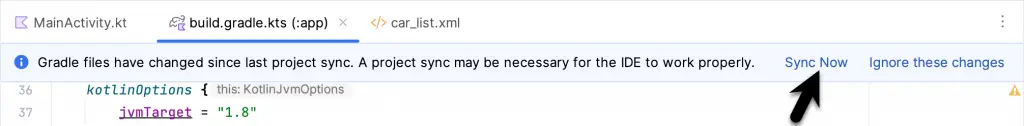
Figure 34-3
|
You are reading a sample chapter from an old edition of the Jetpack Compose Essentials book. Purchase the fully updated Jetpack Compose 1.7 Essentials edition of this book in eBook or Print format. The full book contains 67 chapters and over 700 pages of in-depth information. Buy the full book now in Print or eBook format. Learn more. |
Click on the Sync Now link and wait while the synchronization process completes.
The next step is to add a composable function to download an image and display it using the Image component. The naming convention for the image files is <manufacturer>_logo.png where <manufacturer> is replaced by the manufacturer name (Ford, Cadillac, etc.). Since each car string begins with the manufacturer name, we can construct the image name for each car entry by combining the first word of the string with “_logo.png”. Within the MainActivity.kt file, begin writing the ImageLoader composable function:
@Composable
fun ImageLoader(item: String) {

    val url = "https://www.ebookfrenzy.com/book_examples/car_logos/" + item.substringBefore(" ") + "_logo.png"
}Code language: Kotlin (kotlin)
While constructing the full image URL, the code calls the Kotlin subStringBefore() method on the item string to obtain the text before the first space character.
With the path to the image obtained, code now needs to be added to create an Image component rendered with the image:
.
.
import androidx.compose.foundation.Image
import androidx.compose.foundation.layout.*
import androidx.compose.ui.layout.ContentScale
import androidx.compose.ui.unit.dp
import coil.compose.rememberImagePainter
.
.
@Composable
fun ImageLoader(item: String) {

    val url = "https://www.ebookfrenzy.com/book_examples/car_logos/" + item.
                                    substringBefore(" ") + "_logo.png"

   Image(
        painter = rememberImagePainter(url),
        contentDescription = "car image",
        contentScale = ContentScale.Fit,
        modifier = Modifier.size(75.dp)
    )
}Code language: Kotlin (kotlin)
The above code creates an Image and requests an image painter via a call to the Coil rememberImagePainter() function, passing through the image URL. The image is scaled to fit the size of the Image component, the height and width of which is restricted via a modifier to 75dp.
|
You are reading a sample chapter from an old edition of the Jetpack Compose Essentials book. Purchase the fully updated Jetpack Compose 1.7 Essentials edition of this book in eBook or Print format. The full book contains 67 chapters and over 700 pages of in-depth information. Buy the full book now in Print or eBook format. Learn more. |
As the logo images will be downloaded, the project manifest needs to be updated to add Internet access permission. Within the Project tool window, open the app -> manifests -> AndroidManifest.xml file and add the Internet permission element as follows:
<?xml version="1.0" encoding="utf-8"?>
<manifest xmlns:android="http://schemas.android.com/apk/res/android"
    package="com.example.lazylistdemo">

    <uses-permission android:name="android.permission.INTERNET" />
.
.Code language: HTML, XML (xml)
At the time of writing, the Compose Preview panel did not support the rendering of images using Coil. To test that the ImageLoader works, make the following addition to the MainScreen function:
@Composable
fun MainScreen(itemArray: Array<out String>) {
    ImageLoader("Plymouth GTX")
}Code language: Kotlin (kotlin)
With the change made, run the app on an emulator or device where the Plymouth logo should appear as illustrated in Figure 34-4:

Figure 34-4
Designing the list item composable
At this point in the tutorial, we have an array of list items and a mechanism for loading images. The next requirement is a composable to display each item within the list. This will consist of a Row containing an ImageLoader and a Text component displaying the list item string. To provide more customization options such as elevation effects and rounded corners, the Row will be placed within a Card component. Add the MyListItem function to the MainActivity.kt file so that it reads as follows:
|
You are reading a sample chapter from an old edition of the Jetpack Compose Essentials book. Purchase the fully updated Jetpack Compose 1.7 Essentials edition of this book in eBook or Print format. The full book contains 67 chapters and over 700 pages of in-depth information. Buy the full book now in Print or eBook format. Learn more. |
.
.
import androidx.compose.foundation.shape.RoundedCornerShape
import androidx.compose.material.Card
import androidx.compose.ui.Alignment
.
.
@Composable
fun MyListItem(item: String) {
    Card(
        Modifier
            .padding(8.dp)
            .fillMaxWidth(),
        shape = RoundedCornerShape(10.dp),
        elevation = 5.dp) {

        Row(verticalAlignment = Alignment.CenterVertically) {
            ImageLoader(item)
            Spacer(modifier = Modifier.width(8.dp))
            Text(
                text = item,
                style = MaterialTheme.typography.h6,
                modifier = Modifier.padding(8.dp)
            )
        }
    }
}Code language: Kotlin (kotlin)
Modify the MainScreen function to call the MyListItem composable as follows before testing the app on a device or emulator:
@Composable
fun MainScreen(itemArray: Array<out String>) {
    MyListItem("Buick Roadmaster")
}Code language: Kotlin (kotlin)
Once the app is running, the list item should appear as illustrated in Figure 34-5. Note that this time the ImageLoader function has loaded the Buick logo to match the car description:

Figure 34-5
Building the lazy list
With the preparation work complete, the project is ready for the addition of the LazyColumn component.
.
.
import androidx.compose.foundation.lazy.LazyColumn
import androidx.compose.foundation.lazy.items
.
.
@Composable
fun MainScreen(itemArray: Array<out String>) {
    LazyColumn {
        items(itemArray) { model ->
            MyListItem(item = model)
        }
    }
}Code language: Kotlin (kotlin)
All this code does is call the LazyColumn composable and use the items() function of the LazyListScope to iterate through each element of the itemArray, passing each through to the MyListItem function.
|
You are reading a sample chapter from an old edition of the Jetpack Compose Essentials book. Purchase the fully updated Jetpack Compose 1.7 Essentials edition of this book in eBook or Print format. The full book contains 67 chapters and over 700 pages of in-depth information. Buy the full book now in Print or eBook format. Learn more. |
Testing the project
Compile and run the project once again and verify that a scrollable list resembling that shown in Figure 34-6 below appears on the device or emulator screen:
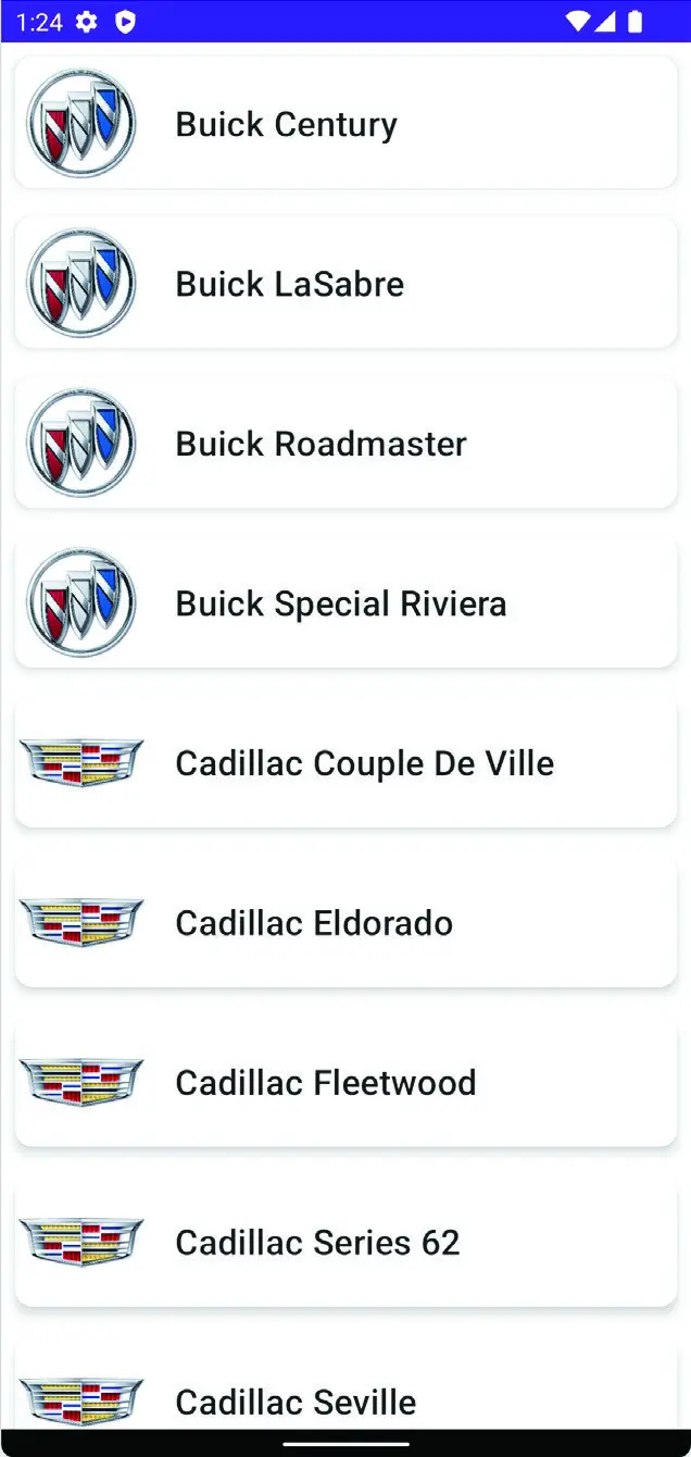
Figure 34-6
Making list items clickable
It is common for the items in a list to do something when clicked. For example, selecting an item for the list might perform an action or even navigate to another screen. The final step in this chapter is to make the items in the list clickable. For this example, we will configure the list items to display a toast message to the user containing the text content of the item. Created using the Android Toast class, toast messages are small notifications that appear on the screen without interrupting the currently visible activity.
Within the MainScreen function, we need to declare an event handler to be called when the user clicks on a list item. This handler will be passed the text of the current item which it will display within a toast message. Locate the MainScreen function in the MainActivity.kt file and modify it as follows:
.
.
import android.widget.Toast
import androidx.compose.ui.platform.LocalContext
import androidx.compose.foundation.*
.
.
@Composable
fun MainScreen(itemArray: Array<out String>) {

    val context = LocalContext.current

    val onListItemClick = { text : String ->

        Toast.makeText(
            context,
            text,
            Toast.LENGTH_SHORT
        ).show()
    }

    LazyColumn {
        items(itemArray) { model ->
            MyListItem(item = model)
        }
    }
}Code language: Kotlin (kotlin)
Next, both the MyListItem function and how it is called need to be updated to pass through a reference to the event handler:
|
You are reading a sample chapter from an old edition of the Jetpack Compose Essentials book. Purchase the fully updated Jetpack Compose 1.7 Essentials edition of this book in eBook or Print format. The full book contains 67 chapters and over 700 pages of in-depth information. Buy the full book now in Print or eBook format. Learn more. |
@Composable
fun MainScreen(itemArray: Array<out String>) {
.
.
    LazyColumn {
        items(itemArray) { model ->
            MyListItem(item = model, onItemClick = onListItemClick)
        }
    }
}

@Composable
fun MyListItem(item: String, onItemClick: (String) -> Unit) {
.
.
}Code language: Kotlin (kotlin)
The last task before testing this new behavior is to add a clickable modifier to the Card component within MyListItem. This needs to call the onListItemClick handler, passing it the current item:
@Composable
fun MyListItem(item: String, onItemClick: (String) -> Unit) {

    Card(
        Modifier
            .padding(8.dp)
            .fillMaxWidth()
            .clickable { onItemClick(item) },
        shape = RoundedCornerShape(10.dp),
        elevation = 5.dp) {
.
.Code language: Kotlin (kotlin)
Compile and run the app and test that clicking on an item displays the toast message containing the text of the selected item:
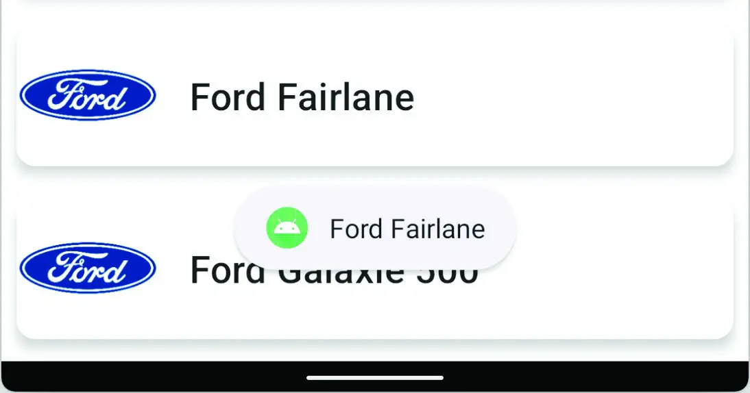
Figure 34-7
Summary
This chapter began by exploring the use of an XML resource for storing data and demonstrated how to read that data into an array during activity initialization. We then introduced the Coil image loading library and explained how it can be used to download and display images over an Internet connection with minimal coding. Next, the tutorial created a scrollable list based on the XML data, making use of the LazyColumn layout composable and the Card component. Finally, code was added to make each item in the list respond to click events.
Although we now have a running example of a Compose lazy list, the project created so far does not yet take advantage of other features of the Compose lazy list components such as sticky headers and scroll position detection. The next chapter, entitled Jetpack Compose Sticky Headers and Scroll Detection, will extend the LazyListDemo project to add these features.
|
You are reading a sample chapter from an old edition of the Jetpack Compose Essentials book. Purchase the fully updated Jetpack Compose 1.7 Essentials edition of this book in eBook or Print format. The full book contains 67 chapters and over 700 pages of in-depth information. Buy the full book now in Print or eBook format. Learn more. |