
The previous chapter focused on using animation when hiding and showing user interface components. In this chapter, we will turn our attention to state-driven animation. The features of the Compose Animation API allow a variety of animation effects to be performed based on the change of state from one value to another. This includes animations such as rotation, motion, and color changes to name just a few options. This chapter will explain the concepts of state-driven animation, introduce the animate as state functions, spring effects, and keyframes, and explore the use of transitions to combine multiple animations.
Understanding state-driven animation
We already know from previous chapters that working with state is a key element of Compose-based app development. Invariably, the way that an app appears, behaves, and responds to user input are all manifestations of changes to and of state occurring behind the scenes. Using the Compose Animation API, state changes can also be used as the basis for animation effects. If a state change transforms the appearance, position, orientation, or size of a component in a layout, there is a good chance that visual transformation can be animated using one or more of the animate as state functions.
Introducing animate as state functions
The animate as state functions are also referred to as the animate*AsState functions. The reason for this is that the functions all use the same naming convention whereby the ‘*’ wildcard is replaced by the type of the state value that is triggering the animation. For example, if you need to animate the background color change of a composable, you will need to use the animateColorAsState() function. At the time of writing, Compose provides state animation functions for Bounds, Color, Dp, Float, Int, IntOffset, IntSize, Offset, Rect, and Size data types which cover most animation requirements.
These functions animate the results of changes to a single state value. In basic terms, the function is given a target state value and then animates the change from the current value to the target value. The functions return special state values that can be used as properties for composables. Consider the following code fragment:
var temperature by remember { mutableStateOf(80) }

val animatedColor: Color by animateColorAsState(
    targetValue = if (temperature > 92) {
        Color.Red
    } else {
        Color.Green
    },
    animationSpec = tween(4500)
)Code language: Kotlin (kotlin)
The above code declares a state variable named temperature initialized with a value of 80. Next, a call is made to animateColorAsState which uses the current temperature setting to decide whether the color should be red or green. Note that the animate as state functions also accept an animation spec, in this case, a duration of 4500 milliseconds. The animatedColor state can now be assigned as a color property for any composable in the layout.
 |
You are reading a sample chapter from an old edition of the Jetpack Compose Essentials book. Purchase the fully updated Jetpack Compose 1.7 Essentials edition of this book in eBook or Print format. The full book contains 67 chapters and over 700 pages of in-depth information. Buy the full book now in Print or eBook format. Learn more. |
In the following code example it is used to control the background color of a Box composable:
Box(
    Modifier.size(width = 20.dp, height = 200.dp)
        .background(animatedColor)
)Code language: Kotlin (kotlin)
If the temperature state value exceeds 92 at any point during execution, the background color of the Box will transition from green to red using the declared animation.
In the remainder of this chapter, we will create some more state-driven animation examples. Finally, we will close out the chapter by demonstrating the use of the updateTransition() function to combine multiple animations.
Creating the AnimateState project
Launch Android Studio and create a new Empty Compose Activity project named AnimateState, specifying com.example.animatestate as the package name, and selecting a minimum API level of API 26: Android 8.0 (Oreo). Within the MainActivity.kt file, delete the Greeting function and add a new empty composable named RotationDemo:
@Composable
fun RotationDemo() {

}Code language: Kotlin (kotlin)
Next, edit the onCreateActivity() method and DefaultPreview function to call RotationDemo instead of Greeting.
|
You are reading a sample chapter from an old edition of the Jetpack Compose Essentials book. Purchase the fully updated Jetpack Compose 1.7 Essentials edition of this book in eBook or Print format. The full book contains 67 chapters and over 700 pages of in-depth information. Buy the full book now in Print or eBook format. Learn more. |
Animating rotation with animateFloatAsState
In this first example, we will animate the rotation of an Image component. Since rotation angle in Compose is declared as a Float value, the animation will be created using the animateFloatAsState() function. Before writing code, a vector image needs to be added to the project. The image file is named propeller.svg and can be located in the images folder of the sample code download available from the following URL:
https://www.ebookfrenzy.com/web/compose/index.php
Display the Resource Manager tool window by clicking on the button highlighted in Figure 37-1. Locate the propeller.svg image in the file system navigator for your operating system and drag it onto the Resource Manager tool window. In the resulting dialog, click Next followed by the Import button to add the image to the project:
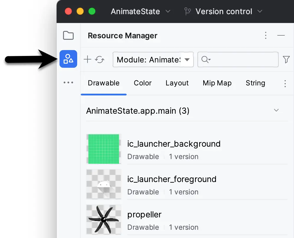
Figure 37-1
The image will also appear in the res -> drawables section of the Project tool window:
|
You are reading a sample chapter from an old edition of the Jetpack Compose Essentials book. Purchase the fully updated Jetpack Compose 1.7 Essentials edition of this book in eBook or Print format. The full book contains 67 chapters and over 700 pages of in-depth information. Buy the full book now in Print or eBook format. Learn more. |
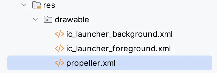
Figure 37-2
Edit the MainActivity.kt file and modify the RotationDemo function to design the user interface layout:
.
.
import androidx.compose.foundation.Image
import androidx.compose.foundation.layout.*
import androidx.compose.material.Button
import androidx.compose.runtime.*
import androidx.compose.ui.Alignment
import androidx.compose.ui.draw.rotate
import androidx.compose.ui.res.painterResource
import androidx.compose.ui.unit.dp
.
.
@Composable
fun RotationDemo() {

    var rotated by remember { mutableStateOf(false) }

    Column(horizontalAlignment = Alignment.CenterHorizontally,
                    modifier = Modifier.fillMaxWidth()) {
        Image(
            painter = painterResource(R.drawable.propeller),
            contentDescription = "fan",
            modifier = Modifier
                .padding(10.dp)
                .size(300.dp)
        )

        Button(
            onClick = { rotated = !rotated },
            modifier = Modifier.padding(10.dp)
        ) {
            Text(text = "Rotate Propeller")
        }
    }
}Code language: Kotlin (kotlin)
The layout consists of a Column containing an Image configured to display the propeller drawing and a Button. The code includes a Boolean state variable named rotated, the value of which is toggled via the Button’s onClick handler.
When previewed, the layout should resemble that illustrated in Figure 37-3 below:
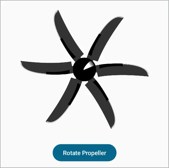
Figure 37-3
|
You are reading a sample chapter from an old edition of the Jetpack Compose Essentials book. Purchase the fully updated Jetpack Compose 1.7 Essentials edition of this book in eBook or Print format. The full book contains 67 chapters and over 700 pages of in-depth information. Buy the full book now in Print or eBook format. Learn more. |
Although the button changes the rotation state value, that state has not yet been connected with an animation. We now need to make use of the animateFloatAsState() function by adding the following code:
.
.
import androidx.compose.animation.core.*
.
.
@Composable
fun RotationDemo() {

    var rotated by remember { mutableStateOf(false) }

    val angle by animateFloatAsState(
        targetValue = if (rotated) 360f else 0f,
        animationSpec = tween(durationMillis = 2500)
    )
.
.Code language: Kotlin (kotlin)
Next, edit the Image declaration and pass the angle state through to the rotate() modifier as follows:
Image(
    painter = painterResource(R.drawable.propeller),
    contentDescription = "fan",
    modifier = Modifier
        .rotate(angle)
        .padding(10.dp)
        .size(300.dp)
)Code language: Kotlin (kotlin)
This code calls animateFloatAsState() and assigns the resulting state value to a variable named angle. If the rotated value is currently set to true, then the target value for the animation is set to 360 degrees, otherwise, it is set to 0. All that remains now is to test the activity. Using either the Preview panel in interactive mode or an emulator or physical device for testing, click on the button. The propeller should rotate 360 degrees in the clockwise direction. A second click will rotate the propeller back to 0 degrees.
The rotation animation is currently using the default FastOutSlowInEasing easing setting where the animation rate slows as the propeller nears the end of the rotation. To see the other easing options outlined in the previous chapter in action, simply add them to the tween() call. The following change, for example, animates the rotation at a constant speed:
animationSpec = tween(durationMillis = 2500, easing = LinearEasing)Code language: Kotlin (kotlin)Animating color changes with animateColorAsState
In this example, we will look at animating color changes using the animateColorAsState() function. In this case, the layout will consist of a Box and Button pair. When the Button is clicked the Box will transition from one color to another using an animation. In preparation for this example, we will need to add an enumeration to the MainActivity.kt file to provide the two background color options. Edit the file and place the enum declaration after the MainActivity class:
|
You are reading a sample chapter from an old edition of the Jetpack Compose Essentials book. Purchase the fully updated Jetpack Compose 1.7 Essentials edition of this book in eBook or Print format. The full book contains 67 chapters and over 700 pages of in-depth information. Buy the full book now in Print or eBook format. Learn more. |
.
.
enum class BoxColor {
    Red, Magenta
}

@Composable
fun RotationDemo() {
.
.Code language: Kotlin (kotlin)
Add a new composable function to the MainActivity.kt file named ColorChangeDemo together with an @Preview function so that it will appear in the Preview panel:
.
.
import androidx.compose.foundation.background
import androidx.compose.ui.graphics.Color
.
.
@Composable
fun ColorChangeDemo() {

    var colorState by remember { mutableStateOf(BoxColor.Red) }

    Column(horizontalAlignment = Alignment.CenterHorizontally,
              modifier = Modifier.fillMaxWidth()) {
        Box(
            modifier = Modifier
                .padding(20.dp)
                .size(200.dp)
                .background(Color.Red)
        )

        Button(
            onClick = {
                colorState = when (colorState) {
                    BoxColor.Red -> BoxColor.Magenta
                    BoxColor.Magenta -> BoxColor.Red
                }
            },
            modifier = Modifier.padding(10.dp)
        ) {
            Text(text = "Change Color")
        }
    }
}

@Preview(showBackground = true)
@Composable
fun ColorChangePreview() {
    AnimateStateTheme {
        ColorChangeDemo()
    }
}
.
.Code language: Kotlin (kotlin)
Exit interactive mode, preview the layout, and confirm that it resembles that shown in Figure 37-4:
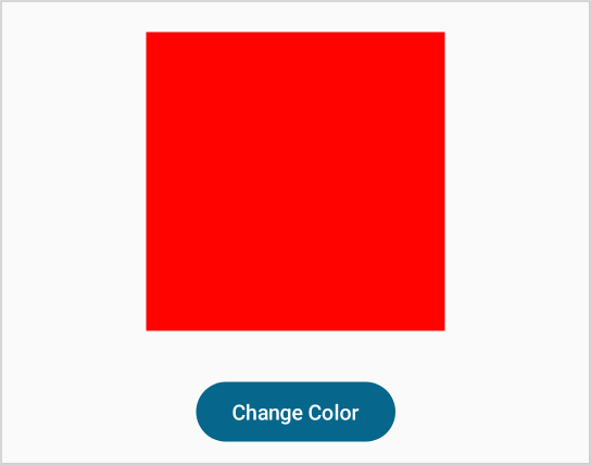
Figure 37-4
The BoxColor enumeration contains two possible color selections, Red and Magenta. A state variable named colorState is declared and initialized to BoxColor.Red. Next, the Button onClick handler uses a when statement to toggle the colorState value between the Red and Magenta BoxColor enumeration values.
The ColorChangeDemo function now needs to use the animateColorAsState() function to implement and animate the Box background color change. The Box also needs to be modified to use the animatedColor state as the background color value:
|
You are reading a sample chapter from an old edition of the Jetpack Compose Essentials book. Purchase the fully updated Jetpack Compose 1.7 Essentials edition of this book in eBook or Print format. The full book contains 67 chapters and over 700 pages of in-depth information. Buy the full book now in Print or eBook format. Learn more. |
.
.
import androidx.compose.animation.animateColorAsState
.
.
@Composable
fun ColorChangeDemo() {

    var colorState by remember { mutableStateOf(BoxColor.Red) }

    val animatedColor: Color by animateColorAsState(
        targetValue = when (colorState) {
                BoxColor.Red -> Color.Magenta
                BoxColor.Magenta -> Color.Red
        },
        animationSpec = tween(4500)
    )

   Column(horizontalAlignment = Alignment.CenterHorizontally,
        modifier = Modifier.fillMaxWidth()) {
        Box(
            modifier = Modifier
                .padding(20.dp)
                .size(200.dp)
                .background(animatedColor)
        )
.
.Code language: Kotlin (kotlin)
The code uses the current colorState color value to set the animation target value to the other color. This triggers the animated color change which is performed over a 4500-millisecond duration. Stop the current interactive session in the Preview panel if it is still running (only one preview can be in interactive mode at a time), locate the new composable preview, and run it in interactive mode. Once the preview is running, use the button to try out the color change animation.
Animating motion with animateDpAsState
In this, final example before looking at the updateTransition() function, we will use the animateDpAsState() function to animate the change in position of a composable. This will involve changing the x position offset of a component and animating the change as it moves to the new location on the screen. Using the same steps as before, add another composable function, this time named MotionDemo, together with a matching preview composable. As with the color change example, we also need an enumeration to contain the position options:
.
.
enum class BoxPosition {
    Start, End
}

@Composable
fun MotionDemo() {

    var boxState by remember { mutableStateOf(BoxPosition.Start)}
    val boxSideLength = 70.dp

    Column(modifier = Modifier.fillMaxWidth()) {
        Box(
            modifier = Modifier
                .offset(x = 0.dp, y = 20.dp)
                .size(boxSideLength)
                .background(Color.Red)
        )

        Spacer(modifier = Modifier.height(50.dp))

        Button(
            onClick = {
                boxState = when (boxState) {
                    BoxPosition.Start -> BoxPosition.End
                    BoxPosition.End -> BoxPosition.Start
                }
            },
            modifier = Modifier.padding(20.dp)
               .align(Alignment.CenterHorizontally)
        ) {
            Text(text = "Move Box")
        }
    }
}

@Preview(showBackground = true)
@Composable
fun MotionDemoPreview() {
    AnimateStateTheme {
        MotionDemo()
    }
}Code language: Kotlin (kotlin)
This example is structured in much the same way as the color change animation except that this time we are working with density-independent pixel values instead of colors. The end goal is to animate the movement of the Box from the start of the screen to the end. Assuming that the code will potentially run on a variety of devices and screen sizes, we need to know the width of the screen to be able to find the end position. This information can be found by accessing properties of the LocalConfiguration instance. This is an object that is local to each Compose-based app and provides access to properties such as screen width, height and density, font scale information, and whether or not night mode is currently activated on the device. For this example we only need to know the width of the screen which can be obtained as follows:
.
.
import androidx.compose.ui.platform.LocalConfiguration
.
.
@Composable
fun MotionDemo() {

    val screenWidth = (LocalConfiguration.current.screenWidthDp.dp)
.
.Code language: Kotlin (kotlin)
Next, we need to add the animation using the animateDpAsState() function:
.
.
import androidx.compose.ui.unit.Dp
.
.
@Composable
fun MotionDemo() {

    val screenWidth = (LocalConfiguration.current.screenWidthDp.dp)
    var boxState by remember { mutableStateOf(BoxPosition.Start)}
    val boxSideLength = 70.dp

    val animatedOffset: Dp by animateDpAsState(
        targetValue = when (boxState) {
            BoxPosition.Start -> 0.dp
            BoxPosition.End -> screenWidth - boxSideLength
        },
        animationSpec = tween(500)
    )
.
.Code language: Kotlin (kotlin)
In the above code, the target state is set to either the start or end of the screen width, depending on the current boxState setting. In the case of the end position, the width of the Box is subtracted from the screen width so that the motion does not move beyond the edge of the screen.
|
You are reading a sample chapter from an old edition of the Jetpack Compose Essentials book. Purchase the fully updated Jetpack Compose 1.7 Essentials edition of this book in eBook or Print format. The full book contains 67 chapters and over 700 pages of in-depth information. Buy the full book now in Print or eBook format. Learn more. |
Now that we have the animatedOffset state declared, we can pass it through as the x parameter to the Box offset() modifier call:
Box(
    modifier = Modifier
        .offset(x = animatedOffset, y = 20.dp)
        .size(boxSides)
        .background(Color.Red)
)Code language: Kotlin (kotlin)
When the code is previewed in interactive mode, clicking the button should now cause the box to be animated as it moves back and forth across the screen.
Adding spring effects
The above example provides an ideal opportunity to introduce the spring animation effect. Spring behavior adds a bounce effect to animations and is applied using the spring() function via the animationSpec parameter. To understand the spring effect it helps to imagine one end of a spring attached to the animation start point (for example the left side of the screen or parent) and the other end attached to the corresponding side of the box. As the box moves, the spring stretches until the endpoint is reached, at which point the box bounces a few times on the string before finally resting at the endpoint.
The two key parameters to the spring() function are damping ratio and stiffness. The damping ratio defines the speed at which the bouncing effect decays and is declared as a Float value where 1.0 has no bounce and 0.1 is the highest bounce. Instead of using Float values, the following predefined constants are also available when configuring the damping ratio:
- DampingRatioHighBouncy
- DampingRatioLowBouncy
- DampingRatioMediumBouncy
- DampingRatioNoBouncy
To add a spring effect to the motion animation, add a spring() function call to the animation as follows:
|
You are reading a sample chapter from an old edition of the Jetpack Compose Essentials book. Purchase the fully updated Jetpack Compose 1.7 Essentials edition of this book in eBook or Print format. The full book contains 67 chapters and over 700 pages of in-depth information. Buy the full book now in Print or eBook format. Learn more. |
.
.
import androidx.compose.animation.core.Spring.DampingRatioHighBouncy
.
.
val animatedOffset: Dp by animateDpAsState(
    targetValue = when (boxState) {
        BoxPosition.Start -> 0.dp
        BoxPosition.End -> screenWidth - boxSideLength
    },
    animationSpec = spring(dampingRatio = DampingRatioHighBouncy)
)Code language: Kotlin (kotlin)
When tested, the box will now bounce when it reaches the target destination.
The stiffness parameter defines the strength of the spring. When using a lower stiffness, the range of motion of the bouncing effect will be greater. The following, for example, combines a high bounce damping ratio with very low stiffness. The result is an animation that is so bouncy that the box bounces beyond the edge of the screen a few times before finally coming to rest at the endpoint:
.
.
import androidx.compose.animation.core.Spring.StiffnessVeryLow
.
.
val animatedOffset: Dp by animateDpAsState(
    targetValue = when (boxState) {
        BoxPosition.Start -> 0.dp
        BoxPosition.End -> screenWidth - boxSides
    },
    spring(dampingRatio = DampingRatioHighBouncy, stiffness = StiffnessVeryLow)
)Code language: Kotlin (kotlin)
The stiffness of the spring effect can be adjusted using the following constants:
- StiffnessHigh
- StiffnessLow
- StiffnessMedium
- StiffnessMediumLow
- StiffnessVeryLow
Take some time to experiment with the different damping and stiffness settings to learn more about the effects they produce.
Working with keyframes
Keyframes allow different duration and easing values to be applied at specific points in an animation timeline. Keyframes are applied to animation via the animationSpec parameter and defined using the keyframes() function which accepts a lambda containing the keyframe data and returns a KeyframesSpec instance.
|
You are reading a sample chapter from an old edition of the Jetpack Compose Essentials book. Purchase the fully updated Jetpack Compose 1.7 Essentials edition of this book in eBook or Print format. The full book contains 67 chapters and over 700 pages of in-depth information. Buy the full book now in Print or eBook format. Learn more. |
A keyframe specification begins by declaring the total required duration for the entire animation to complete. That duration is then marked by timestamps declaring how much of the total animation should be completed at that point based on the state unit type (for example Float, Dp, Int, etc.). These timestamps are created via calls to the at() function.
As an example, edit the animateDpAsState() function call to add a keyframe specification to the animation as follows:
val animatedOffset: Dp by animateDpAsState(
    targetValue = when (boxState) {
        BoxPosition.Start -> 0.dp
        BoxPosition.End -> screenWidth - boxSides
    },
    animationSpec = keyframes {
        durationMillis = 1000
        100.dp.at(10)
        110.dp.at(500)
        200.dp.at(700)
    }
)Code language: Kotlin (kotlin)
This keyframe declares a 1000 millisecond duration for the entire animation. This duration is then divided by three timestamps. The first timestamp occurs 10 milliseconds into the animation, at which point the offset value must have reached 100dp. At 500 milliseconds the offset must be 110dp and, finally, 200dp by the time 700 milliseconds have elapsed. This leaves 300 milliseconds to complete the remainder animation.
Try out the animation and observe the changes in the speed of the animation as each timestamp is reached.
The animation behavior can be further configured using the with() function to add easing settings to the timestamps, for example:
|
You are reading a sample chapter from an old edition of the Jetpack Compose Essentials book. Purchase the fully updated Jetpack Compose 1.7 Essentials edition of this book in eBook or Print format. The full book contains 67 chapters and over 700 pages of in-depth information. Buy the full book now in Print or eBook format. Learn more. |
animationSpec = keyframes {
    durationMillis = 1000
    100.dp.at(10).with(LinearEasing)
    110.dp.at(500).with(FastOutSlowInEasing)
    200.dp.at(700).with(LinearOutSlowInEasing)
}Code language: Kotlin (kotlin)
Combining multiple animations
Multiple animations can be run in parallel based on a single target state using the updateTransition() function. This function is passed the target state and returns a Transition instance to which multiple child animations may be added. When the target state changes, the transition will run all of the child animations concurrently. The updateTransition() call may also be passed an optional label parameter which can be used to identify the transition within the Animation Inspector (a topic that will be covered in the next section).
A Transition object configured to trigger its child animations in response to changes to a state variable named myState would typically be declared as follows:
val transition = updateTransition(targetState = myState,
                                  label = "My Transition")Code language: Kotlin (kotlin)
The Transition class includes a collection of functions that are used to add animation to children. These functions use the naming convention of animate<Type>() depending on the unit type used for the animation such as animateFloat(), animateDp() and animationColor(). The syntax for these functions is as follows:
val myAnimation: <Type> by transition.animate<Type>(

    transitionSpec = {
        // anination spec (tween, spring etc)
    }

) { state ->
    // Code to identify new target state based on current state
}Code language: Kotlin (kotlin)
To demonstrate updateTransitions in action, we will modify the example to perform both the color change and motion animations based on changes to the boxState value. Begin by adding a new function named TransitionDemo together with a corresponding preview composable (undefined symbol errors will be corrected in the next steps):
@Composable
fun TransitionDemo() {
    var boxState by remember { mutableStateOf(BoxPosition.Start)}
    var screenWidth = LocalConfiguration.current.screenWidthDp.dp

    Column(modifier = Modifier.fillMaxWidth()) {
        Box(
            modifier = Modifier
                .offset(x = animatedOffset, y = 20.dp)
                .size(70.dp)
                .background(animatedColor)
        )
        Spacer(modifier = Modifier.height(50.dp))

        Button(
            onClick = {
                boxState = when (boxState) {
                    BoxPosition.Start -> BoxPosition.End
                    BoxPosition.End -> BoxPosition.Start
                }
            },
            modifier = Modifier.padding(20.dp)
               .align(Alignment.CenterHorizontally)
        ) {
            Text(text = "Start Animation")
        }
    }
}

@Preview(showBackground = true)
@Composable
fun TransitionDemoPreview() {
    AnimateStateTheme {
        TransitionDemo()
    }
}Code language: Kotlin (kotlin)
Next, edit the new function to obtain a Transition instance configured to react to changes to boxState:
|
You are reading a sample chapter from an old edition of the Jetpack Compose Essentials book. Purchase the fully updated Jetpack Compose 1.7 Essentials edition of this book in eBook or Print format. The full book contains 67 chapters and over 700 pages of in-depth information. Buy the full book now in Print or eBook format. Learn more. |
Composable
fun TransitionDemo() {
    var boxState by remember { mutableStateOf(BoxPosition.Start)}
    var screenWidth = LocalConfiguration.current.screenWidthDp.dp
    val transition = updateTransition(targetState = boxState,
                 label = "Color and Motion")
.
.Code language: Kotlin (kotlin)
Finally, add the color and motion animations to the transition:
.
.
import androidx.compose.animation.animateColor
.
.
@Composable
fun TransitionDemo() {
.
.
    val transition = updateTransition(targetState = boxState,
                 label = "Color and Motion")

    val animatedColor: Color by transition.animateColor(

        transitionSpec = {
            tween(4000)
        }

    ) { state ->
        when (state) {
            BoxPosition.Start -> Color.Red
            BoxPosition.End -> Color.Magenta
        }
    }

    val animatedOffset: Dp by transition.animateDp(

        transitionSpec = {
            tween(4000)
        }
    ) { state ->
        when (state) {
            BoxPosition.Start -> 0.dp
            BoxPosition.End -> screenWidth - 70.dp
        }
    }
.
.Code language: Kotlin (kotlin)
When previewed, the box should change color as it moves across the screen.
Using the Animation Inspector
The Animation Inspector is a tool built into Android Studio that allows you to interact directly with the animation timeline and manually scroll back and forth through the animation sequences. The inspector is only available when a Transition-based animation is present and is accessed using the button highlighted in Figure 37-5 below:
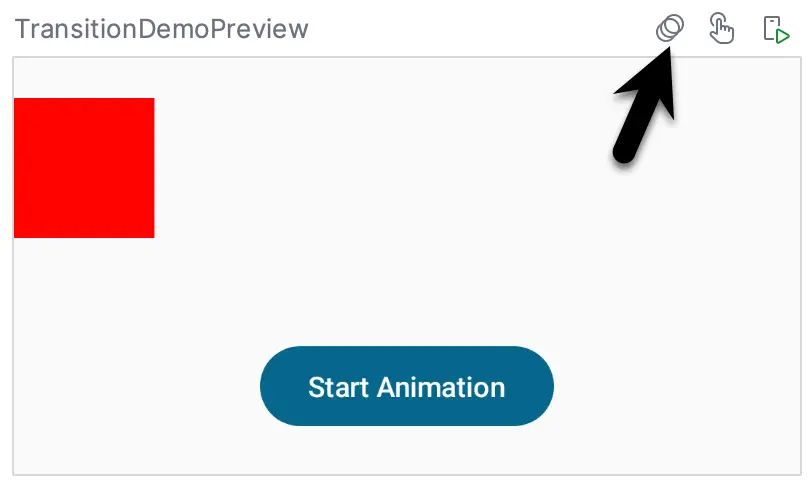
Figure 37-5
If this button is not visible, select the File -> Settings… menu option (Android Studio -> Preferences… on macOS), click on the Experimental option and switch on the Enable animation preview option
|
You are reading a sample chapter from an old edition of the Jetpack Compose Essentials book. Purchase the fully updated Jetpack Compose 1.7 Essentials edition of this book in eBook or Print format. The full book contains 67 chapters and over 700 pages of in-depth information. Buy the full book now in Print or eBook format. Learn more. |
Once enabled, the inspector panel will appear beneath the preview panel as illustrated in Figure 37-6:
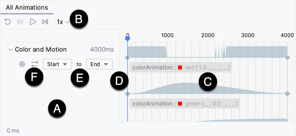
The area marked A contains a section for each transition in the current source file. Since our example only contains a single transition, there is only one entry in the above image. Since a label was passed to the updateTransition() function call, this is displayed as the tab title.
The toolbar (B) provides options to play the animation, jump to the start or end of the timeline, loop repeatedly through the animation, and change the animation playback speed.
The transition’s animation children are listed in the timeline panel (C). The blue vertical line (D) indicates the current position in the timeline which can be dragged to manually move through the animation. The drop-down menus (E) can be used to change the direction of the animation. Note that the options listed in these menus are taken from the BoxPosition enumeration. As an alternative to manually changing these menu settings, click on the button marked F.
Summary
The Compose Animation API provides several options for performing animation based on state changes. A set of animate as state functions are used to animate the results of changes to state values. These functions are passed a target state value and animate the change from the current value to the target value. Animations can be configured in terms of timeline linearity, duration, and spring effects. Individual animations are combined into a single Transition instance using the updateTransition() function. Android Studio includes the Animation Inspector for testing and manually scrolling through animation sequences.
|
You are reading a sample chapter from an old edition of the Jetpack Compose Essentials book. Purchase the fully updated Jetpack Compose 1.7 Essentials edition of this book in eBook or Print format. The full book contains 67 chapters and over 700 pages of in-depth information. Buy the full book now in Print or eBook format. Learn more. |