
In the chapter titled Building Widgets with SwiftUI and WidgetKit, we learned that a widget can appear in small, medium, and large sizes. The project created in the previous chapter included a widget view designed to fit within the small-size format. Since the widget did not specify the supported sizes, it would still be possible to select a large or medium-sized widget from the gallery and place it on the home screen. In those larger formats, however, the widget content would have filled only a fraction of the available widget space. If larger widget sizes are to be supported, the widget should be designed to make full use of the available space.
In this chapter, the WidgetDemo project created in the previous chapter will be modified to add support for the medium widget size.
Supporting Multiple Size Families
Begin by launching Xcode and loading the WidgetDemo project from the previous chapter. As outlined above, this phase of the project will add support for the medium widget size (though these steps apply equally to adding support for the large widget size).
In the absence of specific size configurations, widgets are, by default, configured to support all three size families. To restrict a widget to specific sizes, the supportedFamilies() modifier must be applied to the widget configuration.
To restrict the widget to only small and medium sizes for the WidgetDemo project, edit the WeatherWidget.swift file and modify the WeatherWidget declaration to add the modifier. Also, take this opportunity to modify the widget display name and description:
 |
You are reading a sample chapter from an old edition of iOS App Development Essentials. Purchase the fully updated iOS 18 App Development Essentials book. The full book contains 71 chapters, over 612 pages of in-depth information, downloadable source code, and access to over 50 SwiftUI knowledge test quizzes. |
struct WeatherWidget: Widget {
    let kind: String = "WeatherWidget"

    var body: some WidgetConfiguration {
        AppIntentConfiguration(kind: kind, intent: ConfigurationAppIntent.self,
                  provider: Provider()) { entry in
            WeatherWidgetEntryView(entry: entry)
                .containerBackground(Color("weatherBackgroundColor"),
                              for: .widget)
        }
        .configurationDisplayName("My Weather Widget")
        .description("A demo weather widget.")
        .supportedFamilies([.systemSmall, .systemMedium])
    }
}Code language: Swift (swift)
To preview the widget in medium format, edit the preview macro as follows:
#Preview(as: .systemMedium) {
    WeatherWidget()
} timeline: {
    WeatherEntry(date: Date(),
.
.Code language: Swift (swift)
When the preview canvas updates, it will now include the widget rendered in medium size, as shown in Figure 56-1:
Clearly, the widget needs to take advantage of the additional space the medium size offers. To address this shortcoming, some changes to the widget view must be made.
Adding Size Support to the Widget View
The changes made to the widget configuration mean that the widget can be displayed in either small or medium size. To make the widget adaptive, the widget view needs to identify the size in which it is currently being displayed. This can be achieved by accessing the widgetFamily property of the SwiftUI environment. Remaining in the WeatherWidget.swift file, locate and edit the WeatherWidgetEntryView declaration to obtain the widget family setting from the environment:
struct WeatherWidgetEntryView: View {
    var entry: Provider.Entry

    @Environment(\.widgetFamily) var widgetFamily
.
.Code language: Swift (swift)
Next, embed the subview in a horizontal stack and conditionally display the image for the entry if the size is medium:
|
You are reading a sample chapter from an old edition of iOS App Development Essentials. Purchase the fully updated iOS 18 App Development Essentials book. The full book contains 71 chapters, over 612 pages of in-depth information, downloadable source code, and access to over 50 SwiftUI knowledge test quizzes. |
struct WeatherWidgetEntryView : View {
var entry: Provider.Entry
@Environment(\.widgetFamily) var widgetFamily
var body: some View {
ZStack {
Color("weatherBackgroundColor")
HStack {
WeatherSubView(entry: entry)
if widgetFamily == .systemMedium {
Image(entry.image)
.resizable()
}
}
}
}
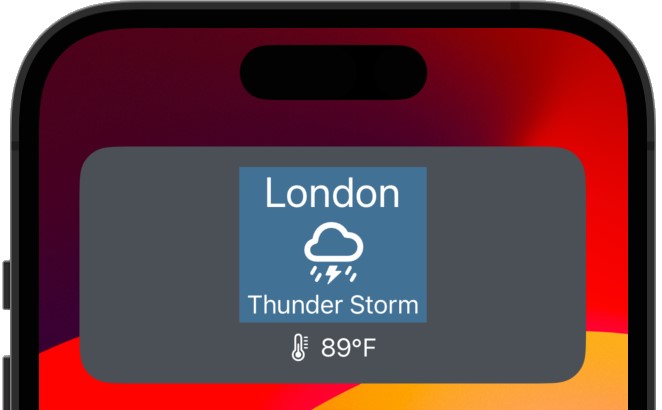
}Code language: Swift (swift)When previewed, the medium-sized version of the widget should appear, as shown in Figure 56-2:
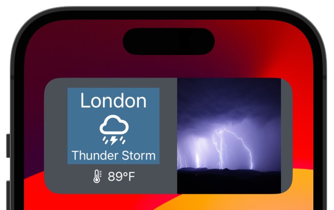
To test the widget on a device or simulator, run the extension as before, and once the widget is installed and running, perform a long press on the home screen background. After a few seconds have elapsed, the screen will change, as shown in Figure 56-3:
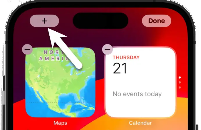
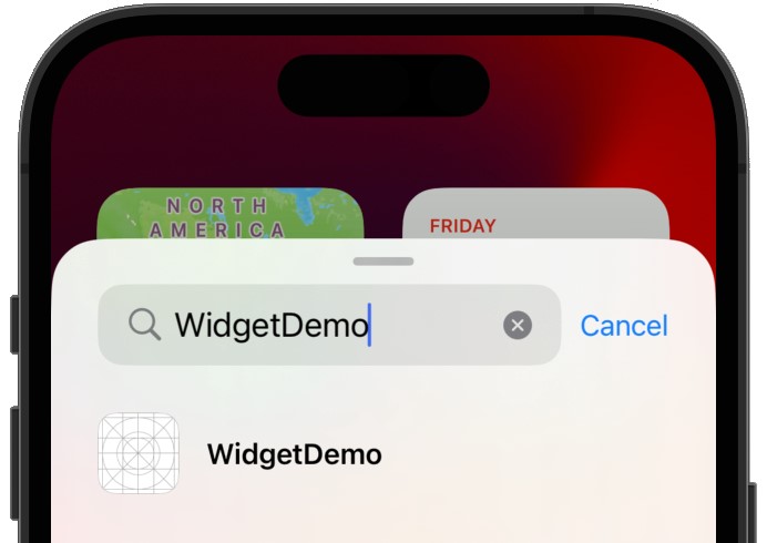
Click on the ‘+’ button indicated by the arrow in the above figure to display the widget gallery and enter WidgetDemo into the search field:
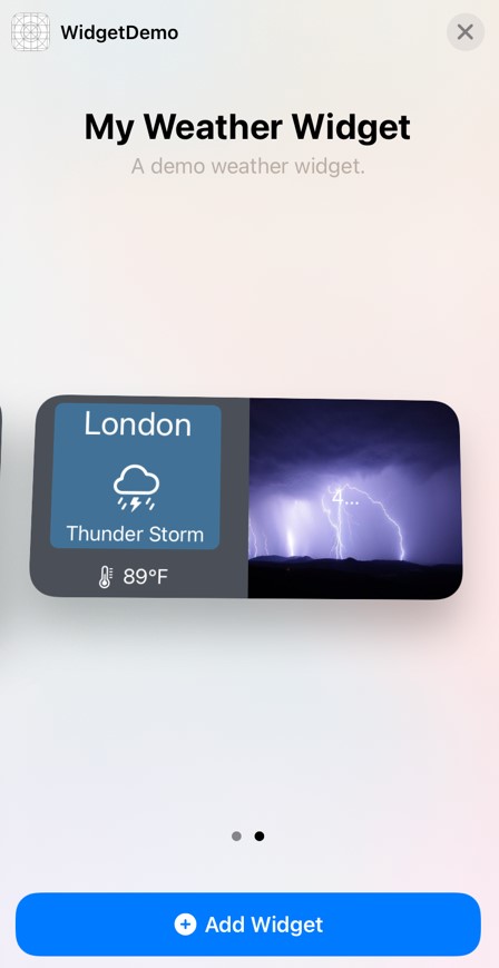
Select the WidgetDemo entry to display the widget size options. Swipe to the left to display the medium widget size, as shown in Figure 56-5, before tapping on the Add Widget button:
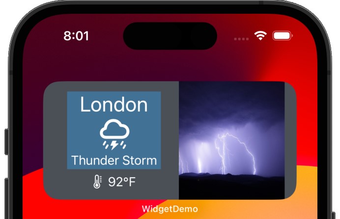
On returning to the home screen, click on the Done button located in the top right-hand corner of the home screen to commit the change. The widget will appear, as illustrated in Figure 56-6, and update as the timeline progresses:
|
You are reading a sample chapter from an old edition of iOS App Development Essentials. Purchase the fully updated iOS 18 App Development Essentials book. The full book contains 71 chapters, over 612 pages of in-depth information, downloadable source code, and access to over 50 SwiftUI knowledge test quizzes. |
Summary
WidgetKit supports small, medium, and large widget size families, and, by default, a widget is assumed to support all three formats. WidgetKit needs to be notified using a widget configuration modifier if a widget only supports specific sizes.
To fully support a size format, a widget should take steps to detect the current size and provide a widget entry layout that makes use of the available space allocated to the widget on the device screen. This involves accessing the SwiftUI environment widgetFamily property and using it as the basis for conditional layout declarations within the widget view.
Now that widget-size family support has been added to the project, the next chapter will add some interactive support to the widget in the form of deep linking into the companion app and widget configuration.