
In previous chapters we have looked at using stacks, lists and outline groups to present information to the user. None of these solutions, however, are particularly useful for displaying content in a grid format. With the introduction of iOS 14, SwiftUI now includes three views for the purpose of displaying multicolumn grids within a user interface layout in the form of LazyVGrid, LazyHGrid and GridItem.
This chapter will introduce these views and demonstrate how, when combined with the ScrollView, they can be used to build scrolling horizontal and vertical grid layouts.
SwiftUI Grids
SwiftUI grids provide a way to display information in a multicolumn layout oriented either horizontally or vertically. When embedded in a ScrollView instance, the user will be able to scroll through the grid if it extends beyond the visible screen area of the device in which the app is running.
As the names suggests, the LazyVGrid and LazyHGrid views only create items to be displayed within the grid when they are about to become visible to the user and then discards those items from memory as they scroll out of view (a concept covered previously in the chapter entitled SwiftUI Stacks and Frames). This allows scrollable grids of potentially infinite numbers of items to be constructed without adversely impacting app performance. The syntax for declaring a vertical grid is as follows:
LazyVGrid(columns: [GridItem], alignment: <horizontalalignment>,
            spacing: CGFloat?, pinnedViews: <views>) {
      // Content Views
}Code language: Swift (swift)
In the above syntax, only the columns argument is mandatory and takes the form of an array of GridItem instances.
 |
You are reading a sample chapter from an old edition of iOS App Development Essentials. Purchase the fully updated iOS 18 App Development Essentials book. The full book contains 71 chapters, over 612 pages of in-depth information, downloadable source code, and access to over 50 SwiftUI knowledge test quizzes. |
Similarly, a horizontal grid would be declared as follows where, once again, all arguments are optional except for the rows argument:
LazyHGrid(rows: [GridItem], alignment: <vertical alignment>,
                     spacing: CGFloat?, pinnedViews: <views>) {
    // Content Views
}Code language: Swift (swift)
GridItems
Each row or column in a grid layout is represented by an instance of the GridItem view. In other words, a GridItem instance represents each row in a LazyHGrid layout and each column when using the LazyVGrid view. The GridItem view defines the properties of the row or column in terms of sizing behavior, spacing and alignment. The GridItem view also provides control over the number of rows or columns displayed within a grid and the minimum size to which an item may be reduced to meet those constraints.
GridItems are declared using the following syntax:
GridItem(sizing, spacing: CGFloat?, alignment: <alignment>)Code language: Swift (swift)The sizing argument is of type GridItemSize and must be declared as one of the following:
- flexible() – The number of rows or columns in the grid will be dictated by the number of GridItem instances in the array passed to LazyVGrid or LazyHGrid view.
- adaptive(minimum: CGFloat) – The size of the row or column is adjusted to fit as many items as possible into the available space. The minimum size to which the item may be reduced can be specified using the optional minimum argument.
- fixed(size: CGFloat) – Specifies a fixed size for the item.
Note that the GridItems in an array can use a mixture of the above settings, for example to make the first column a fixed width with the remaining items configured to fit as many columns as possible into the remaining available space.
|
You are reading a sample chapter from an old edition of iOS App Development Essentials. Purchase the fully updated iOS 18 App Development Essentials book. The full book contains 71 chapters, over 612 pages of in-depth information, downloadable source code, and access to over 50 SwiftUI knowledge test quizzes. |
Since grids in SwiftUI are best explored visually, the remainder of this chapter will create a project demonstrating many of the features of LazyVGrid, LazyHGrid and GridItem.
Creating the GridDemo Project
Launch Xcode and select the option to create a new Multiplatform App project named GridDemo. Once the project has been created, edit the ContentView.swift file to add a custom view to act as grid cell content together with an array of colors to make the grid more visually appealing:
import SwiftUI

struct ContentView: View {

    private var colors: [Color] = [.blue, .yellow, .green]
.
.
    struct CellContent: View {
        var index: Int
        var color: Color

        var body: some View {
            Text("\(index)")
                .frame(minWidth: 50, maxWidth: .infinity, minHeight: 100)
                .background(color)
                .cornerRadius(8)
                .font(.system(.largeTitle))
        }
    }
.
.Code language: Swift (swift)
Working with Flexible GridItems
As previously discussed, if all of the GridItems contained in the array passed to a LazyVGrid view are declared as flexible, the number of GridItems in the array will dictate the number of columns included in the grid.
To see this in action, begin by editing the ContentView.swift file once again and declaring an array of three GridItems as follows:
struct ContentView: View {

    private var colors: [Color] = [.blue, .yellow, .green]
    private var gridItems = [GridItem(.flexible()),
                             GridItem(.flexible()),
                             GridItem(.flexible())]
.
.Code language: Swift (swift)
Next, edit the body declaration to declare a vertical grid containing 9 instances of the custom CellContent custom view (numbered from 0 to 8), as follows:
|
You are reading a sample chapter from an old edition of iOS App Development Essentials. Purchase the fully updated iOS 18 App Development Essentials book. The full book contains 71 chapters, over 612 pages of in-depth information, downloadable source code, and access to over 50 SwiftUI knowledge test quizzes. |
var body: some View {

    LazyVGrid(columns: gridItems, spacing: 5) {
            ForEach((0...8), id: \.self) { index in
                CellContent(index: index,
                       color: colors[index % colors.count])

            }
        }
        .padding(5)
    }
}Code language: Swift (swift)
With the changes made, refer to the preview canvas where the grid should appear as shown in Figure 32-1 below:
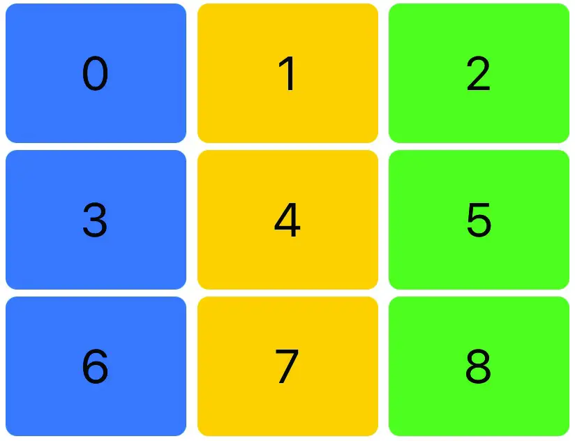
Figure 32-1
Clearly, the grid has been populated with three columns as expected. To add an additional column, simply add another GridItem to the array. It is worth noting at this point that flexible mode is the default setting for the GridItem view, so the flexible declaration can be omitted if desired:
private var gridItems = [GridItem(), GridItem(), GridItem(), GridItem()]Code language: Swift (swift)When previewed, the grid will appear with four columns as shown in Figure 32-2:
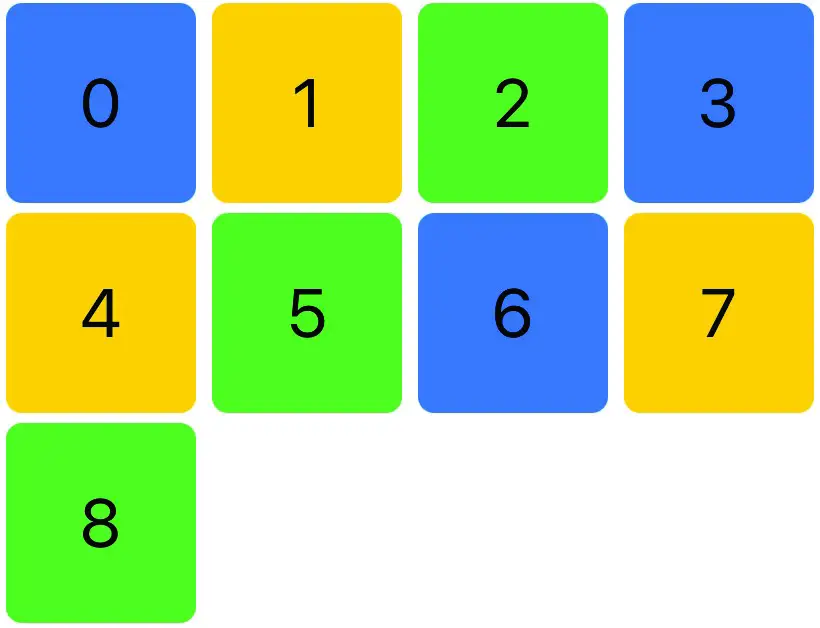
Figure 32-2
|
You are reading a sample chapter from an old edition of iOS App Development Essentials. Purchase the fully updated iOS 18 App Development Essentials book. The full book contains 71 chapters, over 612 pages of in-depth information, downloadable source code, and access to over 50 SwiftUI knowledge test quizzes. |
Adding Scrolling Support to a Grid
The above example grids contained a small number of items which were able to fit entirely within the viewing area of the device. A greater number of items will invariably cause the grid to extend beyond the available screen area. Try, for example, increasing the number of items in the ForEach loop of the body view declaration from 8 to 99 as follows:
var body: some View {

    LazyVGrid(columns: gridItems, spacing: 5) {
            ForEach((0...99), id: \.self) { index in
                CellContent(index: index,
                      color: colors[index % colors.count])
            }
        }
        .padding(5)
    }
}Code language: Swift (swift)
When the grid is now previewed, it will appear as shown in Figure 32-3:
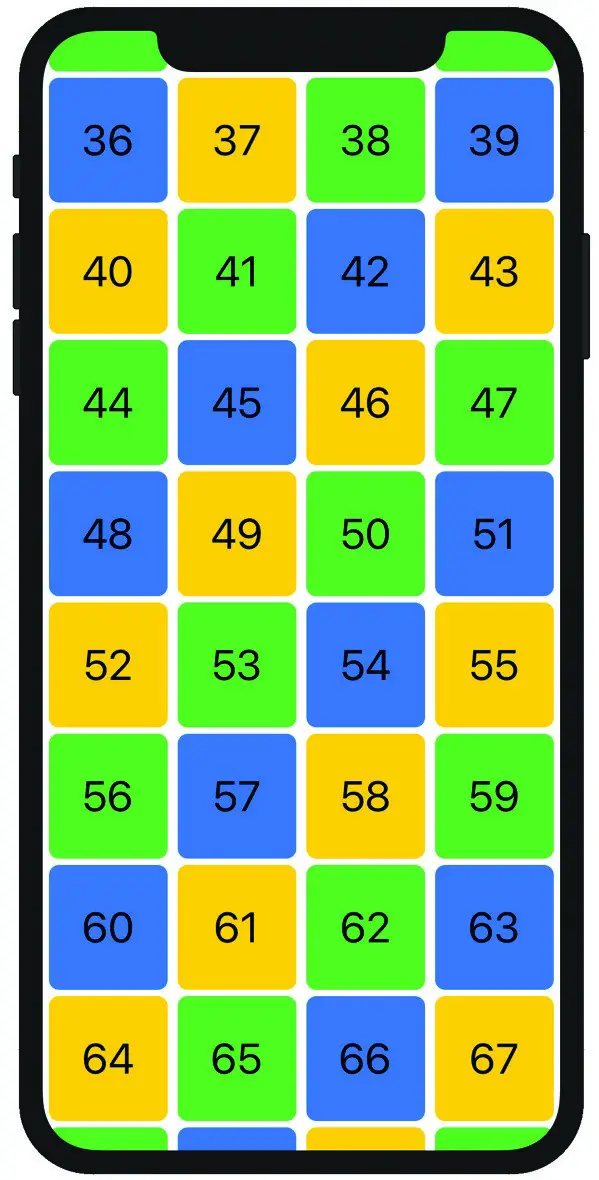
Figure 32-3
It is clear from the preview that the grid is now too tall to fit entirely on the screen. The screen also has the grid centered vertically so that the cells from the middle of the grid are visible instead of starting at the first row. It is also not possible to scroll up and down to view the rest of the grid. All of these issues can be addressed simply by embedding the LazyVGrid in a ScrollView as follows:
var body: some View {

    ScrollView {
        LazyVGrid(columns: gridItems, spacing: 5) {
                ForEach((0...99), id: \.self) { index in
                    CellContent(index: index,
                                color: colors[index % colors.count])
                }
            }
            .padding(5)
        }
    }
}Code language: Swift (swift)
The top of the grid will now be visible within the preview and, if Live Preview is selected, it will be possible to scroll vertically through the grid.
|
You are reading a sample chapter from an old edition of iOS App Development Essentials. Purchase the fully updated iOS 18 App Development Essentials book. The full book contains 71 chapters, over 612 pages of in-depth information, downloadable source code, and access to over 50 SwiftUI knowledge test quizzes. |
Working with Adaptive GridItems
So far, we have seen how the flexible GridItem size setting allows us to define how many columns or rows appear in a grid. The adaptive setting, however, configures the grid view to automatically display as many rows or columns as it can fit into the space occupied by the view. To use adaptive sizing, modify the gridItems array to contain a single adaptive item as follows:
private var gridItems = [GridItem(.adaptive(minimum: 50))]Code language: Swift (swift)This change will result in the grid displaying as many columns as possible with the restriction that the column width cannot be less than 50dp. The following figure demonstrates a partial example of this change as it appears on an iPhone 11 in portrait orientation:
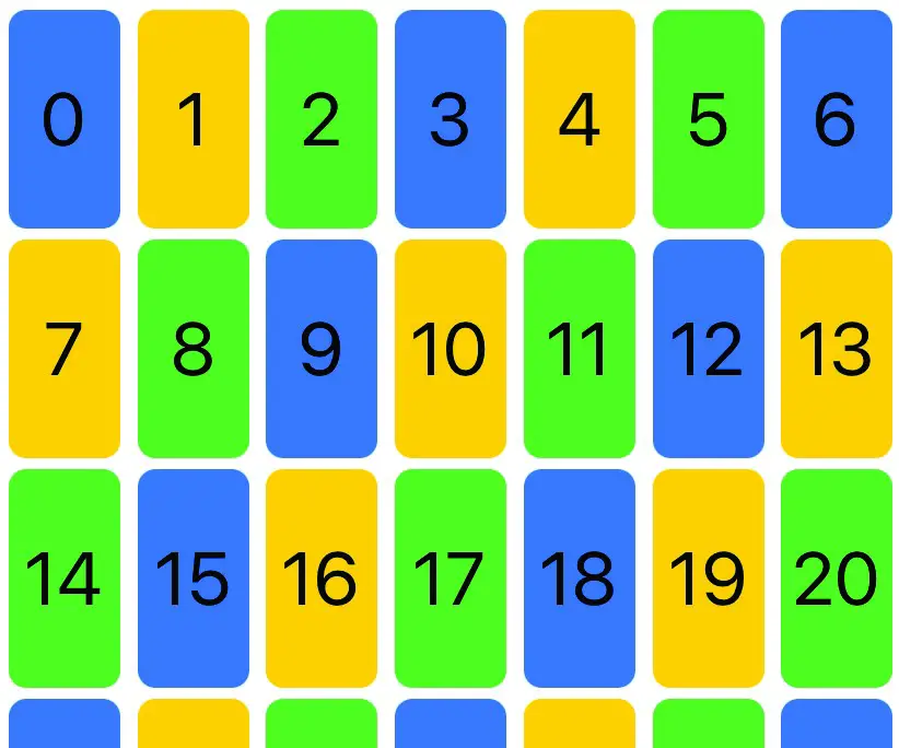
Figure 32-4
Figure 32-5, on the other hand, shows the same grid on an iPhone 11 in landscape orientation. Note that the grid has automatically adapted the number of columns to occupy the wider viewing area:
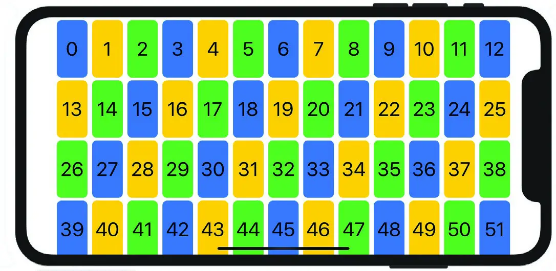
Figure 32-5
|
You are reading a sample chapter from an old edition of iOS App Development Essentials. Purchase the fully updated iOS 18 App Development Essentials book. The full book contains 71 chapters, over 612 pages of in-depth information, downloadable source code, and access to over 50 SwiftUI knowledge test quizzes. |
Working with Fixed GridItems
The GridItem fixed size setting allows rows or columns to be set at a specific size. When using only fixed GridItems in the array passed to the grid view, the number of GridItems will dictate the number of rows or columns. For example, the following array, when passed to a LazyVGrid view, will display a grid containing a single column with a width of 100dp.
private var gridItems = [GridItem(.fixed(100))]Code language: Swift (swift)The following array, on the other hand, will display a three column grid with the columns sized at 75dp, 125dp and 175dp respectively:
private var gridItems = [GridItem(.fixed(75)), GridItem(.fixed(125)),
                              GridItem(.fixed(175))]Code language: Swift (swift)
When rendered, the grid will appear as shown in Figure 32-6:
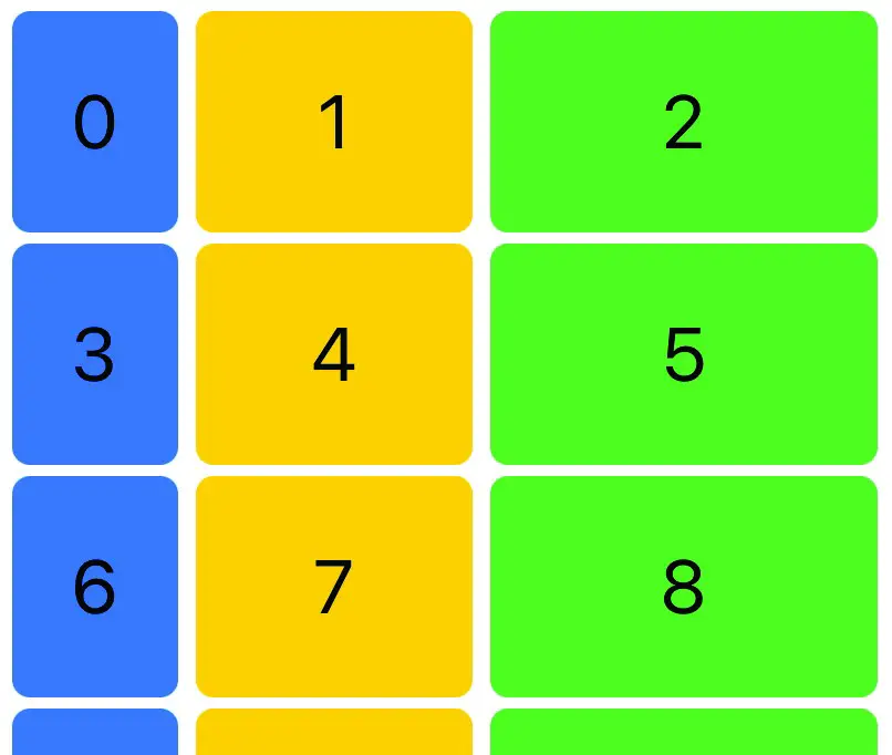
Figure 32-6
When working with grids it is also possible to combine GridItem sizing configurations. The following array, for example, will display the first column of each row with a fixed width with the second and third columns sized equally to occupy the remaining space:
|
You are reading a sample chapter from an old edition of iOS App Development Essentials. Purchase the fully updated iOS 18 App Development Essentials book. The full book contains 71 chapters, over 612 pages of in-depth information, downloadable source code, and access to over 50 SwiftUI knowledge test quizzes. |
private var gridItems = [GridItem(.fixed(85)), GridItem(),
                        GridItem()]Code language: Swift (swift)
When rendered, the grid will appear as illustrated in Figure 32-7 below:
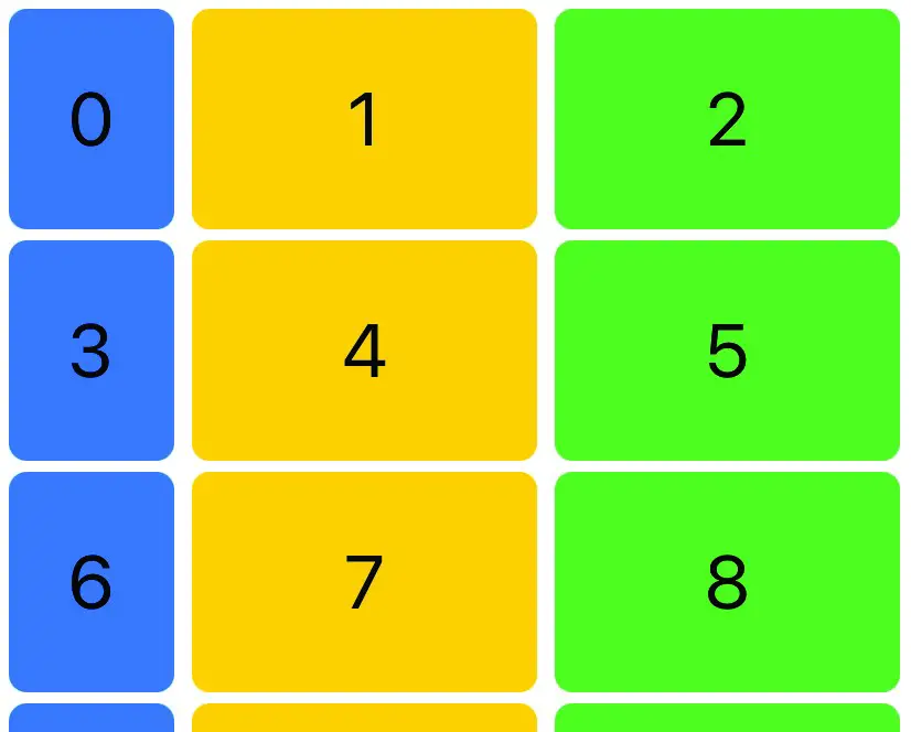
Figure 32-7
Similarly, the following array uses a combination of fixed and adaptive sizing:
private var gridItems = [GridItem(.fixed(100)),
                         GridItem(.adaptive(minimum: 50))]Code language: Swift (swift)
This will result in the first column of each row appearing with a fixed size, with the remainder of the row filled with as many columns as possible subject to the minimum width restriction:
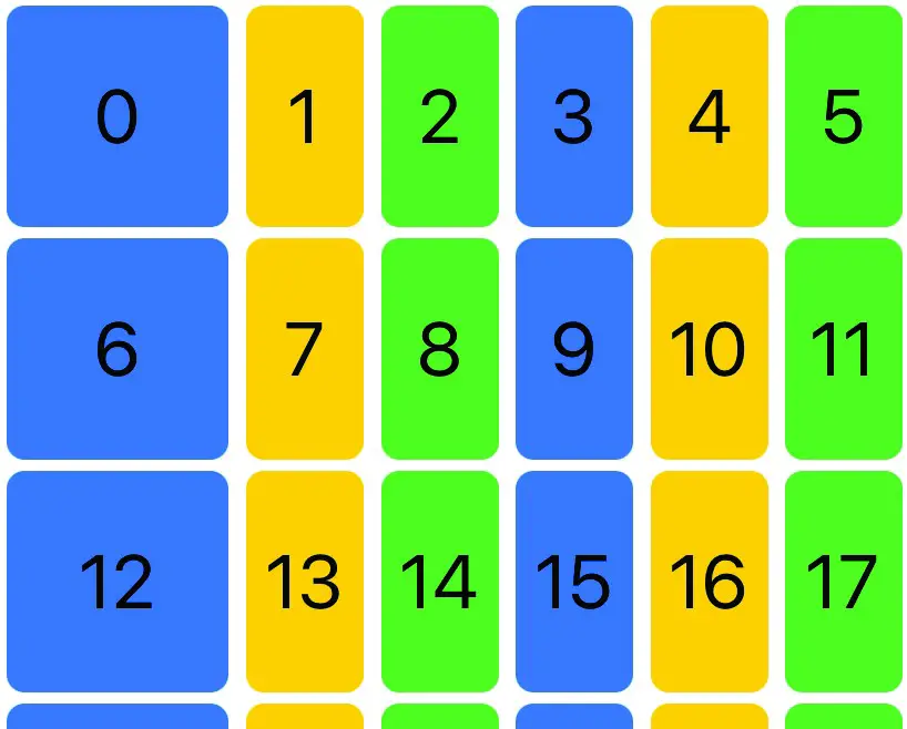
Figure 32-8
|
You are reading a sample chapter from an old edition of iOS App Development Essentials. Purchase the fully updated iOS 18 App Development Essentials book. The full book contains 71 chapters, over 612 pages of in-depth information, downloadable source code, and access to over 50 SwiftUI knowledge test quizzes. |
Using the LazyHGrid View
Horizontal grids work in much the same way as vertically oriented grids with the exception that the configuration is based on rows instead of columns, and that the fixed, minimum and maximum values relate to row height instead of column width. Also, when scrolling is required the grid should be embedded in a horizontal ScrollView instance. The following declaration, for example, places a LazyHGrid within a horizontal ScrollView using adaptive sizing on all rows:
struct ContentView: View {

    private var colors: [Color] = [.blue, .yellow, .green]
    private var gridItems = [GridItem(.adaptive(minimum: 50))]

    var body: some View {

        ScrollView(.horizontal) {
            LazyHGrid(rows: gridItems, spacing: 5) {
                    ForEach((0...50), id: \.self) { index in
                        CellContent(index: index,
                                  color: colors[index % colors.count])
                    }
                }
                .padding(5)
            }
        }
}

struct CellContent: View {
    var index: Int
    var color: Color

    var body: some View {
        Text("\(index)")
            .frame(minWidth: 75, minHeight: 50, maxHeight: .infinity)
            .background(color)
            .cornerRadius(8)
            .font(.system(.largeTitle))
    }
}Code language: Swift (swift)
When previewed, the above declaration will display the grid shown in Figure 32-9 including the ability to scroll horizontally:
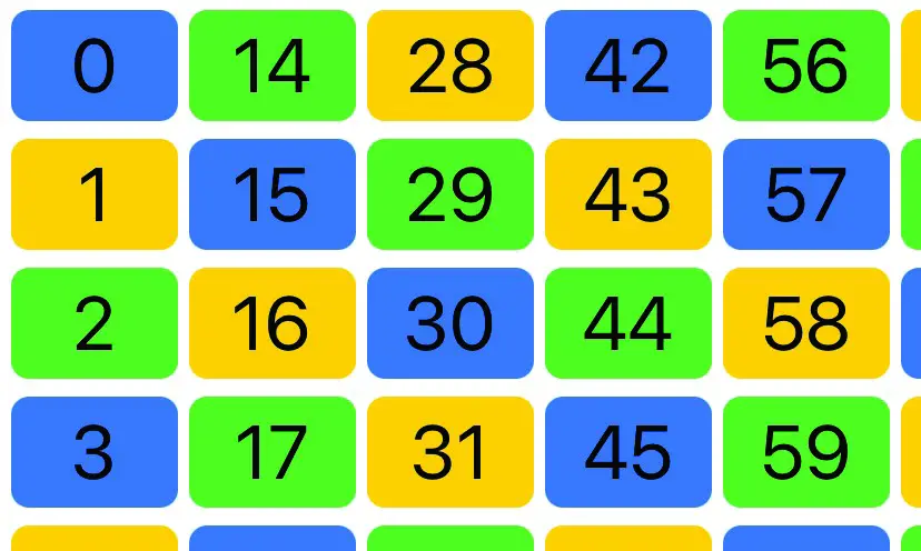
Figure 32-9
The following GridItem array, on the other hand, mixes fixed height with adaptive sizing to increase the height of the first and last grid rows:
private var gridItems = [GridItem(.fixed(150)),
     GridItem(.adaptive(minimum: 50)), GridItem(.fixed(150))]Code language: Swift (swift)
When tested, the grid will appear as shown in Figure 32-10 below:
|
You are reading a sample chapter from an old edition of iOS App Development Essentials. Purchase the fully updated iOS 18 App Development Essentials book. The full book contains 71 chapters, over 612 pages of in-depth information, downloadable source code, and access to over 50 SwiftUI knowledge test quizzes. |
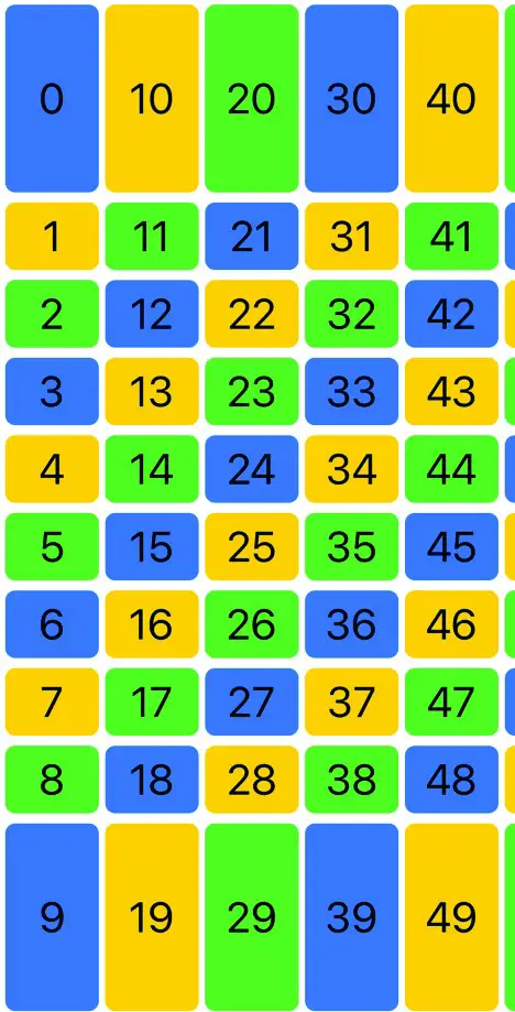
Figure 32-10
As a final example, consider the following GridItem array:
private var gridItems = [GridItem(.fixed(150)),
               GridItem(.flexible(minimum: 50)), GridItem(.fixed(150))]Code language: Swift (swift)
When executed, the grid consist of fixed height first and last rows, while the middle row will size to fill the available remaining height:
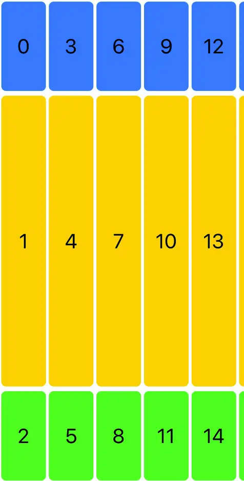
Figure 32-11
Summary
Grid style layouts in SwiftUI are implemented using the LazyHGrid and LazyVGrid views which are designed to organize instances of the GridItem view. The LazyHGrid and LazyVGrid views are passed an array of GridItem views configured to define how the rows and columns of the grid are to be sized together with the content views to be displayed in the grid cells. Wrapping a grid in a ScrollView instance will add scrolling behavior to grids that extend beyond the visible area of the parent view.
|
You are reading a sample chapter from an old edition of iOS App Development Essentials. Purchase the fully updated iOS 18 App Development Essentials book. The full book contains 71 chapters, over 612 pages of in-depth information, downloadable source code, and access to over 50 SwiftUI knowledge test quizzes. |