
The previous chapter introduced LazyHGrid, LazyVGrid, and GridItem views and explored how they can be used to create scrollable multicolumn layouts. While these views can handle large numbers of rows, they lack flexibility, particularly in grid cell arrangement and positioning.
In this chapter, we will work with two grid layout views (Grid and GridRow) that were introduced in iOS 16. While lacking support for large grid layouts, these two views provide several features that are not available when using the lazy grid views including column spanning cells, empty cells, and a range of alignment and spacing options.
Grid and GridRow Views
A grid layout is defined using the Grid view with each row represented by a GridRow child, and direct child views of a GridRow instance represent the column cells in that row.
The syntax for declaring a grid using Grid and GridRow is as follows:
Grid {

    GridRow {
        // Cell views here
    }

    GridRow {
        // Cell views here
    }
.
.
}Code language: Swift (swift)
Creating the GridRowDemo Project
Launch Xcode and select the option to create a new Multiplatform App project named GridRowDemo. Once the project is ready, edit the ContentView.swift file to add a custom view to be used as the content for the grid cells in later examples:
 |
You are reading a sample chapter from an old edition of iOS App Development Essentials. Purchase the fully updated iOS 18 App Development Essentials book. The full book contains 71 chapters, over 612 pages of in-depth information, downloadable source code, and access to over 50 SwiftUI knowledge test quizzes. |
struct CellContent: View {

    var index: Int
    var color: Color

    var body: some View {
        Text("\(index)")
            .frame(minWidth: 50, maxWidth: .infinity, minHeight: 100)
            .background(color)
            .cornerRadius(8)
            .font(.system(.largeTitle))
    }
}Code language: Swift (swift)
A Simple Grid Layout
As a first step, we will create a simple grid 5 x 3 grid by modifying the body of the ContentView structure in the ContentView.swift file as follows:
struct ContentView: View {
    var body: some View {

        Grid {
            GridRow {
                ForEach(1...5, id: \.self) { index in
                    CellContent(index: index, color: .red)
                }
            }

            GridRow {
                ForEach(6...10, id: \.self) { index in
                    CellContent(index: index, color: .blue)
                }
            }

            GridRow {
                ForEach(11...15, id: \.self) { index in
                    CellContent(index: index, color: .green)
                }
            }
        }
        .padding()
    }
}Code language: Swift (swift)
The above example consists of a Grid view parent containing three GridRow children. Each GridRow contains a ForEach loop that generates three CellContent views. After making these changes, the layout should appear within the Preview panel, in turn, as shown in Figure 1-1:
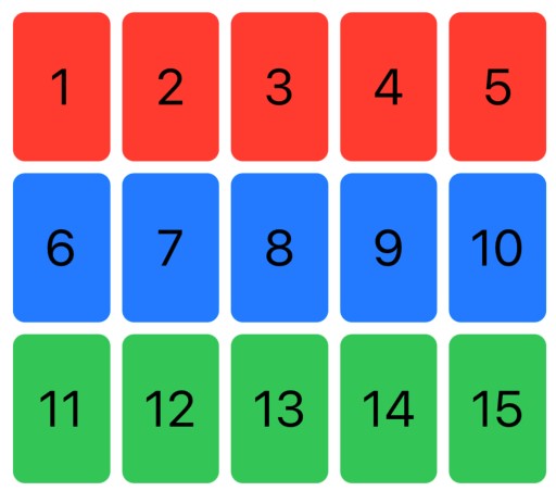
Figure 1-1
Non-GridRow Children
So far in this chapter, we have implied that the direct children of a Grid view must be GridRows. While this is the most common use of the Grid view, it is also possible to include children outside the scope of a GridRow. Grid children not contained within a GridRow will expand to occupy an entire row within the grid layout.
The following changes, for example, add a fourth row to the grid containing a single CellContent view that fills the row:
|
You are reading a sample chapter from an old edition of iOS App Development Essentials. Purchase the fully updated iOS 18 App Development Essentials book. The full book contains 71 chapters, over 612 pages of in-depth information, downloadable source code, and access to over 50 SwiftUI knowledge test quizzes. |
struct ContentView: View {
    var body: some View {
        Grid {
            GridRow {
                ForEach(1...5, id: \.self) { index in
                    CellContent(index: index, color: .red)
                }
            }

            GridRow {
                ForEach(6...10, id: \.self) { index in
                    CellContent(index: index, color: .blue)
                }
            }

            GridRow {
                ForEach(11...15, id: \.self) { index in
                    CellContent(index: index, color: .green)
                }
            }

            CellContent(index: 16, color: .blue)
        }
        .padding()
    }
}Code language: Swift (swift)
Within the Preview panel, the grid should appear as shown in Figure 1-2 below:
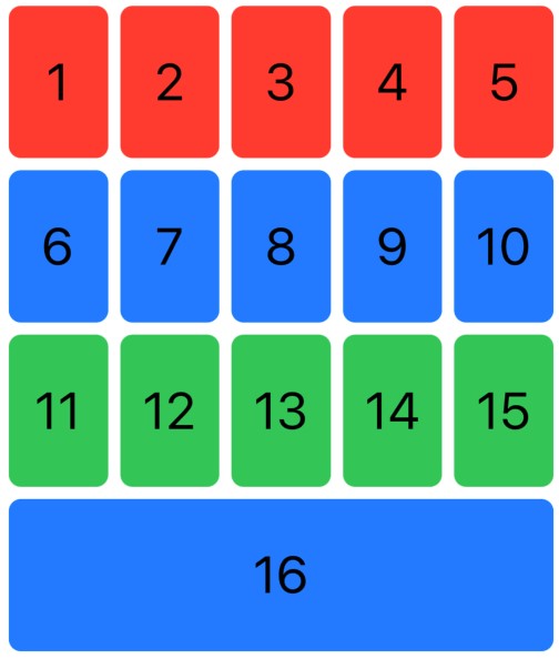
Figure 1-2
Automatic Empty Grid Cells
When creating grids, we generally assume that each row must contain the same number of columns. This is not, however, a requirement when using the Grid and GridRow views. When the Grid view is required to display rows containing different cell counts, it will automatically add empty cells to shorter rows so that they match the longest row. To experience this in our example, change the ForEach loop ranges as follows:
.
.
GridRow {
    ForEach(1...5, id: \.self) { index in
        CellContent(index: index, color: .red)
    }
}

GridRow {
    ForEach(6...8, id: \.self) { index in
        CellContent(index: index, color: .blue)
    }
}

GridRow {
    ForEach(11...12, id: \.self) { index in
        CellContent(index: index, color: .green)
    }
}
.
.Code language: Swift (swift)
When the grid is rendered, it will place empty cells within the rows containing fewer cells as shown in Figure 1-3:
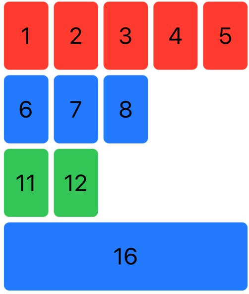
Figure 1-3
|
You are reading a sample chapter from an old edition of iOS App Development Essentials. Purchase the fully updated iOS 18 App Development Essentials book. The full book contains 71 chapters, over 612 pages of in-depth information, downloadable source code, and access to over 50 SwiftUI knowledge test quizzes. |
Adding Empty Cells
In addition to allowing GridRow to add empty cells, you can also insert empty cells into fixed positions in a grid layout. Empty cells are represented by a Color view configured with the “clear” color value. Applying the .gridCellUnsizedAxes() modifier to the Color view ensures that the empty cell matches the default height and width of the occupied cells. Modify the first grid row in our example so that even-numbered columns contain empty cells:
GridRow {
    ForEach(1...5, id: \.self) { index in
        if (index % 2 == 1) {
            CellContent(index: index, color: .red)
        } else {
            Color.clear
                .gridCellUnsizedAxes([.horizontal, .vertical])
        }
    }
}Code language: Swift (swift)
Refer to the Live Preview to verify that the empty cells appear in the first row of the grid as illustrated in Figure 1-4:
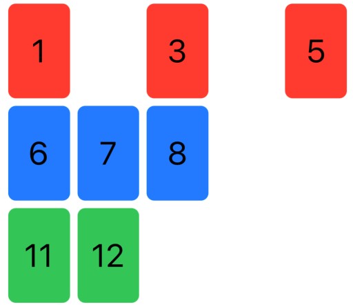
Figure 1-4
Column Spanning
A key feature of Grid and GridRow is the ability for a single cell to span a specified number of columns. We can achieve this by applying the .gridCellColumns() modifier to individual content cell views within GridRow declarations. Add another row to the grid containing two cells configured to span two and three columns respectively:
.
.
CellContent(index: 16, color: .blue)

GridRow {
    CellContent(index: 17, color: .orange)
        .gridCellColumns(2)
    CellContent(index: 18, color: .indigo)
        .gridCellColumns(3)
}
.
.Code language: Swift (swift)
The layout will now appear as shown below:
|
You are reading a sample chapter from an old edition of iOS App Development Essentials. Purchase the fully updated iOS 18 App Development Essentials book. The full book contains 71 chapters, over 612 pages of in-depth information, downloadable source code, and access to over 50 SwiftUI knowledge test quizzes. |
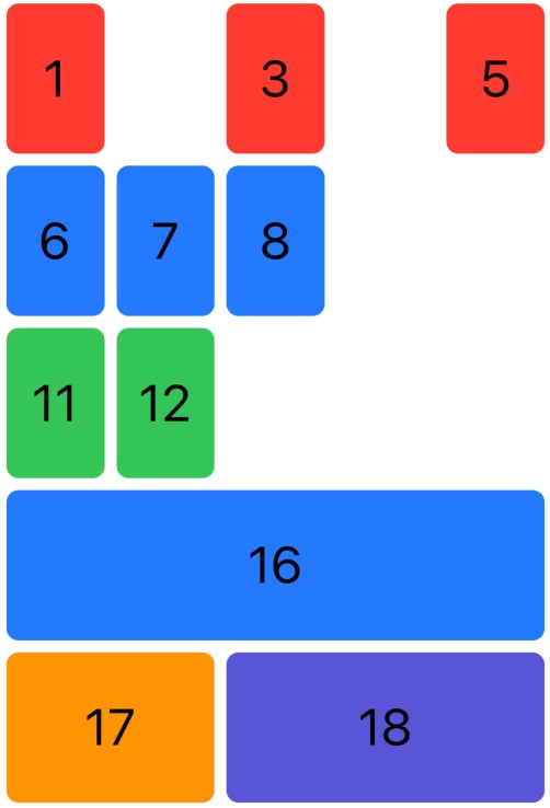
Figure 1-5
Grid Alignment and Spacing
Spacing between rows and columns can be applied using the Grid view’s verticalSpacing and horizontalSpacing parameters, for example:
Grid(horizontalSpacing: 30, verticalSpacing: 0) {
    GridRow {
        ForEach(1...5, id: \.self) { index in
.
.Code language: Swift (swift)
The above changes increase the spacing between columns while removing the spacing between rows so that the grid appears as shown in the figure below:
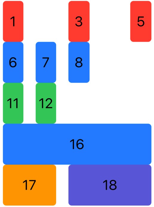
Figure 1-6
We designed CellContent view used throughout this chapter to fill the available space within a grid cell. As this makes it impossible to see changes in alignment, we need to add cells containing content that will demonstrate alignment settings. Begin by inserting two new rows at the top of the grid as outlined below. Also, remove the code that placed empty cells in the row containing cells 1 through 5 so that all cells are displayed:
|
You are reading a sample chapter from an old edition of iOS App Development Essentials. Purchase the fully updated iOS 18 App Development Essentials book. The full book contains 71 chapters, over 612 pages of in-depth information, downloadable source code, and access to over 50 SwiftUI knowledge test quizzes. |
struct ContentView: View {
    var body: some View {
        Grid {

            GridRow {
                CellContent(index: 0, color: .orange)
                Image(systemName: "record.circle.fill")
                Image(systemName: "record.circle.fill")
                Image(systemName: "record.circle.fill")
                CellContent(index: 0, color: .yellow)

            }
            .font(.largeTitle)

            GridRow {
                ForEach(1...5, id: \.self) { index in
                        CellContent(index: index, color: .red)
                }
            }
.
.Code language: Swift (swift)
After making these changes, refer to the preview and verify that the top three rows of the grid match that shown in Figure 1-7:
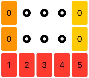
Figure 1-7
We can see from the positioning of the circle symbols that the Grid and GridRow views default to centering content within grid cells. The default alignment for all cells within a grid can be changed by assigning one of the following values to the alignment parameter of the Grid view:
- .trailing
- .leading • .top
- .bottom
- .topLeading
- .topTrailing
- .bottomLeading
- .bottomTrailing
- .center
Cell content can also be aligned with the baselines of text contained in adjoining cells using the following alignment values:
- .centerFirstTextBaseline
- .centerLastTextBaseline
- .leadingFirstTextBaseline
- .leadingLastTextBaseline
- .trailingFirstTextBaseline
- .trailingLastTextBaseline
Modify the Grid declaration in the example code so that all content is aligned at the leading top of the containing cell:
|
You are reading a sample chapter from an old edition of iOS App Development Essentials. Purchase the fully updated iOS 18 App Development Essentials book. The full book contains 71 chapters, over 612 pages of in-depth information, downloadable source code, and access to over 50 SwiftUI knowledge test quizzes. |
struct ContentView: View {
    var body: some View {
        Grid(alignment: .topLeading) {
.
.Code language: Swift (swift)
Review the preview panel and confirm that the positioning of the circle symbols matches the layout shown in Figure 1-8:
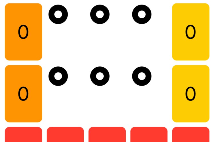
Figure 1-8
It is also possible to override the default vertical alignment setting on individual rows using the alignment property of the GridRow view. The following code modifications, for example, change the second row of symbols to use bottom alignment:
struct ContentView: View {
    var body: some View {
        Grid(alignment: .topLeading) {

        GridRow(alignment: .bottom) {
            CellContent(index: 0, color: .orange)
            Image(systemName: "record.circle.fill")
            Image(systemName: "record.circle.fill")
            Image(systemName: "record.circle.fill")
            CellContent(index: 0, color: .yellow)

        }
        .font(.largeTitle)
.
.Code language: Swift (swift)
The circles in the first row are now positioned along the bottom of the row while the second row continues to adopt the default alignment specified by the parent grid view:
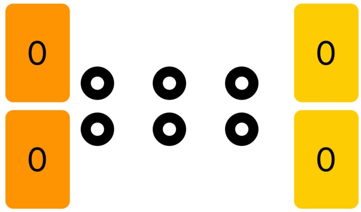
Figure 1-9
|
You are reading a sample chapter from an old edition of iOS App Development Essentials. Purchase the fully updated iOS 18 App Development Essentials book. The full book contains 71 chapters, over 612 pages of in-depth information, downloadable source code, and access to over 50 SwiftUI knowledge test quizzes. |
Note that GridRow alignment will only adjust the vertical positioning of cell content. As illustrated above, the first row of circles has continued to use the leading alignment applied to the parent Grid view.
Horizontal content alignment for the cells in individual columns can be changed by applying the .gridColumnAlignment() modifier to any cell within the corresponding column. The following code change, for example, applies trailing alignment to the second grid column:
struct ContentView: View {
    var body: some View {
        Grid(alignment: .topLeading) {

        GridRow(alignment: .bottom) {
            CellContent(index: 0, color: .orange)
            Image(systemName: "record.circle.fill")
                .gridColumnAlignment(.trailing)
            Image(systemName: "record.circle.fill")
            Image(systemName: "record.circle.fill")
            CellContent(index: 0, color: .yellow)

        }
        .font(.largeTitle)
.
.Code language: Swift (swift)
When previewed, the first grid rows will appear as illustrated in Figure 1-10:
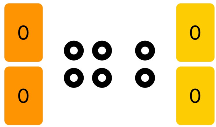
Figure 1-10
Finally, you can override content alignment in an individual using the .gridCellAnchor() modifier as follows:
|
You are reading a sample chapter from an old edition of iOS App Development Essentials. Purchase the fully updated iOS 18 App Development Essentials book. The full book contains 71 chapters, over 612 pages of in-depth information, downloadable source code, and access to over 50 SwiftUI knowledge test quizzes. |
Grid(alignment: .topLeading) {

GridRow(alignment: .bottom) {
    CellContent(index: 0, color: .orange)
    Image(systemName: "record.circle.fill")
        .gridColumnAlignment(.trailing)
    Image(systemName: "record.circle.fill")
        .gridCellAnchor(.center)
    Image(systemName: "record.circle.fill")
        .gridCellAnchor(.top)
    CellContent(index: 0, color: .yellow)
}
.font(.largeTitle)Code language: Swift (swift)
Once the preview updates to reflect the above changes, the circle symbol rows should appear as shown below:
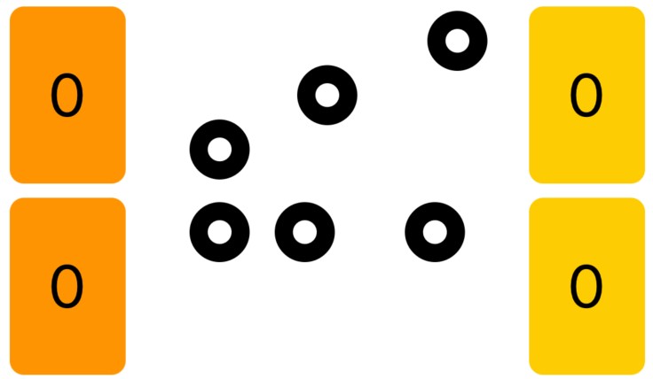
Figure 1-11
Summary
The Grid and GridRow views combine to provide highly flexible grid layout options when working with SwiftUI. While these views are unsuitable for displaying scrolling grids containing a large number of views, they have several advantages over the LazyVGrid and LazyHGrid views covered in the previous chapter. Particular strengths include the ability for a single cell to span multiple columns, support for empty cells, automatic addition of empty cells to maintain matching column counts, and the ability to adjust content alignment at the grid, row, and individual cell levels.