
The SwiftUI TabView component allows the user to navigate between different child views either by selecting tab items located in a tab bar or, when using the page view tab style, by making swiping motions. This chapter will demonstrate how to implement a TabView based interface in a SwiftUI app.
An Overview of SwiftUI TabView
Tabbed views are created in SwiftUI using the TabView container view and consist of a range of child views which represent the screens through which the user will navigate.
By default, the TabView presents a tab bar at the bottom of the layout containing the tab items used to navigate between the child views. A tab item is applied to each content view using a modifier and can be customized to contain Text and Image views (other view types are not supported in tab items).
The currently selected tab may also be controlled programmatically by adding tags to the tab items. Figure 33-1 shows an example TabView layout:
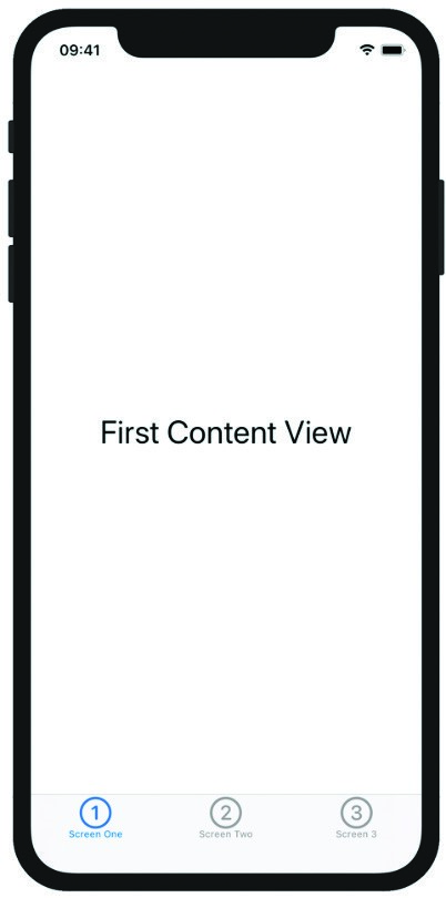
Figure 33-1
 |
You are reading a sample chapter from an old edition of iOS App Development Essentials. Purchase the fully updated iOS 18 App Development Essentials book. The full book contains 71 chapters, over 612 pages of in-depth information, downloadable source code, and access to over 50 SwiftUI knowledge test quizzes. |
Creating the TabViewDemo App
Launch Xcode and select the option to create a new Multiplatform App project named TabViewDemo.
Adding the TabView Container
With the ContentView.swift file loaded into the code editor, delete the default “Hello, world!” Text view and add a TabView as follows:
import SwiftUI

struct ContentView: View {
    var body: some View {
        TabView {

        }
    }
}Code language: Swift (swift)
Adding the Content Views
Next, add three content views to the layout. For the purposes of this example Text views will be used, but in practice these are likely to be more complex views consisting of stack layouts (note the addition of a font modifier to increase the size of the content text):
var body: some View {
    TabView {
        Text("First Content View")
        Text("Second Content View")
        Text("Third Content View")
    }
    .font(.largeTitle)
}Code language: Swift (swift)
Adding View Paging
If the app were to be previewed at this point, the first view would appear but there would be no way to navigate to the other views. One way to implement navigation is to apply PageTabViewStyle to the TabView. This will allow the user to move between the three views by making left and right swiping motions on the screen. To apply this style, add the tabViewStyle() modifier to the TabView as follows:
var body: some View {
    TabView {
        Text("First Content View")
        Text("Second Content View")
        Text("Third Content View")
    }
    .font(.largeTitle)
    .tabViewStyle(PageTabViewStyle())
}Code language: Swift (swift)
Adding the Tab Items
As currently implemented, there is no visual indication to the user that more views are available other than the first view. An alternative to the page view style is to implement the TabView with a tab bar located along the bottom edge of the screen. Since no tab items have been added, the tab bar is currently empty. Clearly the next step is to apply a tab item to each content view using the tabItem() modifier. In this example, each tab item will contain a Text and an Image view:
|
You are reading a sample chapter from an old edition of iOS App Development Essentials. Purchase the fully updated iOS 18 App Development Essentials book. The full book contains 71 chapters, over 612 pages of in-depth information, downloadable source code, and access to over 50 SwiftUI knowledge test quizzes. |
var body: some View {
    TabView {
        Text("First Content View")
            .tabItem {
                Image(systemName: "1.circle")
                Text("Screen One")
            }
        Text("Second Content View")
            .tabItem {
                Image(systemName: "2.circle")
                Text("Screen Two")
            }
        Text("Third Content View")
            .tabItem {
                Image(systemName: "3.circle")
                Text("Screen Three")
            }
    }
    .font(.largeTitle)
}Code language: Swift (swift)
Note also that the PageTabViewStyle modifier must be removed when using the tab bar, otherwise the tab bar will not appear.
With the changes made, verify that the tab items now appear in the tab bar before using Live Preview to test that clicking on a tab item displays the corresponding content view. The completed app should resemble that illustrated in Figure 33-1 above.
Adding Tab Item Tags
To control the currently selected tab in code, a tag needs to be added to each tab item and a state property declared to store the current selection as follows:
struct ContentView: View {

    @State private var selection = 1

    var body: some View {
        TabView() {
            Text("First Content View")
                .tabItem {
                    Image(systemName: "1.circle")
                    Text("Screen One")
                }.tag(1)
            Text("Second Content View")
                .tabItem {
                    Image(systemName: "2.circle")
                    Text("Screen Two")
                }.tag(2)
            Text("Third Content View")
                .tabItem {
                    Image(systemName: "3.circle")
                    Text("Screen Three")
                }.tag(3)
        }
        .font(.largeTitle)
    }
}Code language: Swift (swift)
Next, bind the current selection value of the TabView to the selection state property:
var body: some View {
    TabView(selection: $selection) {
        Text("First Content View")
            .tabItem {
.
.Code language: Swift (swift)
Any changes to the selection state property to a different value within the tag range (in this case a value between 1 and 3) elsewhere in the view will now cause the tabbed view to switch to the corresponding content view.
|
You are reading a sample chapter from an old edition of iOS App Development Essentials. Purchase the fully updated iOS 18 App Development Essentials book. The full book contains 71 chapters, over 612 pages of in-depth information, downloadable source code, and access to over 50 SwiftUI knowledge test quizzes. |
Test this behavior by changing the value assigned to the selection state property while the app is running in Live Preview mode.
Summary
The SwiftUI TabView container provides a mechanism via which the user can navigate between content views by selecting tabs in a tab bar or, when using the page view style, making swiping motions. When using the tab bar, the TabView is implemented by declaring child content views and assigning a tab item to each view. The tab items appear in the tab bar and can be constructed from a Text view, an Image view or a combination of Text and Image views.
To control the current selection of a TabView programmatically, each tab item must be assigned a tag containing a unique value, binding the TabView current selection value to a state property.