
User interface design is largely a matter of selecting the appropriate interface components, deciding how those views will be positioned on the screen, and then implementing navigation between the different screens and views of the app.
As is to be expected, SwiftUI includes a wide range of user interface components to be used when developing an app such as button, label, slider and toggle views. SwiftUI also provides a set of layout views for the purpose of defining both how the user interface is organized and the way in which the layout responds to changes in screen orientation and size.
This chapter will introduce the Stack container views included with SwiftUI and explain how they can be used to create user interface designs with relative ease.
Once stack views have been explained, this chapter will cover the concept of flexible frames and explain how they can be used to control the sizing behavior of views in a layout.
SwiftUI Stacks
SwiftUI includes three stack layout views in the form of VStack (vertical), HStack (horizontal) and ZStack (views are layered on top of each other).
 |
You are reading a sample chapter from an old edition of iOS App Development Essentials. Purchase the fully updated iOS 18 App Development Essentials book. The full book contains 71 chapters, over 612 pages of in-depth information, downloadable source code, and access to over 50 SwiftUI knowledge test quizzes. |
A stack is declared by embedding child views into a stack view within the SwiftUI View file. In the following view, for example, three Image views have been embedded within an HStack:
struct ContentView: View {
    var body: some View {
        HStack {
            Image(systemName: "goforward.10")
            Image(systemName: "goforward.15")
            Image(systemName: "goforward.30")
        }
    }
}Code language: Swift (swift)
Within the preview canvas, the above layout will appear as illustrated in Figure 21-1:

Figure 21-1
A similarly configured example using a VStack would accomplish the same results with the images stacked vertically:
VStack {
    Image(systemName: "goforward.10")
    Image(systemName: "goforward.15")
    Image(systemName: "goforward.30")
}Code language: Swift (swift)
To embed an existing component into a stack, either wrap it manually within a stack declaration, or hover the mouse pointer over the component in the editor so that it highlights, hold down the Command key on the keyboard and left-click on the component. From the resulting menu (Figure 21-2) select the appropriate option:
|
You are reading a sample chapter from an old edition of iOS App Development Essentials. Purchase the fully updated iOS 18 App Development Essentials book. The full book contains 71 chapters, over 612 pages of in-depth information, downloadable source code, and access to over 50 SwiftUI knowledge test quizzes. |
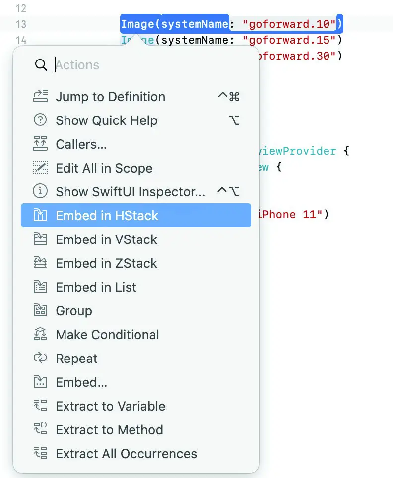
Figure 21-2
Layouts of considerable complexity can be designed simply by embedding stacks within other stacks, for example:
VStack {
    Text("Financial Results")
        .font(.title)

    HStack {
        Text("Q1 Sales")
            .font(.headline)

        VStack {
            Text("January")
            Text("February")
            Text("March")
        }

        VStack {
            Text("$1000")
            Text("$200")
            Text("$3000")
        }
    }
}Code language: Swift (swift)
The above layout will appear as shown in Figure 21-3:
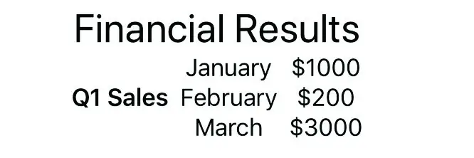
Figure 21-3
As currently configured the layout clearly needs some additional work, particularly in terms of alignment and spacing. The layout can be improved in this regard using a combination of alignment settings, the Spacer component and the padding modifier.
|
You are reading a sample chapter from an old edition of iOS App Development Essentials. Purchase the fully updated iOS 18 App Development Essentials book. The full book contains 71 chapters, over 612 pages of in-depth information, downloadable source code, and access to over 50 SwiftUI knowledge test quizzes. |
Spacers, Alignment and Padding
To add space between views, SwiftUI includes the Spacer component. When used in a stack layout, the spacer will flexibly expand and contract along the axis of the containing stack (in other words either horizontally or vertically) to provide a gap between views positioned on either side, for example:
HStack(alignment: .top) {

    Text("Q1 Sales")
        .font(.headline)
    Spacer()
    VStack(alignment: .leading) {
        Text("January")
        Text("February")
        Text("March")
    }
    Spacer()
.
.Code language: Swift (swift)
In terms of aligning the content of a stack, this can be achieved by specifying an alignment value when the stack is declared, for example:
VStack(alignment: .center) {
            Text("Financial Results")
                .font(.title)Code language: Swift (swift)
Alignments may also be specified with a corresponding spacing value:
VStack(alignment: .center, spacing: 15) {
            Text("Financial Results")
                .font(.title)Code language: Swift (swift)
Spacing around the sides of any view may also be implemented using the padding() modifier. When called without a parameter SwiftUI will automatically use the best padding for the layout, content and screen size (referred to as adaptable padding). The following example sets adaptable padding on all four sides of a Text view:
Text("Hello, world!")
    .padding()Code language: Swift (swift)
Alternatively, a specific amount of padding may be passed as a parameter to the modifier as follows:
|
You are reading a sample chapter from an old edition of iOS App Development Essentials. Purchase the fully updated iOS 18 App Development Essentials book. The full book contains 71 chapters, over 612 pages of in-depth information, downloadable source code, and access to over 50 SwiftUI knowledge test quizzes. |
Text("Hello, world!")
    .padding(15)Code language: Swift (swift)
Padding may also be applied to a specific side of a view with or without a specific value. In the following example a specific padding size is applied to the top edge of a Text view:
Text("Hello, world!")
    .padding(.top, 10)Code language: Swift (swift)
Making use of these options, the example layout created earlier in the chapter can be modified as follows:
VStack(alignment: .center, spacing: 15) {
        Text("Financial Results")
            .font(.title)

        HStack(alignment: .top) {
            Text("Q1 Sales")
                .font(.headline)
            Spacer()
            VStack(alignment: .leading) {
                Text("January")
                Text("February")
                Text("March")
            }
            Spacer()
            VStack(alignment: .leading) {
                Text("$10000")
                Text("$200")
                Text("$3000")
            }
            .padding(5)
        }
        .padding(5)
    }
    .padding(5)
}Code language: Swift (swift)
With the alignments, spacers and padding modifiers added, the layout should now resemble the following figure:
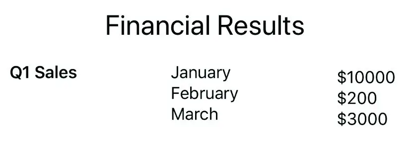
Figure 21-4
More advanced stack alignment topics will be covered in a later chapter entitled “SwiftUI Stack Alignment and Alignment Guides”.
|
You are reading a sample chapter from an old edition of iOS App Development Essentials. Purchase the fully updated iOS 18 App Development Essentials book. The full book contains 71 chapters, over 612 pages of in-depth information, downloadable source code, and access to over 50 SwiftUI knowledge test quizzes. |
Container Child Limit
Container views are limited to 10 direct descendant views. If a stack contains more than 10 direct children, Xcode will likely display the following syntax error:
Extra arguments at positions #11, #12 in callCode language: plaintext (plaintext)If a stack exceeds the 10 direct children limit, the views will need to be embedded into multiple containers. This can, of course, be achieved by adding stacks as subviews, but another useful container is the Group view. In the following example, a VStack can contain 12 Text views by splitting the views between Group containers giving the VStack only two direct descendants:
VStack {

    Group {
         Text("Sample Text")
         Text("Sample Text")
         Text("Sample Text")
         Text("Sample Text")
         Text("Sample Text")
         Text("Sample Text")
    }

    Group {
         Text("Sample Text")
         Text("Sample Text")
         Text("Sample Text")
         Text("Sample Text")
         Text("Sample Text")
         Text("Sample Text")
    }
}Code language: Swift (swift)
In addition to providing a way to avoid the 10-view limit, groups are also useful when performing an operation on multiple views (for example, a set of related views can all be hidden in a single operation by embedding them in a Group and hiding that view).
Text Line Limits and Layout Priority
By default, an HStack will attempt to display the text within its Text view children on a single line. Take, for example, the following HStack declaration containing an Image view and two Text views:
HStack {
    Image(systemName: "airplane")
    Text("Flight times:")
    Text("London")
}
.font(.largeTitle)Code language: Swift (swift)
If the stack has enough room, the above layout will appear as follows:
|
You are reading a sample chapter from an old edition of iOS App Development Essentials. Purchase the fully updated iOS 18 App Development Essentials book. The full book contains 71 chapters, over 612 pages of in-depth information, downloadable source code, and access to over 50 SwiftUI knowledge test quizzes. |

Figure 21-5
If a stack has insufficient room (for example if it is constrained by a frame or is competing for space with sibling views) the text will automatically wrap onto multiple lines when necessary:

Figure 21-6
While this may work for some situations, it may become an issue if the user interface is required to display this text in a single line. The number of lines over which text can flow can be restricted using the lineCount() modifier. The example HStack could, therefore, be limited to 1 line of text with the following change:
HStack {
    Image(systemName: "airplane")
    Text("Flight times:")
    Text("London")
}
.font(.largeTitle)
.lineLimit(1)Code language: Swift (swift)
When an HStack has insufficient space to display the full text and is not permitted to wrap the text over enough lines, the view will resort to truncating the text, as is the case in Figure 21-7:
|
You are reading a sample chapter from an old edition of iOS App Development Essentials. Purchase the fully updated iOS 18 App Development Essentials book. The full book contains 71 chapters, over 612 pages of in-depth information, downloadable source code, and access to over 50 SwiftUI knowledge test quizzes. |

Figure 21-7
In the absence of any priority guidance, the stack view will decide how to truncate the Text views based on the available space and the length of the views. Obviously, the stack has no way of knowing whether the text in one view is more important than the text in another unless the text view declarations include some priority information. This is achieved by making use of the layoutPriority() modifier. This modifier can be added to the views in the stack and passed values indicating the level of priority for the corresponding view. The higher the number, the greater the layout priority and the less the view will be subjected to truncation.
Assuming the flight destination city name is more important than the “Flight times:” text, the example stack could be modified as follows:
HStack {
    Image(systemName: "airplane")
    Text("Flight times:")
    Text("London")
        .layoutPriority(1)
}
.font(.largeTitle)
.lineLimit(1)Code language: Swift (swift)
With a higher priority assigned to the city Text view (in the absence of a layout priority the other text view defaults to a priority of 0) the layout will now appear as illustrated in Figure 21-8:

Figure 21-8
|
You are reading a sample chapter from an old edition of iOS App Development Essentials. Purchase the fully updated iOS 18 App Development Essentials book. The full book contains 71 chapters, over 612 pages of in-depth information, downloadable source code, and access to over 50 SwiftUI knowledge test quizzes. |
Traditional vs. Lazy Stacks
So far in this chapter we have only covered the HStack, VStack and ZStack views. Although the stack examples shown so far contain relatively few child views, it is possible for a stack to contain large quantities of views. This is particularly common when a stack is embedded in a ScrollView. ScrollView is a view which allows the user to scroll through content that extends beyond the visible area of either the containing view or device the screen.
When using the traditional HStack and VStack views, the system will create all the views child views at initialization, regardless of whether those views are currently visible to the user. While this may not be an issue for most requirements, this can lead to performance degradation in situations where a stack has thousands of child views.
To address this issue, SwiftUI also provides “lazy” vertical and horizontal stack views. These views (named LazyVStack and LazyHStack) use exactly the same declaration syntax as the traditional stack views, but are designed to only create child views as they are needed. For example, as the user scrolls through a stack, views that are currently off screen will only be created once they approach the point of becoming visible to the user. Once those views pass out of the viewing area, SwiftUI releases those views so that they no longer take up system resources.
When deciding whether to use traditional or lazy stacks, it is generally recommended to start out using the traditional stacks and to switch to lazy stacks if you encounter performance issues relating to a high number of child views.
SwiftUI Frames
By default, a view will be sized automatically based on its content and the requirements of any layout in which it may be embedded. Although much can be achieved using the stack layouts to control the size and positioning of a view, sometimes a view is required to be a specific size or to fit within a range of size dimensions. To address this need, SwiftUI includes the flexible frame modifier.
|
You are reading a sample chapter from an old edition of iOS App Development Essentials. Purchase the fully updated iOS 18 App Development Essentials book. The full book contains 71 chapters, over 612 pages of in-depth information, downloadable source code, and access to over 50 SwiftUI knowledge test quizzes. |
Consider the following Text view which has been modified to display a border:
Text("Hello World")
    .font(.largeTitle)
    .border(Color.black)Code language: Swift (swift)
Within the preview canvas, the above text view will appear as follows:
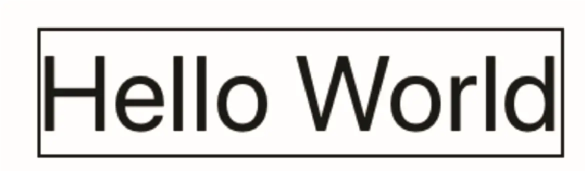
Figure 21-9
In the absence of a frame, the text view has been sized to accommodate its content. If the Text view was required to have height and width dimensions of 100, however, a frame could be applied as follows:
Text("Hello World")
    .font(.largeTitle)
    .border(Color.black)
    .frame(width: 100, height: 100, alignment: .center)Code language: Swift (swift)
Now that the Text view is constrained within a frame, the view will appear as follows:
|
You are reading a sample chapter from an old edition of iOS App Development Essentials. Purchase the fully updated iOS 18 App Development Essentials book. The full book contains 71 chapters, over 612 pages of in-depth information, downloadable source code, and access to over 50 SwiftUI knowledge test quizzes. |

Figure 21-10
In many cases, fixed dimensions will provide the required behavior. In other cases, such as when the content of a view changes dynamically, this can cause problems. Increasing the length of the text, for example, might cause the content to be truncated:

Figure 21-11
This can be resolved by creating a frame with minimum and maximum dimensions:
Text("Hello World, how are you?")
            .font(.largeTitle)
            .border(Color.black)
            .frame(minWidth: 100, maxWidth: 300, minHeight: 100,
                   maxHeight: 100, alignment: .center)Code language: Swift (swift)
Now that the frame has some flexibility, the view will be sized to accommodate the content within the defined minimum and maximum limits. When the text is short enough, the view will appear as shown in Figure 21-10 above. Longer text, however, will be displayed as follows:
|
You are reading a sample chapter from an old edition of iOS App Development Essentials. Purchase the fully updated iOS 18 App Development Essentials book. The full book contains 71 chapters, over 612 pages of in-depth information, downloadable source code, and access to over 50 SwiftUI knowledge test quizzes. |
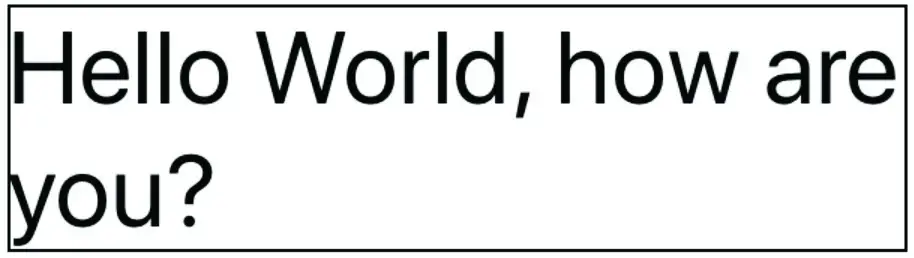
Figure 21-12
Frames may also be configured to take up all the available space by setting the minimum and maximum values to 0 and infinity respectively:
.frame(minWidth: 0, maxWidth: .infinity, minHeight: 0,
          maxHeight: .infinity)Code language: Swift (swift)
Remember that the order in which modifiers are chained often impacts the appearance of a view. In this case, if the border is to be drawn at the edges of the available space it will need to be applied to the frame:
Text("Hello World, how are you?")
    .font(.largeTitle)
    .frame(minWidth: 0, maxWidth: .infinity, minHeight: 0,
          maxHeight: .infinity)
    .border(Color.black, width: 5)Code language: Swift (swift)
By default, the frame will honor the safe areas on the screen when filling the display. Areas considered to be outside the safe area include those occupied by the camera notch on some device models and the bar across the top of the screen displaying the time and Wi-Fi and cellular signal strength icons. To configure the frame to extend beyond the safe area, simply use the edgesIgnoringSafeArea() modifier, specifying the safe area edges to ignore:
.edgesIgnoringSafeArea(.all)Code language: Swift (swift)Frames and the Geometry Reader
Frames can also be implemented so that they are sized relative to the size of the container within which the corresponding view is embedded. This is achieved by wrapping the view in a GeometryReader and using the reader to identify the container dimensions. These dimensions can then be used to calculate the frame size. The following example uses a frame to set the dimensions of two Text views relative to the size of the containing VStack:
|
You are reading a sample chapter from an old edition of iOS App Development Essentials. Purchase the fully updated iOS 18 App Development Essentials book. The full book contains 71 chapters, over 612 pages of in-depth information, downloadable source code, and access to over 50 SwiftUI knowledge test quizzes. |
GeometryReader { geometry in
    VStack {
        Text("Hello World, how are you?")
            .font(.largeTitle)
            .frame(width: geometry.size.width / 2,
                height: (geometry.size.height / 4) * 3)
        Text("Goodbye World")
            .font(.largeTitle)
            .frame(width: geometry.size.width / 3,
                height: geometry.size.height / 4)
    }
}Code language: Swift (swift)
The topmost Text view is configured to occupy half the width and three quarters of the height of the VStack while the lower Text view occupies one third of the width and one quarter of the height.
Summary
User interface design mostly involves gathering components and laying them out on the screen in a way that provides a pleasant and intuitive user experience. User interface layouts must also be responsive so that they appear correctly on any device regardless of screen size and, ideally, device orientation. To ease the process of user interface layout design, SwiftUI provides several layout views and components. In this chapter we have looked at layout stack views and the flexible frame.
By default, a view will be sized according to its content and the restrictions imposed on it by any view in which it may be contained. When insufficient space is available, a view may be restricted in size resulting in truncated content. Priority settings can be used to control the amount by which views are reduced in size relative to container sibling views.
For greater control of the space allocated to a view, a flexible frame can be applied to the view. The frame can be fixed in size, constrained within a range of minimum and maximum values or, using a Geometry Reader, sized relative to the containing view.