
The chapter entitled “SwiftUI Stacks and Frames” touched on the basics of alignment in the context of stack container views. Inevitably, when it comes to designing complex user interface layouts, it will be necessary to move beyond the standard alignment options provided with SwiftUI stack views. With this in mind, this chapter will introduce more advanced stack alignment techniques including container alignment, alignment guides, custom alignments and the implementation of alignments between different stacks.
Container Alignment
The most basic of alignment options when working with SwiftUI stacks is container alignment. These settings define how the child views contained within a stack are aligned in relation to each other and the containing stack. This alignment value applies to all the contained child views unless different alignment guides have been applied on individual views. Views that do not have their own alignment guide are said to be implicitly aligned.
When working with alignments it is important to remember that horizontal stacks (HStack) align child views vertically, while vertical stacks (VStack) align their children horizontally. In the case of the ZStack, both horizontal and vertical alignment values are used.
The following VStack declaration consists of a simple VStack configuration containing three child views:
VStack {
    Text("This is some text")
    Text("This is some longer text")
    Text("This is short")
}Code language: Swift (swift)
In the absence of a specific container alignment value, the VStack will default to aligning the centers (.center) of the contained views as shown in Figure 27-1:
 |
You are reading a sample chapter from an old edition of iOS App Development Essentials. Purchase the fully updated iOS 18 App Development Essentials book. The full book contains 71 chapters, over 612 pages of in-depth information, downloadable source code, and access to over 50 SwiftUI knowledge test quizzes. |

Figure 27-1
In addition to the default center alignment, a VStack can be configured using .leading or .trailing alignment, for example:
VStack(alignment: .trailing) {
    Text("This is some text")
    Text("This is some longer text")
    Text("This is short")
}Code language: Swift (swift)
When rendered, the above VStack layout will appear with the child views aligned along the trailing edges of the views and the container:
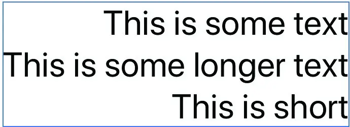
Figure 27-2
Horizontal stacks also default to center alignment in the absence of a specific setting, but also provide top and bottom alignment options in addition to values for aligning text baselines. It is also possible to include spacing values when specifying an alignment. The following HStack uses the default center alignment with spacing and contains three Text view child views, each using a different font size.
|
You are reading a sample chapter from an old edition of iOS App Development Essentials. Purchase the fully updated iOS 18 App Development Essentials book. The full book contains 71 chapters, over 612 pages of in-depth information, downloadable source code, and access to over 50 SwiftUI knowledge test quizzes. |
HStack(spacing: 20) {
    Text("This is some text")
        .font(.largeTitle)
    Text("This is some much longer text")
        .font(.body)
    Text("This is short")
        .font(.headline)
}Code language: Swift (swift)
The above stack will appear as follows when previewed:
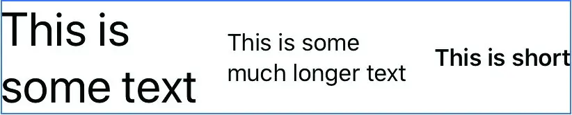
Figure 27-3
Text baseline alignment can be applied based on the baseline of either the first (.firstTextBaseline) or last (.lastTextBaseline) text-based view, for example:
HStack(alignment: .lastTextBaseline, spacing: 20) {
    Text("This is some text")
        .font(.largeTitle)
    Text("This is some much longer text")
        .font(.body)
    Text("This is short")
        .font(.headline)
}Code language: Swift (swift)
Now the three Text views will align with the baseline of the last view:
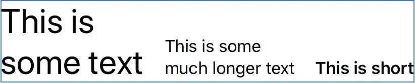
Figure 27-4
|
You are reading a sample chapter from an old edition of iOS App Development Essentials. Purchase the fully updated iOS 18 App Development Essentials book. The full book contains 71 chapters, over 612 pages of in-depth information, downloadable source code, and access to over 50 SwiftUI knowledge test quizzes. |
Alignment Guides
An alignment guide is used to define a custom position within a view that is to be used when that view is aligned with other views contained in a stack. This allows more complex alignments to be implemented than those offered by the standard alignment types such as center, leading and top, though these standard types may still be used when defining an alignment guide. An alignment guide could, for example, be used to align a view based on a position two thirds along its length or 20 points from the top edge.
Alignment guides are applied to views using the alignmentGuide() modifier which takes as arguments a standard alignment type and a closure which must calculate and return a value indicating the point within the view on which the alignment is to be based. To assist in calculating the alignment position within the view, the closure is passed a ViewDimensions object which can be used to obtain the width and height of the view and also the view’s standard alignment positions (.top, .bottom, .leading and so on).
Consider the following VStack containing three rectangles of differing lengths and colors, aligned on their leading edges:
VStack(alignment: .leading) {
    Rectangle()
        .foregroundColor(Color.green)
        .frame(width: 120, height: 50)
    Rectangle()
        .foregroundColor(Color.red)
        .frame(width: 200, height: 50)
    Rectangle()
        .foregroundColor(Color.blue)
        .frame(width: 180, height: 50)
}Code language: Swift (swift)
The above layout will be rendered as shown in Figure 27-5:
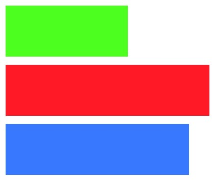
Figure 27-5
|
You are reading a sample chapter from an old edition of iOS App Development Essentials. Purchase the fully updated iOS 18 App Development Essentials book. The full book contains 71 chapters, over 612 pages of in-depth information, downloadable source code, and access to over 50 SwiftUI knowledge test quizzes. |
Now, suppose that instead of being aligned on the leading edge, the second view needs to be aligned 120 points inside the leading edge. This can be implemented using an alignment guide as follows:
VStack(alignment: .leading) {
    Rectangle()
        .foregroundColor(Color.green)
        .frame(width: 120, height: 50)
    Rectangle()
        .foregroundColor(Color.red)
        .alignmentGuide(.leading, computeValue: { d in 120.0 })
        .frame(width: 200, height: 50)
    Rectangle()
        .foregroundColor(Color.blue)
        .frame(width: 180, height: 50)
}Code language: Swift (swift)
While the first and third rectangles continue to be aligned on their leading edges, the second rectangle is aligned at the specified alignment guide position:
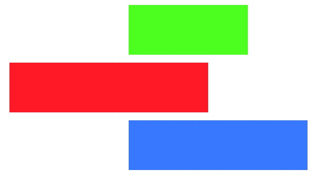
Figure 27-6
When working with alignment guides, it is essential that the alignment type specified in the alignmentGuide() modifier matches the alignment type applied to the parent stack as shown in Figure 27-7. If these do not match, the alignment guide will be ignored by SwiftUI when the layout is rendered.
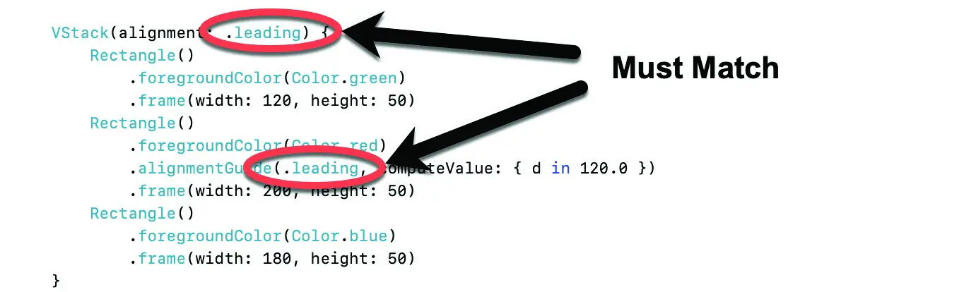
Figure 27-7
|
You are reading a sample chapter from an old edition of iOS App Development Essentials. Purchase the fully updated iOS 18 App Development Essentials book. The full book contains 71 chapters, over 612 pages of in-depth information, downloadable source code, and access to over 50 SwiftUI knowledge test quizzes. |
Instead of hard-coding an offset, the properties of the ViewDimensions object passed to the closure can be used in calculating the alignment guide position. Using the width property, for example, the alignment guide could be positioned one third of the way along the view from the leading edge:
VStack(alignment: .leading) {
    Rectangle()
        .foregroundColor(Color.green)
        .frame(width: 120, height: 50)
    Rectangle()
        .foregroundColor(Color.red)
        .alignmentGuide(.leading,
                    computeValue: { d in d.width / 3 })
        .frame(width: 200, height: 50)
    Rectangle()
        .foregroundColor(Color.blue)
        .frame(width: 180, height: 50)
}Code language: Swift (swift)
Now when the layout is rendered it will appear as shown in Figure 27-8:
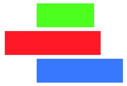
Figure 27-8
The ViewDimensions object also provides access to the HorizontalAlignment and VerticalAlignment properties of the view. In the following example, the trailing edge of the view is identified with an additional 20 points added:
.alignmentGuide(.leading, computeValue: {
                  d in d[HorizontalAlignment.trailing] + 20
})Code language: Swift (swift)
This will cause the trailing edge of the view to be aligned 20 points from the leading edges of the other views:
|
You are reading a sample chapter from an old edition of iOS App Development Essentials. Purchase the fully updated iOS 18 App Development Essentials book. The full book contains 71 chapters, over 612 pages of in-depth information, downloadable source code, and access to over 50 SwiftUI knowledge test quizzes. |
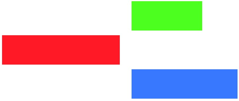
Figure 27-9
Using the Alignment Guides Tool
The best way to gain familiarity with alignment guides is to experiment with the various settings and options. Fortunately, the SwiftUI Lab has created a useful learning tool for trying out the various alignment settings. To use the tool, begin by creating a new Xcode SwiftUI project named AlignmentTool, open the ContentView.swift file and remove all the existing contents.
Next, open a web browser and navigate to the following URL:
This page contains the source code for a tool in a file named alignment-guides-tool.swift. Select and copy the entire source code from the file and paste it into the ContentView.swift file in Xcode. Once loaded, compile and run the app on an iPad device or simulator in landscape mode where it will appear as shown in Figure 27-10:
|
You are reading a sample chapter from an old edition of iOS App Development Essentials. Purchase the fully updated iOS 18 App Development Essentials book. The full book contains 71 chapters, over 612 pages of in-depth information, downloadable source code, and access to over 50 SwiftUI knowledge test quizzes. |
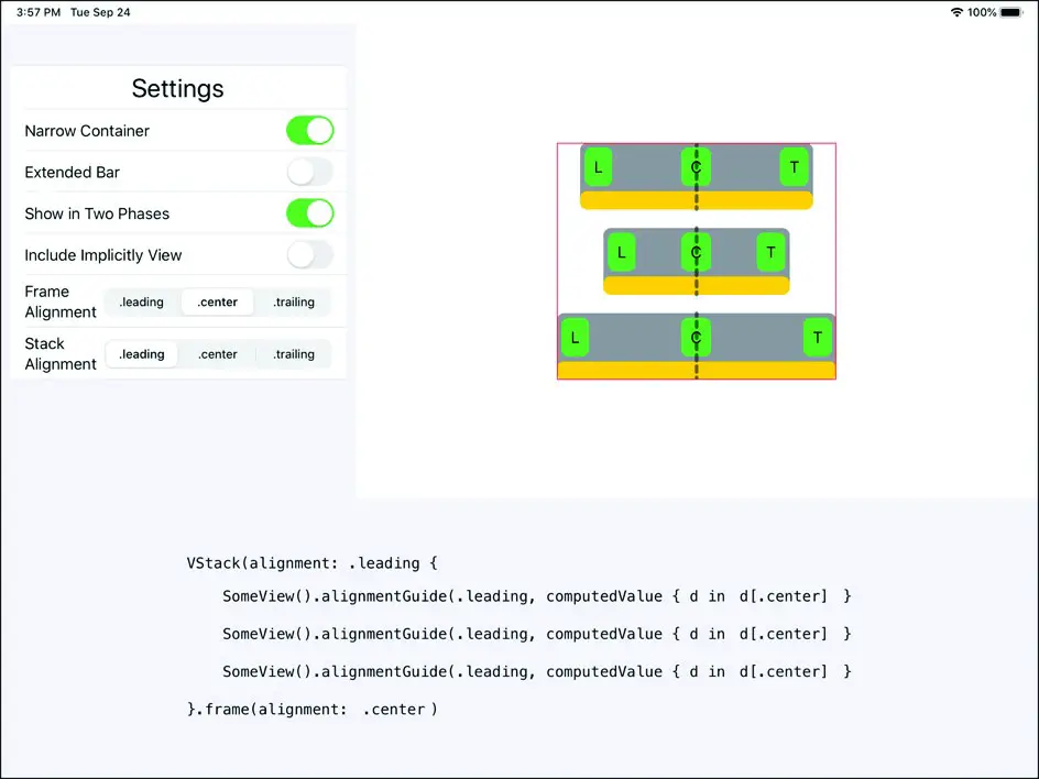
Figure 27-10
Turn on the Include Implicitly View option to see what a view will do without any alignment guides and use the yellow bars under each view together with the green L, C and T buttons and the Stack Alignment options to try different combinations of guide settings. With each selection, the VStack declaration in the bottom section of the screen will change to reflect the current configuration.
Custom Alignment Types
In the previous examples, changes have been made to view alignments based on the standard alignment types. SwiftUI provides a way for the set of standard types to be extended by declaring custom alignment types. A custom alignment type named oneThird could, for example, be created which would make the point of alignment one third of the distance from a specified edge of a view.
Take, for example, the following HStack configuration consisting of four rectangles centered vertically:
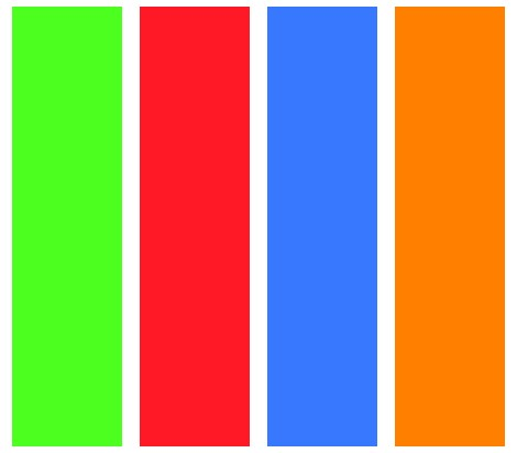
Figure 27-11
|
You are reading a sample chapter from an old edition of iOS App Development Essentials. Purchase the fully updated iOS 18 App Development Essentials book. The full book contains 71 chapters, over 612 pages of in-depth information, downloadable source code, and access to over 50 SwiftUI knowledge test quizzes. |
The declaration to display the above layout reads as follows:
HStack(alignment: .center) {
      Rectangle()
          .foregroundColor(Color.green)
          .frame(width: 50, height: 200)
      Rectangle()
          .foregroundColor(Color.red)
          .frame(width: 50, height: 200)
      Rectangle()
          .foregroundColor(Color.blue)
          .frame(width: 50, height: 200)
      Rectangle()
          .foregroundColor(Color.orange)
          .frame(width: 50, height: 200)
}Code language: Swift (swift)
To change the alignment of one or more of these rectangles, alignment guides could be applied containing the calculations for a computed value. An alternative approach is to create a custom alignment which can be applied to multiple views. This is achieved by extending either VerticalAlignment or HorizontalAlignment to add a new alignment type which returns a calculated value. The following example creates a new vertical alignment type:
extension VerticalAlignment {
    private enum OneThird : AlignmentID {
        static func defaultValue(in d: ViewDimensions) -> CGFloat {
            return d.height / 3
        }
    }
    static let oneThird = VerticalAlignment(OneThird.self)
}Code language: Swift (swift)
The extension must contain an enum that conforms to the AlignmentID protocol which, in turn, dictates that a function named defaultValue() is implemented. This function must accept a ViewDimensions object for a view and return a CGFloat computed value indicating the alignment guide position. In the above example, a position one third of the height of the view is returned.
Once implemented, the custom alignment can be used as shown in the following HStack declaration:
HStack(alignment: .oneThird) {
    Rectangle()
        .foregroundColor(Color.green)
        .frame(width: 50, height: 200)
    Rectangle()
        .foregroundColor(Color.red)
        .alignmentGuide(.oneThird,
             computeValue: { d in d[VerticalAlignment.top] })
        .frame(width: 50, height: 200)

    Rectangle()
        .foregroundColor(Color.blue)

        .frame(width: 50, height: 200)
    Rectangle()
        .foregroundColor(Color.orange)
        .alignmentGuide(.oneThird,
             computeValue: { d in d[VerticalAlignment.top] })
        .frame(width: 50, height: 200)
}Code language: Swift (swift)
In the above example, the new oneThird custom alignment has been applied to two of the rectangle views, resulting in the following layout:
|
You are reading a sample chapter from an old edition of iOS App Development Essentials. Purchase the fully updated iOS 18 App Development Essentials book. The full book contains 71 chapters, over 612 pages of in-depth information, downloadable source code, and access to over 50 SwiftUI knowledge test quizzes. |
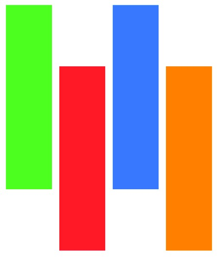
Figure 27-12
In both cases, the alignment was calculated relative to the top of the view with no additional modifications. In fact, the custom alignment can be used in the same way as a standard alignment type. For example, the following changes align the red rectangle relative to the bottom edge of the view:
.alignmentGuide(.oneThird,
             computeValue: { d in d[VerticalAlignment.bottom] })Code language: Swift (swift)
Now when the view is rendered, the alignment guide is set to a position one third of the view height below the bottom edge of the view:
Figure 27-13
Cross Stack Alignment
A typical user interface layout will be created by nesting stacks to multiple levels. A key shortcoming of the standard alignment types is that they do not provide a way for a view in one stack to be aligned with a view in another stack. Consider the following stack configuration consisting of a VStack embedded inside an HStack. In addition to the embedded VStack, the HStack also contains a single additional view:
|
You are reading a sample chapter from an old edition of iOS App Development Essentials. Purchase the fully updated iOS 18 App Development Essentials book. The full book contains 71 chapters, over 612 pages of in-depth information, downloadable source code, and access to over 50 SwiftUI knowledge test quizzes. |
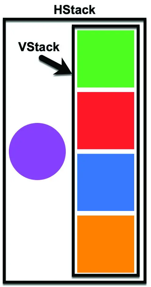
Figure 27-14
The corresponding declaration for the above nested layout reads as follows:
HStack(alignment: .center, spacing: 20) {

    Circle()
        .foregroundColor(Color.purple)
        .frame(width: 100, height: 100)

    VStack(alignment: .center) {
        Rectangle()
            .foregroundColor(Color.green)
            .frame(width: 100, height: 100)
        Rectangle()
            .foregroundColor(Color.red)
            .frame(width: 100, height: 100)
        Rectangle()
            .foregroundColor(Color.blue)
            .frame(width: 100, height: 100)
        Rectangle()
            .foregroundColor(Color.orange)
            .frame(width: 100, height: 100)
    }
}Code language: Swift (swift)
Currently, both the view represented by the circle and the VStack are centered in the vertical plane within the HStack. If we wanted the circle to align with either the top or bottom squares in the VStack we could change the HStack alignment to .top or .bottom and the view would align with the top or bottom squares respectively. If, on the other hand, the purple circle view needed to be aligned with either the second or third square there would be no way of doing so using the standard alignment types. Fortunately, this can be achieved by creating a custom alignment and applying it to both the circle and the square within the VStack with which it is to be aligned.
A simple custom alignment that returns an alignment value relative to the bottom edge of a view can be implemented as follows:
extension VerticalAlignment {
    private enum CrossAlignment : AlignmentID {
        static func defaultValue(in d: ViewDimensions) -> CGFloat {
            return d[.bottom]
        }
    }
    static let crossAlignment = VerticalAlignment(CrossAlignment.self)
}Code language: Swift (swift)
This custom alignment can now be used to align views embedded in different stacks. In the following example, the bottom edge of the circle view is aligned with the third square embedded in the VStack:
|
You are reading a sample chapter from an old edition of iOS App Development Essentials. Purchase the fully updated iOS 18 App Development Essentials book. The full book contains 71 chapters, over 612 pages of in-depth information, downloadable source code, and access to over 50 SwiftUI knowledge test quizzes. |
HStack(alignment: .crossAlignment, spacing: 20) {

    Circle()
        .foregroundColor(Color.purple)
        .alignmentGuide(.crossAlignment,
             computeValue: { d in d[VerticalAlignment.center] })
        .frame(width: 100, height: 100)

    VStack(alignment: .center) {
        Rectangle()
            .foregroundColor(Color.green)
            .frame(width: 100, height: 100)
        Rectangle()
            .foregroundColor(Color.red)
            .frame(width: 100, height: 100)
        Rectangle()
            .foregroundColor(Color.blue)
            .alignmentGuide(.crossAlignment, computeValue:
                             { d in d[VerticalAlignment.center] })
            .frame(width: 100, height: 100)
        Rectangle()
            .foregroundColor(Color.orange)
            .frame(width: 100, height: 100)
    }
}Code language: Swift (swift)
Note that the alignment of the containing HStack also needs to use the crossAlignment type for the custom alignment to take effect. When rendered, the layout now will appear as illustrated in Figure 27-15 below:
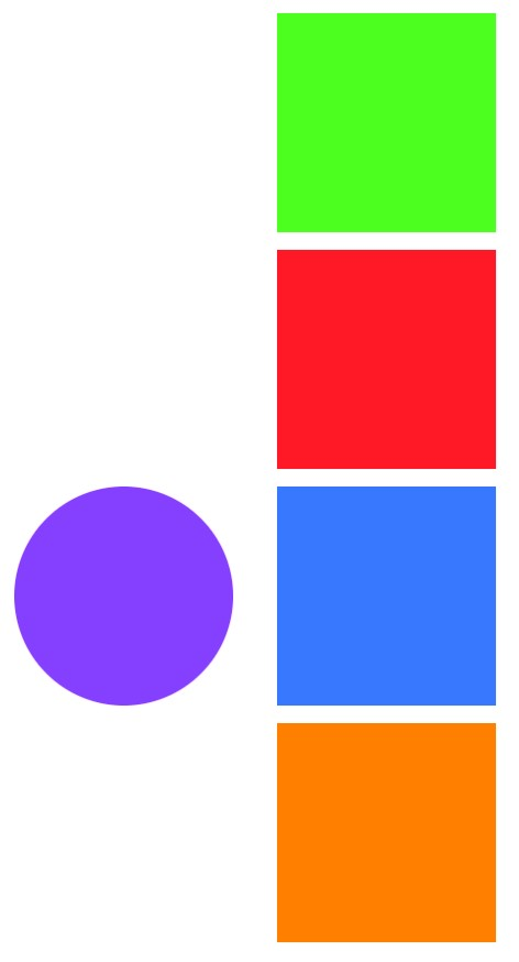
Figure 27-15
ZStack Custom Alignment
By default, the child views of a ZStack are overlaid on top of each other and center aligned. The following figure shows three shape views (circle, square and capsule) stacked on top of each other in a ZStack and center aligned:
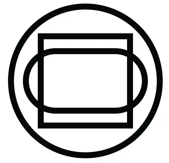
Figure 27-16
Using the standard alignment types, the alignment of all the embedded views can be changed. In Figure 27-17 for example, the ZStack has .leading alignment configured:
|
You are reading a sample chapter from an old edition of iOS App Development Essentials. Purchase the fully updated iOS 18 App Development Essentials book. The full book contains 71 chapters, over 612 pages of in-depth information, downloadable source code, and access to over 50 SwiftUI knowledge test quizzes. |

Figure 27-17
To perform more advanced alignment layouts, where each view within the stack has its own alignment, both horizontal and vertical custom alignments must be combined into a single custom alignment, for example:
extension HorizontalAlignment {
    enum MyHorizontal: AlignmentID {
        static func defaultValue(in d: ViewDimensions) -> CGFloat
                 { d[HorizontalAlignment.center] }
    }
    static let myAlignment =
                 HorizontalAlignment(MyHorizontal.self)
}

extension VerticalAlignment {
    enum MyVertical: AlignmentID {
        static func defaultValue(in d: ViewDimensions) -> CGFloat
                 { d[VerticalAlignment.center] }
    }
    static let myAlignment = VerticalAlignment(MyVertical.self)
}

extension Alignment {
    static let myAlignment = Alignment(horizontal: .myAlignment,
                               vertical: .myAlignment)
}Code language: Swift (swift)
Once implemented, the custom alignments can be used to position ZStack child views on both the horizontal and vertical axes:
ZStack(alignment: .myAlignment) {
   Rectangle()
        .foregroundColor(Color.green)
        .alignmentGuide(HorizontalAlignment.myAlignment)
                           { d in d[.trailing]}
        .alignmentGuide(VerticalAlignment.myAlignment)
                           { d in d[VerticalAlignment.bottom] }
        .frame(width: 100, height: 100)

   Rectangle()
        .foregroundColor(Color.red)
        .alignmentGuide(VerticalAlignment.myAlignment)
                           { d in d[VerticalAlignment.top] }
        .alignmentGuide(HorizontalAlignment.myAlignment)
                           { d in d[HorizontalAlignment.center] }
        .frame(width: 100, height: 100)

    Circle()
        .foregroundColor(Color.orange)
        .alignmentGuide(HorizontalAlignment.myAlignment)
                           { d in d[.leading] }
        .alignmentGuide(VerticalAlignment.myAlignment)
                           { d in d[.bottom] }
        .frame(width: 100, height: 100)
}Code language: Swift (swift)
The above ZStack will appear as shown in Figure 27-18 when rendered:
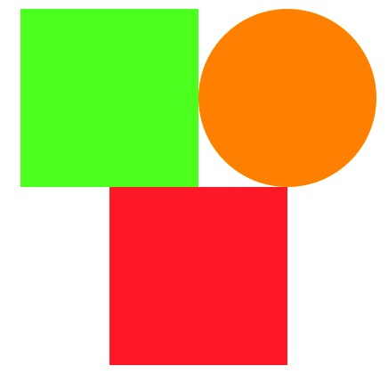
Figure 27-18
|
You are reading a sample chapter from an old edition of iOS App Development Essentials. Purchase the fully updated iOS 18 App Development Essentials book. The full book contains 71 chapters, over 612 pages of in-depth information, downloadable source code, and access to over 50 SwiftUI knowledge test quizzes. |
Take some time to experiment with the alignment settings on each view to gain an understanding of how ZStack custom alignment works. Begin, for example, with the following changes:
ZStack(alignment: .myAlignment) {
   Rectangle()
        .foregroundColor(Color.green)
        .alignmentGuide(HorizontalAlignment.myAlignment)
                           { d in d[.leading]}
        .alignmentGuide(VerticalAlignment.myAlignment)
                           { d in d[VerticalAlignment.bottom] }
        .frame(width: 100, height: 100)

   Rectangle()
        .foregroundColor(Color.red)
        .alignmentGuide(VerticalAlignment.myAlignment)
                           { d in d[VerticalAlignment.center] }
        .alignmentGuide(HorizontalAlignment.myAlignment)
                           { d in d[HorizontalAlignment.trailing] }
        .frame(width: 100, height: 100)

    Circle()
        .foregroundColor(Color.orange)
        .alignmentGuide(HorizontalAlignment.myAlignment)
                           { d in d[.leading] }
        .alignmentGuide(VerticalAlignment.myAlignment)
                           { d in d[.top] }
        .frame(width: 100, height: 100)
}Code language: Swift (swift)
With these changes made, check the preview canvas and verify that the layout now matches Figure 27-19:
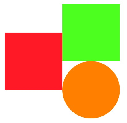
Figure 27-19
Summary
The SwiftUI stack container views can be configured using basic alignment settings that control the positioning of all child views relative to the container. Alignment of individual views within a stack may be configured using alignment guides. An alignment guide includes a closure which is passed a ViewDimensions object which can be used to compute the alignment position for the view based on the view’s height and width. These alignment guides can be implemented as custom alignments which can be reused in the same way as standard alignments when declaring a stack view layout. Custom alignments are also a useful tool when views contained in different stacks need to be aligned with each other. Custom alignment of ZStack child views requires both horizontal and vertical alignment guides.