
A key step in learning to develop apps using SwiftUI is learning how to declare user interface layouts by using the built-in SwiftUI views and building your own custom views. This chapter will introduce the basic concepts of SwiftUI views and outline the syntax used to declare user interface layouts and modify view appearance and behavior.
SwiftUI Views
User interface layouts are composed in SwiftUI by using, creating, and combining views. An essential first step is to understand what the term “view” means. Views in SwiftUI are declared as structures that conform to the View protocol. To conform with the View protocol, a structure is required to contain a body property, and it is within this body property that the view is declared.
SwiftUI includes many built-in views that can be used when constructing a user interface, including text label, button, text field, menu, toggle, and layout manager views. Each of these is a self-contained instance that complies with the View protocol. When building an app with SwiftUI, you will use these views to create custom views of your own, which, when combined, constitute the appearance and behavior of your user interface.
These custom views will range from subviews that encapsulate a reusable subset of view components (perhaps a secure text field and a button for logging into screens within your app) to views that encapsulate the user interface for an entire screen. Regardless of the size and complexity of a custom view or the number of child views encapsulated within, a view is still just an instance that defines some user interface appearance and behavior.
Creating a Basic View
In Xcode, custom views are contained within SwiftUI View files. When a new SwiftUI project is created, Xcode will create a single SwiftUI View file containing a single custom view consisting of a single Text view and an image. Additional view files can be added to the project by selecting the File -> New -> File… menu option and choosing the SwiftUI View file entry from the template screen.
 |
You are reading a sample chapter from an old edition of iOS App Development Essentials. Purchase the fully updated iOS 18 App Development Essentials book. The full book contains 71 chapters, over 612 pages of in-depth information, downloadable source code, and access to over 50 SwiftUI knowledge test quizzes. |
The default SwiftUI View file is named ContentView.swift and reads as follows:
import SwiftUI

struct ContentView: View {
    var body: some View {
        VStack {
            Image(systemName: "globe")
                .imageScale(.large)
                .foregroundStyle(.tint)
            Text("Hello, world!")
        }
        .padding()
    }
}

#Preview {
    ContentView()
}Code language: Swift (swift)
The view is named ContentView and is declared as conforming to the View protocol. It also includes the mandatory body property, which, in turn, contains a vertical stack layout container containing an Image component configured to display a globe graphic and an instance of the built-in Text view component displaying text that reads “Hello, World!”.
The second structure in the file creates an instance of ContentView so that it appears in the preview canvas, a topic that will be covered in detail in later chapters.
Adding Views
Additional views can be added to a parent view by placing them in the body declaration. The following is a simple example containing a single Text view:
struct ContentView: View {
    var body: some View {
        Text("Hello, world!")
    }
}Code language: Swift (swift)
The body property is designed to return a single view, which is a Text view in the above example. Following this logic, adding a second view as follows should cause a syntax error:
|
You are reading a sample chapter from an old edition of iOS App Development Essentials. Purchase the fully updated iOS 18 App Development Essentials book. The full book contains 71 chapters, over 612 pages of in-depth information, downloadable source code, and access to over 50 SwiftUI knowledge test quizzes. |
struct ContentView: View {
    var body: some View {
        Text("Hello, world!")
        Text("Goodbye, world!")
    }
}Code language: Swift (swift)
In practice, however, the above code is valid, and when the layout is previewed, the two text views will appear, as shown in Figure 20-1:

The above example contradicts the limitation that only a single view can be returned from the body. Behind the scenes, however, SwiftUI is avoiding this problem by embedding the Text views inside a TupleView. TupleView is used to create a single view containing multiple other views, but because it provides few options for changing how the layout appears, you will rarely use it when designing SwiftUI layouts.
Adding views in this way works but doesn’t take advantage of the hierarchical approach to SwiftUI development, and we lose the ability to treat the child views as a group in terms of appearance and layout.
Assuming that the goal is to stack the views vertically with equal spacing, it makes more sense to place the new views within the scope of the VStack view, which, as the name suggests, positions views vertically within the containing view:
struct ContentView: View {
    var body: some View {
        VStack {
            Text("Hello, world!")
            Text("Goodbye, world!")
            Text("We'll miss you.")
        }
    }
}Code language: Swift (swift)
SwiftUI Hierarchies
SwiftUI views are hierarchical by nature, starting with parent and child views. This allows views to be nested to multiple levels to create user interfaces of any complexity. Consider, for example, the following view hierarchy diagram:
|
You are reading a sample chapter from an old edition of iOS App Development Essentials. Purchase the fully updated iOS 18 App Development Essentials book. The full book contains 71 chapters, over 612 pages of in-depth information, downloadable source code, and access to over 50 SwiftUI knowledge test quizzes. |
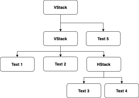
The equivalent view declaration for the above view would read as follows:
struct ContentView: View {
var body: some View {
VStack {
VStack {
Text("Text 1")
Text("Text 2")
HStack {
Text("Text 3")
Text("Text 4")
}
}
Text("Text 5")
}
}
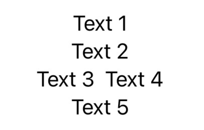
}Code language: Swift (swift)The above layout will appear, as shown below, when previewed:
Concatenating Text Views
A notable exception to the requirement that multiple views be embedded in a container or wrapped in a TupleView is that multiple Text views count as a single view when concatenated. The following, therefore, is a valid view declaration:
struct ContentView: View {
    var body: some View {
        Text("Hello, ") + Text("how ") + Text("are you?")
    }
}Code language: Swift (swift)
Working with Subviews
Apple recommends that views be kept as small and lightweight as possible. This promotes the creation of reusable components, makes view declarations easier to maintain, and results in more efficient layout rendering.
If you find that a custom view declaration has become large and complex, identify areas of the view that can be extracted into a subview. As a very simplistic example, the HStack view in the above example could be extracted as a subview named “MyHStackView” as follows:
|
You are reading a sample chapter from an old edition of iOS App Development Essentials. Purchase the fully updated iOS 18 App Development Essentials book. The full book contains 71 chapters, over 612 pages of in-depth information, downloadable source code, and access to over 50 SwiftUI knowledge test quizzes. |
struct ContentView: View {
    var body: some View {
        VStack {
            VStack {
                Text("Text 1")
                Text("Text 2")
                MyHStackView()
            }
            Text("Text 5")
        }
    }
}

struct MyHStackView: View {
    var body: some View {
        HStack {
            Text("Text 3")
            Text("Text 4")
        }
    }
}Code language: Swift (swift)
Views as Properties
In addition to creating subviews, views may also be assigned to properties as a way to organize complex view hierarchies. Consider the following example view declaration:
struct ContentView: View {

    var body: some View {

        VStack {
            Text("Main Title")
                .font(.largeTitle)
            HStack {
                Text("Car Image")
                Image(systemName: "car.fill")
            }
        }
    }
}Code language: Swift (swift)
Any part of the above declaration can be moved to a property value and then referenced by name. In the following declaration, the HStack has been assigned to a property named carStack, which is then referenced within the VStack layout:
struct ContentView: View {

    let carStack = HStack {
        Text("Car Image")
        Image(systemName: "car.fill")
    }

    var body: some View {
        VStack {
            Text("Main Title")
                .font(.largeTitle)
            carStack
        }
    }
}Code language: Swift (swift)
Modifying Views
It is unlikely that any of the views provided with SwiftUI will appear and behave exactly as required without some form of customization. These changes are made by applying modifiers to the views.
All SwiftUI views have sets of modifiers that can be applied to make appearance and behavior changes. These modifiers take the form of methods called on the instance of the view and wrap the original view inside another view, which applies the necessary changes. This means modifiers can be chained together to apply multiple modifications to the same view. The following, for example, changes the font and foreground color of a Text view:
Text("Text 1")
    .font(.headline)
    .foregroundColor(.red)Code language: Swift (swift)
Similarly, the following example uses modifiers to configure an Image view to be resizable with the aspect ratio set to fit proportionally within the available space:
|
You are reading a sample chapter from an old edition of iOS App Development Essentials. Purchase the fully updated iOS 18 App Development Essentials book. The full book contains 71 chapters, over 612 pages of in-depth information, downloadable source code, and access to over 50 SwiftUI knowledge test quizzes. |
Image(systemName: "car.fill")
    .resizable()
    .aspectRatio(contentMode: .fit)Code language: Swift (swift)
Modifiers may also be applied to custom subviews. In the following example, the font for both Text views in the previously declared MyHStackView custom view will be changed to use the large title font style:
MyHStackView()
    .font(.largeTitle)Code language: Swift (swift)
Working with Text Styles
In the above example, the font used to display text on a view was declared using a built-in text style (in this case, the large title style).
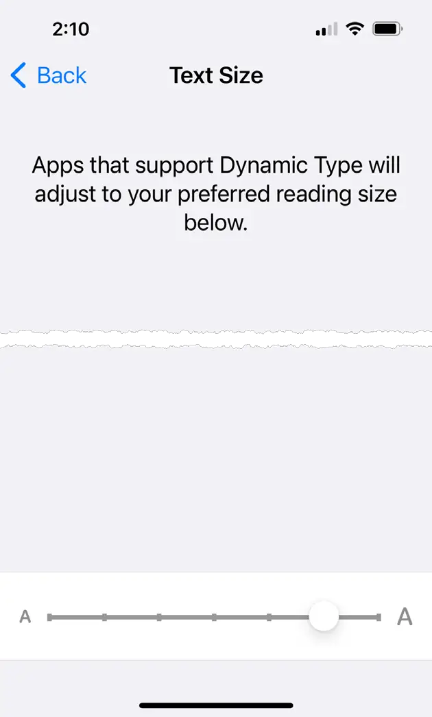
iOS allows the user to select a preferred text size that applications are expected to adopt when displaying text. The current text size can be configured on a device via the Settings -> Display & Brightness -> Text Size screen, which provides a slider to adjust the font size, as shown below:
If a font has been declared on a view using a text style, the text size will dynamically adapt to the user’s preferred font size. Almost without exception, the built-in iOS apps adopt the preferred size setting selected by the user when displaying text, and Apple recommends that third-party apps also conform to the user’s chosen text size. The following text style options are currently available:
- Large Title
- Title, Title2, Title 3
- Headline
- Subheadline
- Body
- Callout
- Footnote
- Caption, Caption2
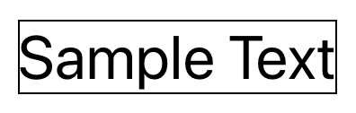
If none of the text styles meet your requirements, it is also possible to apply custom fonts by declaring the font family and size. Although the font size is specified in the custom font, the text will still automatically resize based on the user’s preferred dynamic type text size selection:
|
You are reading a sample chapter from an old edition of iOS App Development Essentials. Purchase the fully updated iOS 18 App Development Essentials book. The full book contains 71 chapters, over 612 pages of in-depth information, downloadable source code, and access to over 50 SwiftUI knowledge test quizzes. |
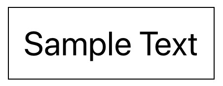
Text("Sample Text")
    .font(.custom("Copperplate", size: 70))Code language: Swift (swift)
The above custom font selection will render the Text view as follows:

Modifier Ordering
When chaining modifiers, it is important to be aware that the order in which they are applied can be significant. Both border and padding modifiers have been applied to the following Text view.
Text("Sample Text")
    .border(Color.black)
    .padding()Code language: Swift (swift)
The border modifier draws a black border around the view, and the padding modifier adds space around the view. When the above view is rendered, it will appear as shown in Figure 20-6:
Given that padding has been applied to the text, it might be reasonable to expect a gap between the text and the border. In fact, the border was only applied to the original Text view. Padding was then applied to the modified view returned by the border modifier. The padding is still applied to the view but outside of the border. For the border to encompass the padding, the order of the modifiers needs to be changed so that the border is drawn on the view returned by the padding modifier:
Text("Sample Text")
    .padding()
    .border(Color.black)Code language: Swift (swift)
With the modifier order switched, the view will now be rendered as follows:
|
You are reading a sample chapter from an old edition of iOS App Development Essentials. Purchase the fully updated iOS 18 App Development Essentials book. The full book contains 71 chapters, over 612 pages of in-depth information, downloadable source code, and access to over 50 SwiftUI knowledge test quizzes. |
If you don’t see the expected effects when working with chained modifiers, remember that this may be because of the order in which they are being applied to the view.
Custom Modifiers
SwiftUI also allows you to create your own custom modifiers. This can be particularly useful if you have a standard set of modifiers that are frequently applied to views. Suppose that the following modifiers are a common requirement within your view declarations:
Text("Text 1")
    .font(.largeTitle)
    .background(Color.white)
    .border(Color.gray, width: 0.2)
    .shadow(color: Color.black, radius: 5, x: 0, y: 5)Code language: Swift (swift)
Instead of applying these four modifiers each time text with this appearance is required, a better solution is to group them into a custom modifier and then reference it each time the modification is needed. Custom modifiers are declared as structs that conform to the ViewModifier protocol and, in this instance, might be implemented as follows:
struct StandardTitle: ViewModifier {
   func body(content: Content) -> some View {
        content
            .font(.largeTitle)
            .background(Color.white)
            .border(Color.gray, width: 0.2)
            .shadow(color: Color.black, radius: 5, x: 0, y: 5)
    }
}Code language: Swift (swift)
The custom modifier is then applied when needed by passing it through to the modifier() method:
Text("Text 1")
    .modifier(StandardTitle())
Text("Text 2")
    .modifier(StandardTitle())Code language: Swift (swift)
With the custom modifier implemented, changes can be made to the StandardTitle implementation, and those changes will automatically propagate through to all views that use the modifier. This avoids the need to change the modifiers on multiple views manually.
|
You are reading a sample chapter from an old edition of iOS App Development Essentials. Purchase the fully updated iOS 18 App Development Essentials book. The full book contains 71 chapters, over 612 pages of in-depth information, downloadable source code, and access to over 50 SwiftUI knowledge test quizzes. |
Basic Event Handling
Although SwiftUI is described as being data-driven, it is still necessary to handle the events generated when a user interacts with the views in the user interface. Some views, such as the Button view, are provided solely to solicit user interaction. In fact, the Button view can be used to turn various views into a “clickable” button. A Button view needs to be declared with the action method to be called when a click is detected together with the view to act as the button content. It is possible, for example, to designate an entire stack of views as a single button. In most cases, however, a Text view will typically be used as the Button content. In the following implementation, a Button view is used to wrap a Text view, which, when clicked, will call a method named buttonPressed():
struct ContentView: View {
    var body: some View {
        Button(action: buttonPressed) {
            Text("Click Me")
        }
    }

    func buttonPressed() {
        // Code to perform action here
    }
}Code language: Swift (swift)
Instead of specifying an action function, the code to be executed when the button is clicked may also be specified as a closure in line with the declaration:
Button(action: {
    // Code to perform action here
}) {
    Text("Click Me")
}Code language: Swift (swift)
Another common requirement is to turn an Image view into a button, for example:
Button(action: {
    print("Button clicked")
}) {
    Image(systemName: "square.and.arrow.down")
}Code language: Swift (swift)
Building Custom Container Views
As outlined earlier in this chapter, subviews provide a valuable way to divide a view declaration into small, lightweight, and reusable blocks. One limitation of subviews, however, is that the content of the container view is static. In other words, it is not possible to dynamically specify the views to be included at the point that a subview is included in a layout. The only children included in the subview are those that are specified in the original declaration.
Consider the following subview, which consists of three TextViews contained within a VStack and modified with custom spacing and font settings.
|
You are reading a sample chapter from an old edition of iOS App Development Essentials. Purchase the fully updated iOS 18 App Development Essentials book. The full book contains 71 chapters, over 612 pages of in-depth information, downloadable source code, and access to over 50 SwiftUI knowledge test quizzes. |
struct MyVStack: View {
    var body: some View {
        VStack(spacing: 10) {
            Text("Text Item 1")
            Text("Text Item 2")
            Text("Text Item 3")
        }
        .font(.largeTitle)
    }
}Code language: Swift (swift)
To include an instance of MyVStack in a declaration, it would be referenced as follows:
MyVStack()Code language: Swift (swift)Suppose, however, that a VStack with a spacing of 10 and a large font modifier is something that is needed frequently within a project, but in each case, different child views are required to be contained within the stack. While this flexibility isn’t possible using subviews, it can be achieved using the SwiftUI ViewBuilder closure attribute when constructing custom container views.
A ViewBuilder takes the form of a Swift closure which can be used to create a custom view comprised of multiple child views, the content of which does not need to be declared until the view is used within a layout declaration. The ViewBuilder closure takes the content views and returns them as a single view, which is, in effect, a dynamically built subview.
The following is an example of using the ViewBuilder attribute to implement our custom MyVStack view:
struct MyVStack<Content: View>: View {
  let content: () -> Content
  init(@ViewBuilder content: @escaping () -> Content) {
    self.content = content
  }

  var body: some View {
    VStack(spacing: 10) {
      content()
   }
   .font(.largeTitle)
  }
}Code language: Swift (swift)
Note that this declaration still returns an instance that complies with the View protocol and that the body contains the VStack declaration from the previous subview. Instead of including static views to be included in the stack, however, the child views of the stack will be passed to the initializer, handled by ViewBuilder, and embedded into the VStack as child views. The custom MyVStack view can now be initialized with different child views wherever it is used in a layout, for example:
|
You are reading a sample chapter from an old edition of iOS App Development Essentials. Purchase the fully updated iOS 18 App Development Essentials book. The full book contains 71 chapters, over 612 pages of in-depth information, downloadable source code, and access to over 50 SwiftUI knowledge test quizzes. |
MyVStack {
    Text("Text 1")
    Text("Text 2")
    HStack {
        Image(systemName: "star.fill")
        Image(systemName: "star.fill")
        Image(systemName: "star")
    }
}
Code language: Swift (swift)
Working with the Label View
The Label view is different from most other SwiftUI views in that it comprises two elements in the form of an icon and text positioned side-by-side. The image can take the form of any image asset, a SwiftUI Shape rendering, or an SF Symbol.
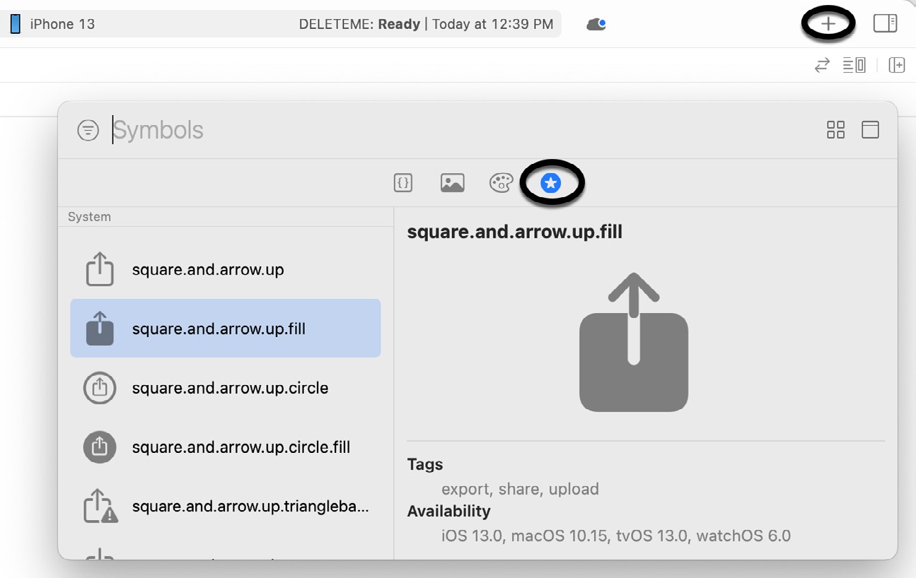
SF Symbols is a collection of thousands of scalable vector drawings for use when developing apps for Apple platforms and designed to complement Apple’s San Francisco system font.
The full set of symbols can be browsed and selected via the Symbols screen of the Library panel, as illustrated in Figure 20-8:
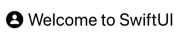
The following is an example of the Label view using an SF Symbol together with a font() modifier to increase the size of the icon and text:
Label("Welcome to SwiftUI", systemImage: "person.circle.fill")
    .font(.largeTitle)Code language: Swift (swift)
The above view will be rendered as shown in Figure 20-9 below:
|
You are reading a sample chapter from an old edition of iOS App Development Essentials. Purchase the fully updated iOS 18 App Development Essentials book. The full book contains 71 chapters, over 612 pages of in-depth information, downloadable source code, and access to over 50 SwiftUI knowledge test quizzes. |
By referencing systemImage: in the Label view declaration, we indicate that the icon is to be taken from the built-in SF Symbol collection. To display an image from the app’s asset catalog, the following syntax would be used instead:
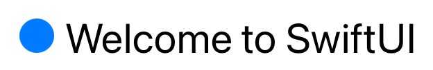
Label("Welcome to SwiftUI", image: "myimage")Code language: Swift (swift)Instead of specifying a text string and an image, the Label may also be declared using separate views for the title and icon. The following Label view declaration, for example, uses a Text view for the title and a Circle drawing for the icon:
Label(
    title: {
        Text("Welcome to SwiftUI")
        .font(.largeTitle)
    },
    icon: { Circle()
        .fill(Color.blue)
        .frame(width: 25, height: 25)
    }
)Code language: Swift (swift)
When rendered, the above Label view will appear, as shown in Figure 20-10:
Summary
SwiftUI user interfaces are declared in SwiftUI View files and composed of components conforming to the View protocol. To conform with the View protocol, a structure must contain a property named body, itself a View.
SwiftUI provides a library of built-in components for designing user interface layouts. The appearance and behavior of a view can be configured by applying modifiers, and views can be modified and grouped to create custom views and subviews. Similarly, custom container views can be created using the ViewBuilder closure property.
|
You are reading a sample chapter from an old edition of iOS App Development Essentials. Purchase the fully updated iOS 18 App Development Essentials book. The full book contains 71 chapters, over 612 pages of in-depth information, downloadable source code, and access to over 50 SwiftUI knowledge test quizzes. |
When a modifier is applied to a view, a new modified view is returned, and subsequent modifiers are then applied to this modified view. This can have significant implications for the order in which modifiers are applied to a view