
The previous chapter covered the List, OutlineGroup and DisclosureGroup views and explored how these can be used to visually present hierarchical information within an app while allowing the user to selectively hide and display sections of that information.
This chapter will serve as a practical demonstration of these features in action through the creation of an example project.
About the Example Project
The project created in this chapter will recreate the user interface shown in Figure 30-4 in the previous chapter using the data represented in Figure 30-1. Initially, the project will use a List view to traverse and display the information in the car data structure. Next, the project will be modified to use the OutlineGroup within the List to display the information in groups using section headers. Finally, the project will be extended to use the DisclosureGroup view.
Creating the OutlineGroupDemo Project
Launch Xcode and select the option to create a new Multiplatform App project named OutlineGroupDemo.
Adding the Data Structure
The first step before a list can be displayed is to add the data structure that will form the basis of the user interface. Each row within the list will be represented by an instance of a structure named CarInfo designed to store the following information:
 |
You are reading a sample chapter from an old edition of iOS App Development Essentials. Purchase the fully updated iOS 18 App Development Essentials book. The full book contains 71 chapters, over 612 pages of in-depth information, downloadable source code, and access to over 50 SwiftUI knowledge test quizzes. |
- id – A UUID to uniquely identify each CarInfo instance.
- name – A string value containing the name of the car type, manufacturer or car model.
- image – A string referencing the SF Symbol image to be displayed.
- children – An array of CarInfo objects representing the children of the current CarInfo instance.
Within the project navigator panel, select the ContentView.swift file and modify it to add the CarInfo structure declaration as follows:
import SwiftUI

struct CarInfo: Identifiable {
    var id = UUID()
    var name: String
    var image: String
    var children: [CarInfo]?
}

struct ContentView: View {
    var body: some View {
        Text("Hello, world!").padding()
    }
}
.
.Code language: Swift (swift)
Now that a structure has been defined, some data needs to be added to populate the CarInfo instances. As mentioned previously, this data structure is represented in Figure 30-1 in the previous chapter. Staying within the ContentView.swift file, add the data as a variable declaration as follows:
.
.
struct CarInfo: Identifiable {
    var id = UUID()
    var name: String
    var image: String
    var children: [CarInfo]?
}

let carItems: [CarInfo] = [

    CarInfo(name: "Hybrid Cars", image: "leaf.fill", children: [
        CarInfo(name: "Toyota", image: "car.circle", children : [
            CarInfo(name: "Prius", image: "leaf.fill"),
            CarInfo(name: "Highlander Hybrid", image: "leaf.fill"),
            CarInfo(name: "Lexus", image: "car.circle", children: [
                    CarInfo(name: "Lexus RX", image: "leaf.fill"),
                    CarInfo(name: "Lexus NX", image: "leaf.fill")])
        ]),
        CarInfo(name: "Ford", image: "car.circle", children : [
            CarInfo(name: "Fusion Energi", image: "leaf.fill"),
            CarInfo(name: "Escape", image: "leaf.fill"),
            CarInfo(name: "Volvo", image: "car.circle", children: [
                    CarInfo(name: "S90 Hybrid", image: "leaf.fill"),
                    CarInfo(name: "XC90 Hybrid", image: "leaf.fill")])
        ]),
    ]),

    CarInfo(name: "Electric Cars", image: "bolt.car.fill", children: [
        CarInfo(name: "Tesla", image: "car.circle", children : [
            CarInfo(name: "Model 3", image: "bolt.car.fill")
        ]),
        CarInfo(name: "Karma", image: "car.circle", children : [
            CarInfo(name: "Revero GT", image: "bolt.car.fill")
        ])
    ])
]

struct ContentView: View {
    var body: some View {
        Text("Hello, world!").padding()
    }
}
.
.Code language: Swift (swift)
Adding the List View
With the data structure added to the project, the next step is to modify the content view so that it uses a List configured to extract the structured data from the carItems array. Before doing that, however, we first need to design a custom view to be presented within each list cell. Add this view to the ContentView.swift file as follows:
struct CellView: View {

    var item: CarInfo

    var body: some View {
        HStack {
            Image(systemName: item.image)
                .resizable()
                .scaledToFit()
                .frame(width: 25, height: 25)
                .foregroundColor(.green)
            Text(item.name)
        }
    }
}Code language: Swift (swift)
The above view expects to be passed a CarInfo instance before constructing a horizontal stack displaying the image and a Text view containing the name of the current item. In the case of the image, it is scaled and the foreground changed to green.
Next, edit the ContentView structure and replace the default “Hello, world!” Text view so that the declaration reads as follows:
|
You are reading a sample chapter from an old edition of iOS App Development Essentials. Purchase the fully updated iOS 18 App Development Essentials book. The full book contains 71 chapters, over 612 pages of in-depth information, downloadable source code, and access to over 50 SwiftUI knowledge test quizzes. |
.
.
struct ContentView: View {
    var body: some View {
        List(carItems, children: \.children) { item in
            CellView(item: item)
        }
    }
}
.
.Code language: Swift (swift)
Testing the Project
Test the progress so far by referring to the preview canvas and switching into Live Preview mode. On launching, the two top level categories will be listed with disclosure controls available:
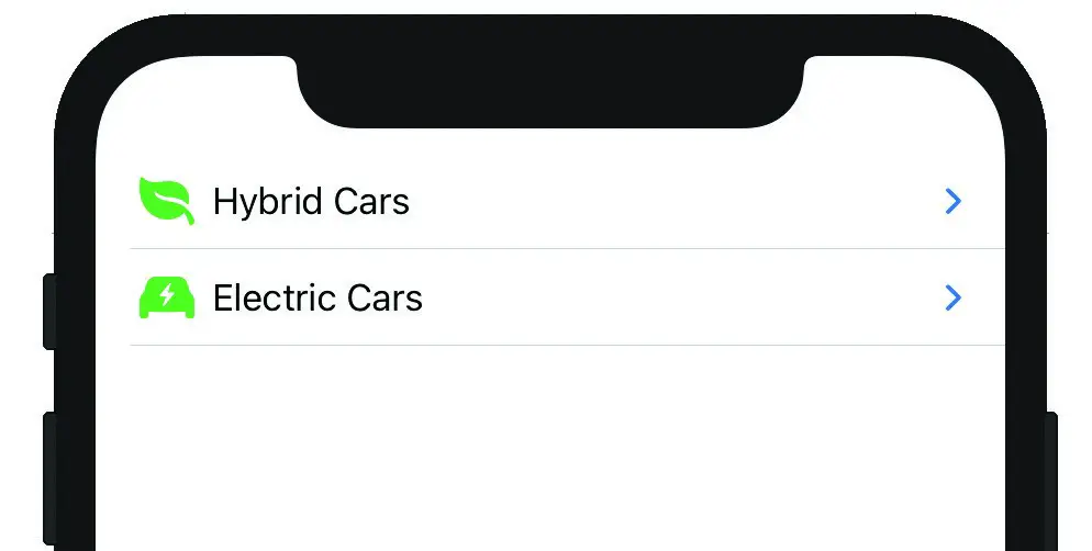
Figure 31-1
Using the disclosure controls, navigate through the levels to make sure that the view is working as expected:
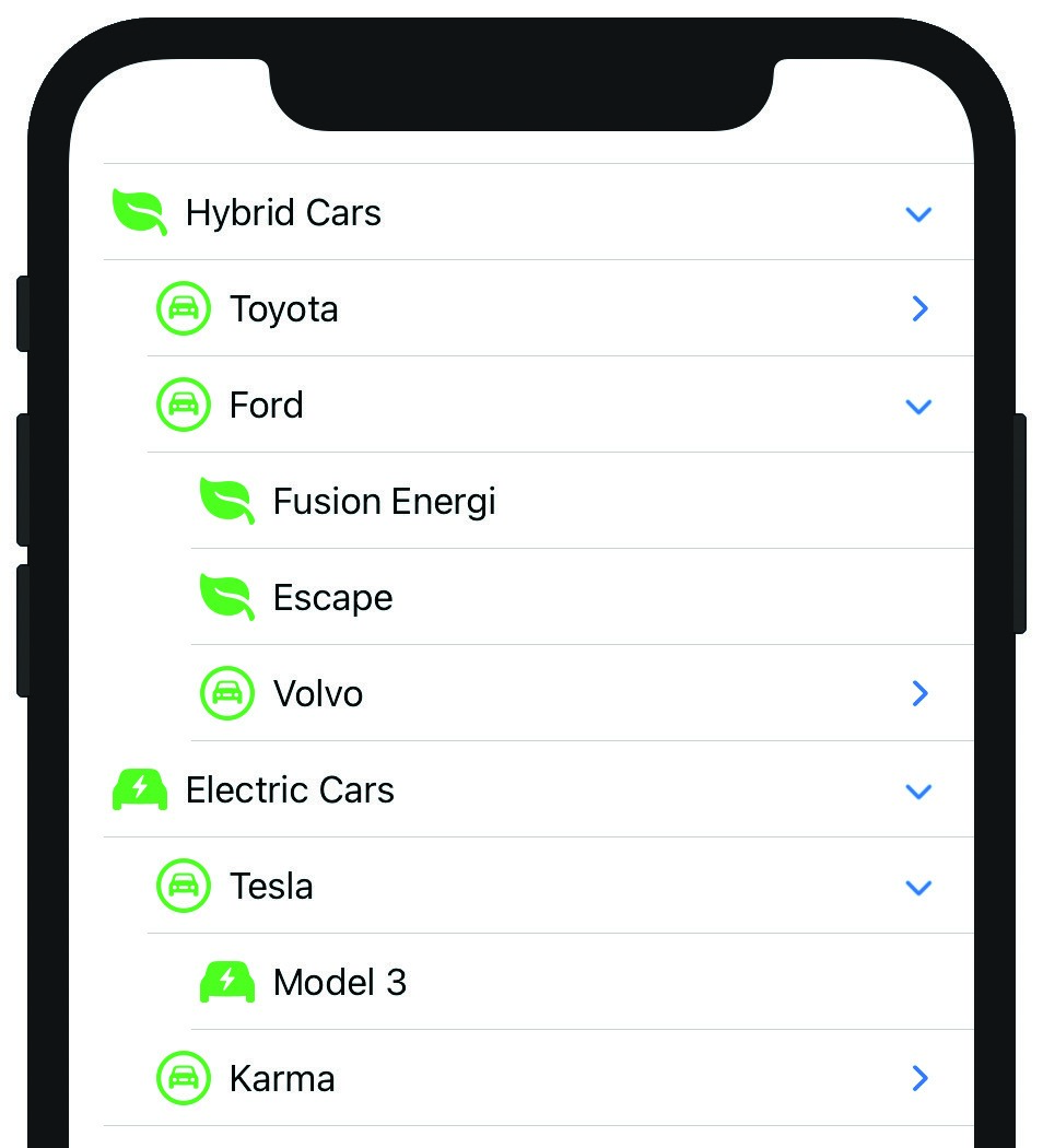
Figure 31-2
Using the Sidebar List Style
The List instance above is displayed using the default list style. When working with hierarchical lists it is worthwhile noting that a List style is available for this specific purpose in the form of the SidebarListSyle. To see this in action, add a modifier to the List view as follows:
|
You are reading a sample chapter from an old edition of iOS App Development Essentials. Purchase the fully updated iOS 18 App Development Essentials book. The full book contains 71 chapters, over 612 pages of in-depth information, downloadable source code, and access to over 50 SwiftUI knowledge test quizzes. |
struct ContentView: View {
    var body: some View {
        List(carItems, children: \.children) { item in
            CellView(item: item)
        }
        .listStyle(SidebarListStyle())
    }
}Code language: Swift (swift)
When previewed, the list will now appear as shown in Figure 31-3, providing a cleaner and more ordered layout than that provided by the default style:
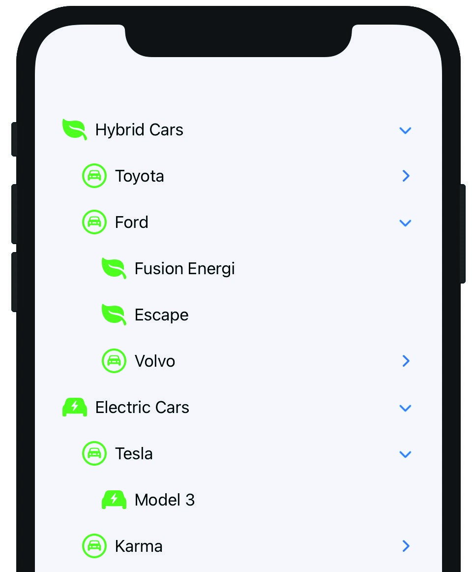
Figure 31-3
Using OutlineGroup
Now that we’ve seen the use of the List view to display hierarchical data, the project will be modified to make use of the OutlineGroup view within a list to divide the list into groups, each with a section header.
Once again working within the ContentView.swift file, modify the ContentView declaration so that it reads as follows:
struct ContentView: View {
    var body: some View {
        List {
            ForEach(carItems) { carItem in
                Section(header: Text(carItem.name)) {
                    OutlineGroup(carItem.children ?? [CarInfo](),
                                 children: \.children) { child in

                        CellView(item: child)
                    }

                }
            }
        }
        .listStyle(InsetListStyle())
    }
}Code language: Swift (swift)
The above declaration takes the first entry in the data structure (in this case “Hybrid Cars”) and assigns it as the title of a Section view. The OutlineGroup then iterates through all of the children of the Hybrid Cars entry. Once all of the children have been processed, the “Electric Cars” item is used as the title for another Section before iterating through all the electric car children.
|
You are reading a sample chapter from an old edition of iOS App Development Essentials. Purchase the fully updated iOS 18 App Development Essentials book. The full book contains 71 chapters, over 612 pages of in-depth information, downloadable source code, and access to over 50 SwiftUI knowledge test quizzes. |
When reviewed using Live Preview, the app should behave as before, with the exception that the information is now grouped into headed sections as shown in Figure 31-4, noting that this time the List is configured with the InsetListStyle modifier:
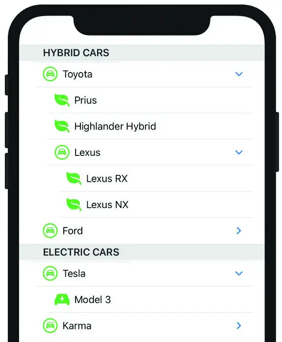
Figure 31-4
Working with DisclosureGroups
The DisclosureGroup view will be demonstrated within a new SwiftUI View file. To add this view, right-click on the Shared folder in the project navigator panel and select the New File… menu option. In the new file template dialog, select the SwiftUI View file option, click Next and name the file SettingsView before clicking on the Create button.
With the SettingsView.swift file loaded into the editor, make the following additions to add some custom views and state properties that will be used to simulate settings controls:
import SwiftUI

struct SettingsView: View {

    @State private var hybridState: Bool = false
    @State private var electricState: Bool = true
    @State private var fuelCellState: Bool = false
    @State private var inversionState: Bool = true
.
.
struct ColorControl: View {

    var color: Color
    var label: String

    var body: some View {
        HStack {
            Text(label)
            Spacer()
            Rectangle()
                .fill(color)
                .frame(width: 30, height: 30)
        }
        .padding(.leading)
        .scaledToFill()
    }
}

struct ToggleControl: View {
    var title: String
    @State var state: Bool

    var body: some View {
        Toggle(title, isOn: $state)
            .padding(.leading)
    }
}Code language: Swift (swift)
Next, modify the body of the SettingsView structure to add a Form view containing the settings controls:
|
You are reading a sample chapter from an old edition of iOS App Development Essentials. Purchase the fully updated iOS 18 App Development Essentials book. The full book contains 71 chapters, over 612 pages of in-depth information, downloadable source code, and access to over 50 SwiftUI knowledge test quizzes. |
struct SettingsView: View {

    @State private var hybridState: Bool = false
    @State private var electricState: Bool = true
    @State private var fuelCellState: Bool = false
    @State private var inversionState: Bool = true

    var body: some View {

        Form {
            ToggleControl(title: " Hybrid Cars", state: hybridState)
            ToggleControl(title: " Electric Cars", state: electricState)
            ToggleControl(title: " Fuel Cell Cars", state: fuelCellState)

            ColorControl(color: .red, label: "Background Color")
            ColorControl(color: .blue, label: "ForegroundColor")
            ToggleControl(title: "Color Inversion",
                                           state: inversionState)
        }
    }
}Code language: Swift (swift)
When reviewed in the preview canvas, the user interface layout should appear as shown in Figure 31-5:
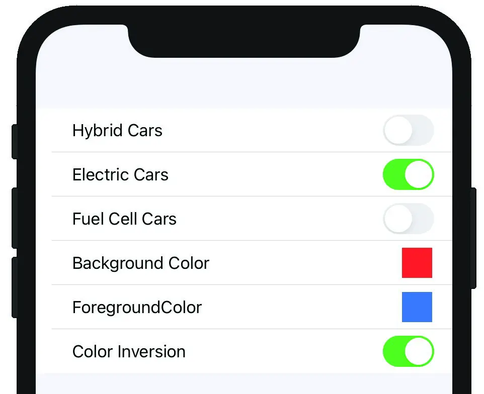
Figure 31-5
With the initial steps of the settings form designed, the next step is to organize the form into groups with titles and disclosure controls. To achieve this, modify the Form view declaration as follows:
var body: some View {

    Form {
        DisclosureGroup {
            ToggleControl(title: "Hybrid Cars", state: hybridState)
            ToggleControl(title: "Electric Cars", state: electricState)
            ToggleControl(title: "Fuel Cell Cars", state: fuelCellState)
        } label : {
            Label("Categories Filters", systemImage: "car.2.fill")
        }

        DisclosureGroup {
            ColorControl(color: .red, label: "Background Color")
            ColorControl(color: .blue, label: "ForegroundColor")
            ToggleControl(title: "Color Inversion",
                                          state: inversionState)
        } label : {
            Label("Color Settings", systemImage: "scribble.variable")
        }
    }
}Code language: Swift (swift)
With the form separated into disclosure groups, the view should appear in the preview canvas as follows:
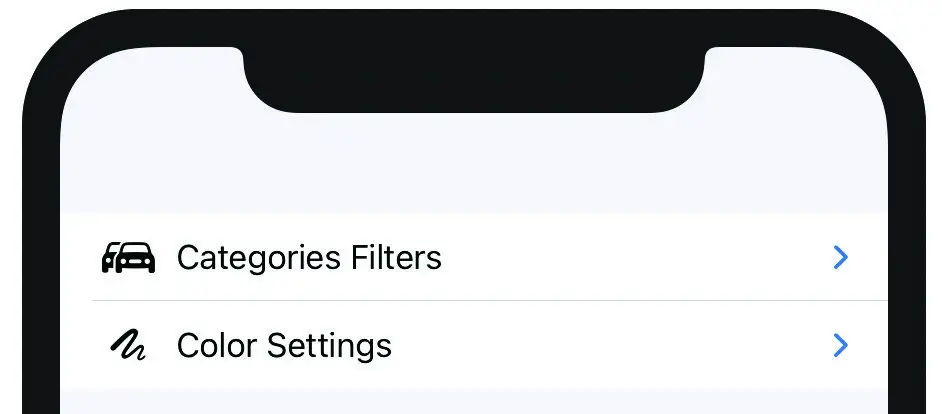
Figure 31-6
|
You are reading a sample chapter from an old edition of iOS App Development Essentials. Purchase the fully updated iOS 18 App Development Essentials book. The full book contains 71 chapters, over 612 pages of in-depth information, downloadable source code, and access to over 50 SwiftUI knowledge test quizzes. |
Switch into Live Preview mode and verify that the disclosure controls can be used to expand and collapse the two groups of settings:
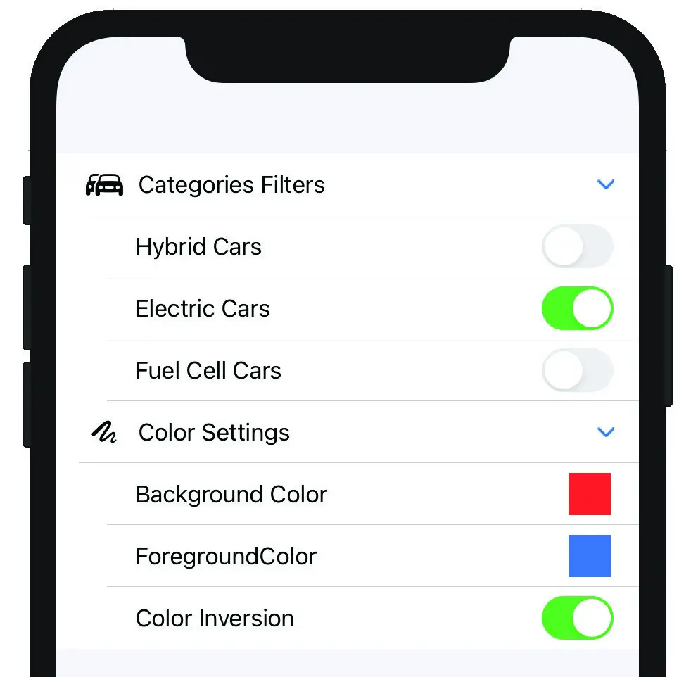
Figure 31-7
By default, disclosure groups are initially collapsed when displayed. To configure a group to appear in expanded mode, simply pass through a Boolean value to the DisclosureGroup declaration. The following code changes, for example, will cause the Category Filters section of the settings form to expand on initialization:
.
.
@State private var filtersExpanded: Bool = true

var body: some View {

    Form {
        DisclosureGroup(isExpanded: $filtersExpanded) {
            ToggleControl(title: "Hybrid Cars", state: hybridState)
            ToggleControl(title: "Electric Cars", state: electricState)
            ToggleControl(title: "Fuel Cell Cars", state: fuelCellState)
        } label : {
            Label("Categories Filters", systemImage: "car.2.fill")
        }
.
.Code language: Swift (swift)
Using Live Preview again, ensure that the category filters group is expanded when the user interface first appears.
Summary
The List and OutlineGroup views provide an easy way to group and display hierarchical information to users with minimal coding. The DisclosureGroup view is used by these views to allow users to expand and collapse sections of information, and may also be used directly in your own SwiftUI declarations. This chapter has demonstrated these views in action within an example project.
|
You are reading a sample chapter from an old edition of iOS App Development Essentials. Purchase the fully updated iOS 18 App Development Essentials book. The full book contains 71 chapters, over 612 pages of in-depth information, downloadable source code, and access to over 50 SwiftUI knowledge test quizzes. |