
The preceding chapters explored the use of the SwiftUI List view to display information to users in an ordered manner. Lists provide a way to present large amounts of information to the user in a navigable and scrollable format.
The features of the List covered so far, however, have not introduced any way to display hierarchical information within a list other than displaying an entirely new screen to the user in response to list item selections. A standard list also has the potential to overwhelm the user with options through which to scroll, with no way to hide subgroups of items to ease navigation.
In this chapter, we will explore some features that were introduced into SwiftUI with iOS 14 which address these issues, including some enhancements to the List view together with the OutlineGroup and DisclosureGroup views. Once these topics have been covered, the next chapter entitled “A SwiftUI List, OutlineGroup and DisclosureGroup Tutorial” will demonstrate practical use of these views.
Hierarchical Data and Disclosures
In keeping with the automotive theme adopted in the previous chapter, consider an app required to present the user with the hierarchical data illustrated in Figure 30-1:
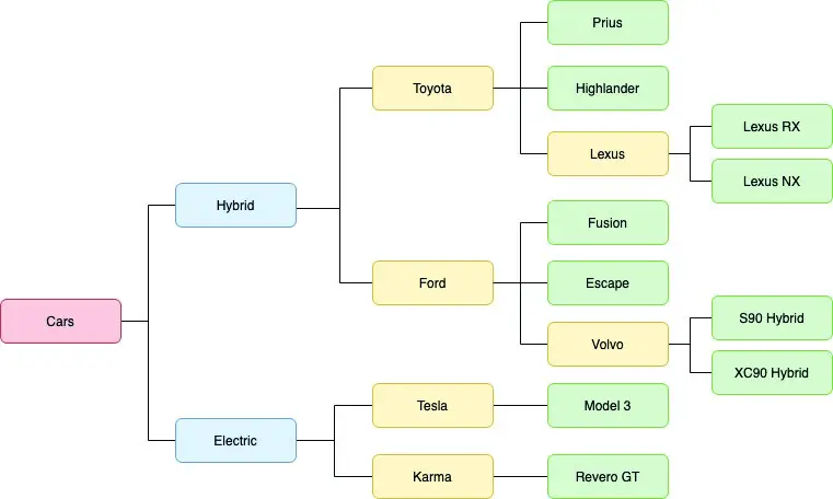
Figure 30-1
 |
You are reading a sample chapter from an old edition of iOS App Development Essentials. Purchase the fully updated iOS 18 App Development Essentials book. The full book contains 71 chapters, over 612 pages of in-depth information, downloadable source code, and access to over 50 SwiftUI knowledge test quizzes. |
When designing such an app, one option would be to begin with a List containing only the two categories of car (Hybrid and Electric), presenting each subsequent layer of data on separate screens. A typical path through such a user interface might involve selecting the Hybrid category to navigate to a list containing the two hybrid car manufacturers, within which selecting Toyota would display a third screen containing the two hybrid models together with a selectable entry to display the hybrid models manufactured by Toyota’s Lexus sub-brand. Having viewed the Lexus hybrid models, the user would then need to navigate back through multiple list levels to be able to navigate to view Tesla electric vehicles.
Clearly a better option would be to display the information hierarchically within a single list, allowing the user to hide and show different sections of the hierarchy. Fortunately, this can be achieved using the List and OutlineGroup SwiftUI components.
Hierarchies and Disclosure in SwiftUI Lists
The previous chapter demonstrated the use of the List component to display so called “flat”, non-hierarchical data to the user. In fact, the List component can also present hierarchically structured data. It does this by traversing the data to identify the child elements in a data structure, and then presenting the resulting hierarchy visually. Figure 30-2 for example, shows the hierarchical data illustrated in Figure 30-1 above presented within a List view:
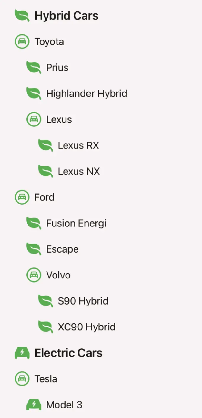
Figure 30-2
Clearly, this provides a better way to present the data to the user without having to traverse multiple depths of list navigation. Note also that disclosure controls are provided in the list to hide and show individual branches of data. Figure 30-3, for example, shows how the disclosure controls (highlighted) have been used to collapse the Toyota, Volvo and electric car data branches:
|
You are reading a sample chapter from an old edition of iOS App Development Essentials. Purchase the fully updated iOS 18 App Development Essentials book. The full book contains 71 chapters, over 612 pages of in-depth information, downloadable source code, and access to over 50 SwiftUI knowledge test quizzes. |
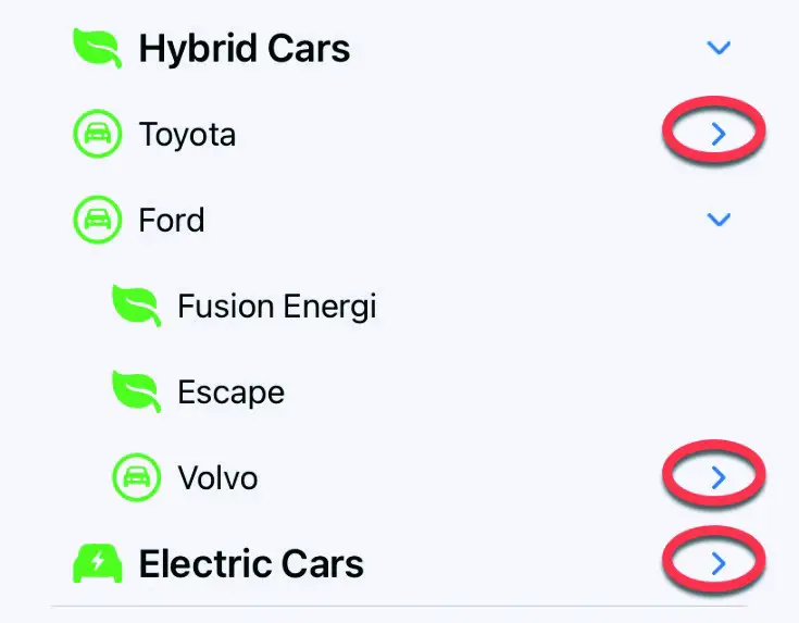
Figure 30-3
Clicking on a collapsed disclosure control will expand the corresponding section of the tree so that it is once again visible.
Assuming that the data to be displayed is correctly structured (an example data structure will be used in the chapter entitled “A SwiftUI List, OutlineGroup and DisclosureGroup Tutorial”), the above example was rendered with the following simple SwiftUI declaration:
struct ContentView: View {
    var body: some View {
        List(carItems, children: \.children) { item in
            HStack {
                Image(systemName: item.image)
                    .resizable()
                    .scaledToFit()
                    .frame(width: 25, height: 25)
                    .foregroundColor(.green)

                Text(item.name)
                    .font(.system(.title3, design: .rounded))
                    .bold()
            }
        }.listStyle(SidebarListStyle())
    }
}Code language: Swift (swift)
All that was required to enable this behavior was to pass through the data structure (carItems in the above example) to the List view together with a keypath to the children, and then iterate through each item.
Using OutlineGroup
Behind the scenes of the above example, the List view is making use of the OutlineGroup view. When used directly, OutlineGroup provides the same basic functionality such as automatically traversing the data tree structure and providing disclosure controls, but with greater control in terms of customizing the display of the data, particularly in terms of organizing data into groups.
|
You are reading a sample chapter from an old edition of iOS App Development Essentials. Purchase the fully updated iOS 18 App Development Essentials book. The full book contains 71 chapters, over 612 pages of in-depth information, downloadable source code, and access to over 50 SwiftUI knowledge test quizzes. |
Figure 30-4, for example, shows the same car data displayed using OutlineGroup within a List to categorize the data into sections titled Hybrid Cars and Electric cars:
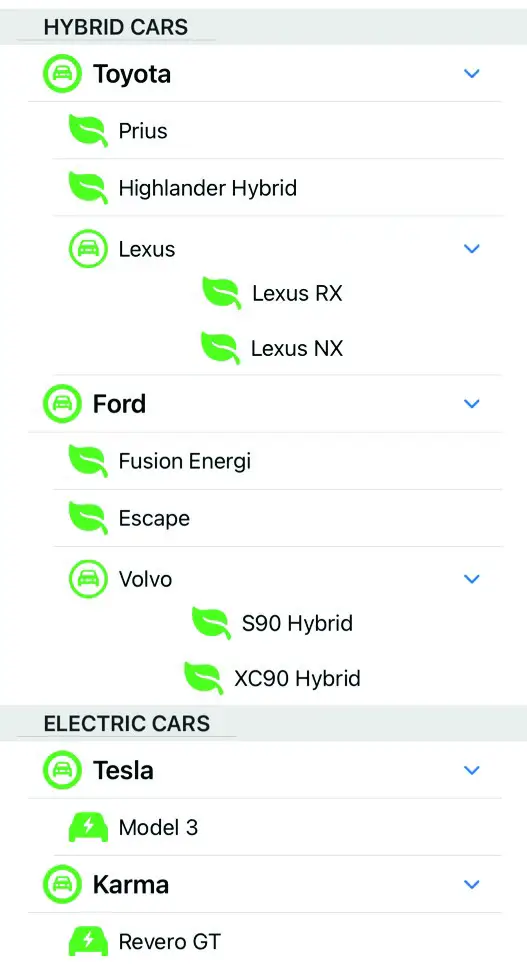
Figure 30-4
The SwiftUI declaration to create and implement the above display using the same car data reads as follows:
struct ContentView: View {
    var body: some View {
        List {
                ForEach(carItems) { carItem in
                    Section(header: Text(carItem.name)) {
                        OutlineGroup(carItem.children ?? [Car](),
                                     children: \.children) { child in

                            HStack {
                                Image(systemName: child.image)
                                    .resizable()
                                    .scaledToFit()
                                    .frame(width: 30, height: 30)
                                    .foregroundColor(.green)
                                Text(child.name)
                            }
                        }
                    }
                }
            }
    }
}Code language: Swift (swift)
In the above example, the OutlineGroup is embedded within a List view. This is not a requirement for using OutlineGroup but results in a more visually pleasing result when the view is rendered.
Using DisclosureGroup
The disclosure behavior outlined in the previous sections are implemented in the background using the DisclosureGroup view which is also available for use directly in SwiftUI-based apps to allow the user to hide and show non-structured items in a layout. The DisclosureGroup view is particularly useful when used in conjunction with the Form view.
|
You are reading a sample chapter from an old edition of iOS App Development Essentials. Purchase the fully updated iOS 18 App Development Essentials book. The full book contains 71 chapters, over 612 pages of in-depth information, downloadable source code, and access to over 50 SwiftUI knowledge test quizzes. |
Consider, for example, the following Form based layout:
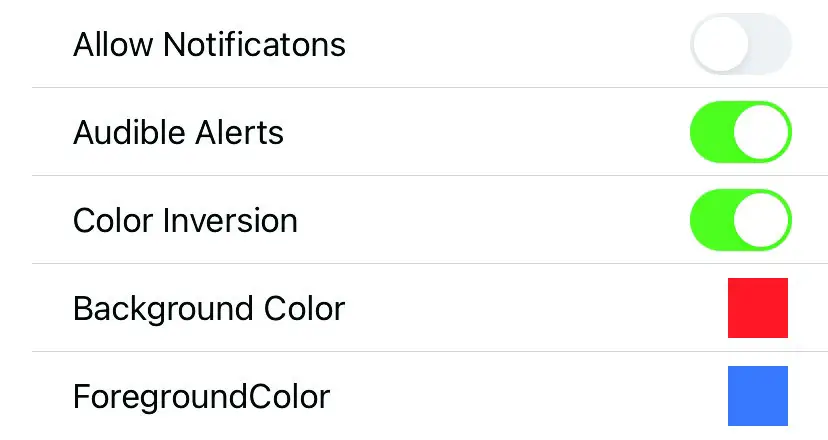
Figure 30-5
The above screen shows part of the settings screen for an app, the SwiftUI declaration for which reads as follows:
Form {
    Toggle("Allow Notificatons", isOn: $stateOne)
        .padding(.leading)
        Toggle("Audible Alerts", isOn: $stateTwo)
            .padding(.leading)
        Toggle("Color Inversion", isOn: $stateThree)
            .padding(.leading)
        ColorControl(color: .red, label: "Background Color")
        ColorControl(color: .blue, label: "ForegroundColor")
}Code language: Swift (swift)
The form has been implemented without consideration to grouping items into categories and, while this may be manageable with just five entries, this screen could become difficult to navigate with larger numbers of items. Using DisclosureGroups, the form might be better organized as shown in Figure 30-6:
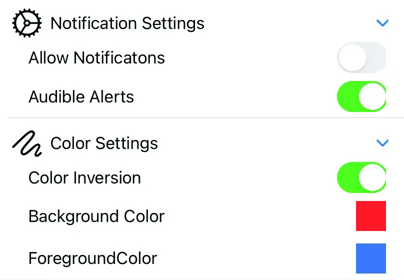
Figure 30-6
|
You are reading a sample chapter from an old edition of iOS App Development Essentials. Purchase the fully updated iOS 18 App Development Essentials book. The full book contains 71 chapters, over 612 pages of in-depth information, downloadable source code, and access to over 50 SwiftUI knowledge test quizzes. |
In this scenario, the form is divided into groups which can be expanded and collapsed using the embedded disclosure controls.
DisclosureGroups are declared using the following syntax:
DisclosureGroup(isExpanded: $controlsVisible) {
        // Content Views go here
        } label: {
            Label("Some Text", systemImage: "gear")
        }Code language: Swift (swift)
Note that the DisclosureGroup accepts an optional trailing closure for declaring the label to appear above the content views. The above example uses a Label view, though this could be any combination of views. The Boolean isExpanded argument is also optional and can be used to control whether the group is expanded when first displayed.
The declaration for the form shown in Figure 30-5 above, might read as follows:
Form {
    DisclosureGroup {
        Toggle("Allow Notificatons", isOn: $stateOne)
            .padding(.leading)
        Toggle("Audible Alerts", isOn: $stateTwo)
            .padding(.leading)
    } label: {
        Label("Notification Settings", systemImage: "gear")
    }
        DisclosureGroup {
            Toggle("Color Inversion", isOn: $stateThree)
                .padding(.leading)
            ColorControl(color: .red, label: "Background Color")
            ColorControl(color: .blue, label: "ForegroundColor")
        } label: {
            Label("Color Settings", systemImage: "scribble")
        }
}Code language: Swift (swift)
Summary
This chapter has introduced the hierarchical data support and disclosure features of the List, OutlineGroup and DisclosureGroup views included with SwiftUI. The List and OutlineGroup views allow hierarchical data to be displayed to the user with just a few lines of code with disclosure controls provided to allow the user to expand and collapse sections of the hierarchy. These disclosure controls are provided by the DisclosureGroup view which may also be used directly within your own SwiftUI view layouts.
|
You are reading a sample chapter from an old edition of iOS App Development Essentials. Purchase the fully updated iOS 18 App Development Essentials book. The full book contains 71 chapters, over 612 pages of in-depth information, downloadable source code, and access to over 50 SwiftUI knowledge test quizzes. |