
The chapter entitled Jetpack Compose Row and Column Layouts used the Row and Column composables to present content elements uniformly within a user interface. One limitation of Row and Column-based layouts is that they are not well suited to organizing dynamic elements in terms of the quantity and sizes of the content. These composables are also less effective when designing layouts that are responsive to device screen orientation and size changes.
In this chapter, we will learn about the Flow layout composables and explore how they provide a more flexible way to organize content in rows and columns.
FlowColumn and FlowRow
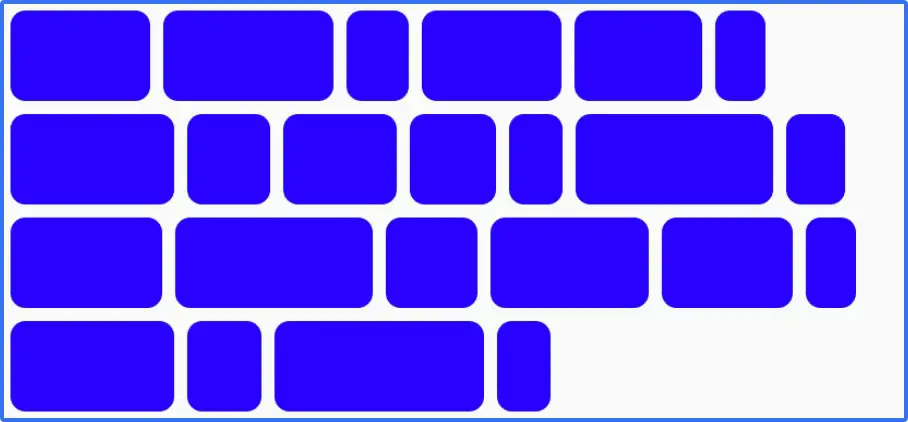
The Row and Column composables work best when you know the number of items to be displayed and their respective sizes. This results in a spreadsheet-like layout with rows of aligned columns. The Flow layouts, however, are designed to flow content onto the next row or column when space runs out. These composables also discard the spreadsheet approach to organization, providing a more flexible approach to displaying items of varying sizes. Figure 28-1, for example, shows a typical FlowRow layout:
As we will explore later in this chapter, Flow layouts provide extensive options for configuring the layout and arrangement of child items, including weight, spacing, alignment, and the maximum number of items per row or column.
The FlowRow composable uses the following syntax:
FlowRow(
modifier: Modifier = Modifier,
horizontalArrangement: Arrangement.Horizontal,
verticalArrangement: Arrangement.Vertical,
maxItemsInEachRow: Int
) {
// Content here
}
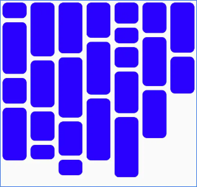
Code language: Kotlin (kotlin)Figure 28-2 shows an example FlowColumn layout:
The FlowColumn composable uses the following syntax:
FlowColumn(
    modifier: Modifier,
    verticalArrangement: Arrangement.Vertical,
    horizontalArrangement: Arrangement.Horizontal,
    maxItemsInEachColumn: Int,
) {
    // Content here
}Code language: Kotlin (kotlin)
Maximum number of items
Without restrictions, the Flow layouts will fit as many items into a row or column as possible before flowing to the next one. The maximum number of items can be restricted using the maxItemsInEachColumn and maxItemsInEachRow properties of the FlowColumn and FlowRow. For example:
FlowRow(maxItemsInEachRow = 10) {
    // Flow items here
}

FlowColumn(maxItemsInEachColumn = 5) {
    // Flow items here
}Code language: Kotlin (kotlin)
Working with main axis arrangement
Main axis arrangement defines how the flow items are positioned along the main axis of the parent Flow layout. For example, the horizontalArrangement property controls the arrangement of flow items along the horizontal axis of the FlowRow composable. Table 28-4 shows the effects of the various horizontalArrangement options when applied to a FlowRow instance:


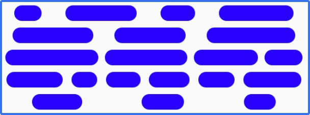
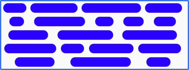
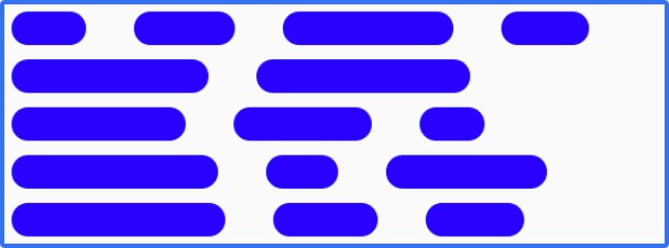
Table 28-4
Similarly, the verticalArrangement property controls the positioning of flow items along the vertical access of the FlowColumn. The same arrangement options are available as those listed above, except that Arrangement.Start and Arrangement.End are replaced by Arrangement.Top and Arrangement.Bottom.
Understanding cross-axis arrangement
Cross-axis arrangement controls the arrangement of a flow layout on the opposite axis to the main flow. In other words, the verticalArrangement property controls the vertical positioning of FlowRow items, while horizontalArrangement does the same along the horizontal axis of FlowColumn items. Table 28-5 demonstrates the three horizontalArrangement options applied to a FlowColumn instance:
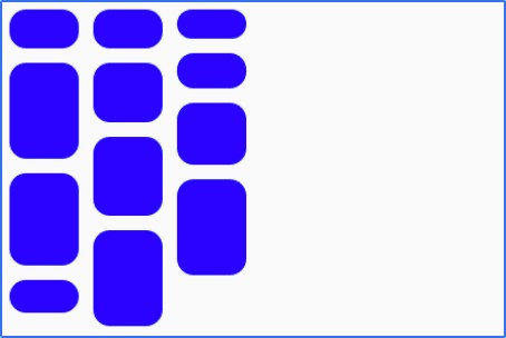
Table 28-5
Item alignment
The alignment of items within individual rows or columns can be controlled by passing an alignment value to the align() modifier of the child items of a Flow layout. This is useful when the Flow items vary in height (FlowRow) or width (FlowColumn). The following code, for example, specifies bottom alignment for a FlowRow item:
FlowRow {
	repeat(6) {
            MyFlowItem(modifier = Modifier.align(Alignment.Bottom))
       }
}Code language: Kotlin (kotlin)
The following table illustrates the effect of applying Alignment.Top, Alignment.CenterVertically, and Alignment. Bottom to FlowRow items of varying height:
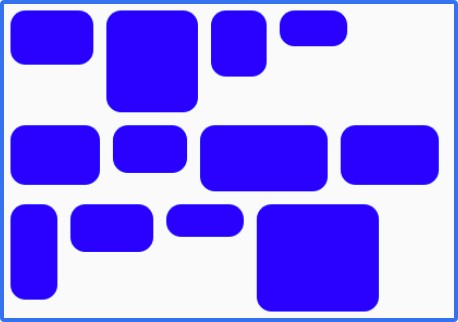
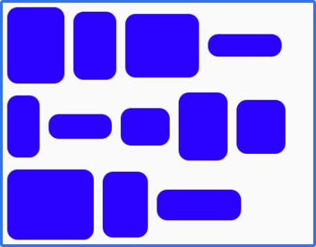
Table 28-6
Equivalent alignment effects can be achieved for FlowColumn items using Alignment.Start, Alignment. CenterHorizontally, and Alignment.End
Controlling item size
Weight factors can be applied to individual Flow items to specify the size relative to the overall space available and the weights of other items in the same row or column. Weights are expressed as Float values and applied to individual Flow items using the weight() modifier. Consider, for example, a FlowRow containing a single item with a weight of 1f:
FlowRow {
    MyFlowItem(
        Modifier
            .weight(1f)
        )
}Code language: Kotlin (kotlin)
When the layout is rendered, the item will occupy all the available space because it is the only item in the row:

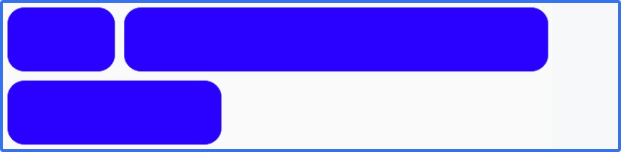
If we add a second item, also with a weight of 1f, the two items will share the row equally:

If we add a third item with a weight of 1f, each item would occupy a third of the space. However, suppose that the third item has a weight of 2f, giving us a weight combination of 1f, 1f, and 2f. In this case, the first two items occupy half of the available space, while the third occupies the other half:

To calculate the size for an item when using weights, the Flow composables divide the amount of space remaining in the row or column by the total item weights, multiplied by the weight of the current item.
Another way to control the size of the items in a Flow layout is to use fractional sizing. Fractional sizing involves specifying the percentage of the overall space in a row or column that an item is to occupy. The fraction is declared as a Float value and applied to FlowRow and FlowColumn items using the fillMaxWidth() and fillMaxHeight() modifiers, respectively. For example:
FlowRow {
    MyFlowItem(Modifier.width(50.dp))
    MyFlowItem(Modifier.fillMaxWidth(0.7f))
    MyFlowItem(Modifier.width(50.dp))
}Code language: Kotlin (kotlin)
Regardless of the sizes of the other items, the fractional item in the above code example will always occupy 70% of the row:

If there is insufficient room for the fractional item, items will flow onto the next row to make room:
Summary
The FlowRow and FlowColumn composables are ideal for arranging groups of items of varying sizes and quantities into flexible rows and columns. When a Flow layout runs out of space to display items, the remaining content flows to the next row or column. Combined with an extensive collection of alignment, spacing, and arrangement options, these composables provide a flexible and easy layout solution for presenting content within apps.