
Now that we have an understanding of the Compose Row and Column composables, we will move on to look at the third layout type provided by Compose in the form of the Box component. This chapter will introduce the Box layout and explore some of the key parameters and modifiers that are available when designing user interface layouts.
An introduction to the Box composable
Unlike the Row and Column which organize children in a horizontal row or vertical column, the Box layout stacks its children on top of each other. The stacking order is defined by the order in which the children are called within the Box declaration, with the first child positioned at the bottom of the stack. As with the Row and Column layouts, Box is provided with several parameters and modifiers that can be used to customize the layout.
Creating the BoxLayout project
Begin by launching Android Studio and, if necessary, closing any currently open projects using the File -> Close Project menu option so that the Welcome screen appears.
Select the New Project option from the welcome screen and, when the new project dialog appears, choose the Empty Compose Activity template before clicking on the Next button.
Enter BoxLayout into the Name field and specify com.example.boxlayout as the package name. Before clicking on the Finish button, change the Minimum API level setting to API 26: Android 8.0 (Oreo). On completion of the project creation process, the BoxLayout project should be listed in the Project tool window located along the left-hand edge of the Android Studio main window.
 |
You are reading a sample chapter from an old edition of the Jetpack Compose Essentials book. Purchase the fully updated Jetpack Compose 1.7 Essentials edition of this book in eBook or Print format. The full book contains 67 chapters and over 700 pages of in-depth information. Buy the full book now in Print or eBook format. Learn more. |
Within the MainActivity.kt file, delete the Greeting function and add a new empty composable named MainScreen:
@Composable
fun MainScreen() {

}Code language: Kotlin (kotlin)
Next, change the onCreateActivity() method and DefaultPreview function to call MainScreen instead of Greeting.
Adding the TextCell composable
In this chapter, we will once again use our TextCell composable, though to best demonstrate the features of the Box layout, we will modify the declaration slightly so that it can be passed an optional font size when called. Remaining within the MainActivity.kt file, add this composable function so that it reads as follows:
.
.
import androidx.compose.foundation.border
import androidx.compose.foundation.layout.padding
import androidx.compose.ui.graphics.Color
import androidx.compose.ui.text.font.FontWeight
import androidx.compose.ui.text.style.TextAlign
import androidx.compose.ui.unit.dp
import androidx.compose.ui.unit.sp
.
.
@Composable
fun TextCell(text: String, modifier: Modifier = Modifier,  fontSize: Int = 150 ) {

    val cellModifier = Modifier
        .padding(4.dp)
        .border(width = 5.dp, color = Color.Black)

    Text(
        text = text, cellModifier.then(modifier),
        fontSize = fontSize.sp,
        fontWeight = FontWeight.Bold,
        textAlign = TextAlign.Center
    )
}Code language: Kotlin (kotlin)
Adding a Box layout
Next, modify the MainScreen function to include a Box layout with three TextCell children:
.
.
import androidx.compose.foundation.layout.Box
import androidx.compose.foundation.layout.size
.
.
@Composable
fun MainScreen() {
    Box {
        val height = 200.dp
        val width = 200.dp

        TextCell("1", Modifier.size(width = width, height = height))
        TextCell("2", Modifier.size(width = width, height = height))
        TextCell("3", Modifier.size(width = width, height = height))
    }
}Code language: Kotlin (kotlin)
After modifying the function, update the Preview panel to reflect these latest changes. Once the layout appears it should resemble Figure 26-1:
|
You are reading a sample chapter from an old edition of the Jetpack Compose Essentials book. Purchase the fully updated Jetpack Compose 1.7 Essentials edition of this book in eBook or Print format. The full book contains 67 chapters and over 700 pages of in-depth information. Buy the full book now in Print or eBook format. Learn more. |
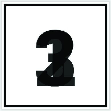
Figure 26-1
The transparent nature of the Text composable allows us to see that the three children have, indeed, been stacked directly on top of each other. While this transparency is useful to show that the children have been stacked, this isn’t the behavior we are looking for in this example. To give the TextCell an opaque background, we need to call the Text composable from within a Surface component. To achieve this, edit the TextCell function so that it now reads as follows:
@Composable
fun TextCell(text: String, modifier: Modifier = Modifier,  fontSize: Int = 150 ) {
.
.
    Surface {
        Text(
            text = text, cellModifier.then(modifier),
            fontSize = fontSize.sp,
            fontWeight = FontWeight.Bold,
            textAlign = TextAlign.Center
        )
    }
}Code language: Kotlin (kotlin)
When the preview is updated, only the last composable to be called by the Box will be visible because it is the uppermost child of the stack.
Box alignment
The Box composable includes support for an alignment parameter to customize the positioning of the group of children within the content area of the box. The parameter is named contentAlignment and may be set to any one of the following values:
- Alignment.TopStart
- Alignment.TopCenter
- Alignment.TopEnd
- Alignment.CenterStart
- Alignment.Center
- Alignment.CenterEnd
- Alignment.BottomCenter
- Alignment.BottomEnd
- Alignment.BottomStart
The diagram in Figure 26-2 illustrates the positioning of the Box content for each of the above settings:
|
You are reading a sample chapter from an old edition of the Jetpack Compose Essentials book. Purchase the fully updated Jetpack Compose 1.7 Essentials edition of this book in eBook or Print format. The full book contains 67 chapters and over 700 pages of in-depth information. Buy the full book now in Print or eBook format. Learn more. |
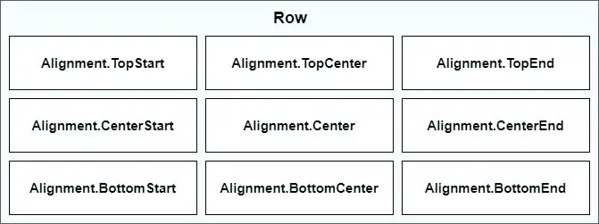
Figure 26-2
To try out some of these alignments options, edit the Box declaration in the MainScreen function both to increase its size and to add a contentAlignment parameter:
.
.
import androidx.compose.ui.Alignment
.
.
@Composable
fun MainScreen() {
.
.
    Box(contentAlignment = Alignment.CenterEnd,
               modifier = Modifier.size(400.dp, 400.dp)) {
        val height = 200.dp
        val width = 200.dp
        TextCell("1", Modifier.size(width = width, height = height))
        TextCell("2", Modifier.size(width = width, height = height))
        TextCell("3", Modifier.size(width = width, height = height))
    }
}Code language: Kotlin (kotlin)
Refresh the preview and verify that the Box content now appears at the CenterEnd position within the Box content area:
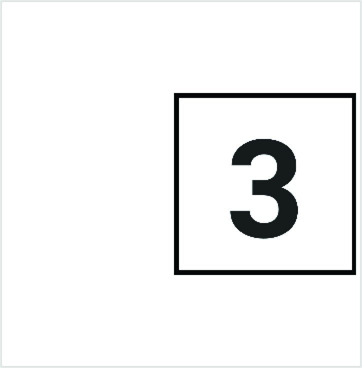
Figure 26-3
BoxScope modifiers
In the chapter entitled Jetpack Compose Row and Column Layouts, we introduced ColumnScope and RowScope and explored how these provide additional modifiers that can be applied individually to child components. In the case of the Box layout, the following BoxScope modifiers are available to be applied to child composables:
|
You are reading a sample chapter from an old edition of the Jetpack Compose Essentials book. Purchase the fully updated Jetpack Compose 1.7 Essentials edition of this book in eBook or Print format. The full book contains 67 chapters and over 700 pages of in-depth information. Buy the full book now in Print or eBook format. Learn more. |
- align() – Aligns the child within the Box content area using the specified Alignment value.
- matchParentSize() – Sizes the child on which the modifier is applied to match the size of the parent Box.
The set of Alignment values accepted by the align modifier is the same as those listed above for Box alignment. The following changes to the MainScreen function demonstrate the align() modifier in action:
@Composable
fun MainScreen() {
.
.
    Box(modifier = Modifier.size(height = 90.dp, width = 290.dp)) {
        Text("TopStart", Modifier.align(Alignment.TopStart))
        Text("TopCenter", Modifier.align(Alignment.TopCenter))
        Text("TopEnd", Modifier.align(Alignment.TopEnd))

        Text("CenterStart", Modifier.align(Alignment.CenterStart))
        Text("Center", Modifier.align(Alignment.Center))
        Text(text = "CenterEnd", Modifier.align(Alignment.CenterEnd))

        Text("BottomStart", Modifier.align(Alignment.BottomStart))
        Text("BottomCenter", Modifier.align(Alignment.BottomCenter))
        Text("BottomEnd", Modifier.align(Alignment.BottomEnd))
    }
}Code language: Kotlin (kotlin)
When previewed, the above Box layout will appear as shown in Figure 26-4 below:
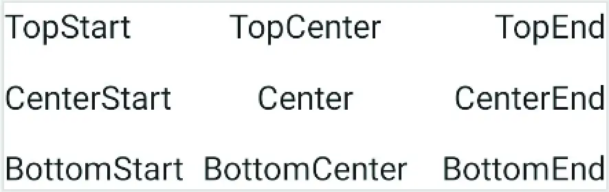
Figure 26-4
Using the clip() modifier
The compose clip() modifier allows composables to be rendered to conform to specific shapes. Though not specific to Box, the Box component provides perhaps the best example of clipping shapes. To define the shape of a composable, the clip() modifier is called and passed a Shape value which can be RectangleShape, CircleShape, RoundedCornerShape, or CutCornerShape.
The following code, for example, draws a Box clipped to appear as a circle:
|
You are reading a sample chapter from an old edition of the Jetpack Compose Essentials book. Purchase the fully updated Jetpack Compose 1.7 Essentials edition of this book in eBook or Print format. The full book contains 67 chapters and over 700 pages of in-depth information. Buy the full book now in Print or eBook format. Learn more. |
.
.
import androidx.compose.foundation.background
import androidx.compose.ui.draw.clip
import androidx.compose.foundation.shape.CircleShape
.
.
Box(Modifier.size(200.dp).clip(CircleShape).background(Color.Blue))
.
.Code language: Kotlin (kotlin)
When rendered, the Box will appear as shown in Figure 26-5:
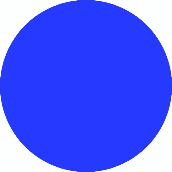
Figure 26-5
To draw a composable with rounded corners call RoundedCornerShape, passing through the radius for each corner. If a single radius value is provided it will be applied to all four corners:
.
.
import androidx.compose.foundation.shape.RoundedCornerShape
.
.
Box(Modifier.size(200.dp).clip(RoundedCornerShape(30.dp)).background(Color.Blue))Code language: Kotlin (kotlin)
The above composable will appear as shown below:
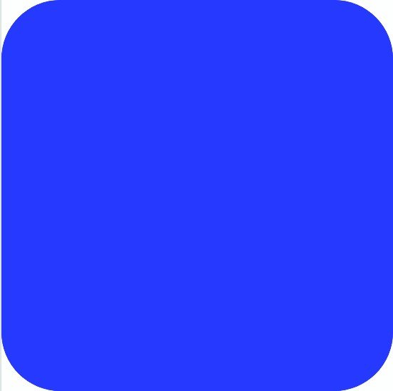
Figure 26-6
|
You are reading a sample chapter from an old edition of the Jetpack Compose Essentials book. Purchase the fully updated Jetpack Compose 1.7 Essentials edition of this book in eBook or Print format. The full book contains 67 chapters and over 700 pages of in-depth information. Buy the full book now in Print or eBook format. Learn more. |
As an alternative to rounded corners, composables may also be rendered with cut corners. In this case, CutCornerShape is passed the cut length for the corners. Once again different values may be specified for each corner, or all corners cut equally with a single length parameter:
.
.
import androidx.compose.foundation.shape.CutCornerShape
.
.
Box(Modifier.size(200.dp).clip(CutCornerShape(30.dp)).background(Color.Blue))
.
.Code language: Kotlin (kotlin)
The following figure shows the Box rendered by the above code:
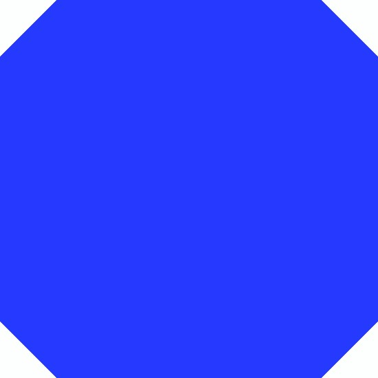
Figure 26-7
Summary
The Compose Box layout positions all of its children on top of each other in a stack arrangement with the first child positioned at the bottom of the stack. By default, this stack will be positioned in the top left-hand corner of the content area, though this can be changed using the contentAlignment parameter when calling the Box composable.
Direct children of a Box layout have access to additional modifiers via RowScope. These modifiers allow individual children to be positioned independently within the Box content using a collection of nine pre-defined position settings.
|
You are reading a sample chapter from an old edition of the Jetpack Compose Essentials book. Purchase the fully updated Jetpack Compose 1.7 Essentials edition of this book in eBook or Print format. The full book contains 67 chapters and over 700 pages of in-depth information. Buy the full book now in Print or eBook format. Learn more. |