
User interface design is largely a matter of selecting the appropriate interface components, deciding how those views will be positioned on the screen, and then implementing navigation between the different screens of the app.
As is to be expected, Compose includes a wide range of user interface components for use when developing an app. Compose also provides a set of layout composables to define both how the user interface is organized and how the layout responds to factors such as changes in screen orientation and size.
This chapter will introduce the Row and Column composables included with Compose and explain how these can be used to create user interface designs with relative ease.
Creating the RowColDemo project
Launch Android Studio and select the New Project option from the welcome screen. Within the resulting new project dialog, choose the Empty Compose Activity template before clicking on the Next button.
Enter RowColDemo into the Name field and specify com.example.rowcoldemo as the package name. Before clicking on the Finish button, change the Minimum API level setting to API 26: Android 8.0 (Oreo).
 |
You are reading a sample chapter from an old edition of the Jetpack Compose Essentials book. Purchase the fully updated Jetpack Compose 1.7 Essentials edition of this book in eBook or Print format. The full book contains 67 chapters and over 700 pages of in-depth information. Buy the full book now in Print or eBook format. Learn more. |
Within the MainActivity.kt file, delete the Greeting function and add a new empty composable named MainScreen:
@Composable
fun MainScreen() {

}Code language: Kotlin (kotlin)
Next, edit the onCreateActivity() method and DefaultPreview function to call MainScreen instead of Greeting. As we work through the examples in this chapter, row and column-based layouts will be built using instances of a custom component named TextCell which displays text within a black border with a small amount of padding to provide space between adjoining components. Before proceeding, add this function to the MainActivity.kt file as follows:
.
.
import androidx.compose.foundation.border
import androidx.compose.foundation.layout.padding
import androidx.compose.foundation.layout.*
import androidx.compose.ui.graphics.Color
import androidx.compose.ui.text.font.FontWeight
import androidx.compose.ui.text.style.TextAlign
import androidx.compose.ui.unit.dp
import androidx.compose.ui.unit.sp
.
.
@Composable
fun TextCell(text: String, modifier: Modifier = Modifier) {

    val cellModifier = Modifier
        .padding(4.dp)
        .size(100.dp, 100.dp)
        .border(width = 4.dp, color = Color.Black)

    Text(text = text, cellModifier.then(modifier),
                fontSize = 70.sp,
                fontWeight = FontWeight.Bold,
                textAlign = TextAlign.Center)
}Code language: Kotlin (kotlin)
Row composable
The Row composable, as the name suggests, lays out its children horizontally on the screen. For example, add a simple Row composable to the MainScreen function as follows:
.
.
@Composable
fun MainScreen() {
    Row {
        TextCell("1")
        TextCell("2")
        TextCell("3")
    }
}Code language: Kotlin (kotlin)
When rendered, the Row declared above will appear as illustrated in Figure 25-1 below:

Figure 25-1
|
You are reading a sample chapter from an old edition of the Jetpack Compose Essentials book. Purchase the fully updated Jetpack Compose 1.7 Essentials edition of this book in eBook or Print format. The full book contains 67 chapters and over 700 pages of in-depth information. Buy the full book now in Print or eBook format. Learn more. |
Column composable
The Column composable performs the same purpose as the Row with the exception that its children are arranged vertically. The following example places the same three composables within a Column:
.
.
@Composable
fun MainScreen() {
    Column {
        TextCell("1")
        TextCell("2")
        TextCell("3")
    }
}Code language: Kotlin (kotlin)
The rendered output from the code will appear as shown in Figure 25-2:
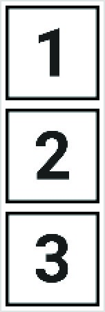
Figure 25-2
Combining Row and Column composables
Row and Column composables can, of course, be embedded within each other to create table style layouts. Try, for example, the following composition containing a mixture of embedded Row and Column layouts:
@Composable
fun MainScreen() {
    Column {
        Row {
            Column {
                TextCell("1")
                TextCell("2")
                TextCell("3")
            }

            Column {
                TextCell("4")
                TextCell("5")
                TextCell("6")
            }

            Column {
                TextCell("7")
                TextCell("8")
            }
        }

        Row {
            TextCell("9")
            TextCell("10")
            TextCell("11")
        }
    }
}Code language: Kotlin (kotlin)
Figure 25-3 illustrates the layout generated by the above code:
|
You are reading a sample chapter from an old edition of the Jetpack Compose Essentials book. Purchase the fully updated Jetpack Compose 1.7 Essentials edition of this book in eBook or Print format. The full book contains 67 chapters and over 700 pages of in-depth information. Buy the full book now in Print or eBook format. Learn more. |
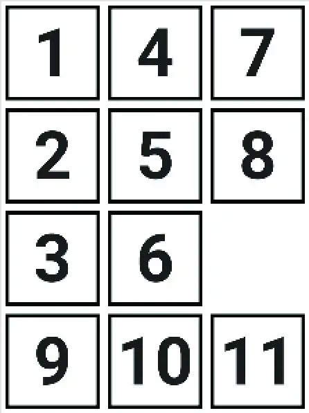
Figure 25-3
Using this technique, Row and Column layouts may be embedded within each other to achieve just about any level of layout complexity.
Layout alignment
Both the Row and Column composables will occupy an area of space within the user interface layout depending on child elements, other composables, and any size-related modifiers that may have been applied. By default, the group of child elements within a Row or Column will be aligned with the top left-hand corner of the content area (assuming the app is running on a device configured with a left-to-right reading locale). We can see this effect if we increase the size of our original example Row composable:
@Composable
fun MainScreen() {
    Row(modifier = Modifier.size(width = 400.dp, height = 200.dp)) {
        TextCell("1")
        TextCell("2")
        TextCell("3")
    }
}Code language: Kotlin (kotlin)
Before making this change, the Row was wrapping its children (in other words sizing itself to match the content). Now that the Row is larger than the content we can see that the default alignment has placed the children in the top left-hand corner of the Row component:
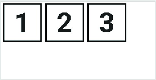
Figure 25-4
|
You are reading a sample chapter from an old edition of the Jetpack Compose Essentials book. Purchase the fully updated Jetpack Compose 1.7 Essentials edition of this book in eBook or Print format. The full book contains 67 chapters and over 700 pages of in-depth information. Buy the full book now in Print or eBook format. Learn more. |
This default alignment in the vertical axis may be changed by passing through a new value using the verticalAlignment parameter of the Row composable. For example, to position the children in the vertical center of the available space, the Alignment.CenterVertically value would be passed to the Row as follows:
.
.
import androidx.compose.ui.Alignment
.
.
@Composable
fun MainScreen() {
    Row(verticalAlignment = Alignment.CenterVertically,
        modifier = Modifier.size(width = 400.dp, height = 200.dp)) {
        TextCell("1")
        TextCell("2")
        TextCell("3")
    }
}Code language: Kotlin (kotlin)
This will cause the content to be positioned in the vertical center of the Row’s area as illustrated below:
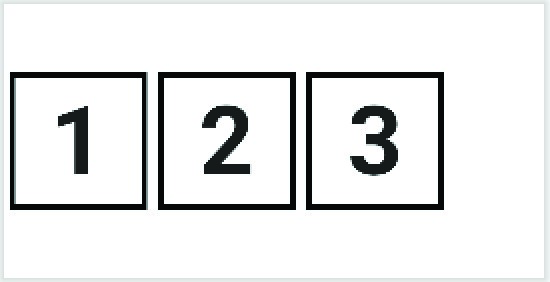
Figure 25-5
The following is a list of alignment values accepted by the Row vertical alignment parameter:
- Alignment.Top – Aligns the content at the top of the Row content area.
- Alignment.CenterVertically – Positions the content in the vertical center of the Row content area.
- Alignment.Bottom – Aligns the content at the bottom of the Row content area.
When working with the Column composable, the horizontalAlignment parameter is used to configure alignment along the horizontal axis. Acceptable values are as follows:
|
You are reading a sample chapter from an old edition of the Jetpack Compose Essentials book. Purchase the fully updated Jetpack Compose 1.7 Essentials edition of this book in eBook or Print format. The full book contains 67 chapters and over 700 pages of in-depth information. Buy the full book now in Print or eBook format. Learn more. |
- Alignment.Start – Aligns the content at the horizontal start of the Column content area.
- Alignment.CenterHorizontally – Positions the content in the horizontal center of the Column content area
- Alignment.End – Aligns the content at the horizontal end of the Column content area.
In the following example, the Column’s children have been aligned with the end of the Column content area:
@Composable
fun MainScreen() {
    Column(horizontalAlignment = Alignment.End,
           modifier = Modifier.width(250.dp)) {
        TextCell("1")
        TextCell("2")
        TextCell("3")
    }
}Code language: Kotlin (kotlin)
When rendered, the resulting column will appear as shown in Figure 25-6:
Figure 25-6
When working with alignment it is worth remembering that it works on the opposite axis to the flow of the containing composable. For example, while the Row organizes children horizontally, alignment operates on the vertical axis. Conversely, alignment operates on the horizontal axis for the Column composable while children are arranged vertically. The reason for emphasizing this point will become evident when we introduce arrangements.
Layout arrangement positioning
Unlike the alignment settings, arrangement controls child positioning along the same axis as the container (i.e. horizontally for Rows and vertically for Columns). Arrangement values are set on Row and Column instances using the horizontalArrangement and verticalArrangement parameters respectively. Arrangement properties can be categorized as influencing either position or child spacing.
|
You are reading a sample chapter from an old edition of the Jetpack Compose Essentials book. Purchase the fully updated Jetpack Compose 1.7 Essentials edition of this book in eBook or Print format. The full book contains 67 chapters and over 700 pages of in-depth information. Buy the full book now in Print or eBook format. Learn more. |
The following positional settings are available for the Row component via the horizontalArrangement parameter:
- Arrangement.Start – Aligns the content at the horizontal start of the Row content area.
- Arrangement.Center – Positions the content in the horizontal center of the Row content area.
- Arrangement.End – Aligns the content at the horizontal end of the Row content area. The above settings can be visualized as shown in Figure 25-7:
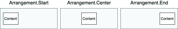
Figure 25-7
The Column composable, on the other hand, accepts the following values for the verticalArrangement parameter:
- Arrangement.Top – Aligns the content at the top of the Column content area.
- Arrangement.Center – Positions the content in the vertical center of the Column content area.
- Arrangement.Bottom – Aligns the content at the bottom of the Column content area. Figure 25-8 illustrates these verticalArrangement settings:
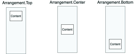
Figure 25-8
Using our example once again, the following change moves the child elements to the end of the Row content area:
|
You are reading a sample chapter from an old edition of the Jetpack Compose Essentials book. Purchase the fully updated Jetpack Compose 1.7 Essentials edition of this book in eBook or Print format. The full book contains 67 chapters and over 700 pages of in-depth information. Buy the full book now in Print or eBook format. Learn more. |
Row(horizontalArrangement = Arrangement.End,
        modifier = Modifier.size(width = 400.dp, height = 200.dp)) {
        TextCell("1")
        TextCell("2")
        TextCell("3")
}Code language: Kotlin (kotlin)
The above code will generate the following user interface layout:
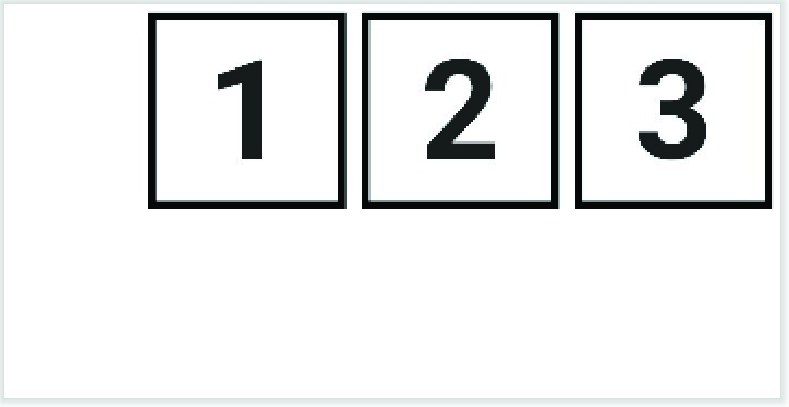
Figure 25-9
Similarly, the following positions child elements at the bottom of the containing Column:
Column(verticalArrangement = Arrangement.Bottom,
        modifier = Modifier.height(400.dp)) {
    TextCell("1")
    TextCell("2")
    TextCell("3")
}Code language: Kotlin (kotlin)
The above composable will render within the Preview panel as illustrated in Figure 25-10 below:
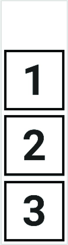
Figure 25-10
|
You are reading a sample chapter from an old edition of the Jetpack Compose Essentials book. Purchase the fully updated Jetpack Compose 1.7 Essentials edition of this book in eBook or Print format. The full book contains 67 chapters and over 700 pages of in-depth information. Buy the full book now in Print or eBook format. Learn more. |
Layout arrangement spacing
Arrangement spacing controls how the child components in a Row or Column are spaced across the content area. These settings are still defined using the horizontalArrangement and verticalArrangement parameters, but require one of the following values:
- Arrangement.SpaceEvenly – Children are spaced equally, including space before the first and after the last child.
- Arrangement.SpaceBetween – Children are spaced equally, with no space allocation before the first and after the last child.
- Arrangement.SpaceAround – Children are spaced equally, including half spacing before the first and after the last child.
In the following declaration, the children of a Row are positioned using the SpaceEvenly setting:
Row(horizontalArrangement = Arrangement.SpaceEvenly,
                     modifier = Modifier.width(1000.dp)) {
        TextCell("1")
        TextCell("2")
        TextCell("3")
}Code language: Kotlin (kotlin)
The above code gives us the following layout with equal gaps at the beginning and end of the row and between each child:
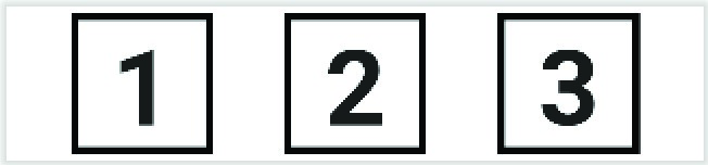
Figure 25-11
Figure 25-12, on the other hand, shows the same row configured with the SpaceBetween setting. Note that the row has no leading or trailing spacing:
|
You are reading a sample chapter from an old edition of the Jetpack Compose Essentials book. Purchase the fully updated Jetpack Compose 1.7 Essentials edition of this book in eBook or Print format. The full book contains 67 chapters and over 700 pages of in-depth information. Buy the full book now in Print or eBook format. Learn more. |

Figure 25-12
Finally, Figure 25-13 shows the effect of applying the SpaceAround setting which adds full spacing between children and half the spacing on the leading and trailing ends:
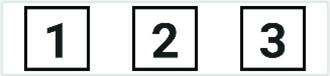
Figure 25-13
Row and Column scope modifiers
The children of a Row or Column are said to be within the scope of the parent. These two scopes (RowScope and ColumnScope) provide a set of additional modifier functions that can be applied to change the behavior and appearance of individual children within a Row or Column. The Android Studio code editor provides a visual indicator when children are within a scope. In Figure 25-14, for example, the editor indicates that the RowScope modifier functions are available to the three child composables:
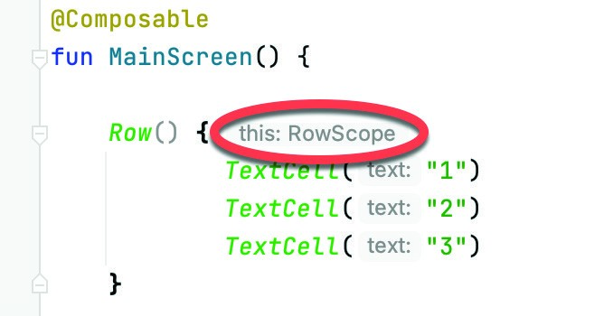
Figure 25-14
|
You are reading a sample chapter from an old edition of the Jetpack Compose Essentials book. Purchase the fully updated Jetpack Compose 1.7 Essentials edition of this book in eBook or Print format. The full book contains 67 chapters and over 700 pages of in-depth information. Buy the full book now in Print or eBook format. Learn more. |
When working with the Column composable, a similar ColumnScope indicator will appear.
ColumnScope includes the following modifiers for controlling the position of child components:
- Modifier.align() – Allows the child to be aligned horizontally using Alignment.CenterHorizontally, Alignment. Start, and Alignment.End values.
- Modifier.alignBy() – Aligns a child horizontally with other siblings on which the alignBy() modifier has also been applied.
- Modifier.weight() – Sets the height of the child relative to the weight values assigned to its siblings.
RowScope provides the following additional modifier functions to Row children:
- Modifier.align() – Allows the child to be aligned vertically using Alignment.CenterVertically, Alignment.Top, and Alignment.Bottom values.
- Modifier.alignBy() – Aligns a child with other siblings on which the alignBy() modifier has also been applied. Alignment may be performed by baseline or using custom alignment line configurations.
- Modifier.alignByBaseline() – Aligns the baseline of a child with any siblings that have also been configured by either the alignBy() or alignByBaseline() modifier.
- Modifier.paddingFrom() – Allows padding to be added to the alignment line of a child.
- Modifier.weight() – Sets the width of the child relative to the weight values assigned to its siblings.
The following Row declaration, for example, sets different alignments on each of the three TextCell children:
Row(modifier = Modifier.height(300.dp)) {
    TextCell("1", Modifier.align(Alignment.Top))
    TextCell("2", Modifier.align(Alignment.CenterVertically))
    TextCell("3", Modifier.align(Alignment.Bottom))
}Code language: Kotlin (kotlin)
When previewed, this will generate a layout resembling Figure 25-15:
|
You are reading a sample chapter from an old edition of the Jetpack Compose Essentials book. Purchase the fully updated Jetpack Compose 1.7 Essentials edition of this book in eBook or Print format. The full book contains 67 chapters and over 700 pages of in-depth information. Buy the full book now in Print or eBook format. Learn more. |
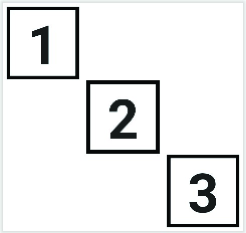
Figure 25-15
The baseline alignment options are especially useful for aligning text content with differing font sizes. Consider, for example, the following Row configuration:
Row {
  Text(
      text = "Large Text",
      fontSize = 40.sp,
      fontWeight = FontWeight.Bold
  )
  Text(
      text = "Small Text",
      fontSize = 32.sp,
      fontWeight = FontWeight.Bold
  )
}Code language: Kotlin (kotlin)
This code consists of a Row containing two Text composables, each using a different font size resulting in the following layout:

Figure 25-16
The Row has aligned the two Text composables along their top edges causing the text content to be out of alignment relative to the text baselines. To resolve this problem we can apply the alignByBaseline() modifier to both children as follows:
|
You are reading a sample chapter from an old edition of the Jetpack Compose Essentials book. Purchase the fully updated Jetpack Compose 1.7 Essentials edition of this book in eBook or Print format. The full book contains 67 chapters and over 700 pages of in-depth information. Buy the full book now in Print or eBook format. Learn more. |
Row {
    Text(
      text = "Large Text",
      Modifier.alignByBaseline(),
      fontSize = 40.sp,
      fontWeight = FontWeight.Bold
    )
    Text(
      text = "Small Text",
      Modifier.alignByBaseline(),
      fontSize = 32.sp,
      fontWeight = FontWeight.Bold,
    )
}Code language: Kotlin (kotlin)
Now when the layout is rendered, the baselines of the two Text composables will be aligned as illustrated in Figure 25-17:

Figure 25-17
As an alternative, the alignByBaseline() modifier may be replaced by a call to the alignBy() function, passing through FirstBaseline as the alignment parameter:
Modifier.alignBy(FirstBaseline)Code language: Kotlin (kotlin)When working with multi-line text, passing LastBaseline through to the alignBy() modifier function will cause appropriately configured sibling components to align with the baseline of the last line of text:
.
.
import androidx.compose.ui.layout.LastBaseline
.
.
@Composable
fun MainScreen() {
    Row {
        Text(
            text = "Large Text\nMore Text",
            Modifier.alignBy(LastBaseline),
            fontSize = 40.sp,
            fontWeight = FontWeight.Bold
        )
        Text(
            text = "Small Text",
            Modifier.alignByBaseline(),
            fontSize = 32.sp,
            fontWeight = FontWeight.Bold,
        )
    }
}Code language: Kotlin (kotlin)
Now when the layout appears the baseline of the text content of the second child will align with the baseline of the last line of text in the first child:
|
You are reading a sample chapter from an old edition of the Jetpack Compose Essentials book. Purchase the fully updated Jetpack Compose 1.7 Essentials edition of this book in eBook or Print format. The full book contains 67 chapters and over 700 pages of in-depth information. Buy the full book now in Print or eBook format. Learn more. |

Figure 25-18
Using the FirstBaseline in the above example would, of course, align the baseline of the small text composable with the baseline of the first line of text in the multi-line component:

Figure 25-19
In the examples we have looked at so far we have specified the baseline as the alignment line for both children. If we need the alignment to be offset for a child, we can do so using the paddingFrom() modifier. The following example adds an additional 80dp vertical offset to the first baseline alignment position of the small text composable:
@Composable
fun MainScreen() {
    Row {
        Text(
            text = "Large Text\nMore Text",
            Modifier.alignBy(FirstBaseline),
            fontSize = 40.sp,
            fontWeight = FontWeight.Bold
        )
        Text(
            text = "Small Text",
            modifier = Modifier.paddingFrom(
                alignmentLine = FirstBaseline, before = 80.dp, after = 0.dp),
            fontSize = 32.sp,
            fontWeight = FontWeight.Bold
        )
    }
}Code language: Kotlin (kotlin)
When rendered, the above layout will appear as shown in Figure 25-20:
|
You are reading a sample chapter from an old edition of the Jetpack Compose Essentials book. Purchase the fully updated Jetpack Compose 1.7 Essentials edition of this book in eBook or Print format. The full book contains 67 chapters and over 700 pages of in-depth information. Buy the full book now in Print or eBook format. Learn more. |

Figure 25-20
Scope modifier weights
The RowScope weight modifier allows the width of each child to be specified relative to its siblings. This works by assigning each child a weight percentage (between 0.0 and 1.0). Two children assigned a weight of 0.5, for example, would each occupy half of the available space. Modify the MainScreen function one last time as follows to demonstrate the use of the weight modifier:
@Composable
fun MainScreen() {
    Row {
        TextCell("1", Modifier.weight(weight = 0.2f, fill = true))
        TextCell("2", Modifier.weight(weight = 0.4f, fill = true))
        TextCell("3", Modifier.weight(weight = 0.3f, fill = true))
    }
}Code language: Kotlin (kotlin)
Rebuild and refresh the preview panel, at which point the layout should resemble that shown in Figure 25-21 below:

Figure 25-21
Siblings that do not have a weight modifier applied will appear at their preferred size leaving the weighted children to share the remaining space.
|
You are reading a sample chapter from an old edition of the Jetpack Compose Essentials book. Purchase the fully updated Jetpack Compose 1.7 Essentials edition of this book in eBook or Print format. The full book contains 67 chapters and over 700 pages of in-depth information. Buy the full book now in Print or eBook format. Learn more. |
ColumnScope also provides align(), alignBy(), and weight() modifiers, though these all operate on the horizontal axis. Unlike RowScope, there is no concept of baselines when working with ColumnScope.
Summary
The Compose Row and Column components provide an easy way to layout child composables in horizontal and vertical arrangements. When embedded within each other, the Row and Column allow table style layouts of any level of complexity to be created. Both layout components include options for customizing the alignment, spacing, and positioning of children. Scope modifiers allow the positioning, and sizing behavior of individual children to be defined, including aligning and sizing children relative to each other.