
Now that we understand what FlowRow and FlowColumn are and how they work, we can put his knowledge to practical use. In this chapter, we will create a project demonstrating these Flow layout components in action.
Creating the FlowLayoutDemo project
Launch Android Studio and select the New Project option from the welcome screen. Choose the Empty Activity template within the resulting new project dialog before clicking the Next button.
Enter FlowLayoutDemo into the Name field and specify com.example.customlayout as the package name. Before clicking the Finish button, change the Minimum API level setting to API 26: Android 8.0 (Oreo). Upon completion of the project creation process, the FlowLayoutDemo project should be listed in the Project tool window along the left-hand edge of the Android Studio main window.
Within the MainActivity.kt file, delete the Greeting function and add a new empty composable named MainScreen:
@Composable
fun MainScreen() {

}Code language: Kotlin (kotlin)
Next, edit the OnCreate() method and GreetingPreview function to call MainScreen instead of Greeting.
 |
You are reading a sample chapter from an old edition of the Jetpack Compose Essentials book. Purchase the fully updated Jetpack Compose 1.7 Essentials edition of this book in eBook or Print format. The full book contains 67 chapters and over 700 pages of in-depth information. Buy the full book now in Print or eBook format. Learn more. |
Finally, edit the Gradle Scripts -> build.gradle.kts (Module: app) file to increase the compileSDK setting to API 34, and to add a dependency for the Foundation library before clicking on the Sync Now link:
plugins {
    id("com.android.application")
    id("org.jetbrains.kotlin.android")
}

android {
    namespace = "com.example.flowlayoutdemo"
    compileSdk = 34
.
.
dependencies {
.
.
   implementation("androidx.compose.foundation:foundation:1.5.0")
.
.
}Code language: Gradle (gradle)
Generating random height and color values
This project aims to use the Flow layouts to display multiple Box composables configured with different dimensions and color properties. Before we write the code for the Boxes, we first need a data class to store the color and size values. Add a new class to the MainActivity.kt file as follows:
.
.
import androidx.compose.ui.graphics.Color
import androidx.compose.ui.unit.Dp
.
.
data class ItemProperties(
    val color: Color,
    val width: Dp,
    val height: Dp
)

class MainActivity : ComponentActivity() {
.
.Code language: Kotlin (kotlin)
Now that we can store the current item properties, the next step is to write code to generate random size and color values. We will do this by creating a list of properties, calling the Kotlin Random.nextInt() method for each instance to generate dimensions and RGB color values within the MainScreen function:
.
.
import androidx.compose.foundation.layout.ExperimentalLayoutApi
import androidx.compose.ui.unit.dp
import kotlin.random.Random
.
.
@OptIn(ExperimentalLayoutApi::class)
@Composable
fun MainScreen() {

    val items = (1 .. 12).map {
        ItemProperties(
            width = Random.nextInt(20, 100).dp,
            height = Random.nextInt(10, 40).dp,
            color = Color(
                Random.nextInt(255),
                Random.nextInt(255),
                Random.nextInt(255),
                255
            )
        )
    }
}Code language: Kotlin (kotlin)
The above code configures 12 ItemProperties instances with random widths and heights ranging between 20 and 100 dp, and 10 and 40 dp, respectively. Next, Color objects are created using random RGB values (0 to 255). In addition, the alpha Color property is set to 255 to ensure only solid, non-transparent colors are generated.
Note that the above code includes a directive to opt into experimental API features. The Flow composables were still in the experimental development phase at the time of writing. Depending on when you are reading this book, this setting may no longer be required.
|
You are reading a sample chapter from an old edition of the Jetpack Compose Essentials book. Purchase the fully updated Jetpack Compose 1.7 Essentials edition of this book in eBook or Print format. The full book contains 67 chapters and over 700 pages of in-depth information. Buy the full book now in Print or eBook format. Learn more. |
Adding the Box Composable
Now that we have a data set containing random color and dimension properties, the next step is to iterate through the item properties and apply them to Box instances within a FlowRow. Remaining in the MainScreen function, add the FlowRow and Box code as follows:
.
.
import androidx.compose.foundation.background
import androidx.compose.foundation.layout.Box
import androidx.compose.foundation.layout.width
import androidx.compose.foundation.layout.FlowRow
import androidx.compose.foundation.layout.height
import androidx.compose.foundation.layout.padding
import androidx.compose.foundation.shape.RoundedCornerShape
import androidx.compose.ui.draw.clip
.
.
@OptIn(ExperimentalLayoutApi::class)
@Composable
fun MainScreen() {
.
.
FlowRow(Modifier.width(300.dp)) {
items.forEach { properties ->
Box(modifier = Modifier
.padding(2.dp)
.width(properties.width)
.height(30.dp)
.clip(RoundedCornerShape(8.dp))
.background(properties.color)
)
}
}
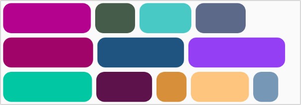
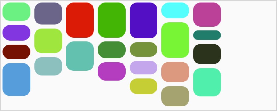
}Code language: Kotlin (kotlin)After making the above code additions, the layout should resemble Figure 29-1 when viewed in the Preview panel:
Modifying the Flow arrangement
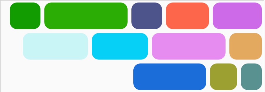
The FlowRow in the above example is defaulting to Arrangement.Start for the horizontal arrangement. Modify the FlowRow declaration in the MainScreen function to set the horizontalArrangement property to Arrangement. End as follows:
.
.
import androidx.compose.foundation.layout.Arrangement
.
.
   FlowRow(Modifier.width(300.dp),
        horizontalArrangement = Arrangement.End) {

        items.forEach { properties ->
.
.Code language: Kotlin (kotlin)
When the Preview panel refreshes, the layout should resemble Figure 29-2 below:
Repeat the above steps to experiment with the Center, SpaceAround, spacedBy(), and SpaceBetween arrangement options. Once you have tried all the options, change the horizontalArrangement parameter to Arrangement.Start.
|
You are reading a sample chapter from an old edition of the Jetpack Compose Essentials book. Purchase the fully updated Jetpack Compose 1.7 Essentials edition of this book in eBook or Print format. The full book contains 67 chapters and over 700 pages of in-depth information. Buy the full book now in Print or eBook format. Learn more. |
Modifying item alignment
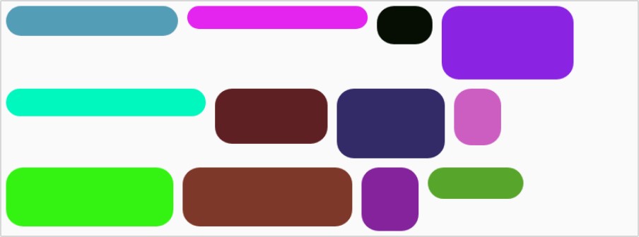
The next step in this project is to introduce random height values so that we can experiment with item alignment. Begin by editing the MainScreen function to make the Box height random:
.
.
items.forEach { properties ->
Box(modifier = Modifier
.padding(2.dp)
.width(properties.width)
.height(properties.height)
.clip(RoundedCornerShape(8.dp))
.background(properties.color)
)
}
.
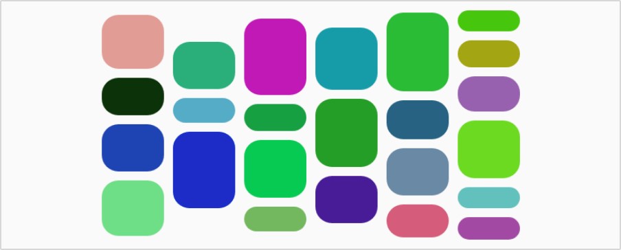
.Code language: Kotlin (kotlin)When Previewed, the layout will include Boxes of varying heights:
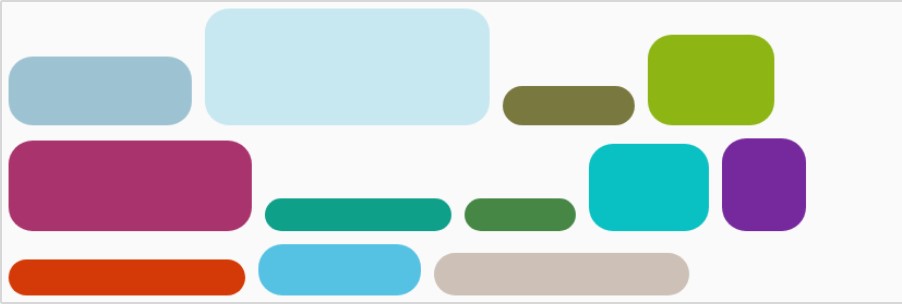
The layout has defaulted to top alignment for items with shorter heights. Add the align() modifier to the Box declaration to switch to bottom alignment:
.
.
import androidx.compose.ui.Alignment
.
.
items.forEach { properties ->
Box(modifier = Modifier
.align(Alignment.Bottom)
.padding(2.dp)
.width(properties.width)
.height(properties.height)
.clip(RoundedCornerShape(8.dp))
.background(properties.color)
)
}
.
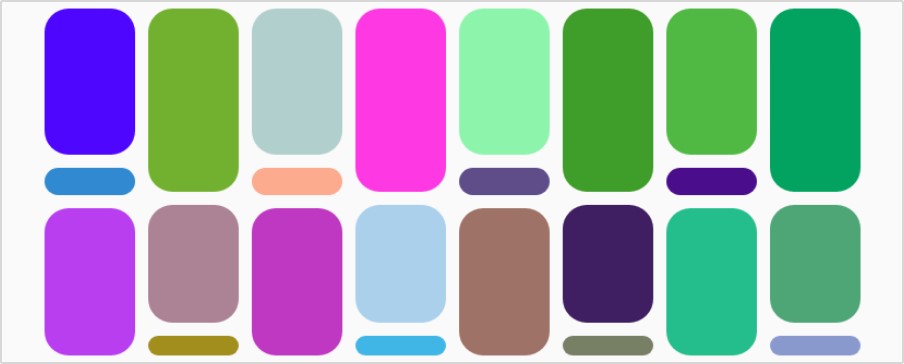
.Code language: Kotlin (kotlin)Check the layout preview to verify that the shorter items are now aligned with the bottom of each row:
Switching to FlowColumn
Begin the transition from a FlowRow layout to FlowColumn by making the following code changes:
|
You are reading a sample chapter from an old edition of the Jetpack Compose Essentials book. Purchase the fully updated Jetpack Compose 1.7 Essentials edition of this book in eBook or Print format. The full book contains 67 chapters and over 700 pages of in-depth information. Buy the full book now in Print or eBook format. Learn more. |
.
.
import androidx.compose.foundation.layout.FlowColumn
.
.
   val items = (1 .. 24).map {
        ItemProperties(
.
.
    FlowColumn(Modifier
        .width(300.dp)
        .height(120.dp),
        verticalArrangement = Arrangement.Top) {

        items.forEach { properties ->
            Box(modifier = Modifier
               // .align(Alignment.Bottom)
                .padding(2.dp)
                .width(30.dp)
                .height(properties.height)
                .clip(RoundedCornerShape(8.dp))
                .background(properties.color)
            )
        }
    }
.
.Code language: Kotlin (kotlin)
Using the Preview panel, verify that the items now appear in top-aligned columns:
Before moving to the next section, experiment with the effects of changing the verticalArrangement property to Arrangement.Bottom and Arrangement.Center.
Using cross-axis arrangement
As outlined in the previous chapter, cross-axis arrangement controls the position of the Flow layout along the opposite axis to the main flow axis. We can see this in practice by changing the horizontalArrangement parameter of our FlowColumn declaration as follows:
FlowColumn(Modifier
        .width(300.dp)
        .height(120.dp),
        verticalArrangement = Arrangement.Center,
        horizontalArrangement = Arrangement.Center) {Code language: Kotlin (kotlin)
The above change should cause the Flow items to appear in the horizontal center of the parent FlowColumn, as illustrated in Figure 29-6:
Adding item weights
This tutorial’s final step is adding weight values to the Flow items. The goal is to apply a specific weight depending on the position of the item in the flow. This means that we need to be able to access the index value of the forEach loop, which we can do using forEachIndexed. We will also set a fixed height for all items to make the weight settings more obvious. Edit the MainScreen function and make the following changes:
|
You are reading a sample chapter from an old edition of the Jetpack Compose Essentials book. Purchase the fully updated Jetpack Compose 1.7 Essentials edition of this book in eBook or Print format. The full book contains 67 chapters and over 700 pages of in-depth information. Buy the full book now in Print or eBook format. Learn more. |
.
.
   FlowColumn(Modifier
        .width(300.dp)
        .height(120.dp),
        verticalArrangement = Arrangement.Center,
        horizontalArrangement = Arrangement.Center) {

        items.forEachIndexed { index, properties ->

            var weight = 0.5f

            if (index % 2 == 0) {
                weight = 2f
            } else if (index % 3 == 0) {
                weight = 3f
            }

            Box(modifier = Modifier
                .weight(weight)
                .padding(2.dp)
                .width(30.dp)
                .height(30.dp)
                .clip(RoundedCornerShape(8.dp))
                .background(properties.color)
            )
        }
    }
.
.Code language: Kotlin (kotlin)
The resulting layout should appear as shown in Figure 29-7:
Summary
In this chapter, we used the knowledge from the Jetpack Compose FlowRow and FlowColumn Layouts chapter to create example FlowRow and FlowColumn layouts. The tutorial also demonstrated how alignment, arrangement, and weight settings change how Flow items are presented.