
Although the Box, Row, and Column composables provide a great deal of flexibility in terms of layout design, situations will inevitably arise where you have a specific layout requirement that cannot be achieved using the built-in layout components. Fortunately, Compose includes several more advanced layout options. In this chapter, we will explore one of these in the form of custom layout modifiers.
Compose layout basics
Before exploring custom layouts, it will be helpful to first understand the basics of how user interface elements are positioned in a Compose-based user interface. As we already know, user interface layouts are created by writing composable functions which generate UI elements that are, in turn, rendered on the screen. Composables call other composables creating a UI hierarchy tree consisting of parent and child relationships. Each child can have its own children, and so on.
As the app executes, the composable hierarchy is rapidly and continually recomposed in response to changes in state. Each time a parent composable is called, it is responsible for controlling the size and positioning of all of its children. The position of the child is defined using x and y coordinates relative to the position of the parent. In terms of size, the parent imposes constraints that define the maximum and minimum allowable height and width dimensions of the child.
Depending on configuration, the size of a parent can either be fixed (for example using the size() modifier) or calculated based on the size and positioning of its children.
The built-in Box, Row, and Column components all contain logic that measures each child and calculates how to position each to create the corresponding row, column, or stack positioning. The same techniques used behind the scenes by these built-in layouts are also available to you to create your own custom layouts.
 |
You are reading a sample chapter from an old edition of the Jetpack Compose Essentials book. Purchase the fully updated Jetpack Compose 1.7 Essentials edition of this book in eBook or Print format. The full book contains 67 chapters and over 700 pages of in-depth information. Buy the full book now in Print or eBook format. Learn more. |
Custom layouts
Custom layouts are quite straightforward to implement and fall into two categories. In its most basic form, a custom layout can be implemented as a layout modifier which can be applied to a single user interface element (something similar to the standard padding() modifier). Alternatively, a new Layout composable can be written which applies to all the children of a composable (the technique used by the Box, Column, and Row composables).
In the rest of this chapter, we will explore the custom layout modifier approach to custom layout development. Since experimentation is a good way to understand custom layouts, each step of this introduction to custom layout modifiers will be demonstrated using an example project. Feel free to modify the examples in this chapter and observe how the changes affect the resulting user interface layout.
Creating the LayoutModifier project
Launch Android Studio and select the New Project option from the welcome screen. Within the resulting new project dialog, choose the Empty Compose Activity template before clicking on the Next button.
Enter LayoutModifier into the Name field and specify com.example.LayoutModifier as the package name. Before clicking on the Finish button, change the Minimum API level setting to API 26: Android 8.0 (Oreo).
Within the MainActivity.kt file, delete the Greeting function and add a new empty composable named MainScreen:
|
You are reading a sample chapter from an old edition of the Jetpack Compose Essentials book. Purchase the fully updated Jetpack Compose 1.7 Essentials edition of this book in eBook or Print format. The full book contains 67 chapters and over 700 pages of in-depth information. Buy the full book now in Print or eBook format. Learn more. |
@Composable
fun MainScreen() {

}Code language: Kotlin (kotlin)
Next, edit the onCreateActivity() method and DefaultPreview function to call MainScreen instead of Greeting.
Adding the ColorBox composable
The child elements in most of these examples in this chapter will be represented by colored boxes. Although the Box component is primarily intended as a way to stack children on top of each other, an empty Box is also a simple and effective way to draw rectangles on the screen. Since we will be drawing multiple boxes, it makes sense to add a reusable composable for this purpose. Add the following ColorBox composable function to the MainActivity.kt file:
.
.
import androidx.compose.foundation.background
import androidx.compose.foundation.layout.*
import androidx.compose.ui.graphics.Color
import androidx.compose.ui.unit.dp
import androidx.compose.ui.layout.layout
.
.
@Composable
fun ColorBox(modifier: Modifier) {
    Box(Modifier.padding(1.dp).size(width = 50.dp, height = 10.dp).then(modifier))
}
Next, modify the MainScreen composable function to include a Box with a ColorBox child:
@Composable
fun MainScreen() {
    Box(modifier = Modifier.size(120.dp, 80.dp)) {
        ColorBox(
            Modifier.background(Color.Blue)
        )
    }
}Code language: Kotlin (kotlin)
When the layout is previewed, it will appear as shown in Figure 27-1 below:
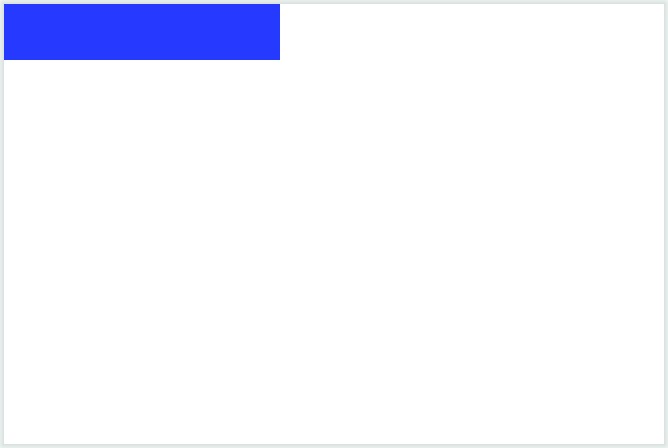
Figure 27-1
Creating a custom layout modifier
The Box layout in the above example has positioned the ColorBox element in the top left-hand corner of its content area. This is the default position for the child of a Box layout in absence of alignment parameters or modifiers to the contrary.
|
You are reading a sample chapter from an old edition of the Jetpack Compose Essentials book. Purchase the fully updated Jetpack Compose 1.7 Essentials edition of this book in eBook or Print format. The full book contains 67 chapters and over 700 pages of in-depth information. Buy the full book now in Print or eBook format. Learn more. |
We can now create a simple custom layout modifier that can be applied to the ColorBox to move it to a new position within the parent Box.
Custom layout modifiers are written using the following standard syntax:
fun Modifier.<custom layout name> (
    // Optional parameters here
) = layout { measurable, constraints ->
    // Code to adjust position and size of element
}Code language: Kotlin (kotlin)
The layout’s trailing lambda is passed two parameters named measurable and constraints respectively. The measurable parameter is the child element on which the modifier was called, while the constraints parameter contains the maximum and minimum width and height values allowed for the child.
For this example, we want to be able to specify a new x and y position for the child relative to the default position assigned to it by the parent. Before we do that, we to clarify what is meant by default position.
Understanding default position
In the example created so far, the default position is the top left-hand corner of the Box’s content area which equates to x and y coordinates 0, 0. The second child of a Row layout, on the other hand, would be positioned at entirely different default x and y coordinates within the context of the parent.
|
You are reading a sample chapter from an old edition of the Jetpack Compose Essentials book. Purchase the fully updated Jetpack Compose 1.7 Essentials edition of this book in eBook or Print format. The full book contains 67 chapters and over 700 pages of in-depth information. Buy the full book now in Print or eBook format. Learn more. |
The layout modifier is not concerned about the default position of the child within the context of the parent. Instead, it is only interested in calculating where the child will be positioned relative to the default position. In other words, the modifier will calculate the new position relative to 0, 0, and return the new offset coordinates. The parent will then apply the offset to the actual coordinates to move the child to the custom position.
A parent might, for example, calculate the default x and y coordinates of a child are 50, 70. A custom layout modifier will calculate the new position relative to 0, 0 and return the new offset (perhaps 20, 10). The parent will then apply the offset to the actual position (in this case 50, 70) to move the child to the custom position at 70, 80.
Completing the layout modifier
The next step in implementing our modifier is to allow new coordinate offsets to be passed through when it is called. Begin implementing the modifier, which we will name exampleLayout within the MainActivity.kt file so that it reads as follows:
fun Modifier.exampleLayout(
      x: Int,
      y: Int
) = layout { measurable, constraints ->

}Code language: Kotlin (kotlin)
When the modifier lays out the child it will need to know the child’s measurements to make sure it conforms to the constraints passed to the lambda. These values are obtained by calling the measure() method of the measurable instance, passing through the constraints object. This call will return a Placeable instance containing height and width values. We can also call methods on the Placeable instance to specify the new position of the element within its parent content area. Start by adding code to the modifier to perform this measurement as follows:
fun Modifier.exampleLayout(
    x: Int,
    y: Int
) = layout { measurable, constraints ->
    val placeable = measurable.measure(constraints)
}Code language: Kotlin (kotlin)
When developing custom layouts an important rule to remember is that a child must only be measured once each time the modifier is called. This rule, referred to as single-pass measurement, is required to ensure that the user interface tree hierarchies are rendered quickly and efficiently.
|
You are reading a sample chapter from an old edition of the Jetpack Compose Essentials book. Purchase the fully updated Jetpack Compose 1.7 Essentials edition of this book in eBook or Print format. The full book contains 67 chapters and over 700 pages of in-depth information. Buy the full book now in Print or eBook format. Learn more. |
Next, we need to call a method named layout(), passing through the height and width values from the placeable value. We also need to pass a trailing lambda to the layout() method containing the code to position the child:
fun Modifier.exampleLayout(
    x: Int,
    y: Int
) = layout { measurable, constraints ->
    val placeable = measurable.measure(constraints)

    layout(placeable.width, placeable.height) {
        placeable.placeRelative(x, y)
    }
}Code language: Kotlin (kotlin)
Within the lambda, the child element is positioned via a call to the placeRelative() method of the Placeable object, using the new x and y coordinates that were passed to the modifier.
Using a custom modifier
Now that we have created the custom modifier, it is ready to be applied to a child composable, in this case, our ColorBox component. Locate and edit the MainScreen composable and modify the ColorBox call to apply the exampleLayout() modifier:
@Composable
fun MainScreen() {
    Box(Modifier.size(120.dp, 80.dp)) {
        ColorBox(
            Modifier
                .exampleLayout(90, 50)
                .background(Color.Blue)
        )
    }
}Code language: Kotlin (kotlin)
When the layout is now rendered in the preview panel, the position of the ColorBox element will be adjusted to match the x and y coordinates passed to the exampleLayout modifier:
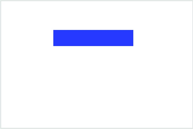
Figure 27-2
|
You are reading a sample chapter from an old edition of the Jetpack Compose Essentials book. Purchase the fully updated Jetpack Compose 1.7 Essentials edition of this book in eBook or Print format. The full book contains 67 chapters and over 700 pages of in-depth information. Buy the full book now in Print or eBook format. Learn more. |
Working with alignment lines
When adjusting the position of the child composable in the above example, the top left-hand corner of the ColorBox was moved to a specific x and y coordinate. It could also be said that the box was positioned based on the intersection of two alignment lines which correspond to the left and top sides of the rectangle as illustrated in Figure 27-3:
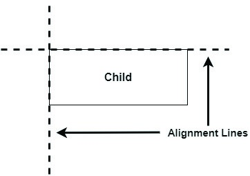
Figure 27-3
Given that we have access to the height and width measurements of the child element, we can set positioning based on any horizontal or vertical alignment line (or a combination of both). We could, for example, position the child based on a vertical alignment line located midway along its length as visualized below:
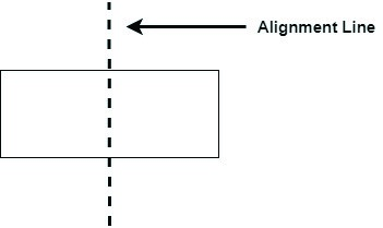
Figure 27-4
In fact, we could make the position of our hypothetical alignment line configurable by passing it through as a parameter to the layout modifier. To demonstrate this concept, modify the exampleLayout modifier code as follows:
|
You are reading a sample chapter from an old edition of the Jetpack Compose Essentials book. Purchase the fully updated Jetpack Compose 1.7 Essentials edition of this book in eBook or Print format. The full book contains 67 chapters and over 700 pages of in-depth information. Buy the full book now in Print or eBook format. Learn more. |
.
.
import kotlin.math.roundToInt
.
.
fun Modifier.exampleLayout(
    fraction: Float
) = layout { measurable, constraints ->
    val placeable = measurable.measure(constraints)

    val x = -(placeable.width * fraction).roundToInt()

    layout(placeable.width, placeable.height) {
        placeable.placeRelative(x = x, y = 0)
    }
}Code language: Kotlin (kotlin)
These changes require some explanation. To begin with, the modifier is no longer passed x and y coordinates. Instead, the new position will be calculated relative to the default coordinates defined by the parent (which will be 0, 0). Also, the modifier now accepts a floating-point parameter representing the position of the vertical alignment line as a percentage of the width of the child. The x coordinate is then calculated as follows:
val x = -(placeable.width * fraction).roundToInt()Code language: Kotlin (kotlin)This calculation takes the width of the child from the placeable object and multiplies it by the fraction parameter value. Because this results in a floating-point result, it is rounded to an integer so that it can be used as a coordinate value in the call to placeRelative(). Finally, since a move of the alignment line to the right is equivalent to moving the child to the left, the x value is inverted into a negative value. The child is then placed at the new coordinates. Note that since the vertical positioning is unchanged, the y value is set to 0.
Perhaps the best way to see this modifier in action is to apply it to the children of a Column layout. With this in mind, modify the MainScreen composable as follows:
.
import androidx.compose.ui.Alignment
.
.
@Composable
fun MainScreen() {
     Box(contentAlignment = Alignment.Center,
               modifier = Modifier.size(120.dp, 80.dp)) {
        Column {
            ColorBox(
                Modifier.exampleLayout(0f).background(Color.Blue)
            )
            ColorBox(
                Modifier.exampleLayout(0.25f).background(Color.Green)
            )
            ColorBox(
                Modifier.exampleLayout(0.5f).background(Color.Yellow)
            )
            ColorBox(
                Modifier.exampleLayout(0.25f).background(Color.Red)
            )
            ColorBox(
                Modifier.exampleLayout(0.0f).background(Color.Magenta)
            )
        }
    }
}Code language: Kotlin (kotlin)
The above layout will appear in the Preview panel as shown in Figure 27-5. Note that the dotted line has been superimposed to indicate the position of the alignment line for each child:
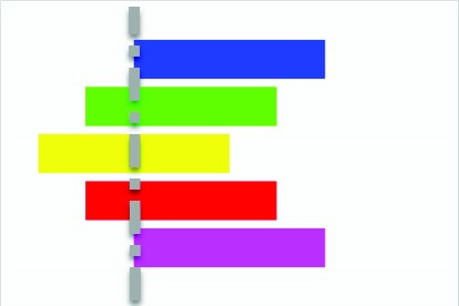
Figure 27-5
|
You are reading a sample chapter from an old edition of the Jetpack Compose Essentials book. Purchase the fully updated Jetpack Compose 1.7 Essentials edition of this book in eBook or Print format. The full book contains 67 chapters and over 700 pages of in-depth information. Buy the full book now in Print or eBook format. Learn more. |
Working with baselines
We already know from working with the Row and Column layouts in the chapter entitled Jetpack Compose Row and Column Layouts that a Text composable can be aligned relative to its text content baselines. The FirstBaseline and LastBaseline alignment lines correspond to the bottom edge of the first and last lines of text content contained within a Text component respectively.
When writing custom layout modifiers, these baselines can be accessed via the Placeable object and used as reference points for customizing child positioning. For example:
val placeable = measurable.measure(constraints)

val firstBaseline = placeable[FirstBaseLine]
val lastBaseline = placeable[LastBaseline]Code language: Kotlin (kotlin)
Since not all composables support baseline alignment, the code in the layout modifier should check that the child it has been passed supports this type of alignment. This can be achieved by checking that the alignment does not equate to AlignmentLine.Unspecified, for example:
if placeable[FirstBaseline] == AlignmentLine.Unspecified {
    // child passed to modifier does not support FirstBaseline alignment
}Code language: JavaScript (javascript)
Summary
While much can be achieved using the built-in Row, Column, and Box layouts in combination with the corresponding scope modifiers, there will often be instances where a child element will need to be positioned in a way that is not supported using the standard options. This challenge can be addressed by creating a custom layout modifier which can then be applied to any child element as needed. A custom layout modifier is passed a set of constraints indicating size restrictions and the child element to be positioned. The child can then be measured (an action that must only be performed once within a layout modifier) and calculations performed to customize the size and position of the child within the content area of the parent. Positioning may also be customized based on baseline alignment when supported by the child element.