
So far in this book, we have introduced the Box, Column, and Row layout components provided with Compose and shown how these are used to layout child elements in an organized way. We have also covered the creation and use of custom layout modifiers and explored how these can be used to modify the position of individual child elements within a parent layout. In this chapter, we will cover the creation of your own custom layout components.
An overview of custom layouts
Custom layouts in Compose allow you to design your own layout components with full control over how all of the child elements are sized and positioned. The techniques covered in this chapter are the same as those used by Google to create the built-in Compose Row, Column, and Box layouts. Custom layouts also share some similarities with custom content modifiers. A custom layout can be thought of as a way to apply a custom layout modifier to multiple children.
Custom layouts are declared using the Compose Layout composable function, the sole purpose of which is to provide a way to measure and position multiple children.
Custom layout syntax
Most custom layout declarations will begin with the same standard structure. The following code, for example, declares a custom layout which doesn’t make any changes to the layout properties of its children and serves as a template from which to build your own custom layouts:
@Composable
fun DoNothingLayout(
    modifier: Modifier = Modifier,
    content: @Composable () -> Unit
) {
    Layout(
        modifier = modifier,
        content = content
    ) { measurables, constraints ->
        val placeables = measurables.map { measurable ->
            // Measure each children
            measurable.measure(constraints)
        }

        layout(constraints.maxWidth, constraints.maxHeight) {
            placeables.forEach { placeable ->
                placeable.placeRelative(x = 0, y = 0)
            }
        }
    }
}Code language: Kotlin (kotlin)
As we can see, the layout is declared as a composable function named DoNothingLayout. This function accepts both a modifier and the content to be displayed via a slot API:
 |
You are reading a sample chapter from an old edition of the Jetpack Compose Essentials book. Purchase the fully updated Jetpack Compose 1.7 Essentials edition of this book in eBook or Print format. The full book contains 67 chapters and over 700 pages of in-depth information. Buy the full book now in Print or eBook format. Learn more. |
@Composable
fun DoNothingLayout(
    modifier: Modifier = Modifier,
    content: @Composable () -> Unit
) {
.
.Code language: Kotlin (kotlin)
The custom layout composable may also be designed to accept additional parameters which can then be used when calculating child layout properties.
The function then makes a call to the Compose Layout() composable which accepts a trailing lambda. This lambda is passed two parameters named measurables and constraints respectively. The measurables parameter contains all of the child elements contained within the content, while the constraints parameter contains the maximum and minimum width and height values allowed for the children:
.
.
    Layout(
        modifier = modifier,
        content = content
    ) { measurables, constraints ->
.
.Code language: Kotlin (kotlin)
Next, the children are measured and those measurements mapped to a list of Placeable objects:
.
.
        val placeables = measurables.map { measurable ->
            // Measure each child
            measurable.measure(constraints)
        }
.
.Code language: Kotlin (kotlin)
The map method used above executes the code within the trailing lambda on each child element in the measurables object which, in turn, measures each child. The result is a list of Placeable instances (one for each child) which is then assigned to a variable named placeables.
Finally, the layout() function (this is the same function that was used for custom layout modifiers in the previous chapter) is called and passed the maximum height and width values allowed by the parent. The trailing lambda then iterates through each child in the placeables variable and positions it relative to the default position designated by the parent.
|
You are reading a sample chapter from an old edition of the Jetpack Compose Essentials book. Purchase the fully updated Jetpack Compose 1.7 Essentials edition of this book in eBook or Print format. The full book contains 67 chapters and over 700 pages of in-depth information. Buy the full book now in Print or eBook format. Learn more. |
Using a custom layout
Once a custom layout has been created, it can be called in much the same way as the standard Compose layouts. Our example layout could therefore be called as follows:
DoNothingLayout(Modifier.padding(8.dp)) {
    Text("Text Line 1")
    Text("Text Line 2")
    Text("Text Line 3")
    Text("Text Line 4")
}Code language: Kotlin (kotlin)
Since the custom layout doesn’t reposition any child elements, the above code would result in the four Text composables being stacked in top of each other. In the remainder of this chapter we will create a project containing a custom layout that lays out its children.
Creating the CustomLayout project
Launch Android Studio and select the New Project option from the welcome screen. Within the resulting new project dialog, choose the Empty Compose Activity template before clicking on the Next button.
Enter CustomLayout into the Name field and specify com.example.customlayout as the package name. Before clicking on the Finish button, change the Minimum API level setting to API 26: Android 8.0 (Oreo). On completion of the project creation process, the CustomLayout project should be listed in the Project tool window located along the left-hand edge of the Android Studio main window.
Within the MainActivity.kt file, delete the Greeting function and add a new empty composable named MainScreen:
|
You are reading a sample chapter from an old edition of the Jetpack Compose Essentials book. Purchase the fully updated Jetpack Compose 1.7 Essentials edition of this book in eBook or Print format. The full book contains 67 chapters and over 700 pages of in-depth information. Buy the full book now in Print or eBook format. Learn more. |
@Composable
fun MainScreen() {

}Code language: Kotlin (kotlin)
Next, edit the onCreateActivity() method and DefaultPreview function to call MainScreen instead of Greeting.
Creating the CascadeLayout composable
The custom layout will be named CascadeLayout, the purpose of which is to layout its children in a column with each child indented by the width of the preceding child. An optional parameter will also be implemented to allow the spacing between the child elements to be configured.
Edit the MainActivity.kt file and begin by implementing the basic template of the CascadeLayout composable so that it reads as follows:
.
.
import androidx.compose.ui.layout.Layout
.
.
@Composable
fun CascadeLayout(
    modifier: Modifier = Modifier,
    content: @Composable () -> Unit
) {
    Layout(
        modifier = modifier,
        content = content
    ) { measurables, constraints ->
        layout(constraints.maxWidth, constraints.maxHeight) {
            val placeables = measurables.map { measurable ->
            measurable.measure(constraints)
        }

            placeables.forEach { placeable ->

            }
        }
    }
}Code language: Kotlin (kotlin)
Next, the spacing parameter needs to be added. To make this optional, we will provide this parameter with a zero default value. Also, since the amount by which a child is to be indented will increase each time a child is added to the column, we need to add a variable in which to track the latest indent. Similarly, the y coordinate will also need to be retained so that each child appears below the preceding child:
@Composable
fun CascadeLayout(
    modifier: Modifier = Modifier,
    spacing: Int = 0,
    content: @Composable () -> Unit
) {
    Layout(
        modifier = modifier,
        content = content
    ) { measurables, constraints ->
        var indent = 0
.
.
       layout(constraints.maxWidth, constraints.maxHeight) {
            var yCoord = 0
.
.Code language: Kotlin (kotlin)
The first child will be positioned at coordinates 0, 0 so we simply use the zero initialized indent and yCoord values:
|
You are reading a sample chapter from an old edition of the Jetpack Compose Essentials book. Purchase the fully updated Jetpack Compose 1.7 Essentials edition of this book in eBook or Print format. The full book contains 67 chapters and over 700 pages of in-depth information. Buy the full book now in Print or eBook format. Learn more. |
placeable.placeRelative(x = indent, y = yCoord)Code language: Kotlin (kotlin)Next, we increase the indent value by the width of the current child, plus the optional spacing value. The yCoord value is also increased by the height of the current child, once again adding the optional spacing:
indent += placeable.width + spacing
yCoord += placeable.height + spacingCode language: Kotlin (kotlin)
With the indent and y coordinate variable updated, the forEach loop iterates to the next child, repeating the process until all the children have been positioned.
Using the CascadeLayout composable
We are now ready to try out our new custom layout. The layout is designed to work with children of varying sizes, so the test will involve Box layouts of differing widths and heights. We will also pass a spacing value to the layout when it is called.
Locate the MainScreen composable within the MainActivity.kt file and add a call to our new custom layout as follows:
.
.
import androidx.compose.foundation.background
import androidx.compose.foundation.layout.Box
import androidx.compose.foundation.layout.size
import androidx.compose.ui.graphics.Color
import androidx.compose.ui.unit.dp
.
.
@Composable
fun MainScreen() {

    Box {
        CascadeLayout(spacing = 20) {
            Box(modifier = Modifier.size(60.dp).background(Color.Blue))
            Box(modifier = Modifier.size(80.dp, 40.dp).background(Color.Red))
            Box(modifier = Modifier.size(90.dp, 100.dp).background(Color.Cyan))
            Box(modifier = Modifier.size(50.dp).background(Color.Magenta))
            Box(modifier = Modifier.size(70.dp).background(Color.Green))
        }
    }
}Code language: Kotlin (kotlin)
Preview the layout and verify that it appears as shown in Figure 28-1:
|
You are reading a sample chapter from an old edition of the Jetpack Compose Essentials book. Purchase the fully updated Jetpack Compose 1.7 Essentials edition of this book in eBook or Print format. The full book contains 67 chapters and over 700 pages of in-depth information. Buy the full book now in Print or eBook format. Learn more. |
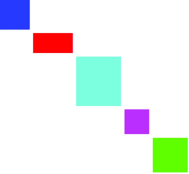
Figure 28-1
Summary
Custom layout support in Compose allows you to create your own layouts, which operate at the same syntactic level as the built-in Row, Column, and Box layouts. These custom layouts are created using a standard template mechanism built around the Compose Layout function. This function is passed a measurables object containing all children of the layout together with a set of constraints providing the maximum and minimum size values permitted by the parent. The individual children are then extracted from the measurables object and placed at specific coordinates within the layout content area to meet the custom layout requirements. In this chapter, we created a custom layout that positions its children in a cascading column layout. In practice, this technique can be used to design custom layouts of just about any level of complexity.