
In the previous chapter, we introduced ConstraintLayout and explained how the key features of this layout manager can be used to create complex and responsive user interface designs. This chapter will describe how ConstraintLayout is used within Compose layouts while providing example implementations of the various ConstraintLayout features you can combine to design your layouts.
Calling ConstraintLayout
ConstraintLayout is provided in the form of a composable in the same way as all other layouts in Compose and can be called as follows:
ConstraintLayout {
    // Children here
}Code language: Kotlin (kotlin)
As with other layout composables, ConstraintLayout also accepts a Modifier parameter, for example:
ConstraintLayout(Modifier.size(width = 200.dp, height = 300.dp)
                        .background(Color.Green)) {
    // Children here
}Code language: Kotlin (kotlin)
Generating references
In the absence of any constraints, a composable child of a ConstraintLayout will be positioned in the top left-hand corner of the content area (assuming the app is running in a left-to-right, top to bottom locale). Composables that are to be constrained must be assigned a reference before constraints can be applied. This is a two-step process consisting of generating the references, and then assigning them to composables before constraints are applied. A single reference can be generated via a call to the createRef() function and the result assigned to a constant:
val text1 = createRef()Code language: Kotlin (kotlin)Alternatively, multiple references may be created in a single step by calling createRefs() as follows:
 |
You are reading a sample chapter from an old edition of the Jetpack Compose Essentials book. Purchase the fully updated Jetpack Compose 1.7 Essentials edition of this book in eBook or Print format. The full book contains 67 chapters and over 700 pages of in-depth information. Buy the full book now in Print or eBook format. Learn more. |
val (button, text1, text2) = createRefs()Code language: Kotlin (kotlin)Assigning a reference to a composable
Once references have been generated, they are applied to individual composables using the constrainAs() modifier function. The following code, for example, assigns the text1 reference to a Text component:
ConstraintLayout {
    val text1 = createRef()

    Text("Hello", modifier = Modifier.constrainAs(text1) {
        // Constraints here
    })Code language: Kotlin (kotlin)
As we can see in the above code, the constrainAs() modifier has a trailing lambda in which the constraints are added.
Adding constraints
The most common form of constraint is one between one side of a composable and one side of either the parent ConstraintLayout, or another composable. Constraints of this type are declared within the constrainAs() trailing lambda via calls to the linkTo() function. There are different ways to call linkTo() depending on the nature of the constraints being created. The following code, for example, constrains the top and bottom edges of a Text component to the top and bottom of the parent ConstraintLayout instance, both with a 16dp margin:
Text("Hello", modifier = Modifier.constrainAs(text1) {
    top.linkTo(parent.top, margin = 16.dp)
    bottom.linkTo(parent.bottom, margin = 16.dp)
})Code language: Kotlin (kotlin)
The linkTo() function may also be passed multiple constraints as parameters. In the following example, the start and end sides of the Text component are constrained to components named button1 and button2, while the top and bottom edges are constrained to the top and bottom of the parent with a bias of 0.8:
Text("Hello", modifier = Modifier.constrainAs(mytext) {
    linkTo(parent.top, parent.bottom, bias = 0.8f)
    linkTo(button1.end, button2.start)
})Code language: Kotlin (kotlin)
In addition to applying constraints using the linkTo() function, a component can be centered horizontally and vertically relative to another component or the parent:
|
You are reading a sample chapter from an old edition of the Jetpack Compose Essentials book. Purchase the fully updated Jetpack Compose 1.7 Essentials edition of this book in eBook or Print format. The full book contains 67 chapters and over 700 pages of in-depth information. Buy the full book now in Print or eBook format. Learn more. |
Text("text1", modifier = Modifier.constrainAs(text1) {
    centerVerticallyTo(text2)
    centerHorizontallyTo(parent)
})Code language: Kotlin (kotlin)
In the above example, text1 will be positioned on the vertical axis to align with the vertical center of text2 and at the horizontal center of the ConstraintLayout parent.
The centerAround() function can be used to center a component horizontally or vertically relative to a side of another component. In the following example, text1 is centered horizontally relative to the end of text2, and vertically relative to the top edge of text4:
Text("text1", modifier = Modifier.constrainAs(text1) {
    centerAround(text2.end)
    centerAround(text4.top)
})Code language: Kotlin (kotlin)
In the remainder of this chapter, we will create a new project and work through some examples of using ConstraintLayout in Compose.
Creating the ConstraintLayout project
Launch Android Studio and select the New Project option from the welcome screen. In the new project dialog, choose the Empty Compose Activity template before clicking on the Next button.
Enter ConstraintLayout into the Name field and specify com.example.constraintlayout as the package name. Before clicking on the Finish button, change the Minimum API level setting to API 26: Android 8.0 (Oreo). Within the MainActivity.kt file, delete the Greeting function and add a new empty composable named MainScreen:
|
You are reading a sample chapter from an old edition of the Jetpack Compose Essentials book. Purchase the fully updated Jetpack Compose 1.7 Essentials edition of this book in eBook or Print format. The full book contains 67 chapters and over 700 pages of in-depth information. Buy the full book now in Print or eBook format. Learn more. |
@Composable
fun MainScreen() {

}Code language: Kotlin (kotlin)
Next, edit the onCreateActivity() method and DefaultPreview function to call MainScreen instead of Greeting.
Adding the ConstraintLayout library
Support for ConstraintLayout in Compose is contained in a separate library that is not included in new projects by default. Before starting to work with ConstraintLayout, we need to add this library to the project build configuration. Within the Project tool window, navigate to the Gradle Scripts folder and open the build.gradle (Module: ConstraintLayout) file for editing. Once the file is loaded into the editor, locate the dependencies section and add an implementation line for the Compose ConstraintLayout library as follows:
dependencies {
.
.
    implementation "androidx.constraintlayout:constraintlayout-compose:1.0.0"
.
.Code language: Gradle (gradle)
Note that a more recent version of the library may have been released since this book was published. If the line is highlighted in yellow, hover the mouse pointer over the line and wait for a popup message to appear containing the latest version number. Update the implementation directive to reflect this newer library version.
Adding a custom button composable
When working through the examples in this chapter, we will be applying constraints to Button composables of various sizes. To make the code easier to read, we need to create a custom button composable to which we can pass the text content and a modifier. Within the MainActivity.kt file, add this composable so that it reads as follows:
.
.
import androidx.compose.material.Button
import androidx.constraintlayout.compose.ConstraintLayout
.
.
@Composable
fun MyButton(text: String, modifier: Modifier = Modifier) {
    Button(
        onClick = { },
        modifier = modifier
    ) {
        Text(text)
    }
}Code language: Kotlin (kotlin)
With these initial steps completed, we can start to experiment with the various features of ConstraintLayout.
|
You are reading a sample chapter from an old edition of the Jetpack Compose Essentials book. Purchase the fully updated Jetpack Compose 1.7 Essentials edition of this book in eBook or Print format. The full book contains 67 chapters and over 700 pages of in-depth information. Buy the full book now in Print or eBook format. Learn more. |
Basic constraints
Begin by adding a ConstraintLayout to the MainScreen function together with a set of references that will be used throughout the remainder of this chapter:
.
.
import androidx.compose.foundation.layout.size
import androidx.compose.ui.unit.dp
.
.
@Composable
fun MainScreen() {
    ConstraintLayout(Modifier.size(width = 200.dp, height = 200.dp)) {
        val (button1, button2, button3) = createRefs()

    }
}Code language: Kotlin (kotlin)
Next, add a single MyButton call to the layout and use the constrainAs() modifier to assign it the button1 reference:
@Composable
fun MainScreen() {
    ConstraintLayout(Modifier.size(width = 200.dp, height = 200.dp)) {
        val (button1, button2, button3) = createRefs()

        MyButton(text = "Button1", Modifier.constrainAs(button1)
        {

        })
    }
}Code language: Kotlin (kotlin)
The above layout will appear in the Preview panel with the button positioned in the top left-hand corner of the ConstraintLayout content area. We can move the position of the button by constraining it to the sides of the parent layout. The following changes constrain the top and start edges of the button to the corresponding sides of the ConstraintLayout parent with margins of 60dp and 30dp respectively:
.
.
MyButton(text = "Button1", Modifier.constrainAs(button1)
{
    top.linkTo(parent.top, margin = 60.dp)
    start.linkTo(parent.start, margin = 30.dp)
})
.
.Code language: Kotlin (kotlin)
Refresh the preview and verify that the button has moved to the location specified by the constraints. Note also that hovering over the preview causes annotations to appear indicating the constraints that have been applied to the layout as shown in Figure 30-1:
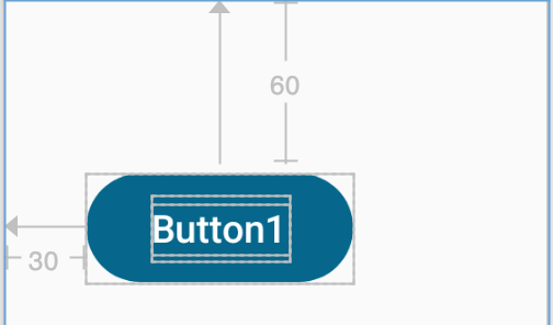
Figure 30-1
|
You are reading a sample chapter from an old edition of the Jetpack Compose Essentials book. Purchase the fully updated Jetpack Compose 1.7 Essentials edition of this book in eBook or Print format. The full book contains 67 chapters and over 700 pages of in-depth information. Buy the full book now in Print or eBook format. Learn more. |
Opposing constraints
The previous example demonstrated how to constrain a composable to a fixed position within the parent using constraints with margins. In this section, we will begin to look at opposing constraints. An opposing constraint is created when both sides along the same axis of a composable are constrained. The following changes, for example, apply opposing constraints on button1 along the horizontal axis:
MyButton(text = "Button1", Modifier.constrainAs(button1)
{
    top.linkTo(parent.top, margin = 60.dp)
    start.linkTo(parent.start)
    end.linkTo(parent.end)
})Code language: Kotlin (kotlin)
The opposing constraints have the effect of horizontally centering the component within the ConstraintLayout resulting in the preview shown in Figure 30-2:
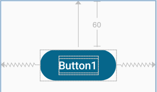
Figure 30-2
Note that opposing constraints are designated by the jagged spring-like connecting lines between the button and parent. Opposing constraints may be declared more concisely passing through the constraints as parameters to the linkTo() function as follows:
MyButton(text = "Button1", Modifier.constrainAs(button1)
{
    top.linkTo(parent.top, margin = 60.dp)
    linkTo(parent.start, parent.end)
})Code language: Kotlin (kotlin)
If the goal is simply to use opposing constraints to center the component within the parent, the same result can more easily be achieved as follows:
|
You are reading a sample chapter from an old edition of the Jetpack Compose Essentials book. Purchase the fully updated Jetpack Compose 1.7 Essentials edition of this book in eBook or Print format. The full book contains 67 chapters and over 700 pages of in-depth information. Buy the full book now in Print or eBook format. Learn more. |
centerVerticallyTo(parent)
centerHorizontallyTo(parent)Code language: Kotlin (kotlin)
So far, all of the constraints we have looked at have involved links between a composable and the parent. Constraints can, of course, also be applied between components, for example:
MyButton(text = "Button1", Modifier.constrainAs(button1)
{
    centerHorizontallyTo(parent)
    top.linkTo(parent.top)
    bottom.linkTo(button2.top)
})

MyButton(text = "Button2", Modifier.constrainAs(button2)
{
   centerHorizontallyTo(parent)
    top.linkTo(button1.bottom)
    bottom.linkTo(parent.bottom)
})Code language: Kotlin (kotlin)
The above code will render in the preview panel as shown in Figure 30-3 below:
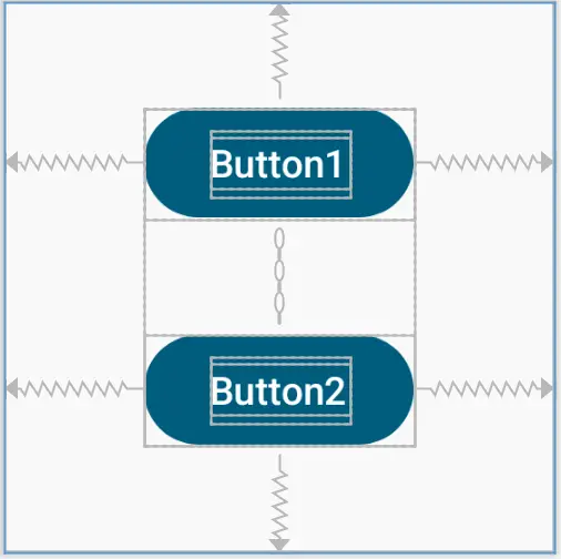
Figure 30-3
Constraint bias
In the previous chapter, the concept of using bias settings to favor one opposing constraint over another was outlined. In the absence of other settings, opposing constraints will always center a component between the elements to which it is constrained. Applying bias allows the positioning of the constrained composable to be moved relative to the available space. The original button1 constraints from earlier in the chapter can, for example, be modified to include bias as follows:
MyButton(text = "Button1", Modifier.constrainAs(button1)
{
    top.linkTo(parent.top, margin = 60.dp)
    linkTo(parent.start, parent.end, bias = 0.75f)
})Code language: Kotlin (kotlin)
When previewed, button1 will be positioned at 75% of the width of the parent as illustrated in Figure 30-4:
|
You are reading a sample chapter from an old edition of the Jetpack Compose Essentials book. Purchase the fully updated Jetpack Compose 1.7 Essentials edition of this book in eBook or Print format. The full book contains 67 chapters and over 700 pages of in-depth information. Buy the full book now in Print or eBook format. Learn more. |
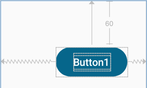
Figure 30-4
Constraint margins
Constraints can be used in conjunction with margins to implement fixed gaps between a component and another element (such as another composable, a guideline, barrier, or the side of the parent layout). Consider the following example from earlier in the chapter:
MyButton(text = "Button1", Modifier.constrainAs(button1)
{
    top.linkTo(parent.top, margin = 60.dp)
    linkTo(parent.start, parent.end)
})Code language: Kotlin (kotlin)
This code gives us the layout illustrated in Figure 30-2 above. As currently configured, horizontal constraints run to the left and right edges of the parent ConstraintLayout. As such, button1 has opposing horizontal constraints indicating that the ConstraintLayout layout engine has some discretion in terms of the actual positioning of the component at runtime. This allows the layout some flexibility to accommodate different screen sizes and device orientations. The horizontal bias setting is also able to control the position of the component right up to the right-hand side of the layout. Figure 30-5, for example, shows the same button with 100% horizontal bias applied:
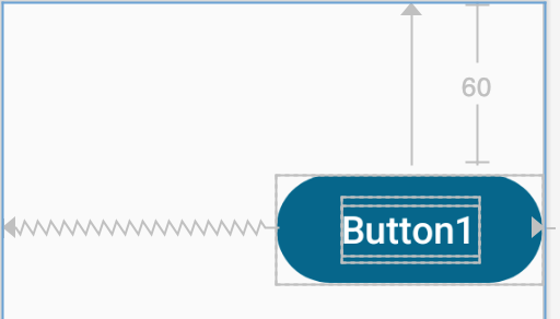
Figure 30-5
ConstraintLayout margins appear at the end of constraint connections and represent a fixed gap into which the button cannot be moved even when adjusting bias or in response to layout changes elsewhere in the user interface. In the following code, the right-hand constraint now includes a 30dp margin into which the component cannot be moved even though the bias is still set at 100%:
|
You are reading a sample chapter from an old edition of the Jetpack Compose Essentials book. Purchase the fully updated Jetpack Compose 1.7 Essentials edition of this book in eBook or Print format. The full book contains 67 chapters and over 700 pages of in-depth information. Buy the full book now in Print or eBook format. Learn more. |
MyButton(text = "Button1", Modifier.constrainAs(button1)
{
    top.linkTo(parent.top, margin = 60.dp)
    linkTo(parent.start, parent.end, endMargin = 30.dp, bias = 1.0f)
})Code language: Kotlin (kotlin)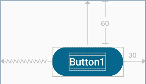
Figure 30-6
This margin would also be preserved if the width of the parent reduced (such as occurs when a device is rotated between landscape and portrait orientation), or if a component to the left, to which button1 was constrained, were to grow in size.
Even without a bias setting, margins will have an impact on the positioning of a component. The following code, for example, sets margins of different widths on the start and end constraints of button1:
MyButton(text = "Button1", Modifier.constrainAs(button1)
{
    top.linkTo(parent.top, margin = 60.dp)
    linkTo(parent.start, parent.end, startMargin = 30.dp, endMargin = 50.dp)
})Code language: Kotlin (kotlin)
This results in the button being offset relative to the margins as shown in Figure 30-7:
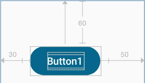
Figure 30-7
|
You are reading a sample chapter from an old edition of the Jetpack Compose Essentials book. Purchase the fully updated Jetpack Compose 1.7 Essentials edition of this book in eBook or Print format. The full book contains 67 chapters and over 700 pages of in-depth information. Buy the full book now in Print or eBook format. Learn more. |
The importance of opposing constraints and bias
As discussed in the previous chapter, opposing constraints, margins, and bias form the cornerstone of responsive layout design in Android when using the ConstraintLayout. When a composable is constrained without opposing constraint connections, those constraints are essentially margin constraints. This is indicated visually within the Preview panel by solid straight lines accompanied by margin measurements as shown in Figure 30-8.
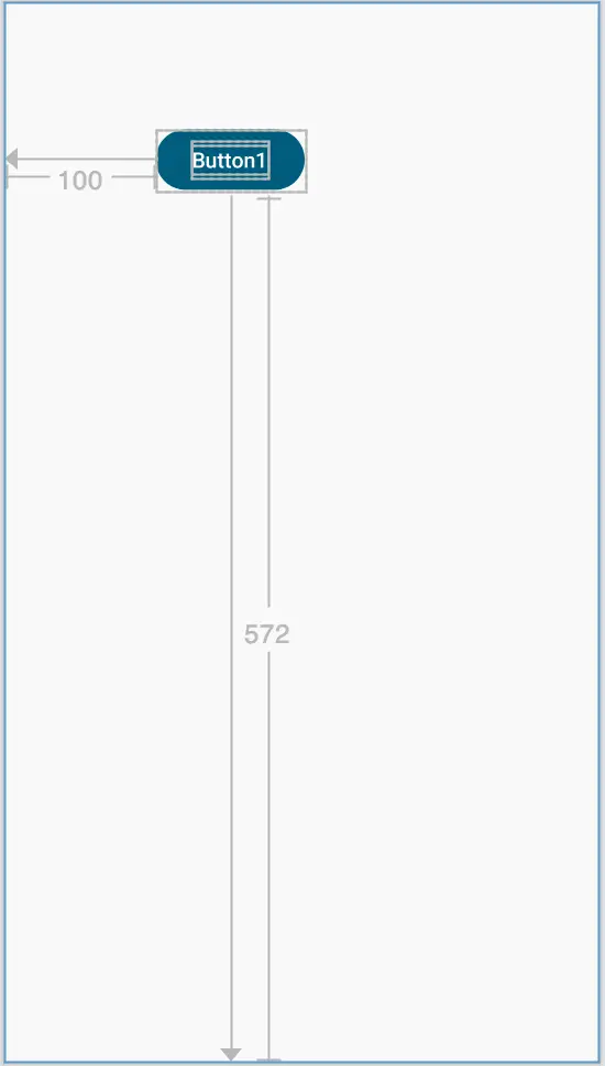
Figure 30-8
The above constraints essentially fix the button at that position. The result of this is that if the device is rotated to landscape orientation, the button will no longer be visible since the vertical constraint pushes it beyond the top edge of the device screen (as is the case in Figure 30-9). A similar problem will arise if the app is run on a device with a smaller screen than that used during the design process.
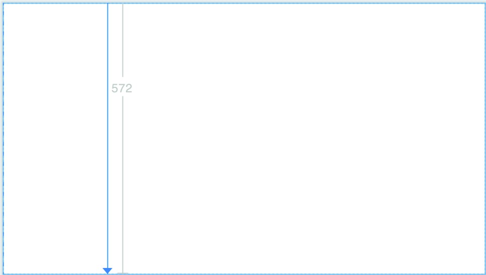
Figure 30-9
When opposing constraints are implemented, the constraint connection is represented by the spring-like jagged line (the spring metaphor is intended to indicate that the position of the component is not fixed to absolute x and y coordinates):
|
You are reading a sample chapter from an old edition of the Jetpack Compose Essentials book. Purchase the fully updated Jetpack Compose 1.7 Essentials edition of this book in eBook or Print format. The full book contains 67 chapters and over 700 pages of in-depth information. Buy the full book now in Print or eBook format. Learn more. |
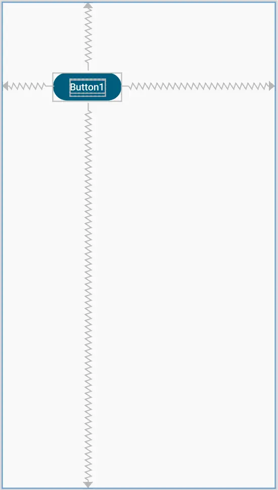
Figure 30-10
In the above layout, vertical and horizontal bias settings have been configured such that the button will always be positioned 90% of the distance from the bottom and 35% from the left-hand edge of the parent layout. When rotated, therefore, the button is still visible and positioned in the same location relative to the dimensions of the screen:
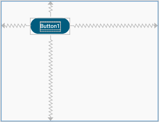
Figure 30-11
When designing a responsive and adaptable user interface layout, it is important to take into consideration both bias and opposing constraints when manually designing a user interface layout and making corrections to automatically created constraints.
Creating chains
A chain constraint may be created between two or more components by calling either createHorizontalChain() or createVerticalChain(), passing through the component references as parameters. The following code, for example, creates a horizontal chain between three buttons:
|
You are reading a sample chapter from an old edition of the Jetpack Compose Essentials book. Purchase the fully updated Jetpack Compose 1.7 Essentials edition of this book in eBook or Print format. The full book contains 67 chapters and over 700 pages of in-depth information. Buy the full book now in Print or eBook format. Learn more. |
ConstraintLayout(Modifier.size(width = 400.dp, height = 100.dp)) {
    val (button1, button2, button3) = createRefs()

    createHorizontalChain(button1, button2, button3)

    MyButton(text = "Button1", Modifier.constrainAs(button1) {
        centerVerticallyTo(parent)
    })

    MyButton(text = "Button2", Modifier.constrainAs(button2) {
        centerVerticallyTo(parent)
    })

    MyButton(text = "Button3", Modifier.constrainAs(button3) {
        centerVerticallyTo(parent)
    })
}Code language: Kotlin (kotlin)
When previewed, the buttons will be positioned as shown in Figure 30-12 below:
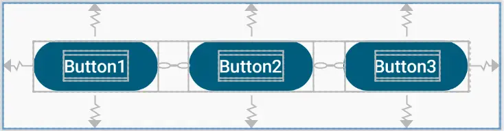
Figure 30-12
As outlined in “A Guide to ConstraintLayout in Compose”, a chain may be arranged using Packed, Spread, or SpreadInside styles. Modify the createHorizontalChain() function call to change the style from the default (Spread) to SpreadInside as follows:
.
.
import androidx.constraintlayout.compose.ChainStyle
.
.
@Composable
fun MainScreen() {
    ConstraintLayout(Modifier.size(width = 400.dp, height = 100.dp)) {
        val (button1, button2, button3) = createRefs()

        createHorizontalChain(button1, button2, button3,
            chainStyle = ChainStyle.SpreadInside)
.
.Code language: Kotlin (kotlin)
The buttons will now be arranged as shown below:
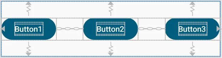
Figure 30-13
|
You are reading a sample chapter from an old edition of the Jetpack Compose Essentials book. Purchase the fully updated Jetpack Compose 1.7 Essentials edition of this book in eBook or Print format. The full book contains 67 chapters and over 700 pages of in-depth information. Buy the full book now in Print or eBook format. Learn more. |
Working with guidelines
ConstraintLayout guidelines provide a horizontal or vertical anchor line to which composables may be contained. This is particularly useful when a group of components needs to be aligned relative to a specific axis line. A guideline position can be declared as a percentage of either the height or width of the parent or positioned at a specific offset from a side. The following, for example, creates a guideline that is parallel to the starting edge of the parent (in other words a vertical line) positioned 25% of the way across the parent content area:
createGuidelineFromStart(fraction = .25f)Code language: Kotlin (kotlin)Similarly, the following function call creates a horizontal guideline positioned 60dp above the bottom edge of the parent:
createGuidelineFromBottom(offset = 60.dp)Code language: Kotlin (kotlin)Replace the code in the MainScreen function with the following code to create a vertical guideline to which the three buttons are constrained:
ConstraintLayout(Modifier.size(width = 400.dp, height = 220.dp)) {
    val (button1, button2, button3) = createRefs()

    val guide = createGuidelineFromStart(fraction = .60f)

    MyButton(text = "Button1", Modifier.constrainAs(button1) {
        top.linkTo(parent.top, margin = 30.dp)
        end.linkTo(guide, margin = 30.dp)
    })

    MyButton(text = "Button2", Modifier.constrainAs(button2) {
        top.linkTo(button1.bottom, margin = 20.dp)
        start.linkTo(guide, margin = 40.dp)
    })

    MyButton(text = "Button3", Modifier.constrainAs(button3) {
        top.linkTo(button2.bottom, margin = 40.dp)
        end.linkTo(guide, margin = 20.dp)
    })
}Code language: Kotlin (kotlin)
This layout should appear as illustrated in Figure 30-14 below when rendered in the Preview panel:
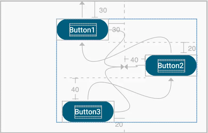
Figure 30-14
|
You are reading a sample chapter from an old edition of the Jetpack Compose Essentials book. Purchase the fully updated Jetpack Compose 1.7 Essentials edition of this book in eBook or Print format. The full book contains 67 chapters and over 700 pages of in-depth information. Buy the full book now in Print or eBook format. Learn more. |
Working with barriers
ConstraintLayout barriers are created relative to a specific side of one or more components using the following functions:
- createStartBarrier()
- createEndBarrier()
- createTopBarrier()
- createBottomBarrier()
Each function is passed a list of components to which the barrier is to be assigned together with an optional margin and returns a barrier reference to which other components may be constrained, for example:
val barrier = createEndBarrier(button1, button2, margin = 30.dp)Code language: Kotlin (kotlin)The above statement will create a vertical barrier (start and end barriers are vertical while top and bottom are horizontal) positioned 30dp from the end of button1 and button2. If button1 and button2 are of different widths the barrier will be 30dp from the end of the widest component at any given time.
To demonstrate ConstraintLayout barriers, we will begin by recreating the layout illustrated in Figure 29-11 in the previous chapter. Begin by modifying the MainScreen function so that it reads as follows:
.
.
import androidx.compose.foundation.layout.width
import androidx.constraintlayout.compose.Dimension
.
.
@Composable
fun MainScreen() {
    ConstraintLayout(Modifier.size(width = 350.dp, height = 220.dp)) {
        val (button1, button2, button3) = createRefs()

        MyButton(text = "Button1", Modifier.width(100.dp).constrainAs(button1) {
            top.linkTo(parent.top, margin = 30.dp)
            start.linkTo(parent.start, margin = 8.dp)
        })

        MyButton(text = "Button2", Modifier.width(100.dp).constrainAs(button2) {
            top.linkTo(button1.bottom, margin = 20.dp)
            start.linkTo(parent.start, margin = 8.dp)
        })

        MyButton(text = "Button3", Modifier.constrainAs(button3) {
            linkTo(parent.top, parent.bottom,
                      topMargin = 8.dp, bottomMargin = 8.dp)
            linkTo(button1.end, parent.end, startMargin = 30.dp,
                                                 endMargin = 8.dp)
        })
    }
}Code language: Kotlin (kotlin)
The button3 component needs to be sized to fill the maximum available space allowed by its constraints. Not only will this ensure that the button fills the available height, but also allows the width to adjust in response to changes in the size of button1 and button2. To achieve this, the width and height dimension constraints of button3 need to be changed to fillConstraints. Modify the button3 declaration to add these dimension constraints as follows:
|
You are reading a sample chapter from an old edition of the Jetpack Compose Essentials book. Purchase the fully updated Jetpack Compose 1.7 Essentials edition of this book in eBook or Print format. The full book contains 67 chapters and over 700 pages of in-depth information. Buy the full book now in Print or eBook format. Learn more. |
MyButton(text = "Button3", Modifier.constrainAs(button3) {
    linkTo(parent.top, parent.bottom, topMargin = 8.dp, bottomMargin = 8.dp)
    linkTo(button1.end, parent.end, startMargin = 30.dp, endMargin = 8.dp)
    width = Dimension.fillToConstraints
    height = Dimension.fillToConstraints
})Code language: Kotlin (kotlin)
In the Preview panel, the layout should appear as shown in Figure 30-15:
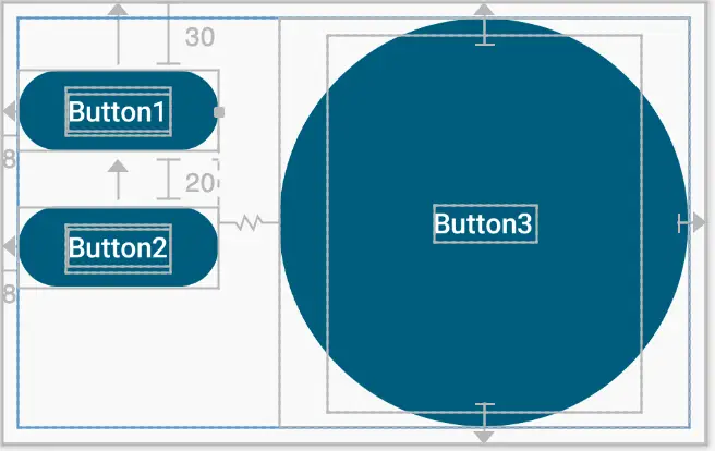
Figure 30-15
Next, we need to check if the layout is already providing the required behavior by increasing the width of button1 as follows:
MyButton(text = "Button1", Modifier.width(150.dp).constrainAs(button1) {Code language: Kotlin (kotlin)Note the width dimension of button3 has reduced as required as expected:
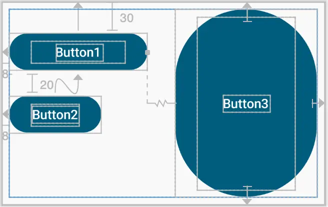
Figure 30-16
|
You are reading a sample chapter from an old edition of the Jetpack Compose Essentials book. Purchase the fully updated Jetpack Compose 1.7 Essentials edition of this book in eBook or Print format. The full book contains 67 chapters and over 700 pages of in-depth information. Buy the full book now in Print or eBook format. Learn more. |
Now return the width of button1 to 100dp, then increase the width of button2 to 150dp. This time the width of button3 has not been reduced, causing an overlap with button2:
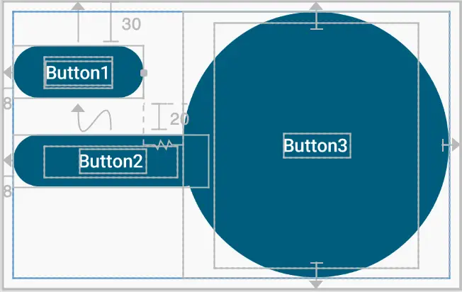
Figure 30-17
Clearly, this does not meet our layout specifications. This is happening because button3 is only constrained by button1 and is not affected by changes to button2. To resolve this shortcoming, we need to create a barrier positioned at the end of button1 and button2. Instead of constraining the start edge of button3 against the end of button1 we will, instead, constrain the start of the button against the barrier:
@Composable
fun MainScreen() {
    ConstraintLayout(Modifier.size(width = 350.dp, height = 220.dp)) {
        val (button1, button2, button3) = createRefs()

        val barrier = createEndBarrier(button1, button2)
.
.
        MyButton(text = "Button3", Modifier.constrainAs(button3) {
            linkTo(parent.top, parent.bottom,
                topMargin = 8.dp, bottomMargin = 8.dp)
            linkTo(button1.end, parent.end, startMargin = 30.dp,
                endMargin = 8.dp)
            start.linkTo(barrier, margin = 30.dp)
            width = Dimension.fillToConstraints
            height = Dimension.fillToConstraints
        })
    }
}Code language: Kotlin (kotlin)
With these changes made, button3 will resize regardless of whether it is button1 or button2 which increases in width. As either width changes, the barrier to which button3 is constrained will move proportionally, thereby reducing the width of button3:
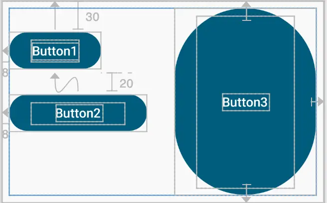
Figure 30-18
|
You are reading a sample chapter from an old edition of the Jetpack Compose Essentials book. Purchase the fully updated Jetpack Compose 1.7 Essentials edition of this book in eBook or Print format. The full book contains 67 chapters and over 700 pages of in-depth information. Buy the full book now in Print or eBook format. Learn more. |
Decoupling constraints with constraint sets
So far in this chapter, all of the constraints have been declared within modifiers applied to individual composables. Compose also allows constraints to be declared separately in the form of constraint sets. These decoupled constraints can then be passed to the ConstraintLayout and applied to composable children.
Decoupled constraints allow you to create sets of constraints that can be reused without having to duplicate modifier declarations. These constraint sets also provide flexibility in terms of passing different sets of constraints depending on other criteria. A layout might, for example, use different constraint sets depending on screen size or device orientation.
To demonstrate constraint sets, modify the MainScreen function as follows:
@Composable
fun MainScreen() {
    ConstraintLayout(Modifier.size(width = 200.dp, height = 200.dp)) {
        val button1 = createRef()

        MyButton(text = "Button1", Modifier.size(200.dp).constrainAs(button1) {
            linkTo(parent.top, parent.bottom, topMargin = 8.dp,
                                                   bottomMargin = 8.dp)
            linkTo(parent.start, parent.end, startMargin = 8.dp,
                                                   endMargin = 8.dp)
            width = Dimension.fillToConstraints
            height = Dimension.fillToConstraints
        })
    }
}Code language: Kotlin (kotlin)
This layout displays a button that is allowed to fill the available size allowed by the constraints applied to it:
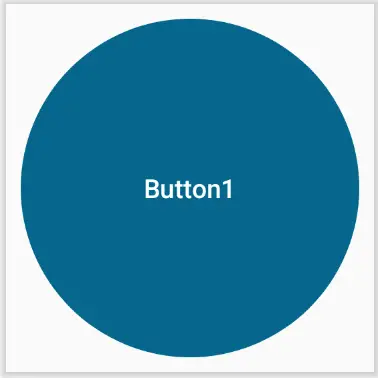
Figure 30-19
|
You are reading a sample chapter from an old edition of the Jetpack Compose Essentials book. Purchase the fully updated Jetpack Compose 1.7 Essentials edition of this book in eBook or Print format. The full book contains 67 chapters and over 700 pages of in-depth information. Buy the full book now in Print or eBook format. Learn more. |
We will now decouple these constraints into a separate constraint set. To make the constraint set more useful, we will allow the margin value to be passed as an argument. Remaining within the MainActivity.kt file, declare the constraint set as follows:
.
.
import androidx.compose.ui.unit.Dp
import androidx.constraintlayout.compose.ConstraintSet
.
.
private fun myConstraintSet(margin: Dp): ConstraintSet {
    return ConstraintSet {
        val button1 = createRefFor("button1")

        constrain(button1) {
            linkTo(parent.top, parent.bottom, topMargin = margin,
                                      bottomMargin = margin)
            linkTo(parent.start, parent.end, startMargin = margin,
                                      endMargin = margin)
            width = Dimension.fillToConstraints
            height = Dimension.fillToConstraints
        }
    }
}Code language: Kotlin (kotlin)
The above code declares a new function that accepts a margin value and returns a ConstraintSet object. Next, a call is made to the createRefFor() function to generate a reference for whichever composable the constraint set is applied to. Next, the constraint set is created by calling the constrain() function passing through the reference and declaring the constraints in the trailing lambda.
With the constraint set created, it can be passed to the ConstraintLayout and applied to button1. This involves creating an instance of the constraint set, passing it through to the ConstraintLayout instance, and using the layout() modifier function to associate the constraint set reference with the button1 composable. Modify the MainScreen function to apply these changes:
@Composable
fun MainScreen() {

    ConstraintLayout(constraints, Modifier.size(width = 200.dp, height = 200.dp))
    {
        val button1 = createRef()
        val constraints = myConstraintSet(margin = 8.dp)

        MyButton(text = "Button1", Modifier.size(200.dp).layoutId("button1"))
    }
}Code language: Kotlin (kotlin)
Preview the layout to verify that it still appears as expected.
Summary
ConstraintLayout provides a flexible way to implement complex user interface layouts that respond well to dynamic changes such as screen orientation rotation and changes in the size of components included in a layout. Before a composable can be constrained it must first be associated with a ConstraintLayout reference. The most basic of constraints involves attaching or linking the sides of a component to either the parent container or the side of another component. These links can be applied either with or without margins. Components may be centered by applying opposing constraints or offset by applying bias. The chapter also demonstrated the use of chains, barriers, and guidelines to influence the positioning behavior of multiple components and explored the use of constraint sets to create reusable sets of constraints that can be passed through to ConstraintLayout instances.
|
You are reading a sample chapter from an old edition of the Jetpack Compose Essentials book. Purchase the fully updated Jetpack Compose 1.7 Essentials edition of this book in eBook or Print format. The full book contains 67 chapters and over 700 pages of in-depth information. Buy the full book now in Print or eBook format. Learn more. |