
In this chapter, we will introduce Compose modifiers and explain how they can be used to customize the appearance and behavior of composables. Topics covered will include an overview of modifiers and an introduction to the Modifier object. The chapter will also explain how to create and use modifiers, and how to add modifier support to your own composables.
An overview of modifiers
Many composables accept one or more parameters that define their appearance and behavior within the running app. We can, for example, specify the font size and weight of a Text composable by passing through parameters as follows:
@Composable
fun DemoScreen() {
    Text(
         "My Vacation",
         fontSize = 40.sp,
         fontWeight = FontWeight.Bold
    )
}Code language: Kotlin (kotlin)
In addition to parameters of this type, most built-in composables also accept an optional modifier parameter which allows additional aspects of the composable to be configured. Unlike parameters, which are generally specific to the type of composable (a font setting would have no meaning to a Column component for example), modifiers are more general in that they can be applied to any composable.
The foundation for building modifiers is the Modifier object. Modifier is a built-in Compose object designed to store configuration settings that can be applied to composables. The Modifier object provides a wide selection of methods that can be called upon to configure properties such as borders, padding, background, size requirements, event handlers, and gestures to name just a few. Once declared, a Modifier can be passed to other composables and used to change appearance and behavior.
In the remainder of this chapter, we will explore the key concepts of modifiers and demonstrate their use within an example project.
 |
You are reading a sample chapter from an old edition of the Jetpack Compose Essentials book. Purchase the fully updated Jetpack Compose 1.7 Essentials edition of this book in eBook or Print format. The full book contains 67 chapters and over 700 pages of in-depth information. Buy the full book now in Print or eBook format. Learn more. |
Creating the ModifierDemo project
Launch Android Studio and select the New Project option from the welcome screen. Within the new project dialog, choose the Empty Compose Activity template before clicking on the Next button.
Enter ModifierDemo into the Name field and specify com.example.modifierdemo as the package name. Before clicking on the Finish button, change the Minimum API level setting to API 26: Android 8.0 (Oreo). Once the project has been created, the project files should be listed in the Project tool window located along the left-hand edge of the Android Studio main window.
Load the MainActivity.kt file into the code editor and delete the Greeting composable before making the following changes:
package com.example.modifierdemo
.
.
import androidx.compose.ui.graphics.Color
import androidx.compose.ui.unit.sp
import androidx.compose.ui.text.font.FontWeight
.
.
class MainActivity : ComponentActivity() {
    override fun onCreate(savedInstanceState: Bundle?) {
        super.onCreate(savedInstanceState)
        setContent {
            ModifierDemoTheme {
                Surface(color = MaterialTheme.colors.background) {
                    DemoScreen()
                }
            }
        }
    }
}

@Composable
fun DemoScreen() {
    Text(
        "Hello Compose",
        fontSize = 40.sp,
        fontWeight = FontWeight.Bold
    )
}

@Preview(showBackground = true)
@Composable
fun DefaultPreview() {
    ModifierDemoTheme {
        DemoScreen()
    }
}Code language: Kotlin (kotlin)
Creating a modifier
The first step in learning to work with modifiers is to create one. To begin with, we can create a modifier without any configuration settings as follows:
val modifier = ModifierCode language: Kotlin (kotlin)This essentially gives us a blank modifier containing no configuration settings. To configure the modifier, we need to call methods on it. For example, the modifier can be configured to add 10dp of padding on all four sides of any composable to which it is applied:
|
You are reading a sample chapter from an old edition of the Jetpack Compose Essentials book. Purchase the fully updated Jetpack Compose 1.7 Essentials edition of this book in eBook or Print format. The full book contains 67 chapters and over 700 pages of in-depth information. Buy the full book now in Print or eBook format. Learn more. |
val modifier = Modifier.padding(all = 10.dp)Code language: Kotlin (kotlin)Method calls on a Modifier instance may be chained together to apply multiple configuration settings in a single operation. The following addition to the modifier will draw a black, 2dp wide border around a composable:
val modifier = Modifier
    .padding(all = 10.dp)
    .border(width = 2.dp, color = Color.Black)Code language: Kotlin (kotlin)
Once a modifier has been created it can be passed to any composable which accepts a modifier parameter. Edit the DemoScreen function so that it reads as follows to pass our modifier to the Text composable:
.
.
import androidx.compose.foundation.border
import androidx.compose.foundation.layout.padding
import androidx.compose.ui.unit.dp
.
.
@Composable
fun DemoScreen() {

    val modifier = Modifier
        .border(width = 2.dp, color = Color.Black)
        .padding(all = 10.dp)

    Text(
        "Hello Compose",
        modifier = modifier,
        fontSize = 40.sp,
        fontWeight = FontWeight.Bold
    )
}Code language: Kotlin (kotlin)
When the layout is previewed it should appear as illustrated in Figure 24-1:
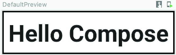
Figure 24-1
As we can see from the preview, the padding and border have been applied to the text. Clearly, the Text composable has been implemented such that it accepts a modifier as a parameter. If a composable accepts a modifier it will always be the first optional parameter in the parameter list. This has the added benefit of allowing the modifier to be passed without declaring the argument name. The following, therefore, is syntactically correct:
|
You are reading a sample chapter from an old edition of the Jetpack Compose Essentials book. Purchase the fully updated Jetpack Compose 1.7 Essentials edition of this book in eBook or Print format. The full book contains 67 chapters and over 700 pages of in-depth information. Buy the full book now in Print or eBook format. Learn more. |
Text(
    "Hello Compose",
    modifier,
    fontSize = 40.sp,
    fontWeight = FontWeight.Bold
)Code language: Kotlin (kotlin)
Modifier ordering
The order in which modifiers are chained is of great significance to the resulting output. In the above example, the border was applied first followed by the padding. This has the result of the border appearing outside the padding. To place the border inside the padding, the order of the modifiers needs to be swapped as follows:
val modifier = Modifier
    .padding(all = 10.dp)
    .border(width = 2.dp, color = Color.Black)Code language: Kotlin (kotlin)
When previewed, the Text composable will appear as shown in Figure 24-2 below:
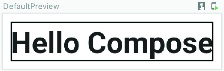
Figure 24-2
If you don’t see the expected effects when working with chained modifiers, keep in mind this may be because of the order in which they are being applied to the component.
Adding modifier support to a composable
So far in this chapter, we have shown how to create a modifier and use it with a built-in composable. When developing your own composables it is important to consider whether modifier support should be included to make the function more configurable.
|
You are reading a sample chapter from an old edition of the Jetpack Compose Essentials book. Purchase the fully updated Jetpack Compose 1.7 Essentials edition of this book in eBook or Print format. The full book contains 67 chapters and over 700 pages of in-depth information. Buy the full book now in Print or eBook format. Learn more. |
When adding modifier support to a composable the first rule is that the parameter should be named “modifier” and must be the first optional parameter in the function’s parameter list. As an example, we can add a new composable named CustomImage to our project which accepts as parameters the image resource to display and a modifier. Edit the MainActivity.kt file and add this composable so that it reads as follows:
.
.
import androidx.compose.foundation.Image
import androidx.compose.ui.res.painterResource
.
.
@Composable
fun CustomImage(image: Int) {
    Image(
        painter = painterResource(image),
        contentDescription = null
    )
}Code language: Kotlin (kotlin)
As currently declared, the function only accepts one parameter in the form of the image resource. The next step is to add the modifier parameter:
@Composable
fun CustomImage(image: Int, modifier: Modifier) {
    Image(
        painter = painterResource(image),
        contentDescription = null
    )
}Code language: Kotlin (kotlin)
It is important to remember that the modifier parameter must be optional so that the function can be called without one. This means that we need to specify an empty Modifier instance as the default for the parameter:
@Composable
fun CustomImage(image: Int, modifier: Modifier = Modifier) {
.
.Code language: Kotlin (kotlin)
Finally, we need to make sure that the modifier is applied to the Image composable, keeping in mind that it will be the first optional parameter:
@Composable
fun CustomImage(image: Int, modifier: Modifier = Modifier) {
    Image(
        painter = painterResource(image),
        contentDescription = null,
        modifier
    )
}Code language: Kotlin (kotlin)
Now that we have created a new composable with modifier support we are almost ready to call it from the DemoScreen function. First, however, we need to add an image resource to the project. The image is named vacation.jpg and can be found in the images folder of the sample code archive which can be downloaded from the following web page:
|
You are reading a sample chapter from an old edition of the Jetpack Compose Essentials book. Purchase the fully updated Jetpack Compose 1.7 Essentials edition of this book in eBook or Print format. The full book contains 67 chapters and over 700 pages of in-depth information. Buy the full book now in Print or eBook format. Learn more. |
https://www.ebookfrenzy.com/web/compose14/index.php
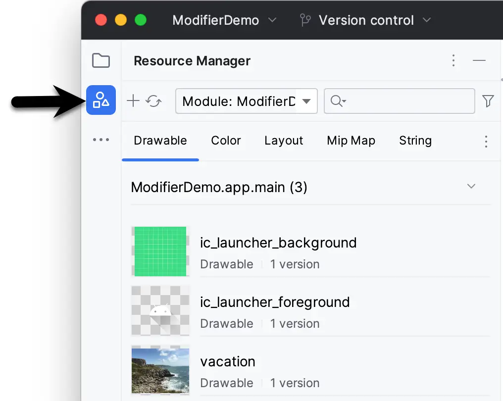
Display the Resource Manager tool window by clicking on the button highlighted in Figure 24-3. Locate the vacation.png image in the file system navigator for your operating system and drag it onto the Resource Manager tool window. In the resulting dialog, click Next followed by the Import button to add the image to the project:
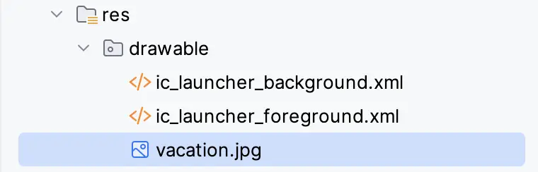
The image will also appear in the res -> drawables section of the Project tool window:
Next, modify the DemoScreen composable to include a call to the CustomImage component:
.
.
import androidx.compose.ui.Alignment
import androidx.compose.foundation.layout.*
.
.
@Composable
fun DemoScreen() {

    val modifier = Modifier
        .border(width = 2.dp, color = Color.Black)
        .padding(all = 10.dp)

    Column(
        Modifier.padding(20.dp),
        horizontalAlignment = Alignment.CenterHorizontally,
        verticalArrangement = Arrangement.Center
    ) {
        Text(
            "Hello Compose",
            modifier = modifier,
            fontSize = 40.sp,
            fontWeight = FontWeight.Bold
        )
        Spacer(Modifier.height(16.dp))
        CustomImage(R.drawable.vacation)
    }
}Code language: Kotlin (kotlin)
Refresh and build the preview and verify that the layout matches that shown in Figure 24-5 below:
|
You are reading a sample chapter from an old edition of the Jetpack Compose Essentials book. Purchase the fully updated Jetpack Compose 1.7 Essentials edition of this book in eBook or Print format. The full book contains 67 chapters and over 700 pages of in-depth information. Buy the full book now in Print or eBook format. Learn more. |
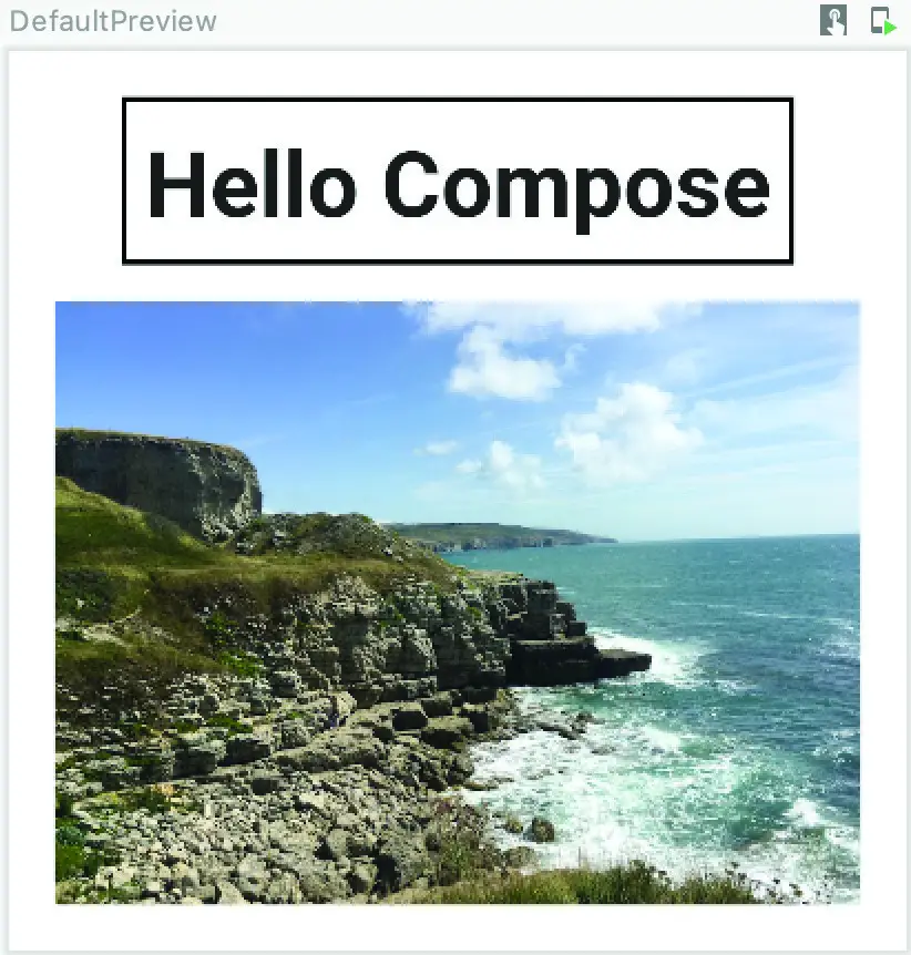
Figure 24-5
At this point, the Image component is using the default Modifier instance that we declared in the CustomImage function signature. To change this we need to construct a custom modifier and pass it through to CustomImage to modify the appearance on the image resource when it is displayed:
.
.
import androidx.compose.foundation.shape.RoundedCornerShape
import androidx.compose.ui.draw.clip
.
.
Spacer(Modifier.height(16.dp))
CustomImage(R.drawable.vacation,
    Modifier
        .padding(16.dp)
        .width(270.dp)
        .clip(shape = RoundedCornerShape(30.dp))
)
.
.Code language: Kotlin (kotlin)
The preview should now display the image with padding, fixed width, and rounded corners:
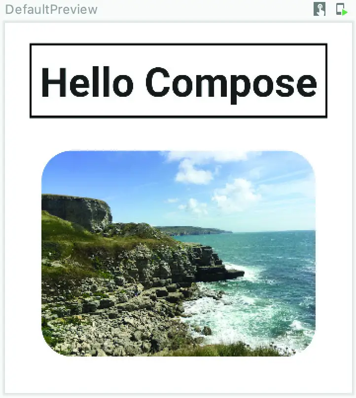
Figure 24-6
Common built-in modifiers
A list of the full set of Modifier methods is beyond the scope of this book (there are currently over 100). For a detailed and complete list of methods, refer to the Compose documentation at the following URL:
|
You are reading a sample chapter from an old edition of the Jetpack Compose Essentials book. Purchase the fully updated Jetpack Compose 1.7 Essentials edition of this book in eBook or Print format. The full book contains 67 chapters and over 700 pages of in-depth information. Buy the full book now in Print or eBook format. Learn more. |
https://developer.android.com/reference/kotlin/androidx/compose/ui/Modifier
The following is a selection of some of the more commonly used functions:
- background – Draws a solid colored shape behind the composable.
- clickable – Specifies a handler to be called when the composable is clicked. Also causes a ripple effect when the click is performed.
- clip – Clips the composable content to a specified shape.
- fillMaxHeight – The composable will be sized to fit the maximum height permitted by its parent.
- fillMaxSize – The composable will be sized to fit the maximum height and width permitted by its parent.
- fillMaxWidth – The composable will be sized to fit the maximum width permitted by its parent.
- layout – Used when implementing custom layout behavior, a topic covered in the chapter entitled Building Custom Layouts in Jetpack Compose.
- offset – Positions the composable the specified distance from its current position along the x and y-axis.
- padding – Adds space around a composable. Parameters can be used to apply spacing to all four sides or to specify different padding for each side.
- rotate – Rotates the composable on its center point by a specified number of degrees.
- scale – Increase or reduce the size of the composable by the specified scale factor.
- scrollable – Enables scrolling for a composable that extends beyond the viewable area of the layout in which it is contained.
- size – Used to specify the height and width of a composable. In the absence of a size setting, the composable will be sized to accommodate its content (referred to as wrapping).
Combining modifiers
When working with Compose, situations may arise where you have two or more Modifier objects, all of which need to be applied to the same composable. For this situation, Compose allows modifiers to be combined using the then keyword. The syntax for using this is as follows:
val combinedModifier = firstModifier.then(secondModifier).then(thirdModifier) ...Code language: Kotlin (kotlin)The result will be a modifier that contains the configurations of all specified modifiers. To see this in action, modify the MainActivity.kt file to add a second modifier for use with the Text composable:
.
.
val modifier = Modifier
    .border(width = 2.dp, color = Color.Black)
    .padding(all = 10.dp)

val secondModifier = Modifier.height(100.dp)
.
.Code language: Kotlin (kotlin)
Next, change the Text call to combine both modifiers:
|
You are reading a sample chapter from an old edition of the Jetpack Compose Essentials book. Purchase the fully updated Jetpack Compose 1.7 Essentials edition of this book in eBook or Print format. The full book contains 67 chapters and over 700 pages of in-depth information. Buy the full book now in Print or eBook format. Learn more. |
Text(
    "Hello Compose",
    modifier.then(secondModifier),
    fontSize = 40.sp,
    fontWeight = FontWeight.Bold
)Code language: Kotlin (kotlin)
The Text composable should now appear in the preview panel with a height of 100dp in addition to the original font, border, and padding settings.
Summary
Modifiers are created using instances of the Compose Modifier object and are passed as parameters to composables to change appearance and behavior. A modifier is configured by calling methods on the Modifier object to define settings such as size, padding, rotation, and background color. Most of the built-in composables provided with the Compose system will accept a modifier as a parameter. It is also possible (and recommended) to add modifier support to your own composable functions. If a composable function accepts a modifier, it will always be the second optional parameter in the function’s parameter list. Multiple modifier instances may be combined using the then keyword before being applied to a component.