
In this chapter, we will be creating a project within Android Studio to practice the use of slot APIs to build flexible and dynamic composable functions. This will include writing a composable function with two slots and calling that function with different content composables based on selections made by the user.
About the project
Once the project is completed, it will consist of a title, progress indicator, and two checkboxes. The checkboxes will be used to control whether the title is represented as text or graphics, and also whether a circular or linear progress indicator is displayed. Both the title and progress indicator will be declared as slots which will be filled with either a Text or Image composable for the title or, in the case of the progress indicator, a LinearProgressIndicator or CircularProgressIndicator component.
Creating the SlotApiDemo project
Launch Android Studio and select the New Project option from the welcome screen. Choose the Empty Activity template within the New Project dialog before clicking on the Next button.
Enter SlotApiDemo into the Name field and specify com.example.slotapidemo as the package name. Before clicking on the Finish button, change the Minimum API level setting to API 26: Android 8.0 (Oreo). Once the project has been created, the SlotApiDemo project should be listed in the Project tool window located along the left-hand edge of the Android Studio main window.
Preparing the MainActivity class file
Android Studio should have automatically loaded the MainActivity.kt file into the code editor. If it has not, locate it in the Project tool window (app -> java -> com.example.slotapidemo -> MainActivity.kt) and double-click on it to load it into the editor. Once loaded, modify the file to remove the template code as follows:
 |
You are reading a sample chapter from an old edition of the Jetpack Compose Essentials book. Purchase the fully updated Jetpack Compose 1.7 Essentials edition of this book in eBook or Print format. The full book contains 67 chapters and over 700 pages of in-depth information. Buy the full book now in Print or eBook format. Learn more. |
package com.example.slotapidemo
.
.
class MainActivity : ComponentActivity() {
    override fun onCreate(savedInstanceState: Bundle?) {
        super.onCreate(savedInstanceState)
        setContent {
            SlotApiDemoTheme {
                Surface(
                    modifier = Modifier.fillMaxSize(),
                    color = MaterialTheme.colorScheme.background
                ) {
                    // Greeting("Android")
                }
            }
        }
    }
}
/*
@Composable
fun Greeting(name: String) {
    Text(text = "Hello $name!")
}

@Preview(showBackground = true)
@Composable
fun GreetingPreview() {
    SlotApiDemoTheme {
        Greeting("Android")
    }
}
*/Code language: Kotlin (kotlin)
Creating the MainScreen composable
Edit the onCreate method of the MainActivity class to call a composable named MainScreen from within the Surface component:
override fun onCreate(savedInstanceState: Bundle?) {
    super.onCreate(savedInstanceState)
    setContent {
        SlotDemoTheme {
            Surface(
                modifier = Modifier.fillMaxSize(),
                color = MaterialTheme.colorScheme.background
            ) {
                MainScreen()
            }
        }
    }
}Code language: Kotlin (kotlin)
MainScreen will contain the state and event handlers for the two Checkbox components. Start adding this composable now, making sure to place it after the closing brace (}) of the MainActivity class declaration:
.
.
import androidx.compose.runtime.*
import androidx.compose.material3.*
import androidx.compose.foundation.layout.*
.
.
@Composable
fun MainScreen() {

    var linearSelected by remember { mutableStateOf(true) }
    var imageSelected by remember { mutableStateOf(true) }

    val onLinearClick = { value : Boolean ->
        linearSelected = value
    }

    val onTitleClick = { value : Boolean ->
        imageSelected = value
    }
}Code language: Kotlin (kotlin)
Here we have declared two state variables, one for each of the two Checkbox components, and initialized them to true. Next, event handlers have been declared to allow the state of each variable to be changed when the user toggles the Checkbox settings. Later in the project, MainScreen will be modified to call a second composable named ScreenContent.
Adding the ScreenContent composable
When the MainScreen function calls it, the ScreenContent composable will need to be passed the state variables and event handlers and can initially be declared as follows:
package com.example.slotapidemo
.
.
import androidx.compose.ui.Alignment
import androidx.compose.ui.unit.dp
.
.
@Composable
fun ScreenContent(
    linearSelected: Boolean,
    imageSelected: Boolean,
    onTitleClick: (Boolean) -> Unit,
    onLinearClick: (Boolean) -> Unit) {

    Column(
        modifier = Modifier.fillMaxSize(),
        horizontalAlignment = Alignment.CenterHorizontally,
        verticalArrangement = Arrangement.SpaceBetween
    ) {

    }
}Code language: Kotlin (kotlin)
As the name suggests, the ScreenContent composable is going to be responsible for displaying the screen content including the title, progress indicator, and checkboxes. In preparation for this content, we have made a call to the Column composable and configured it to center its children along the horizontal axis. The SpaceBetween arrangement property has also been set. This tells the column to space its children evenly but not to include spacing before the first or after the last child.
|
You are reading a sample chapter from an old edition of the Jetpack Compose Essentials book. Purchase the fully updated Jetpack Compose 1.7 Essentials edition of this book in eBook or Print format. The full book contains 67 chapters and over 700 pages of in-depth information. Buy the full book now in Print or eBook format. Learn more. |
One of the child composables which ScreenContent will call will be responsible for rendering the two Checkbox components. While these could be added directly within the Column composable, a better approach is to place them in a separate composable which can be called from within ScreenContent.
Creating the Checkbox composable
The composable containing the checkboxes will consist of a Row component containing two Checkbox instances. In addition, Text composables will be positioned to the left of each Checkbox with a Spacer separating the two Text/Checkbox pairs.
When it is called, the Checkboxes composable will need to be passed the two state variables which will be used to make sure the checkboxes display the current state. Also passed will be references to the onLinearClick and onTitleClick event handlers which will be assigned to the onCheckChange properties of the two Checkbox components.
Remaining within the MainActivity.kt file, add the CheckBoxes composable so that it reads as follows:
@Composable
fun CheckBoxes(
    linearSelected: Boolean,
    imageSelected: Boolean,
    onTitleClick: (Boolean) -> Unit,
    onLinearClick: (Boolean) -> Unit
) {
    Row(
        Modifier.padding(20.dp),
        verticalAlignment = Alignment.CenterVertically
    ) {
        Checkbox(
            checked = imageSelected,
            onCheckedChange = onTitleClick
        )
        Text("Image Title")
        Spacer(Modifier.width(20.dp))
        Checkbox(checked = linearSelected,
            onCheckedChange = onLinearClick
        )
        Text("Linear Progress")
    }
}Code language: Kotlin (kotlin)
If you would like to preview the composable before proceeding, add the following preview declaration before clicking on the Build & Refresh link in the Preview panel:
|
You are reading a sample chapter from an old edition of the Jetpack Compose Essentials book. Purchase the fully updated Jetpack Compose 1.7 Essentials edition of this book in eBook or Print format. The full book contains 67 chapters and over 700 pages of in-depth information. Buy the full book now in Print or eBook format. Learn more. |
@Preview
@Composable
fun DemoPreview() {
    CheckBoxes(
        linearSelected = true,
        imageSelected = true,
        onTitleClick = { /*TODO*/ },
        onLinearClick = { /*TODO*/})
}Code language: Kotlin (kotlin)
When calling the CheckBoxes composable in the above preview function we are setting the two state properties to true and assigning stub lambdas that do nothing as the event callbacks.
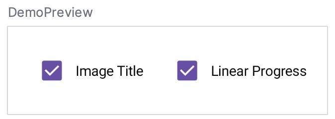
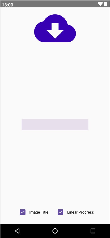
Once the preview has been refreshed, the layout should match that shown in Figure 23-1 below:
Implementing the ScreenContent slot API
Now that we have added the composable containing the two checkboxes, we can call it from within the Column contained within ScreenContent. Since both the state variables and event handlers were already passed into ScreenContent, we can simply pass these to the Checkboxes composable when we call it. Locate the ScreenContent composable and modify it as follows:
@Composable
fun ScreenContent(
    linearSelected: Boolean,
    imageSelected: Boolean,
    onTitleClick: (Boolean) -> Unit,
    onLinearClick: (Boolean) -> Unit) {

    Column(
        modifier = Modifier.fillMaxSize(),
        horizontalAlignment = Alignment.CenterHorizontally,
        verticalArrangement = Arrangement.SpaceBetween
    ) {
        CheckBoxes(linearSelected, imageSelected, onTitleClick, onLinearClick)
    }
}Code language: Kotlin (kotlin)
In addition to the row of checkboxes, ScreenContent also needs slots for the title and progress indicator. These will be named titleContent and progressContent and need to be added as parameters and referenced as children of the Column:
@Composable
fun ScreenContent(
    linearSelected: Boolean,
    imageSelected: Boolean,
    onTitleClick: (Boolean) -> Unit,
    onLinearClick: (Boolean) -> Unit,
    titleContent: @Composable () -> Unit,
    progressContent: @Composable () -> Unit) {

    Column(
        modifier = Modifier.fillMaxSize(),
        horizontalAlignment = Alignment.CenterHorizontally,
        verticalArrangement = Arrangement.SpaceBetween
    ) {
        titleContent()
        progressContent()
        CheckBoxes(linearSelected, imageSelected, onTitleClick, onLinearClick)
    }
}Code language: Kotlin (kotlin)
All that remains is to add some code to the MainScreen declaration so that different composables are provided for the slots based on the current values of the linearSelected and imageSelected state variables. Before taking that step, however, we need to add one more composable to display an image in the title slot.
|
You are reading a sample chapter from an old edition of the Jetpack Compose Essentials book. Purchase the fully updated Jetpack Compose 1.7 Essentials edition of this book in eBook or Print format. The full book contains 67 chapters and over 700 pages of in-depth information. Buy the full book now in Print or eBook format. Learn more. |
Adding an Image drawable resource
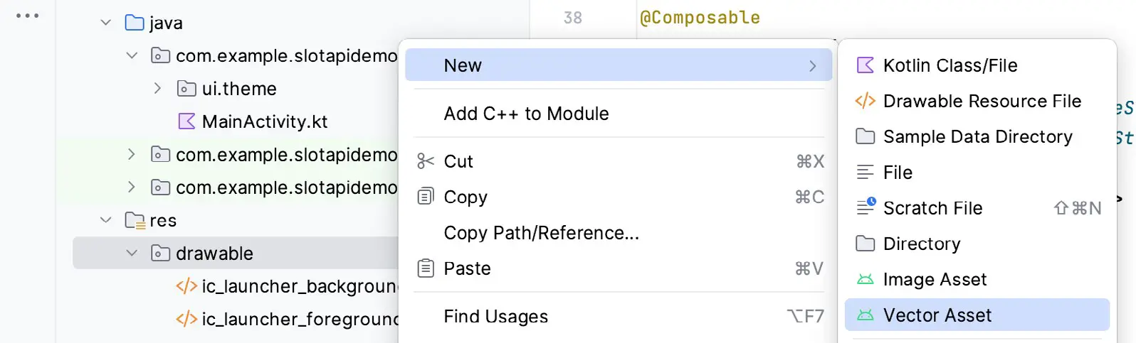
For this example, we will use one of the built-in vector drawings included with the Android SDK. To select a drawing and add it to the project, begin by locating the drawable folder in the Project tool window (app -> res -> drawable) and right-click on it. In the resulting menu (Figure 23-2) select the New -> Vector Asset menu option:
Once the menu option has been selected, Android Studio will display the Asset Studio dialog shown in Figure 23-3 below:
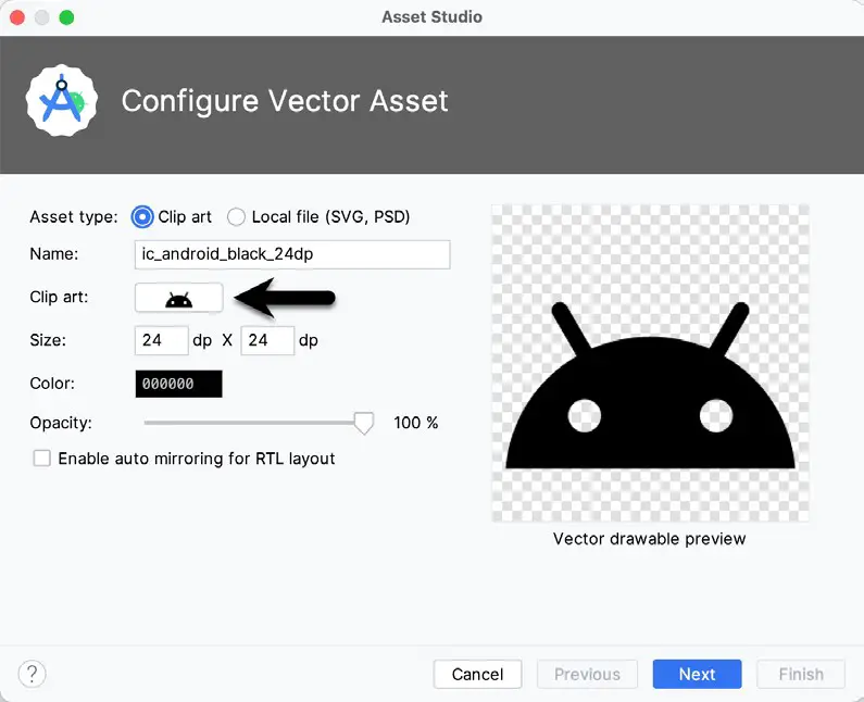
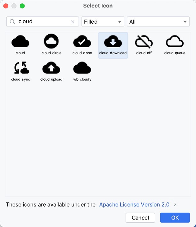
Within the dialog, click on the image to the right of the Clip Art label as indicated by the arrow in the above figure to display a list of available icons. In the search box, enter “cloud” and select the “Cloud Download” icon as shown in Figure 23-4 below:
Click on the OK button to select the drawing and return to the Asset Studio dialog. Increase the size of the image to 150dp x 150dp before clicking the Next button. On the subsequent screen, click on Finish to save the file in the default location.
While changing the image’s color in the Asset Studio dialog was possible, the color selector only allows us to specify colors by RGB value. Instead, we want to use a named color from the project resources. So, in the Project tool window, find and open the colors.xml file under app -> res -> values. This file contains a set of named color properties. In this example, the plan is to use the color named purple_700:
|
You are reading a sample chapter from an old edition of the Jetpack Compose Essentials book. Purchase the fully updated Jetpack Compose 1.7 Essentials edition of this book in eBook or Print format. The full book contains 67 chapters and over 700 pages of in-depth information. Buy the full book now in Print or eBook format. Learn more. |
<?xml version="1.0" encoding="utf-8"?>
<resources>
.
.
    <color name="purple_700">#FF3700B3</color>Code language: HTML, XML (xml)
Having chosen a color from the resources, double-click on the baseline_cloud_download_24.xml vector asset file in the Project tool window to load it into the code editor and modify the android:tint property as follows:
<vector android:height="150dp" android:tint="@color/purple_700"
    android:viewportHeight="24" android:viewportWidth="24"
    android:width="150dp" xmlns:android="http://schemas.android.com/apk/res/android">
    <path android:fillColor="@android:color/white" android:pathData="M19.35,10.04C18.67,6.59 15.64,4 12,4 9.11,4 6.6,5.64 5.35,8.04 2.34,8.36 0,10.91 0,14c0,3.31 2.69,6 6,6h13c2.76,0 5,-2.24 5,-5 0,-2.64 -2.05,-4.78 -4.65,-4.96zM17,13l-5,5 -5,-5h3V9h4v4h3z"/>
</vector>Code language: HTML, XML (xml)
Coding the TitleImage composable
Now that we have an image to display for the title, the next step is to add a composable to the MainActivity.kt file to display the image. To make this composable as reusable as possible, we will design it so that it is passed the image resource to be displayed:
.
.
import androidx.compose.foundation.Image
import androidx.compose.ui.res.painterResource
.
.
@Composable
fun TitleImage(drawing: Int) {
    Image(
        painter = painterResource(drawing),
        contentDescription = "title image",
        modifier = Modifier.size(150.dp)
    )
}Code language: Kotlin (kotlin)
The Image component provides several ways to render graphics depending on which parameters are used when it is called. Since we are using a resource image, the component makes a call to the painterResource method to render the image.
Completing the MainScreen composable
Now that all of the child composables have been added and the state variable and event handlers implemented, it is time to complete work on the MainScreen declaration. Specifically, code needs to be added to this composable to display different content in the two ScreenContent slots depending on the current checkbox selections.
Locate the MainScreen composable in the MainActivity.kt file and add code to call the ScreenContent function as follows:
|
You are reading a sample chapter from an old edition of the Jetpack Compose Essentials book. Purchase the fully updated Jetpack Compose 1.7 Essentials edition of this book in eBook or Print format. The full book contains 67 chapters and over 700 pages of in-depth information. Buy the full book now in Print or eBook format. Learn more. |
@Composable
fun MainScreen() {

    var linearSelected by remember { mutableStateOf(true) }
    var imageSelected by remember { mutableStateOf(true) }

    val onLinearClick = { value : Boolean ->
        linearSelected = value
    }

    val onTitleClick = { value : Boolean ->
        imageSelected = value
    }

    ScreenContent(
        linearSelected = linearSelected,
        imageSelected = imageSelected,
        onLinearClick = onLinearClick,
        onTitleClick = onTitleClick,
        titleContent = {
            if (imageSelected) {

                TitleImage(drawing = R.drawable.baseline_cloud_download_24)

            } else {
                Text("Downloading",
                  style = MaterialTheme.typography.headlineSmall,
                    modifier = Modifier.padding(30.dp))
            }
        },
        progressContent = {
            if (linearSelected) {
                LinearProgressIndicator(Modifier.height(40.dp))
            } else {
                CircularProgressIndicator(Modifier.size(200.dp),
                      strokeWidth = 18.dp)
            }
        }
    )
}Code language: Kotlin (kotlin)
The ScreenContent call begins by passing through the state variables and event handlers which will subsequently be passed down to the two Checkbox instances:
ScreenContent(
    linearSelected = linearSelected,
    imageSelected = imageSelected,
    onLinearClick = onLinearClick,
    onTitleClick = onTitleClick,Code language: Kotlin (kotlin)
The next parameter deals with the titleContent slot and uses an if statement to pass through either a TitleImage or Text component depending on the current value of the imageSelected state:
titleContent = {
    if (imageSelected) {

        TitleImage(drawing = R.drawable.baseline_cloud_download_24)

    } else {
        Text("Downloading", style = MaterialTheme.typography.headlineSmall,
            modifier = Modifier.padding(30.dp))
    }
},Code language: Kotlin (kotlin)
Finally, either a linear or circular progress indicator is used to fill ScreenContent’s progressContent slot based on the current value of the linearSelected state:
progressContent = {
    if (linearSelected) {
        LinearProgressIndicator(Modifier.height(40.dp))
    } else {
        CircularProgressIndicator(Modifier.size(200.dp), strokeWidth = 18.dp)
    }
}Code language: Kotlin (kotlin)
Note that we haven’t passed a progress value through to either of the progress indicators. This will cause the components to enter indeterminate progress mode which will cause them to show a continually cycling indicator.
Previewing the project
With these changes complete, the project is now ready to preview. Locate the DemoPreview composable added earlier in the chapter and modify it to call MainScreen instead of the Checkboxes composable. Also, add the system UI to the preview:
|
You are reading a sample chapter from an old edition of the Jetpack Compose Essentials book. Purchase the fully updated Jetpack Compose 1.7 Essentials edition of this book in eBook or Print format. The full book contains 67 chapters and over 700 pages of in-depth information. Buy the full book now in Print or eBook format. Learn more. |
@Preview(showSystemUi = true)
@Composable
fun DemoPreview() {
    MainScreen()
}Code language: Kotlin (kotlin)
Once a rebuild has been performed, the Preview panel should resemble that shown in Figure 23-5:
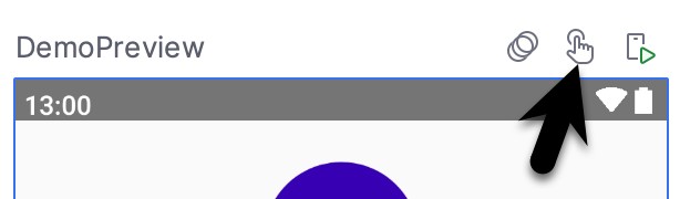
To test that the project works, start interactive mode by clicking on the button indicated in Figure 23-6:
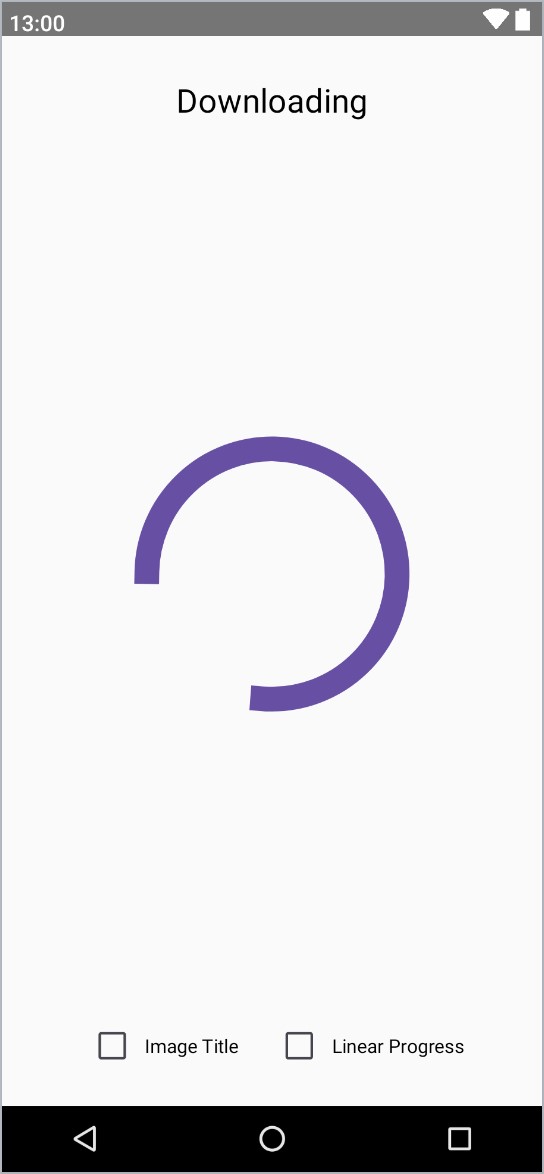
Once interactive mode has started, experiment with different combinations of checkbox settings to confirm that the slot API for the ScreenContent composable is performing as expected. Figure 23-7, for example, shows the rendering with both checkboxes disabled:
Summary
In this chapter, we have demonstrated the use of a slot API to insert different content into a composable at the point that it is called during runtime. Incidentally, we also passed state variables and event handler references down through multiple levels of composable functions and explored how to use Android Studio’s Asset Studio to select and configure built-in vector drawable assets. Finally, we also used the built-in Image component to render an image within a user interface layout.