
The appearance of Android apps is intended to conform to a set of guidelines defined by Material Design. Google developed Material Design to provide a level of design consistency between different apps while also allowing app developers to include their own branding in terms of color, typography, and shape choices (a concept referred to Material theming). In addition to design guidelines, Material Design also includes a set of UI components for use when designing user interface layouts, many of which we have used throughout this book.
This chapter will provide an overview of how theming works within an Android Studio Compose project and explore how the default design configurations provided for newly created projects can be modified to meet your branding requirements.
Material Design 2 vs. Material Design 3
Before beginning, it is important to note that Google is transitioning from Material Design 2 to Material Design 3 and that Android Studio Giraffe defaults to Material Design 3. Material Design 3 provides the basis for Material You, a feature introduced in Android 12 that allows an app to automatically adjust theme elements to complement preferences configured by the user on the device. For example, dynamic color support provided by Material Design 3 allows the colors used in apps to adapt automatically to match the user’s wallpaper selection.
At the time of writing, shape theming was not yet supported by Material Design 3. However, the concepts covered in this chapter for color and typography will apply to shapes when support is available.
Material Design 3 theming
Before exploring Material Design 3, we first need to look at how it is used in an Android Studio project created using the Empty Activity template. The first point to note is that calls to the top-level composable in the onCreate() method and the GreetingPreview function are embedded in a theme composable. The following, for example, is the code generated for a project named MyApp:
 |
You are reading a sample chapter from an old edition of the Jetpack Compose Essentials book. Purchase the fully updated Jetpack Compose 1.7 Essentials edition of this book in eBook or Print format. The full book contains 67 chapters and over 700 pages of in-depth information. Buy the full book now in Print or eBook format. Learn more. |
class MainActivity : ComponentActivity() {
override fun onCreate(savedInstanceState: Bundle?) {
super.onCreate(savedInstanceState)
setContent {
MyAppTheme {
Surface(
modifier = Modifier.fillMaxSize(),
color = MaterialTheme.colorScheme.background
) {
Greeting("Android")
}
}
}
}
}
@Preview(showBackground = true)
@Composable
fun GreetingPreview() {
MyAppTheme {
Greeting("Android")
}
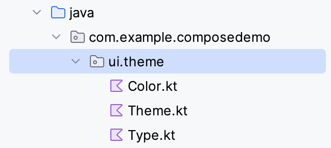
}Code language: Kotlin (kotlin)All of the files associated with MyAppTheme are contained within the ui.theme sub-package of the project, as shown in Figure 59-1:
The theme itself is declared in the Theme.kt file, which begins by declaring different color palettes for use when the device is in light or dark mode. These palettes are created by calling the darkColorScheme() and lightColorScheme() builder functions and specifying the colors for the different Material Theme color slots:
private val DarkColorScheme = darkColorScheme(
    primary = Purple80,
    secondary = PurpleGrey80,
    tertiary = Pink80
)

private val LightColorScheme = lightColorScheme(
    primary = Purple40,
    secondary = PurpleGrey40,
    tertiary = Pink40

    /* Other default colors to override
    background = Color(0xFFFFFBFE),
    surface = Color(0xFFFFFBFE),
    onPrimary = Color.White,
    onSecondary = Color.White,
    onTertiary = Color.White,
    onBackground = Color(0xFF1C1B1F),
    onSurface = Color(0xFF1C1B1F),
    */
)Code language: Kotlin (kotlin)
This is just a subset of the slots available for color theming. For Material Design 3, for example, there is a total Working with Compose Theming of 24 color slots available for use when designing a theme. In the absence of a slot assignment, the Material components use built-in default colors. A full listing of MD3 color slot names can be found at:
https://developer.android.com/reference/kotlin/androidx/compose/material3/ColorScheme
These color slots are used by the Material components to set color attributes. For example, the primary color slot is used as the background color for the Material Button component. The actual colors assigned to the slots are declared in the Color.kt file as follows:
|
You are reading a sample chapter from an old edition of the Jetpack Compose Essentials book. Purchase the fully updated Jetpack Compose 1.7 Essentials edition of this book in eBook or Print format. The full book contains 67 chapters and over 700 pages of in-depth information. Buy the full book now in Print or eBook format. Learn more. |
val Purple80 = Color(0xFFD0BCFF)
val PurpleGrey80 = Color(0xFFCCC2DC)
val Pink80 = Color(0xFFEFB8C8)

val Purple40 = Color(0xFF6650a4)
val PurpleGrey40 = Color(0xFF625b71)
val Pink40 = Color(0xFF7D5260)Code language: Kotlin (kotlin)
Material Design 3 themes may also include support for dynamic colors via calls to the dynamicDarkColorScheme() and dynamicLightColorScheme() functions passing through the current local context as a parameter. These functions will then generate color schemes that match the user’s settings on the device (for example, wallpaper selection). Since dynamic colors are only supported on Android 12 (S) or later, defensive code is included in the theme declared in the Theme.kt file. In addition to the color palette, MaterialTheme is also passed typography settings which are declared in the Type.kt file.:
@Composable
fun MyAppTheme(
    darkTheme: Boolean = isSystemInDarkTheme(),
    dynamicColor: Boolean = true,
    content: @Composable () -> Unit
) {
    val colorScheme = when {
        dynamicColor && Build.VERSION.SDK_INT >= Build.VERSION_CODES.S -> {
            val context = LocalContext.current
            if (darkTheme) dynamicDarkColorScheme(context) else
                                    dynamicLightColorScheme(context)
        }

        darkTheme -> DarkColorScheme
        else -> LightColorScheme
    }
    val view = LocalView.current
    if (!view.isInEditMode) {
        SideEffect {
            val window = (view.context as Activity).window
            window.statusBarColor = colorScheme.primary.toArgb()
            WindowCompat.getInsetsController(window, view).
                            isAppearanceLightStatusBars = darkTheme
        }
    }

    MaterialTheme(
        colorScheme = colorScheme,
        typography = Typography,
        content = content
    )
}Code language: Kotlin (kotlin)
Note that the theme uses the slot API (introduced in the chapter entitled An Overview of Jetpack Compose Slot APIs) to display the content. In terms of typography, Material Design has a set of type scales, three of which are declared in the Type.kt file (albeit with two commented out):
val Typography = Typography(
    bodyLarge = TextStyle(
        fontFamily = FontFamily.Default,
        fontWeight = FontWeight.Normal,
        fontSize = 16.sp,
        lineHeight = 24.sp,
        letterSpacing = 0.5.sp
    )
    /* Other default text styles to override
    titleLarge = TextStyle(
        fontFamily = FontFamily.Default,
        fontWeight = FontWeight.Normal,
        fontSize = 22.sp,
        lineHeight = 28.sp,
        letterSpacing = 0.sp
    ),
    labelSmall = TextStyle(
        fontFamily = FontFamily.Default,
        fontWeight = FontWeight.Medium,
        fontSize = 11.sp,
        lineHeight = 16.sp,
        letterSpacing = 0.5.sp
    )
    */
)Code language: Kotlin (kotlin)
)
As with the color slots, this is only a subset of the type scales supported by Material Design. The full list can be found online at:
https://developer.android.com/reference/kotlin/androidx/compose/material3/Typography
|
You are reading a sample chapter from an old edition of the Jetpack Compose Essentials book. Purchase the fully updated Jetpack Compose 1.7 Essentials edition of this book in eBook or Print format. The full book contains 67 chapters and over 700 pages of in-depth information. Buy the full book now in Print or eBook format. Learn more. |
Creating a custom theme involves editing these files to use different colors, typography, and shape settings. These changes will then be used by the Material components that make up the app’s user interface.
Note that dynamic colors only take effect when enabled on the device by the user within the wallpaper and styles section of the Android Settings app.
Building a custom theme
As we have seen, the coding work in implementing a theme is relatively simple. The difficult part, however, is often choosing complementary colors to make up the theme. Fortunately, Google has developed a tool that makes it easy to design custom color themes for your apps. This tool is called the Material Theme Builder and is available at:
https://m3.material.io/theme-builder#/custom
On the custom screen (Figure 59-2), make a color selection for the primary color key (A) by clicking on the color circle to display the color selection dialog. Once a color has been selected, the preview (B) will change to reflect the recommended colors for all MD3 color slots, along with example app interfaces and widgets. The button marked D previews the color scheme in light and dark modes. In addition, you can override the generated colors for the Secondary, Tertiary, and Neutral slots by clicking on the corresponding color circles to display the color selection dialog.
|
You are reading a sample chapter from an old edition of the Jetpack Compose Essentials book. Purchase the fully updated Jetpack Compose 1.7 Essentials edition of this book in eBook or Print format. The full book contains 67 chapters and over 700 pages of in-depth information. Buy the full book now in Print or eBook format. Learn more. |
The area marked B displays example app interfaces, light and dark color scheme charts, and widgets that update to preview your color selections. Since the panel is longer than the typical browser window, you must scroll down to see all the information:
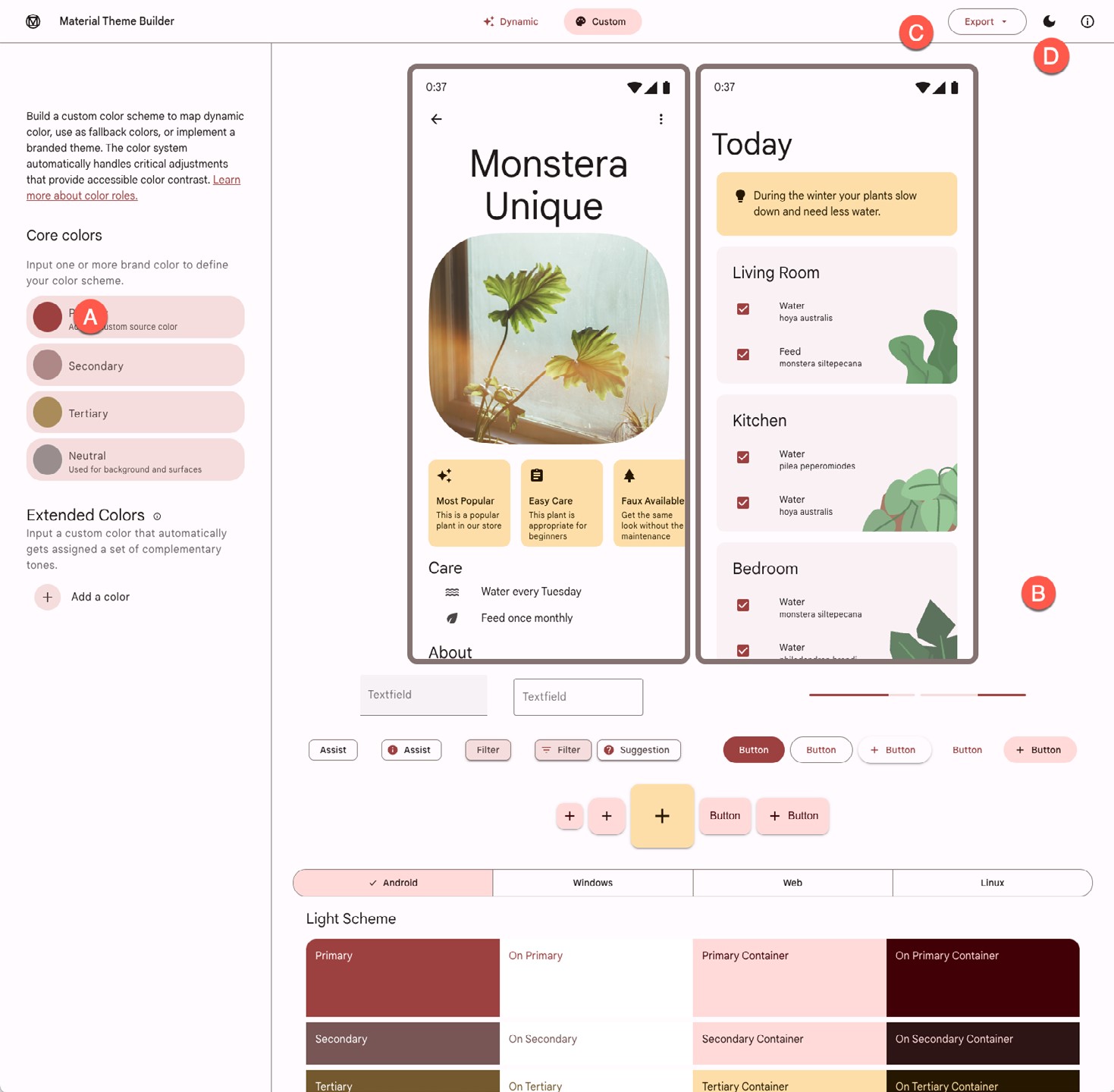
To incorporate the theme into your design, click the Export button (C) and select the Jetpack Compose (Theme. kt) option. Once downloaded, the Color.kt and Theme.kt files can replace the existing files in your project. Note that the theme name in the exported Theme.kt file must be changed to match your project.
Summary
Material Design provides guidelines and components defining how Android apps appear. Individual branding can be applied to an app by designing themes that specify the colors, fonts, and shapes used when displaying the app. Google is currently introducing Material Design 3 which replaces Material Design 2 and supports the new features of Material Me, including dynamic colors. Google also provides the Material Theme Builder for designing your own themes, which eases the task of choosing complementary theme colors. Once this tool has been used to create a theme, the corresponding files can be exported and used within an Android Studio project.