
This chapter will demonstrate how to create a new theme using the Material Theme Builder tool, integrate it into an Android Studio project, and test dynamic theme colors.
Creating the ThemeDemo project
Launch Android Studio and create a new Empty Activity project named ThemeDemo, specifying com.example. themedemo as the package name and selecting a minimum API level of API 26: Android 8.0 (Oreo).
Within the MainActivity.kt file, delete the Greeting function and add a new empty composable named MainScreen:
@Composable
fun MainScreen() {

}Code language: Kotlin (kotlin)
Next, edit the OnCreate() method and GreetingPreview function to call MainScreen instead of Greeting and enable the system UI preview option:
@Preview(showBackground = true, showSystemUi = true)
@Composable
fun GreetingPreview() {
.
.Code language: Kotlin (kotlin)
Designing the user interface
The main activity will contain a simple layout containing some common MD3 components. This will let us see the effect of theming work performed later in the chapter. For the latest information on which MD3 components are available for use with Jetpack Compose, refer to the following web page: https://developer.android.com/jetpack/androidx/releases/compose-material3
 |
You are reading a sample chapter from an old edition of the Jetpack Compose Essentials book. Purchase the fully updated Jetpack Compose 1.7 Essentials edition of this book in eBook or Print format. The full book contains 67 chapters and over 700 pages of in-depth information. Buy the full book now in Print or eBook format. Learn more. |
Within the MainActivity.kt file, edit the MainScreen composable, so it reads as follows:
.
.
import androidx.compose.foundation.layout.Arrangement
import androidx.compose.foundation.layout.Column
import androidx.compose.material.icons.Icons
import androidx.compose.material.icons.filled.Favorite
import androidx.compose.material.icons.filled.Home
import androidx.compose.material.icons.filled.Settings
import androidx.compose.material3.*
import androidx.compose.runtime.*
import androidx.compose.ui.Alignment
.
.
@Composable
fun MainScreen() {

    var selectedItem by remember { mutableStateOf(0) }
    val items = listOf("Home", "Settings", "Favorites")
    val icons = listOf(Icons.Filled.Home, Icons.Filled.Settings,
                                  Icons.Filled.Favorite)

    Column(
        verticalArrangement = Arrangement.SpaceBetween,
        horizontalAlignment = Alignment.CenterHorizontally
    ) {

        TopAppBar(title = { Text("ThemeDemo") }, scrollBehavior = null)

        Button(onClick = { }) {
            Text("MD3 Button")
        }

        Text("A Theme Demo")

        FloatingActionButton(onClick = { }) {
                Text("FAB")
        }

        NavigationBar {
            items.forEachIndexed { index, item ->
                NavigationBarItem(
                    icon = { Icon(icons[index], contentDescription = null) },
                    label = { Text(item) },
                    selected = selectedItem == index,
                    onClick = { selectedItem = index }
                )
            }
        }
    }
}Code language: Kotlin (kotlin)
If the editor reports that TopAppBar is an experimental API, add the following directive to the MainScreen composable:
@OptIn(ExperimentalMaterial3Api::class)
@Composable
fun MainScreen() {
.
.Code language: Kotlin (kotlin)
When previewed, the MainScreen layout should appear as illustrated in Figure 60-1:
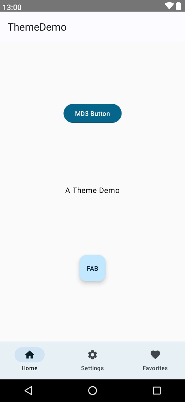
The completed design is currently using default theme colors and fonts. The next step is to build an entirely new theme for the app.
Building a new theme
The theme for the project will be designed and generated using the Material Theme Builder. Open a browser window and navigate to the following URL to access the builder tool:
|
You are reading a sample chapter from an old edition of the Jetpack Compose Essentials book. Purchase the fully updated Jetpack Compose 1.7 Essentials edition of this book in eBook or Print format. The full book contains 67 chapters and over 700 pages of in-depth information. Buy the full book now in Print or eBook format. Learn more. |
https://m3.material.io/theme-builder#/custom
Once you have loaded the builder, select a wallpaper and click on the Custom button at the top of the screen. Next, click on the Primary color circle in the Core colors section to display the color selector. From the color selector, choose any color you feel like using as the basis for your theme before clicking on the Close button:
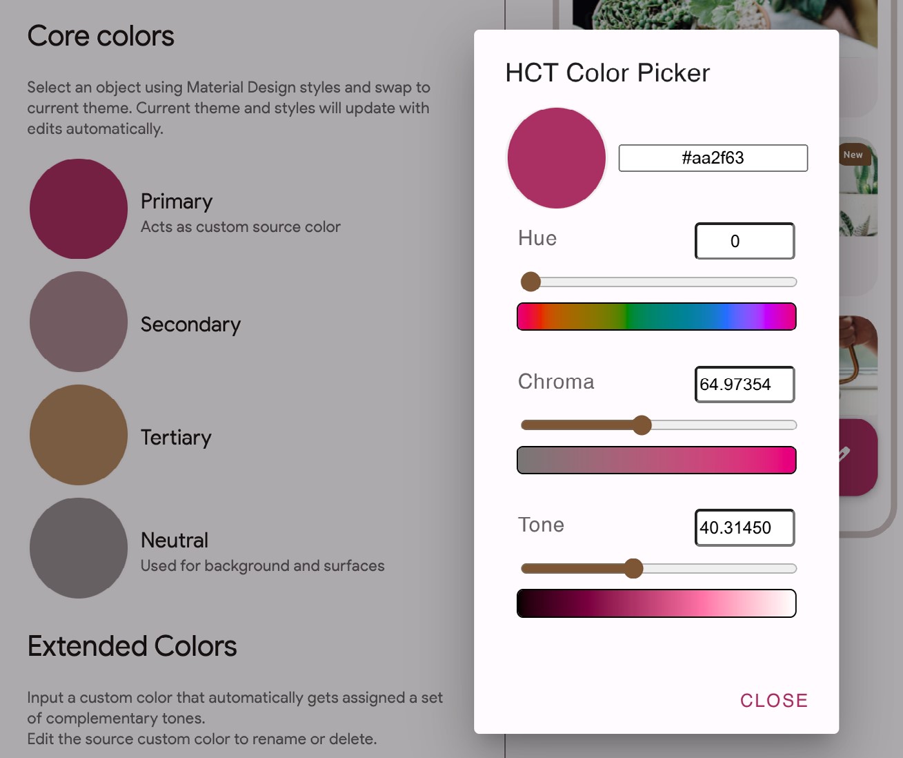
Review the color scheme in the Your Theme panel and make any necessary color adjustments using the Core colors panel until you are happy with the color slots. Once the theme is ready, click on the Export button in the top right-hand corner and select the Jetpack Compose (Theme.kt) option. When prompted, save the file to a suitable location on your computer filesystem. The theme will be saved as a compressed file named materialtheme.zip.
Using the appropriate tool for your operating system, unpack the theme file, which should contain the following files in a folder with the path material-theme/ui/theme:
- Color.kt
- Theme.kt
Now that the theme files have been generated, they need to be integrated into the Android Studio project.
|
You are reading a sample chapter from an old edition of the Jetpack Compose Essentials book. Purchase the fully updated Jetpack Compose 1.7 Essentials edition of this book in eBook or Print format. The full book contains 67 chapters and over 700 pages of in-depth information. Buy the full book now in Print or eBook format. Learn more. |
Adding the theme to the project
Before we can add the new theme to the project, we first need to remove the old theme files. Select and delete the Color.kt and Theme.kt files from the ui.theme folder within the Android Studio Project tool window. Once the files have been removed, locate the custom theme files in the material-theme/ui/theme folder on your local filesystem and copy and paste them into the ui.theme folder in the Project tool window.
After adding the files, edit each one in turn and change the package declaration to match the current project which, assuming you followed the steps at the start of the chapter, will read as follows:
package com.example.themedemo.ui.themeCode language: Kotlin (kotlin)Next, edit the Theme.kt and change the name of the Theme composable from AppTheme to ThemeDemoTheme:
@Composable
fun ThemeDemoTheme(
  useDarkTheme: Boolean = isSystemInDarkTheme(),
  content: @Composable() () -> Unit
) {
  val colors = if (!useDarkTheme) {
     LightColors
 } else {
     DarkColors
.
.Code language: Kotlin (kotlin)
Return to the MainActivity.kt file and refresh the Preview panel to confirm that the components are rendered using the new theme. Then, take some time to explore the Colors.kt and Theme.kt files to see the different available theme settings. Also, experiment by making changes to different typography and color values.
Enabling dynamic colors
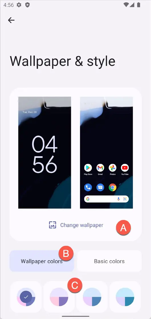
The app must be run on a device or emulator running Android 12 or later with the correct Wallpaper settings to test dynamic colors. First, launch the Settings app on the device or emulator and select Wallpaper & style from the list of options. On the wallpaper settings screen, click the option to change the wallpaper (marked A in Figure 60-3) and select a wallpaper image containing colors that differ significantly from the colors in your theme. Once selected, assign the wallpaper to the Home screen.
|
You are reading a sample chapter from an old edition of the Jetpack Compose Essentials book. Purchase the fully updated Jetpack Compose 1.7 Essentials edition of this book in eBook or Print format. The full book contains 67 chapters and over 700 pages of in-depth information. Buy the full book now in Print or eBook format. Learn more. |
Return to the Wallpaper & styles screen and make sure that the Wallpaper colors option is selected (B) before trying out the different color scheme buttons (C). As each option is clicked, the wallpaper example will change to reflect the selection:
Once you have chosen a wallpaper, return to Android Studio, load the Theme.kt file into the code editor and make the following changes to the ThemeDemoTheme composable to add support for dynamic colors:
.
.
import android.os.Build
import androidx.compose.material3.dynamicDarkColorScheme
import androidx.compose.material3.dynamicLightColorScheme
import androidx.compose.ui.platform.LocalContext
.
.
@Composable
fun ThemeDemoTheme(
  useDarkTheme: Boolean = isSystemInDarkTheme(),
  dynamicColor: Boolean = true,
  content: @Composable() () -> Unit
) {
    val colors = when {
        dynamicColor && Build.VERSION.SDK_INT >= Build.VERSION_CODES.S -> {
            val context = LocalContext.current
            if (useDarkTheme) dynamicDarkColorScheme(context)
            else dynamicLightColorScheme(context)
        }
        useDarkTheme -> DarkColors
        else -> LightColors
    }

    MaterialTheme(
      colorScheme = colors,
      content = content
  )
}Code language: Kotlin (kotlin)
Build and run the app and note that the layout is now using a theme that matches the wallpaper color. Place the ThemeDemo app into the background, return to the Wallpaper & styles settings screen, and choose a different wallpaper. Bring the ThemeDemo app to the foreground again, at which point it will have dynamically adapted to match the new wallpaper.
Summary
This chapter demonstrates how to use the Material Theme Builder to design a new theme and explains the steps to integrate the generated theme files into a project. Finally, the chapter showed how to implement and use the Material You dynamic colors feature introduced with Android 12.