
The goal of this chapter is to introduce SwiftUI 2D drawing techniques. In addition to a group of built-in shape and gradient drawing options, SwiftUI also allows custom drawing to be performed by creating entirely new views that conform to the Shape and Path protocols.
Creating the DrawDemo Project
Launch Xcode and select the option to create a new Multiplatform App named DrawDemo.
SwiftUI Shapes
SwiftUI includes a set of five pre-defined shapes that conform to the Shape protocol which can be used to draw circles, rectangles, rounded rectangles and ellipses. Within the DrawDemo project, open the ContentView.swift file and add a single rectangle:
struct ContentView: View {
    var body: some View {
        Rectangle()
}Code language: Swift (swift)
By default, a shape will occupy all the space available to it within the containing view and will be filled with the foreground color of the parent view (by default this will be black). Within the preview canvas, a black rectangle will fill the entire safe area of the screen.
The color and size of the shape may be adjusted using the fill() modifier and by wrapping it in a frame. Delete the Rectangle view and replace it with the declaration which draws a red filled 200×200 circle:
 |
You are reading a sample chapter from an old edition of iOS App Development Essentials. Purchase the fully updated iOS 18 App Development Essentials book. The full book contains 71 chapters, over 612 pages of in-depth information, downloadable source code, and access to over 50 SwiftUI knowledge test quizzes. |
Circle()
    .fill(Color.red)
    .frame(width: 200, height: 200)Code language: Swift (swift)
When previewed, the above circle will appear as illustrated in Figure 35-1:
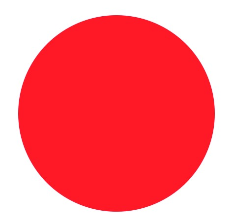
Figure 35-1
To draw an unfilled shape with a stroked outline, the stroke() modifier can be applied, passing through an optional line width value. By default, a stroked shape will be drawn using the default foreground color which may be altered using the foregroundColor() modifier. Remaining in the ContentView.swift file, replace the circle with the following:
Capsule()
    .stroke(lineWidth: 10)
    .foregroundColor(.blue)
    .frame(width: 200, height: 100)Code language: Swift (swift)
Note that the frame for the above Capsule shape is rectangular. A Capsule contained in a square frame simply draws a circle. The above capsule declaration appears as follows when rendered:
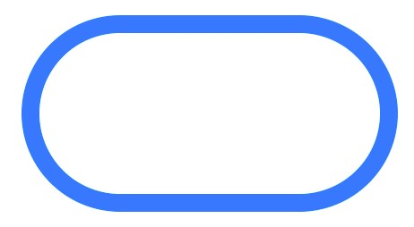
Figure 35-2
|
You are reading a sample chapter from an old edition of iOS App Development Essentials. Purchase the fully updated iOS 18 App Development Essentials book. The full book contains 71 chapters, over 612 pages of in-depth information, downloadable source code, and access to over 50 SwiftUI knowledge test quizzes. |
The stroke modifier also supports different style types using a StrokeStyle instance. The following declaration, for example, draws a rounded rectangle using a dashed line:
RoundedRectangle(cornerRadius: CGFloat(20))
    .stroke(style: StrokeStyle(lineWidth: 8, dash: [CGFloat(10)]))
    .foregroundColor(.blue)
    .frame(width: 200, height: 100)Code language: Swift (swift)
The above shape will be rendered as follows:
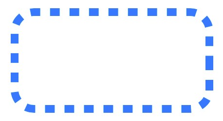
Figure 35-3
By providing additional dash values to a StrokeStyle() instance and adding a dash phase value, a range of different dash effects can be achieved, for example:
Ellipse()
    .stroke(style: StrokeStyle(lineWidth: 20,
             dash: [CGFloat(10), CGFloat(5), CGFloat(2)],
             dashPhase: CGFloat(10)))
    .foregroundColor(.blue)
    .frame(width: 250, height: 150)Code language: Swift (swift)
When run or previewed, the above declaration will draw the following ellipse:
|
You are reading a sample chapter from an old edition of iOS App Development Essentials. Purchase the fully updated iOS 18 App Development Essentials book. The full book contains 71 chapters, over 612 pages of in-depth information, downloadable source code, and access to over 50 SwiftUI knowledge test quizzes. |
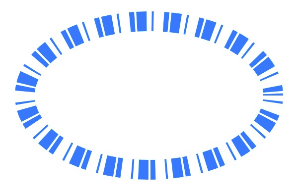
Figure 35-4
Using Overlays
When drawing a shape, it is not possible to combine the fill and stroke modifiers to render a filled shape with a stroked outline. This effect can, however, be achieved by overlaying a stroked view on top of the filled shape, for example:
Ellipse()
    .fill(Color.red)
    .overlay(Ellipse()
        .stroke(Color.blue, lineWidth: 10))
    .frame(width: 250, height: 150)Code language: Swift (swift)
The above example draws a red filled ellipse with a blue stroked outline as illustrated in Figure 35-5:
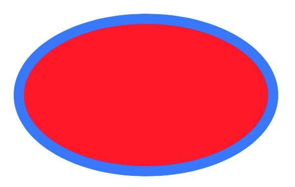
Figure 35-5
Drawing Custom Paths and Shapes
The shapes used so far in this chapter are essentially structure objects that conform to the Shape protocol. To conform with the shape protocol, a structure must implement a function named path() which accepts a rectangle in the form of a CGRect value and returns a Path object that defines what is to be drawn in that rectangle.
|
You are reading a sample chapter from an old edition of iOS App Development Essentials. Purchase the fully updated iOS 18 App Development Essentials book. The full book contains 71 chapters, over 612 pages of in-depth information, downloadable source code, and access to over 50 SwiftUI knowledge test quizzes. |
A Path instance provides the outline of a 2D shape by specifying coordinate points and defining the lines drawn between those points. Lines between points in a path can be drawn using straight lines, cubic and quadratic Bézier curves, arcs, ellipses and rectangles.
In addition to being used in a custom shape implementation, paths may also be drawn directly within a view. Try modifying the ContentView.swift file so that it reads as follows:
struct ContentView: View {
    var body: some View {
        Path { path in
            path.move(to: CGPoint(x: 10, y: 0))
            path.addLine(to: CGPoint(x: 10, y: 350))
            path.addLine(to: CGPoint(x: 300, y: 300))
            path.closeSubpath()
        }
    }
}Code language: Swift (swift)
A path begins with the coordinates of the start point using the move() method. Methods are then called to add additional lines between coordinates. In this case, the addLine() method is used to add straight lines. Lines may be drawn in a path using the following methods. In each case, the drawing starts at the current point in the path and ends at the specified end point:
- addArc – Adds an arc based on radius and angle values.
- addCurve – Adds a cubic Bézier curve using the provided end and control points.
- addLine – Adds a straight line ending at the specified point.
- addLines – Adds straight lines between the provided array of end points.
- addQuadCurve – Adds a quadratic Bézier curve using the specified control and end points.
- closeSubPath – Closes the path by connecting the end point to the start point.
A full listing of the line drawing methods and supported arguments can be found online at:
https://developer.apple.com/documentation/swiftui/path
|
You are reading a sample chapter from an old edition of iOS App Development Essentials. Purchase the fully updated iOS 18 App Development Essentials book. The full book contains 71 chapters, over 612 pages of in-depth information, downloadable source code, and access to over 50 SwiftUI knowledge test quizzes. |
When rendered in the preview canvas, the above path will appear as shown in Figure 35-6:
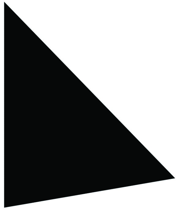
Figure 35-6
The custom drawing may also be adapted by applying modifiers, for example with a green fill color:
Path { path in
    path.move(to: CGPoint(x: 10, y: 0))
    path.addLine(to: CGPoint(x: 10, y: 350))
    path.addLine(to: CGPoint(x: 300, y: 300))
    path.closeSubpath()
}
.fill(Color.green)Code language: Swift (swift)
Although it is possible to draw directly within a view, it generally makes more sense to implement custom shapes as reusable components. Within the ContentView.swift file, implement a custom shape as follows:
struct MyShape: Shape {
    func path(in rect: CGRect) -> Path {
        var path = Path()

        path.move(to: CGPoint(x: rect.minX, y: rect.minY))
        path.addQuadCurve(to: CGPoint(x: rect.minX, y: rect.maxY),
            control: CGPoint(x: rect.midX, y: rect.midY))
        path.addLine(to: CGPoint(x: rect.minX, y: rect.maxY))
        path.addLine(to: CGPoint(x: rect.maxX, y: rect.maxY))
        path.closeSubpath()
        return path
    }
}Code language: Swift (swift)
The custom shape structure conforms to the Shape protocol by implementing the required path() function. The
|
You are reading a sample chapter from an old edition of iOS App Development Essentials. Purchase the fully updated iOS 18 App Development Essentials book. The full book contains 71 chapters, over 612 pages of in-depth information, downloadable source code, and access to over 50 SwiftUI knowledge test quizzes. |
CGRect value passed to the function is used to define the boundaries into which a triangle shape is drawn, with one of the sides drawn using a quadratic curve.
Now that the custom shape has been declared, it can be used in the same way as the built-in SwiftUI shapes, including the use of modifiers. To see this in action, change the body of the main view to read as follows:
struct ContentView: View {
    var body: some View {
        MyShape()
            .fill(.red)
            .frame(width: 360, height: 350)
    }
}Code language: Swift (swift)
When rendered, the custom shape will appear in the designated frame as illustrated in Figure 35-7 below:
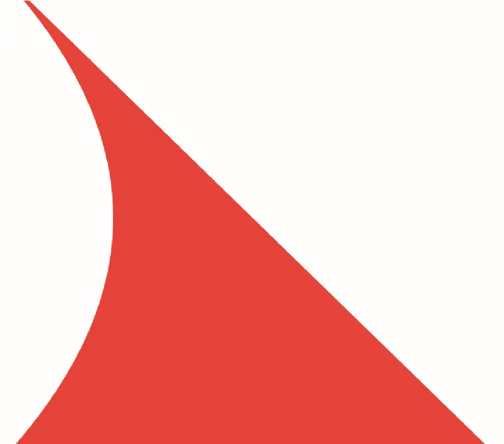
Figure 35-7
Drawing Gradients
SwiftUI provides support for drawing gradients including linear, angular (conic) and radial gradients. In each case, the gradient is provided with a Gradient object initialized with an array of colors to be included in the gradient and values that control the way in which the gradient is rendered.
|
You are reading a sample chapter from an old edition of iOS App Development Essentials. Purchase the fully updated iOS 18 App Development Essentials book. The full book contains 71 chapters, over 612 pages of in-depth information, downloadable source code, and access to over 50 SwiftUI knowledge test quizzes. |
The following declaration, for example, generates a radial gradient consisting of five colors applied as the fill pattern for a Circle:
struct ContentView: View {

    let colors = Gradient(colors: [Color.red, Color.yellow,
                   Color.green, Color.blue, Color.purple])

    var body: some View {
            Circle()
                .fill(RadialGradient(gradient: colors,
                      center: .center,
                      startRadius: CGFloat(0),
                      endRadius: CGFloat(300)))
    }
}Code language: Swift (swift)
When rendered the above gradient will appear as follows:
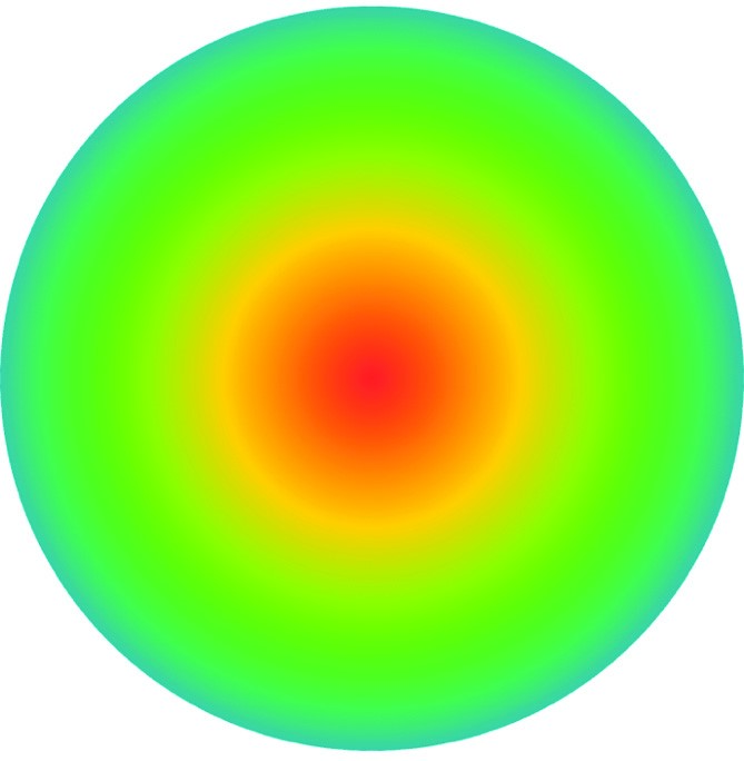
Figure 35-8
The following declaration, on the other hand, generates an angular gradient with the same color range:
Circle()
    .fill(AngularGradient(gradient: colors, center: .center))Code language: Swift (swift)
The angular gradient will appear as illustrated in the following figure:
|
You are reading a sample chapter from an old edition of iOS App Development Essentials. Purchase the fully updated iOS 18 App Development Essentials book. The full book contains 71 chapters, over 612 pages of in-depth information, downloadable source code, and access to over 50 SwiftUI knowledge test quizzes. |
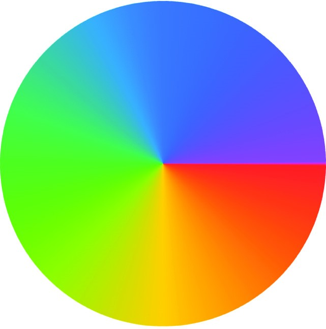
Figure 35-9
Similarly, a LinearGradient running diagonally would be implemented as follows:
Rectangle()
    .fill(LinearGradient(gradient: colors,
                       startPoint: .topLeading,
                         endPoint: .bottomTrailing))
    .frame(width: 360, height: 350)Code language: Swift (swift)
The above linear gradient will be rendered as follows:
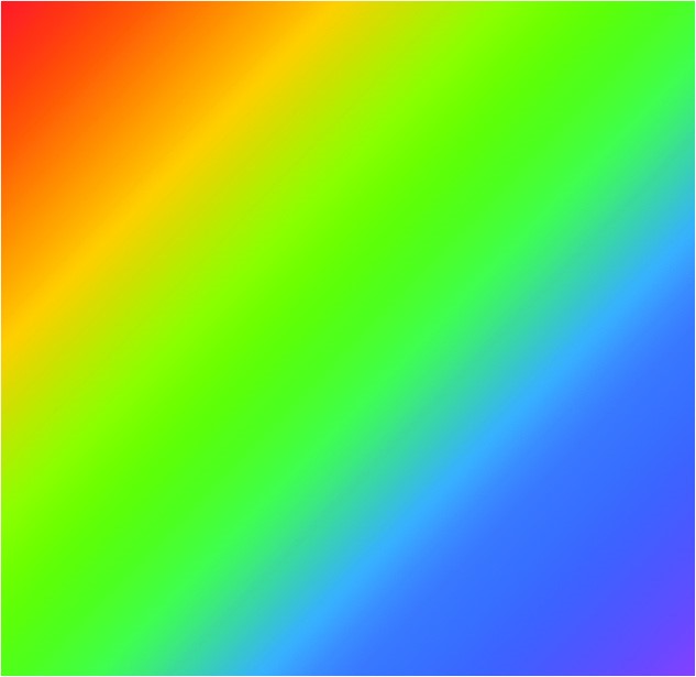
Figure 35-10
The final step in the DrawingDemo project is to apply gradients for the fill and background modifiers for our MyShape instance as follows:
|
You are reading a sample chapter from an old edition of iOS App Development Essentials. Purchase the fully updated iOS 18 App Development Essentials book. The full book contains 71 chapters, over 612 pages of in-depth information, downloadable source code, and access to over 50 SwiftUI knowledge test quizzes. |
MyShape()
    .fill(RadialGradient(gradient: colors,
                           center: .center,
                      startRadius: CGFloat(0),
                        endRadius: CGFloat(300)))
     .background(LinearGradient(gradient: Gradient(colors:
                               [Color.black, Color.white]),
                       startPoint: .topLeading,
                         endPoint: .bottomTrailing))
     .frame(width: 360, height: 350)Code language: Swift (swift)
With the gradients added, the MyShape rendering should match the figure below:
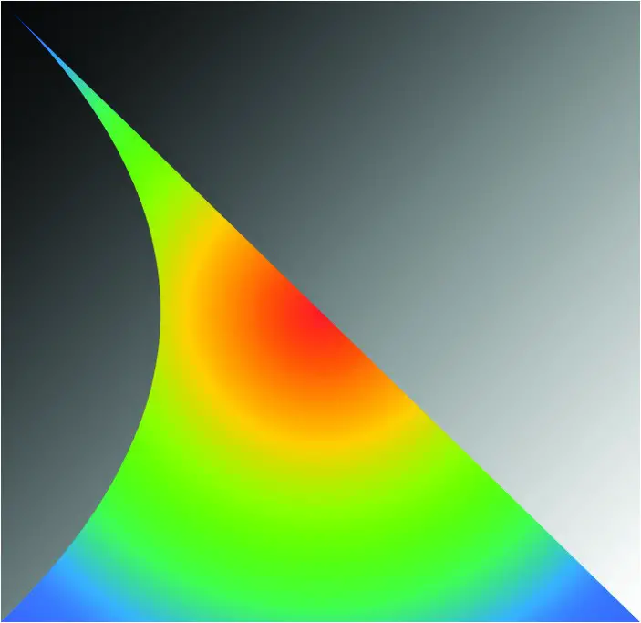
Figure 35-11
Summary
SwiftUI includes a built-in set of views that conform to the Shape protocol for drawing standard shapes such as rectangles, circles and ellipses. Modifiers can be applied to these views to control stroke, fill and color properties.
Custom shapes are created by specifying paths which consist of sets of points joined by straight or curved lines.
SwiftUI also includes support for drawing radial, linear and angular gradient patterns.
|
You are reading a sample chapter from an old edition of iOS App Development Essentials. Purchase the fully updated iOS 18 App Development Essentials book. The full book contains 71 chapters, over 612 pages of in-depth information, downloadable source code, and access to over 50 SwiftUI knowledge test quizzes. |