
This chapter is intended to provide an overview and examples of animating views and implementing transitions within a SwiftUI app. Animation can take a variety of forms including the rotation, scaling and motion of a view on the screen.
Transitions, on the other hand, define how a view will appear as it is added to or removed from a layout, for example whether a view slides into place when it is added, or shrinks from view when it is removed.
Creating the AnimationDemo Example Project
To try out the examples in this chapter, create a new Multiplatform App Xcode project named AnimationDemo.
Implicit Animation
Many of the built-in view types included with SwiftUI contain properties that control the appearance of the view such as scale, opacity, color and rotation angle. Properties of this type are animatable, in that the change from one property state to another can be animated instead of occurring instantly. One way to animate these changes to a view is to use the animation() modifier (a concept referred to as implicit animation because the animation is implied for any modifiers applied to the view that precede the animation modifier).
To experience basic animation using this technique, modify the ContentView.swift file in the AnimationDemo project so that it contains a Button view configured to rotate in 60 degree increments each time it is tapped:
 |
You are reading a sample chapter from an old edition of iOS App Development Essentials. Purchase the fully updated iOS 18 App Development Essentials book. The full book contains 71 chapters, over 612 pages of in-depth information, downloadable source code, and access to over 50 SwiftUI knowledge test quizzes. |
struct ContentView : View {

    @State private var rotation: Double = 0

    var body: some View {
       Button(action: {
           self.rotation =
                  (self.rotation < 360 ? self.rotation + 60 : 0)
           }) {
           Text("Click to animate")
               .rotationEffect(.degrees(rotation))
       }
    }
}Code language: Swift (swift)
When tested using Live Preview, each click causes the Button view to rotate as expected, but the rotation is immediate. Similarly, when the rotation reaches a full 360 degrees, the view actually rotates counter-clockwise 360 degrees, but so quickly the effect is not visible. These effects can be slowed down and smoothed out by adding the animation() modifier with an optional animation curve to control the timing of the animation:
var body: some View {
   Button(action: {
       self.rotation =
              (self.rotation < 360 ? self.rotation + 60 : 0)
   }) {
       Text("Click to Animate")
           .rotationEffect(.degrees(rotation))
           .animation(.linear)
   }
}Code language: Swift (swift)
The optional animation curve defines the linearity of the animation timeline. This setting controls whether the animation is performed at a constant speed or whether it starts out slow and speeds up. SwiftUI provides the following basic animation curves:
- linear – The animation is performed at constant speed for the specified duration and is the option declared in the above code example.
- easeOut – The animation starts out fast and slows as the end of the sequence approaches.
- easeIn – The animation sequence starts out slow and speeds up as the end approaches.
- easeInOut – The animation starts slow, speeds up and then slows down again.
Preview the animation once again and note that the rotation now animates smoothly. When defining an animation, the duration may also be specified. Change the animation modifier so that it reads as follows:
.animation(.linear(duration: 1))Code language: Swift (swift)Now the animation will be performed more slowly each time the Button is clicked.
As previously mentioned, an animation can apply to more than one modifier. The following changes, for example, animate both rotation and scaling effects:
|
You are reading a sample chapter from an old edition of iOS App Development Essentials. Purchase the fully updated iOS 18 App Development Essentials book. The full book contains 71 chapters, over 612 pages of in-depth information, downloadable source code, and access to over 50 SwiftUI knowledge test quizzes. |
.
.
@State private var scale: CGFloat = 1

var body: some View {
   Button(action: {
        self.rotation =
               (self.rotation < 360 ? self.rotation + 60 : 0)
        self.scale = (self.scale < 2.8 ? self.scale + 0.3 : 1)
   }) {
       Text("Click to Animate")
        .scaleEffect(scale)
        .rotationEffect(.degrees(rotation))
        .animation(.linear(duration: 1))
   }
}Code language: Swift (swift)
These changes will cause the button to increase in size with each rotation, then scale back to its original size during the return rotation.

Figure 36-1
A variety of spring effects may also be added to the animation using the spring() modifier, for example:
Text("Click to Animate")
    .scaleEffect(scale)
    .rotationEffect(.degrees(rotation))
    .animation(.spring(response: 1, dampingFraction: 0.2, blendDuration: 0))Code language: Swift (swift)
This will cause the rotation and scale effects to go slightly beyond the designated setting, then bounce back and forth before coming to rest at the target angle and scale.
When working with the animation() modifier, it is important to be aware that the animation is only implicit for modifiers that are applied before the animation modifier itself. In the following implementation, for example, only the rotation effect is animated since the scale effect is applied after the animation modifier:
|
You are reading a sample chapter from an old edition of iOS App Development Essentials. Purchase the fully updated iOS 18 App Development Essentials book. The full book contains 71 chapters, over 612 pages of in-depth information, downloadable source code, and access to over 50 SwiftUI knowledge test quizzes. |
Text("Click to Animate")
    .rotationEffect(.degrees(rotation))
    .animation(.spring(response: 1, dampingFraction: 0.2, blendDuration: 0))
    .scaleEffect(scale)Code language: Swift (swift)
Repeating an Animation
By default, an animation will be performed once each time it is initiated. An animation may, however, be configured to repeat one or more times. In the following example, the animation is configured to repeat a specific number of times:
.animation(Animation.linear(duration: 1).repeatCount(10))Code language: Swift (swift)Each time an animation repeats, it will perform the animation in reverse as the view returns to its original state. If the view is required to instantly revert to its original appearance before repeating the animation, the autoreverses parameter must be set to false:
.animation(Animation.linear(duration: 1).repeatCount(10, autoreverses: false))Code language: Swift (swift)An animation may also be configured to repeat indefinitely using the repeatForever() modifier as follows:
.repeatForever(autoreverses: true))Code language: Swift (swift)Explicit Animation
As previously discussed, implicit animation using the animation() modifier implements animation on any of the animatable properties on a view that appear before the animation modifier. SwiftUI provides an alternative approach referred to as explicit animation which is implemented using the withAnimation() closure. When using explicit animation, only the property changes that take place within the withAnimation() closure will be animated. To experience this in action, modify the example so that the rotation effect is performed within a withAnimation() closure and remove the animation() modifier:
var body: some View {
    Button(action: { withAnimation(.linear (duration: 2)) {
            self.rotation =
               (self.rotation < 360 ? self.rotation + 60 : 0)
        }
        self.scale = (self.scale < 2.8 ? self.scale + 0.3 : 1)
       }) {

       Text("Click to Animate")
          .rotationEffect(.degrees(rotation))
          .scaleEffect(scale)
    }
}Code language: Swift (swift)
With the changes made, preview the layout and note that only the rotation is now animated. By using explicit animation, animation can be limited to specific properties of a view without worrying about the ordering of modifiers.
|
You are reading a sample chapter from an old edition of iOS App Development Essentials. Purchase the fully updated iOS 18 App Development Essentials book. The full book contains 71 chapters, over 612 pages of in-depth information, downloadable source code, and access to over 50 SwiftUI knowledge test quizzes. |
.
.
@State private var visibility = false

var body: some View {
   VStack {
        Toggle(isOn: $visibility) {
           Text("Toggle Text Views")
        }
        .padding()

        if visibility {
            Text("Hello World")
                .font(.largeTitle)
        }

        if !visibility {
            Text("Goodbye World")
                .font(.largeTitle)
        }
    }
}
.
.Code language: Swift (swift)
Animation and State Bindings
Animations may also be applied to state property bindings such that any view changes that occur as a result of that state value changing will be animated. If the state of a Toggle view causes one or more other views to become visible to the user, for example, applying an animation to the binding will cause the appearance and disappearance of all those views to be animated.
Within the ContentView.swift file, implement the following layout which consists of a VStack, Toggle view and two Text views. The Toggle view is bound to a state property named visible, the value of which is used to control which of the two Text views is visible at one time:
When previewed, switching the toggle on and off will cause one or other of the Text views to appear instantly. To add an animation to this change, simply apply a modifier to the state binding as follows:
.
.
var body: some View {
   VStack {
       Toggle(isOn: $visibility.animation(.linear(duration: 5))) {
           Text("Toggle Text Views")
       }
       .padding()
.
.Code language: Swift (swift)
Now when the toggle is switched, one Text view will gradually fade from view as the other gradually fades in (unfortunately, at the time of writing this and other transition effects were only working when running on a simulator or physical device). The same animation will also be applied to any other views in the layout where the appearance changes as a result of the current state of the visibility property.
Automatically Starting an Animation
So far in this chapter, all the animations have been triggered by an event such as a button click. Often an animation will need to start without user interaction, for example when a view is first displayed to the user. Since an animation is triggered each time an animatable property of a view changes, this can be used to automatically start an animation when a view appears.
|
You are reading a sample chapter from an old edition of iOS App Development Essentials. Purchase the fully updated iOS 18 App Development Essentials book. The full book contains 71 chapters, over 612 pages of in-depth information, downloadable source code, and access to over 50 SwiftUI knowledge test quizzes. |
To see this technique in action, modify the example ContentView.swift file as follows:
struct ContentView : View {

    var body: some View {

        ZStack {
            Circle()
                .stroke(lineWidth: 2)
                .foregroundColor(Color.blue)
                .frame(width: 360, height: 360)

            Image(systemName: "forward.fill")
               .font(.largeTitle)
               .offset(y: -180)
        }
    }
}Code language: Swift (swift)
The content view uses a ZStack to overlay an Image view over a circle drawing where the offset of the Image view has been adjusted to position the image on the circumference of the circle. When previewed, the view should match that shown in Figure 36-2:
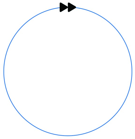
Figure 36-2
Adding a rotation effect to the Image view will give the appearance that the arrows are following the circle. Add this effect and an animation to the Image view as follows:
Image(systemName: "forward.fill")
   .font(.largeTitle)
   .offset(y: -180)
   .rotationEffect(.degrees(360))
   .animation(Animation.linear(duration: 5)
                           .repeatForever(autoreverses: false))Code language: Swift (swift)
As currently implemented the animation will not trigger when the view is tested in a Live Preview. This is because no action is taking place to change an animatable property, thereby initiating the animation.
|
You are reading a sample chapter from an old edition of iOS App Development Essentials. Purchase the fully updated iOS 18 App Development Essentials book. The full book contains 71 chapters, over 612 pages of in-depth information, downloadable source code, and access to over 50 SwiftUI knowledge test quizzes. |
This can be solved by making the angle of rotation subject to a Boolean state property, and then toggling that property when the ZStack first appears via the onAppear() modifier. In terms of implementing this behavior for our circle example, the content view declarations need to read as follows:
import SwiftUI

struct ContentView : View {

    @State private var isSpinning: Bool = true

    var body: some View {

       ZStack {
            Circle()
                .stroke(lineWidth: 2)
                .foregroundColor(Color.blue)
                .frame(width: 360, height: 360)

            Image(systemName: "forward.fill")
               .font(.largeTitle)
               .offset(y: -180)
               .rotationEffect(.degrees(isSpinning ? 0 : 360))
               .animation(Animation.linear(duration: 5)
                           .repeatForever(autoreverses: false))
       }
       .onAppear() {
          self.isSpinning.toggle()
       }
    }
}Code language: Swift (swift)
When SwiftUI initializes the content view, but before it appears on the screen, the isSpinning state property will be set to false and, based on the ternary operator, the rotation angle set to zero. After the view has appeared, however, the onAppear() modifier will toggle the isSpinning state property to true which will, in turn, cause the ternary operator to change the rotation angle to 360 degrees. As this is an animatable property, the animation modifier will activate and animate the rotation of the Image view through 360 degrees. Since this animation has been configured to repeat indefinitely, the image will continue to move around the circle.
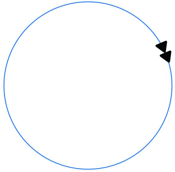
Figure 36-3
SwiftUI Transitions
A transition occurs in SwiftUI whenever a view is made visible or invisible to the user. To make this process more visually appealing than having the view instantly appear and disappear, SwiftUI allows these transitions to be animated in several ways using either individual effects or by combining multiple effects.
Begin by implementing a simple layout consisting of a Toggle button and a Text view. The toggle is bound to a state property which is then used to control whether the text view is visible. To make the transition more noticeable, animation has been applied to the state property binding:
|
You are reading a sample chapter from an old edition of iOS App Development Essentials. Purchase the fully updated iOS 18 App Development Essentials book. The full book contains 71 chapters, over 612 pages of in-depth information, downloadable source code, and access to over 50 SwiftUI knowledge test quizzes. |
struct ContentView : View {

    @State private var isButtonVisible: Bool = true

    var body: some View {
       VStack {
            Toggle(isOn:$isButtonVisible.animation(
                                   .linear(duration: 2))) {
                Text("Show/Hide Button")
            }
            .padding()

            if isButtonVisible {
                Button(action: {}) {
                    Text("Example Button")
                }
                .font(.largeTitle)
            }
        }
    }
}Code language: Swift (swift)
After making the changes, use the Live Preview or a device or simulator to switch the toggle button state and note that the Text view fades in and out of view as the state changes (keeping in mind that some effects may not work in the Live Preview). This fading effect is the default transition used by SwiftUI. This default can be changed by passing a different transition to the transition() modifier, for which the following options are available:
- scale – The view increases in size as it is made visible and shrinks as it disappears.
- slide – The view slides in and out of view. • move(edge: edge) – As the view is added or removed it does so by moving either from or toward the specified edge.
- opacity – The view retains its size and position while fading from view (the default transition behavior). To configure the Text view to slide into view, change the example as follows:
if isButtonVisible {
    Button(action: {}) {
        Text("Example Button")
    }
    .font(.largeTitle)
    .transition(.slide)
}Code language: Swift (swift)
Alternatively, the view can be made to shrink from view and then grow in size when inserted and removed:
.transition(.scale)Code language: Swift (swift)The move() transition can be used as follows to move the view toward a specified edge of the containing view. In the following example, the view moves from bottom to top when disappearing and from top to bottom when appearing:
.transition(.move(edge: .top))Code language: Swift (swift)When previewing the above move transition, you may have noticed that after completing the move, the Button disappears instantly. This somewhat jarring effect can be improved by combining the move with another transition.
Combining Transitions
SwiftUI transitions are combined using an instance of AnyTransition together with the combined(with:) method. To combine, for example, movement with opacity, a transition could be configured as follows:
|
You are reading a sample chapter from an old edition of iOS App Development Essentials. Purchase the fully updated iOS 18 App Development Essentials book. The full book contains 71 chapters, over 612 pages of in-depth information, downloadable source code, and access to over 50 SwiftUI knowledge test quizzes. |
.transition(AnyTransition.opacity.combined(with: .move(edge: .top)))Code language: Swift (swift)When the above example is implemented, the Text view will include a fading effect while moving.
To remove clutter from layout bodies and to promote re-usability, transitions can be implemented as extensions to the AnyTransition class. The above combined transition, for example, can be implemented as follows:
extension AnyTransition {
    static var fadeAndMove: AnyTransition {
        AnyTransition.opacity.combined(with: .move(edge: .top))
    }
}Code language: Swift (swift)
When implemented as an extension, the transition can simply be passed as an argument to the transition() modifier, for example:
.transition(.fadeAndMove)Code language: Swift (swift)Asymmetrical Transitions
By default, SwiftUI will simply reverse the specified insertion transition when removing a view. To specify a different transition for adding and removing views, the transition can be declared as being asymmetric. The following transition, for example, uses the scale transition for view insertion and sliding for removal:
.transition(.asymmetric(insertion: .scale, removal: .slide))Code language: Swift (swift)Summary
This chapter has explored the implementation of animation when changes are made to the appearance of a view. In the case of implicit animation, changes to a view caused by modifiers can be animated through the application of the animated() modifier. Explicit animation allows only specified properties of a view to be animated in response to appearance changes. Animation may also be applied to state property bindings such that any view changes that occur as a result of that state value changing will be animated.
|
You are reading a sample chapter from an old edition of iOS App Development Essentials. Purchase the fully updated iOS 18 App Development Essentials book. The full book contains 71 chapters, over 612 pages of in-depth information, downloadable source code, and access to over 50 SwiftUI knowledge test quizzes. |
A transition occurs when a view is inserted into, or removed from, a layout. SwiftUI provides several options for animating these transitions including fading, scaling and sliding. SwiftUI also provides the ability to both combine transitions and define asymmetric transitions where different animation effects are used for insertion and removal of a view.