
Now that we have installed Android Studio, the next step is to create an Android app using Jetpack Compose. Although this project will use several Compose features, it is an intentionally simple example intended to provide an early demonstration of Compose in action and an initial success on which to build as you work through the remainder of the book. The project will also verify that your Android Studio environment is correctly installed and configured.
This chapter will create a new project using the Android Studio Compose project template and explore both the basic structure of a Compose-based Android Studio project and some of the key areas of Android Studio. The next chapter will use this project to create a simple Android app.
Both chapters will briefly explain key features of Compose as they are introduced within the project. If anything is unclear when you have completed the project, rest assured that all the areas covered in the tutorial will be explored in greater detail in later chapters of the book.
About the project
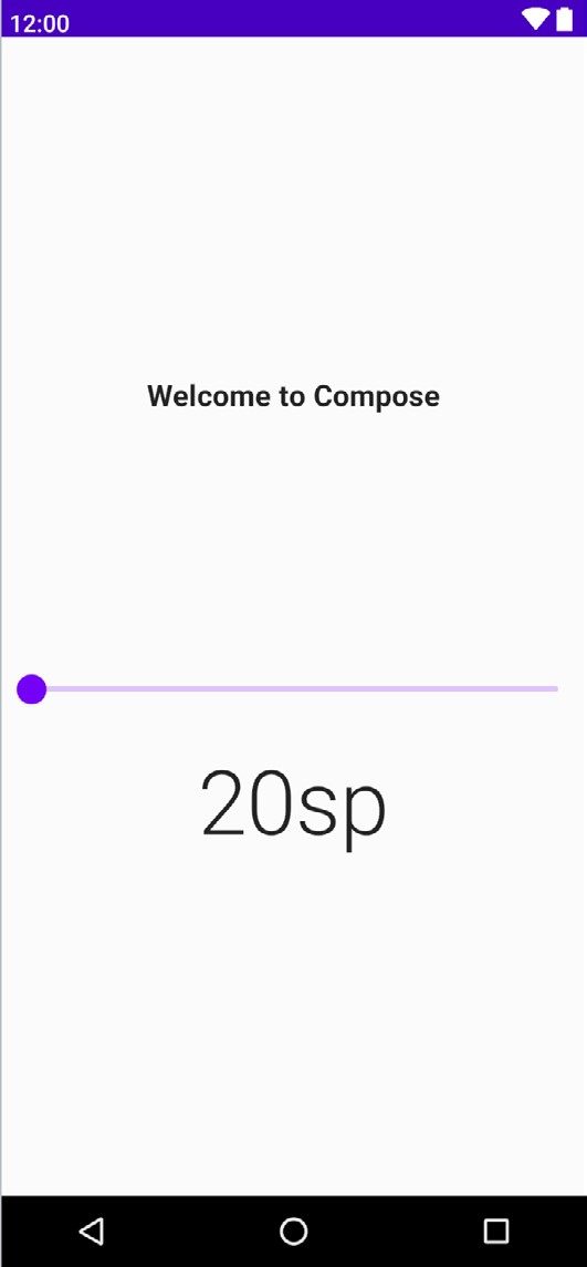
The completed project will consist of two text components and a slider. When the slider is moved, the current value will be displayed on one of the text components, while the font size of the second text instance will adjust to match the current slider position. Once completed, the user interface for the app will appear as shown in Figure 3-1:
Creating the project
The first step in building an app is to create a new project within Android Studio. Begin, therefore, by launching Android Studio so that the “Welcome to Android Studio” screen appears as illustrated in Figure 3-2:
 |
You are reading a sample chapter from an old edition of the Jetpack Compose Essentials book. Purchase the fully updated Jetpack Compose 1.7 Essentials edition of this book in eBook or Print format. The full book contains 67 chapters and over 700 pages of in-depth information. Buy the full book now in Print or eBook format. Learn more. |
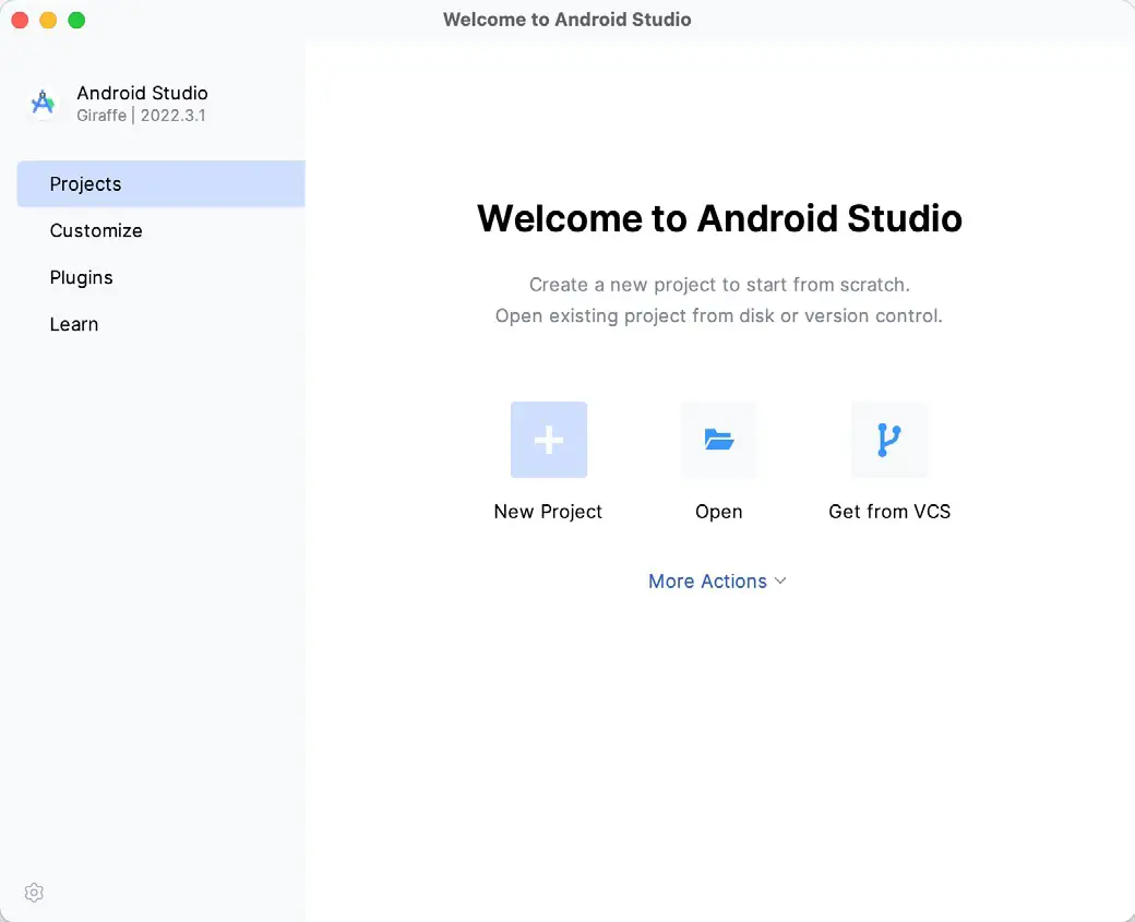
Once this window appears, Android Studio is ready for a new project to be created. To create the new project, click on the New Project button to display the first screen of the New Project wizard.
Creating an activity
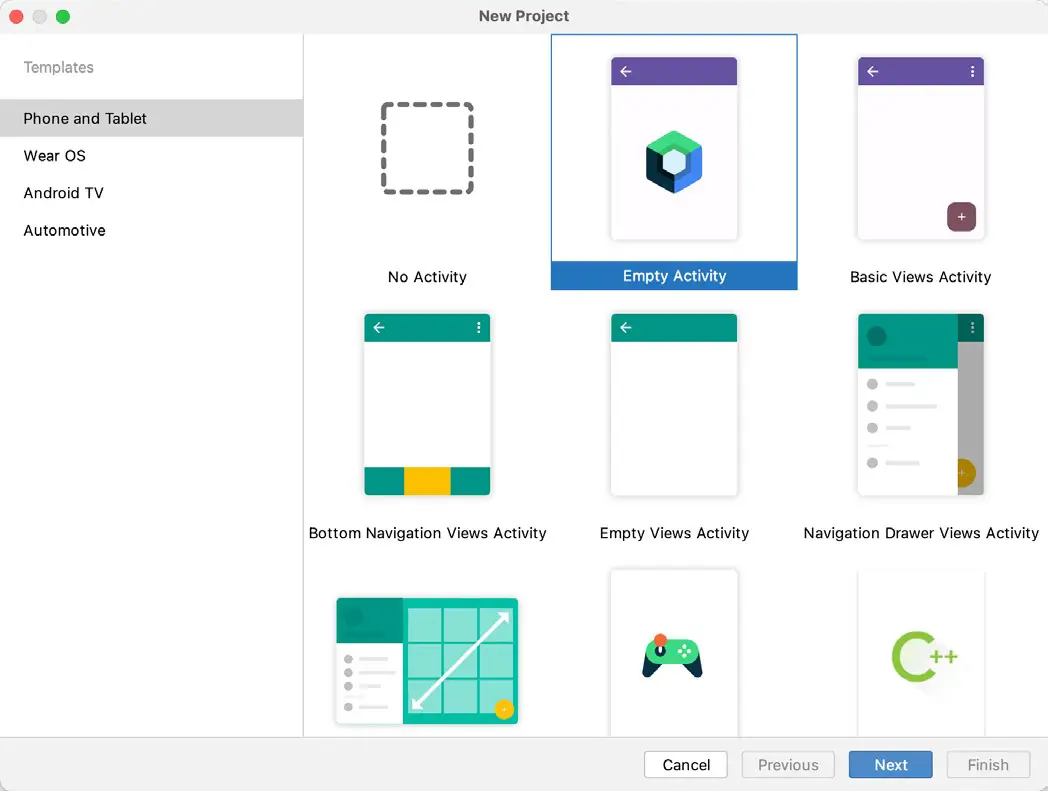
The next step is to define the type of initial activity that is to be created for the application. The left-hand panel provides a list of platform categories from which the Phone and Tablet option must be selected. Although various activity types are available when developing Android applications, only the Empty Activity template provides a pre-configured project ready to work with Compose. Select this option before clicking on the Next button:
Defining the project and SDK settings
In the project configuration window (Figure 3-4), set the Name field to ComposeDemo. The application name is the name by which the application will be referenced and identified within Android Studio and is also the name that would be used if the completed application were to go on sale in the Google Play store:
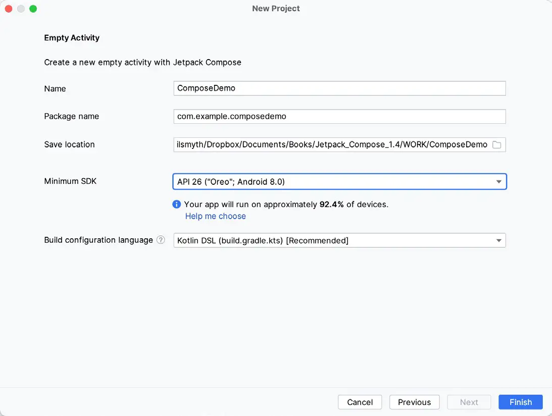
The Package name uniquely identifies the application within the Google Play app store application ecosystem. Although this can be set to any string that uniquely identifies your app, it is traditionally based on the reversed URL of your domain name followed by the application’s name. For example, if your domain is www.mycompany. com, and the application has been named ComposeDemo, then the package name might be specified as follows:
com.mycompany.composedemoCode language: Kotlin (kotlin)If you do not have a domain name, you can enter any other string into the Company Domain field, or you may use example.com for testing, though this will need to be changed before an application can be published:
|
You are reading a sample chapter from an old edition of the Jetpack Compose Essentials book. Purchase the fully updated Jetpack Compose 1.7 Essentials edition of this book in eBook or Print format. The full book contains 67 chapters and over 700 pages of in-depth information. Buy the full book now in Print or eBook format. Learn more. |
com.example.composedemoCode language: Kotlin (kotlin)The Save location setting will default to a location in the folder named AndroidStudioProjects located in your home directory and may be changed by clicking on the folder icon to the right of the text field containing the current path setting.
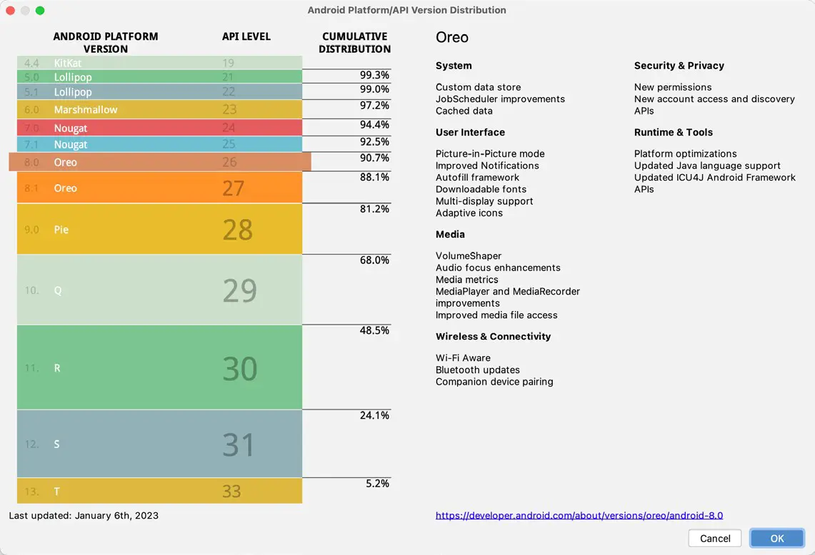
Set the minimum SDK setting to API 26: Android 8.0 (Oreo). This is the minimum SDK that will be used in most projects created in this book unless a necessary feature is only available in a more recent version. The objective here is to build an app using the latest Android SDK, while also retaining compatibility with devices running older versions of Android (in this case as far back as Android 8.0). The text beneath the Minimum SDK setting will outline the percentage of Android devices currently in use on which the app will run. Click on the Help me choose link to see a full breakdown of the various Android versions still in use:
Finally, select Kotlin DSL (build.gradle.kts) as the build configuration language before clicking Finish to create the project.
Enabling the New Android Studio UI
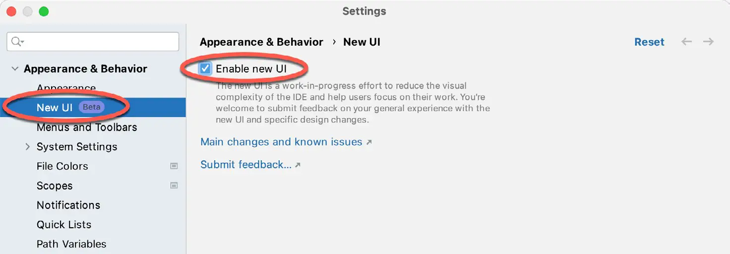
Android Studio is transitioning to a new, modern user interface that is not enabled by default in the Giraffe version. If your installation of Android Studio resembles Figure 3-6 below, then you will need to enable the new UI before proceeding:
Enable the new UI by selecting the File -> Settings… menu option (Android Studio -> Settings… on macOS) and selecting the New UI option under Appearance and Behavior in the left-hand panel. From the main panel, turn on the Enable new UI checkbox before clicking Apply, followed by OK to commit the change:
|
You are reading a sample chapter from an old edition of the Jetpack Compose Essentials book. Purchase the fully updated Jetpack Compose 1.7 Essentials edition of this book in eBook or Print format. The full book contains 67 chapters and over 700 pages of in-depth information. Buy the full book now in Print or eBook format. Learn more. |
When prompted, restart Android Studio to activate the new user interface.
Previewing the example project
Once Android Studio has restarted, the main window will reappear using the new UI and containing our AndroidSample project as illustrated in Figure 3-8 below:
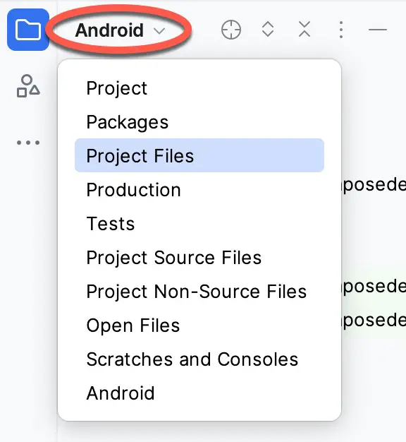
The newly created project and references to associated files are listed in the Project tool window located on the left-hand side of the main project window. The Project tool window has several modes in which information can be displayed. By default, this panel should be in Android mode. This setting is controlled by the menu at the top of the panel as highlighted in Figure 3-9. If the panel is not currently in Android mode, use the menu to switch mode:
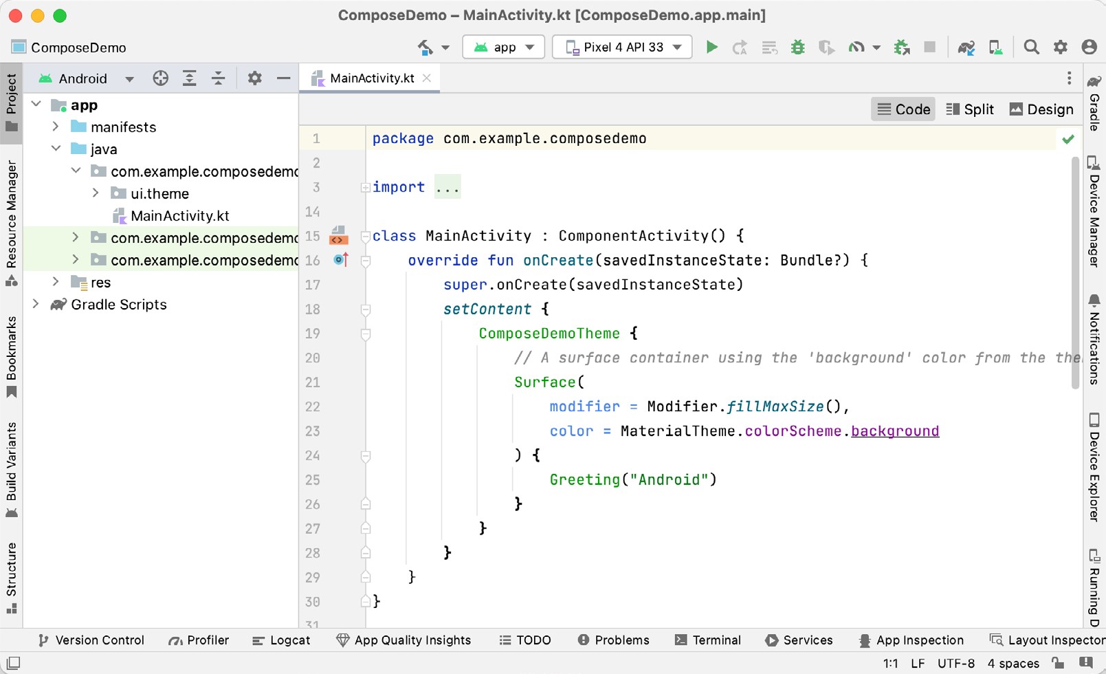
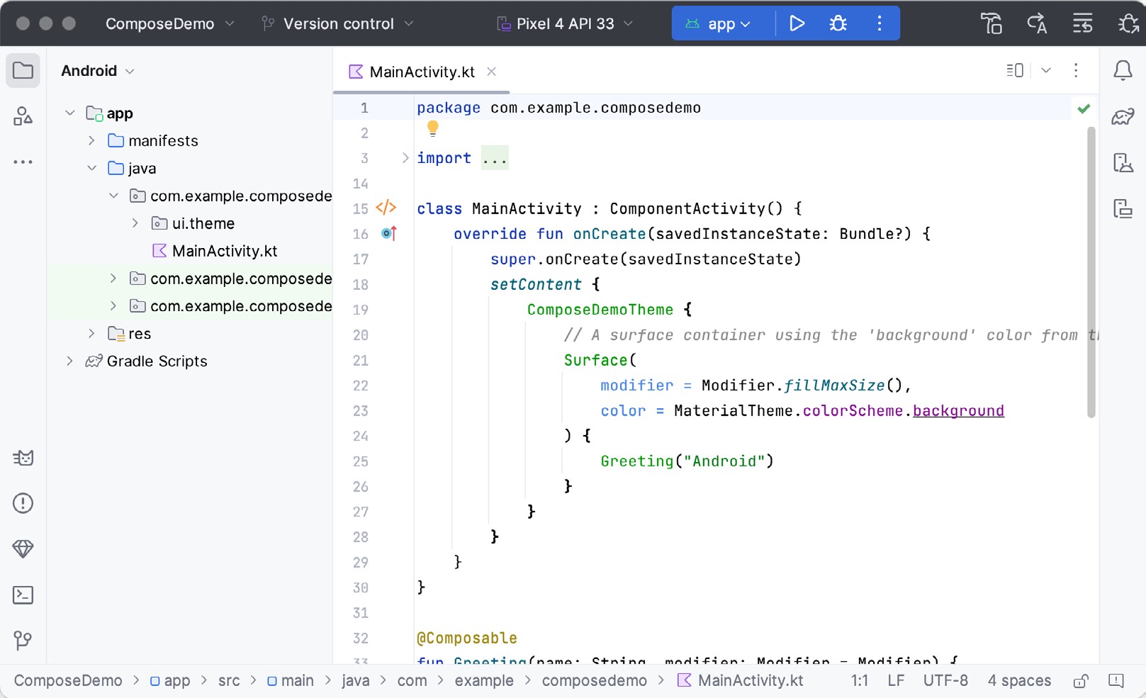
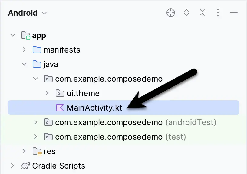
The code for the main activity of the project (an activity corresponds to a single user interface screen or module within an Android app) is contained within the MainActivity.kt file located under app -> java -> com.example. composedemo within the Project tool window as indicated in Figure 3-10:
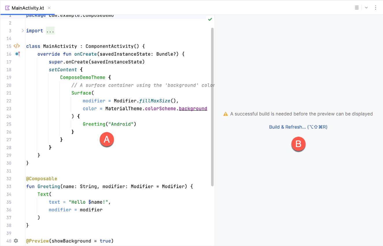
Double-click on this file to load it into the main code editor panel. The editor can be used in different view modes. Only the source code of the currently selected file is visible when the editor is in Code mode (as it is in Figure 3-8 above). However, the most useful when working with Compose is Split mode. To switch between Code and Split modes, click on the button marked A in Figure 3-11 below:
|
You are reading a sample chapter from an old edition of the Jetpack Compose Essentials book. Purchase the fully updated Jetpack Compose 1.7 Essentials edition of this book in eBook or Print format. The full book contains 67 chapters and over 700 pages of in-depth information. Buy the full book now in Print or eBook format. Learn more. |
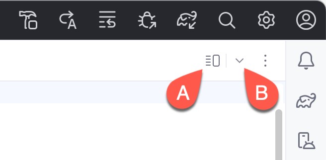
The button marked B above displays a menu that may also be used to change editor view modes:
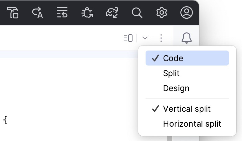
Split mode displays the code editor (A) alongside the Preview panel (B) in which the current user interface design will appear:
Only the Preview panel is displayed when the editor is in Design mode.
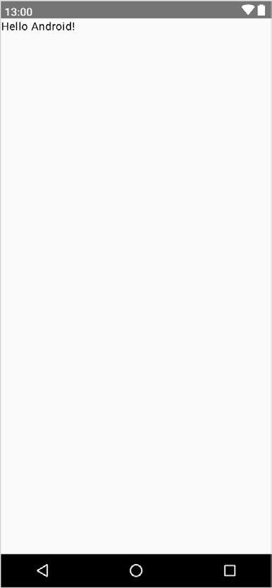
To get us started, Android Studio has already added some code to the MainActivity.kt file to display a Text component configured to display a message which reads “Hello Android”.
If the project has not yet been built, the Preview panel will display the message shown in Figure 3-14:
|
You are reading a sample chapter from an old edition of the Jetpack Compose Essentials book. Purchase the fully updated Jetpack Compose 1.7 Essentials edition of this book in eBook or Print format. The full book contains 67 chapters and over 700 pages of in-depth information. Buy the full book now in Print or eBook format. Learn more. |
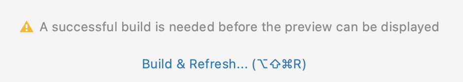
If you see this notification, click on the Build & Refresh link to rebuild the project. After the build is complete, the Preview panel should update to display the user interface defined by the code in the MainActivity.kt file:

Reviewing the main activity
Android applications are created by combining one or more elements known as Activities. An activity is a single, standalone module of application functionality that either correlates directly to a single user interface screen and its corresponding functionality, or acts as a container for a collection of related screens. An appointments application might, for example, contain an activity screen that displays appointments set up for the current day. The application might also utilize a second activity consisting of multiple screens where new appointments may be entered by the user and existing appointments edited.
When we created the ComposeDemo project, Android Studio created a single initial activity for our app, named it MainActivity, and generated some code for it in the MainActivity.kt file. This activity contains the first screen that will be displayed when the app is run on a device. Before we modify the code for our requirements in the next chapter, it is worth taking some time to review the code currently contained within the MainActivity.kt file.
The file begins with the following line (keep in mind that this may be different if you used your own domain name instead of com.example):
package com.example.composedemoCode language: Kotlin (kotlin)This tells the build system that the classes and functions declared in this file belong to the com.example. composedemo package which we configured when we created the project.
|
You are reading a sample chapter from an old edition of the Jetpack Compose Essentials book. Purchase the fully updated Jetpack Compose 1.7 Essentials edition of this book in eBook or Print format. The full book contains 67 chapters and over 700 pages of in-depth information. Buy the full book now in Print or eBook format. Learn more. |
Next is a series of import directives. The Android SDK comprises a vast collection of libraries that provide the foundation for building Android apps. If all of these libraries were included within an app the resulting app bundle would be too large to run efficiently on a mobile device. To avoid this problem, an app only imports the libraries that it needs to be able to run:
import android.os.Bundle
import androidx.activity.ComponentActivity
import androidx.activity.compose.setContent
import androidx.compose.foundation.layout.fillMaxSize
import androidx.compose.material3.MaterialTheme
import androidx.compose.material3.Surface
import androidx.compose.material3.Text
.
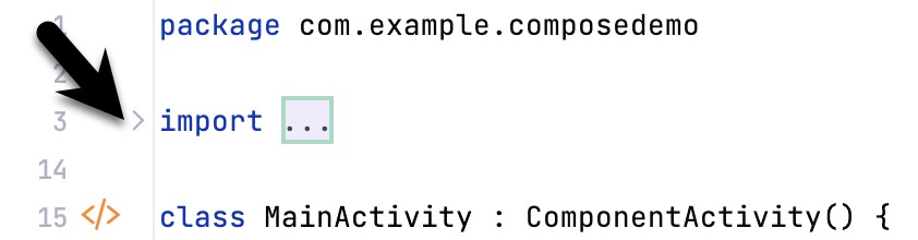
.Code language: Kotlin (kotlin)Initially, the list of import directives will most likely be “folded” to save space. To unfold the list, click on the small disclosure button indicated by the arrow in Figure 3-16 below:
The MainActivity class is then declared as a subclass of the Android ComponentActivity class:
class MainActivity : ComponentActivity() {
.
.
}Code language: Kotlin (kotlin)
The MainActivity class implements a single method in the form of onCreate(). This is the first method that is called when an activity is launched by the Android runtime system and is an artifact of the way apps used to be developed before the introduction of Compose. The onCreate() method is used here to provide a bridge between the containing activity and the Compose-based user interfaces that are to appear within it:
override fun onCreate(savedInstanceState: Bundle?) {
    super.onCreate(savedInstanceState)
    setContent {
        ComposeDemoTheme {
.
.
        }
    }
}Code language: JavaScript (javascript)
The method declares that the content of the activity’s user interface will be provided by a composable function named ComposeDemoTheme. This composable function is declared in the Theme.kt file located under the app -> <package name> -> ui.theme folder in the Project tool window. This, along with the other files in the ui.theme folder defines the colors, fonts, and shapes to be used by the activity and provides a central location from which to customize the overall theme of the app’s user interface.
|
You are reading a sample chapter from an old edition of the Jetpack Compose Essentials book. Purchase the fully updated Jetpack Compose 1.7 Essentials edition of this book in eBook or Print format. The full book contains 67 chapters and over 700 pages of in-depth information. Buy the full book now in Print or eBook format. Learn more. |
The call to the ComposeDemoTheme composable function is configured to contain a Surface composable. Surface is a built-in Compose component designed to provide a background for other composables:
ComposeDemoTheme {
    // A surface container using the 'background' color from the theme
    Surface(
        modifier = Modifier.fillMaxSize(),
        color = MaterialTheme.colorScheme.background
.
.
}Code language: Kotlin (kotlin)
In this case, the Surface component is configured to fill the entire screen and with the background set to the standard background color defined by the Android Material Design theme. Material Design is a set of design guidelines developed by Google to provide a consistent look and feel across all Android apps. It includes a theme (including fonts and colors), a set of user interface components (such as button, text, and a range of text fields), icons, and generally defines how an Android app should look, behave and respond to user interactions.
Finally, the Surface is configured to contain a composable function named Greeting which is passed a string value that reads “Android”:
ComposeDemoTheme {
    // A surface container using the 'background' color from the theme
    Surface(
        modifier = Modifier.fillMaxSize(),
        color = MaterialTheme.colorScheme.background
    ) {
        Greeting("Android")
    }
}Code language: Kotlin (kotlin)
Outside of the scope of the MainActivity class, we encounter our first composable function declaration within the activity. The function is named Greeting and is, unsurprisingly, marked as being composable by the @ Composable annotation:
@Composable
fun Greeting(name: String, modifier: Modifier = Modifier) {
    Text(
        text = "Hello $name!",
        modifier = modifier
    )
}Code language: Kotlin (kotlin)
The function accepts a String parameter (labeled name) and calls the built-in Text composable, passing through a string value containing the word “Hello” concatenated with the name parameter. The function also accepts an optional modifier parameter (a topic covered in the chapter titled How to Use Modifiers in Jetpack Compose). As will soon become evident as you work through the book, composable functions are the fundamental building blocks for developing Android apps using Compose.
|
You are reading a sample chapter from an old edition of the Jetpack Compose Essentials book. Purchase the fully updated Jetpack Compose 1.7 Essentials edition of this book in eBook or Print format. The full book contains 67 chapters and over 700 pages of in-depth information. Buy the full book now in Print or eBook format. Learn more. |
The second composable function declared in the MainActivity.kt file reads as follows:
@Preview(showBackground = true)
@Composable
fun GreetingPreview() {
    ComposeDemoTheme {
        Greeting("Android")
    }
}Code language: Kotlin (kotlin)
Earlier in the chapter, we looked at how the Preview panel allows us to see how the user interface will appear without having to compile and run the app. At first glance, it would be easy to assume that the preview rendering is generated by the code in the onCreate() method. In fact, that method only gets called when the app runs on a device or emulator. Previews are generated by preview composable functions. The @Preview annotation associated with the function tells Android Studio that this is a preview function and that the content emitted by the function is to be displayed in the Preview panel. As we will see later in the book, a single activity can contain multiple preview composable functions configured to preview specific sections of a user interface using different data values.
In addition, each preview may be configured by passing parameters to the @Preview annotation. For example, to view the preview with the rest of the standard Android screen decorations, modify the preview annotation so that it reads as follows:
@Preview(showSystemUi = true)Code language: Kotlin (kotlin)Once the preview has been updated, it should now be rendered as shown in Figure 3-17:
Preview updates
One final point worth noting is that the Preview panel is live and will automatically reflect minor changes made to the composable functions that make up a preview. To see this in action, edit the call to the Greeting function in the GreetingPreview() preview composable function to change the name from “Android” to “Compose”. Note that as you make the change in the code editor, it is reflected in the preview.
|
You are reading a sample chapter from an old edition of the Jetpack Compose Essentials book. Purchase the fully updated Jetpack Compose 1.7 Essentials edition of this book in eBook or Print format. The full book contains 67 chapters and over 700 pages of in-depth information. Buy the full book now in Print or eBook format. Learn more. |
More significant changes will require a build and refresh before being reflected in the preview. When this is required, Android Studio will display the following “Out of date” notice at the top of the Preview panel and a Build & Refresh button (indicated by the arrow in Figure 3-18):
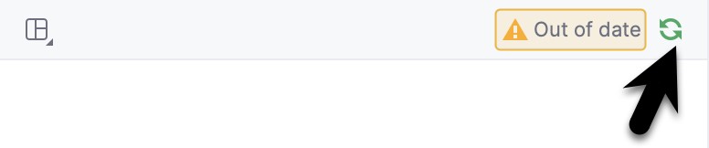
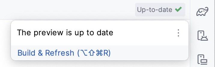
Simply click on the button to update the preview for the latest changes. Occasionally, Android Studio will fail to update the preview after code changes. If you believe that the preview no longer matches your code, hover the mouse pointer over the Up-to-date status text and select Build & Refresh from the resulting menu, as illustrated in Figure 3-19:
The Preview panel also includes an interactive mode that allows you to trigger events on the user interface components (for example, clicking buttons, moving sliders, scrolling through lists, etc.). Since ComposeDemo contains only an inanimate Text component at this stage, it makes more sense to introduce interactive mode in the next chapter.
Bill of Materials and the Compose version
Although Jetpack Compose and Android Studio appear to be tightly integrated, they are two separate products developed by different teams at Google. As a result, there is no guarantee that the most recent Android Studio version will default to using the latest version of Jetpack Compose. It can, therefore, be helpful to know which version of Jetpack Compose is being used by Android Studio. This is declared in a Bill of Materials (BOM) setting within the build configuration files of your Android Studio projects.
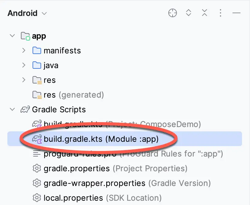
To identify the BOM for a project, locate the Gradle Scripts -> build.gradle.kts (Module: app) file (highlighted in the figure below) and double-click on it to load it into the editor:
|
You are reading a sample chapter from an old edition of the Jetpack Compose Essentials book. Purchase the fully updated Jetpack Compose 1.7 Essentials edition of this book in eBook or Print format. The full book contains 67 chapters and over 700 pages of in-depth information. Buy the full book now in Print or eBook format. Learn more. |
With the file loaded into the editor, locate the compose-bom entry in the dependencies section:
dependencies {
.
.
    implementation(platform("androidx.compose:compose-bom:2023.03.00"))
.
.Code language: Kotlin (kotlin)
In the above example, we can see that the project is using BOM 2023.03.00. With this information, we can use the BOM to library version mapping web page at the following URL to identify the library versions being used to build our app:
https://developer.android.com/jetpack/compose/bom/bom-mapping
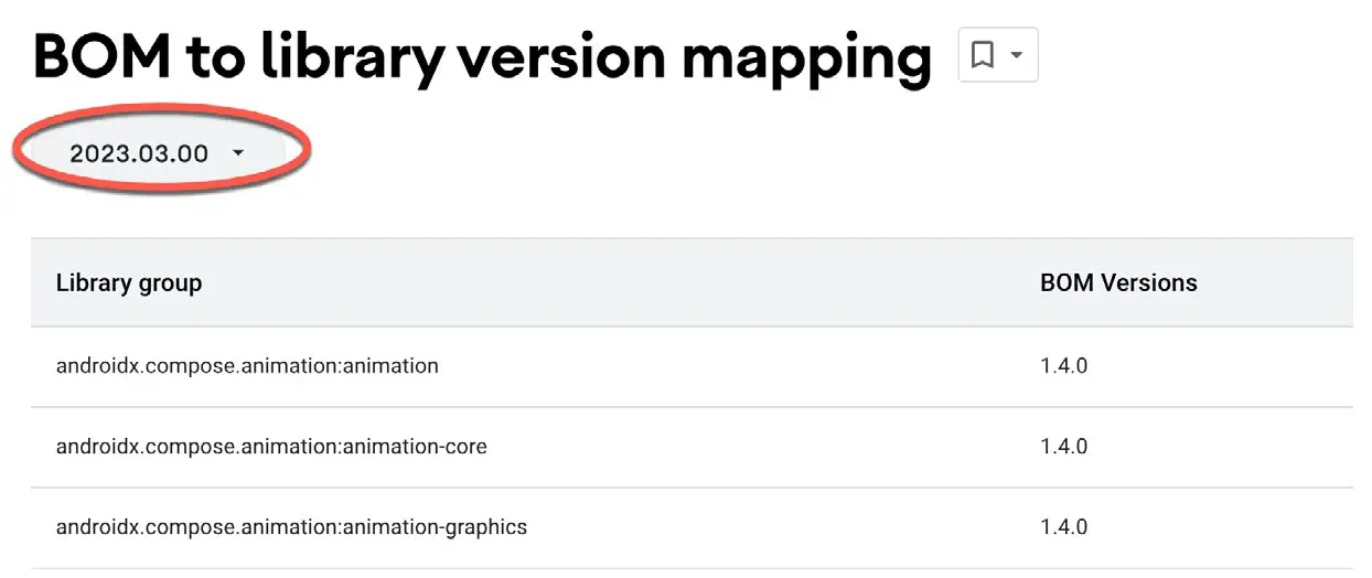
Once the web page has loaded, select the BOM version from the menu highlighted in Figure 3-21 below. For example, the figure shows that BOM 2023.03.00 uses version 1.4.0 of the Compose libraries:
The BOM does not currently define the versions of all the dependencies listed in the build file. Therefore, you will see some library dependencies in the build.gradle.kts file that include a specific version number, as is the case with the core-ktx and lifecycle-runtime-ktx libraries:
|
You are reading a sample chapter from an old edition of the Jetpack Compose Essentials book. Purchase the fully updated Jetpack Compose 1.7 Essentials edition of this book in eBook or Print format. The full book contains 67 chapters and over 700 pages of in-depth information. Buy the full book now in Print or eBook format. Learn more. |
dependencies {

    implementation 'androidx.core:core-ktx:1.9.0'
    implementation 'androidx.lifecycle:lifecycle-runtime-ktx:2.6.1'
.
.Code language: Kotlin (kotlin)
You can add specific version numbers to any libraries you add to the dependencies, though it is recommended to rely on the BOM settings whenever possible to ensure library compatibility. However, a version number declaration will be required when adding libraries not listed in the BOM. You can also override the BOM version of a library by appending a version number to the declaration. The following declaration, for example, overrides the version number in the BOM for the compose.ui library:
implementation 'androidx.compose.ui:ui:1.3.3'Code language: Kotlin (kotlin)Summary
In this chapter, we have created a new project using Android Studio’s Empty Activity template and explored some of the code automatically generated for the project. We have also introduced several features of Android Studio designed to make app development with Compose easier. The most useful features, and the places where you will spend most of your time while developing Android apps, are the code editor and Preview panel.
While the default code in the MainActivity.kt file provides an interesting example of a basic user interface, it bears no resemblance to the app we want to create. In the next chapter, we will modify and extend the app by removing some of the template code and writing our own composable functions.