
In the previous chapter, we created a new Compose-based Android Studio project named ComposeDemo and took some time to explore both Android Studio and some of the project code that it generated to get us started. With those basic steps covered, this chapter will use the ComposeDemo project as the basis for a new app. This will involve the creation of new composable functions, introduce the concept of state, and make use of the Preview panel in interactive mode. As with the preceding chapter, key concepts explained in basic terms here will be covered in significantly greater detail in later chapters.
Getting started
Start Android Studio if it is not already running and open the ComposeDemo project created in the previous chapter. Once the project has loaded, double-click on the MainActivity.kt file (located in the Project tool window under app -> java -> <package name>) to open it in the code editor. If necessary, switch the editor into Split mode so that both the editor and Preview panel are visible.
Removing the template Code
Within the MainActivity.kt file, delete some of the template code so that the file reads as follows:
package com.example.composedemo
.
.
class MainActivity : ComponentActivity() {
    override fun onCreate(savedInstanceState: Bundle?) {
        super.onCreate(savedInstanceState)
        setContent {
            ComposeDemoTheme {
                Surface(
                    modifier = Modifier.fillMaxSize(),
                    color = MaterialTheme.colorScheme.background
                ) {
                    // Greeting("Android")
                }
            }
        }
    }
}
/*
@Composable
fun Greeting(name: String, modifier: Modifier = Modifier) {
    Text(
        text = "Hello $name!",
        modifier = modifier
    )
}

@Preview(showSystemUi = true)
@Composable
fun GreetingPreview() {
    ComposeDemoTheme {
        Greeting("Android")
    }
}
*/Code language: Kotlin (kotlin)
The Composable hierarchy
Before we write the composable functions that will make up our user interface, it helps to visualize the relationships between these components. The ability of one composable to call other composables essentially allows us to build a hierarchy tree of components. Once completed, the composable hierarchy for our ComposeDemo main activity can be represented as shown in Figure 4-1:
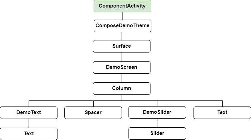
All of the elements in the above diagram, except for ComponentActivity, are composable functions. Of those functions, the Surface, Column, Spacer, Text, and Slider functions are built-in composables provided by Compose. The DemoScreen, DemoText, and DemoSlider composables, on the other hand, are functions that we will create to provide both structure to the design and the custom functionality we require for our app. You can find the ComposeDemoTheme composable declaration in the ui.theme -> Theme.kt file.
 |
You are reading a sample chapter from an old edition of the Jetpack Compose Essentials book. Purchase the fully updated Jetpack Compose 1.7 Essentials edition of this book in eBook or Print format. The full book contains 67 chapters and over 700 pages of in-depth information. Buy the full book now in Print or eBook format. Learn more. |
Adding the DemoText composable
We are now going to add a new composable function to the activity to represent the DemoText item in the hierarchy tree. The purpose of this composable is to display a text string using a font size value that adjusts in real-time as the slider moves. Place the cursor beneath the final closing brace (}) of the MainActivity declaration and add the following function declaration:
fun DemoText() {
}Code language: Kotlin (kotlin)
The @Composable annotation notifies the build system that this is a composable function. When the function is called, the plan is for it to be passed both a text string and the font size at which that text is to be displayed. This means that we need to add some parameters to the function:
@Composable
fun DemoText(message: String, fontSize: Float) {
}Code language: Kotlin (kotlin)
The next step is to make sure the text is displayed. To achieve this, we will make a call to the built-in Text composable, passing through as parameters the message string, font size, and, to make the text more prominent, a bold font weight setting:
@Composable
fun DemoText(message: String, fontSize: Float) {
Text(
text = message,
fontSize = fontSize.sp,
fontWeight = FontWeight.Bold
)
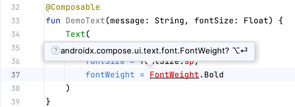
}Code language: Kotlin (kotlin)Note that after making these changes, the code editor indicates that “sp” and “FontWeight” are undefined. This happens because these are defined and implemented in libraries that have not yet been imported into the MainActivity.kt file. One way to resolve this is to click on an undefined declaration so that it highlights as shown below, and then press Alt+Enter (Opt+Enter on macOS) on the keyboard to import the missing library automatically:
Alternatively, you may add the missing import statements manually to the list at the top of the file:
|
You are reading a sample chapter from an old edition of the Jetpack Compose Essentials book. Purchase the fully updated Jetpack Compose 1.7 Essentials edition of this book in eBook or Print format. The full book contains 67 chapters and over 700 pages of in-depth information. Buy the full book now in Print or eBook format. Learn more. |
.
.
import androidx.compose.ui.text.font.FontWeight
import androidx.compose.ui.unit.sp
.
.Code language: Kotlin (kotlin)
In the remainder of this book, all code examples will include any required library import statements.
We have now finished writing our first composable function. Notice that, except for the font weight, all the other properties are passed to the function when it is called (a function that calls another function is generally referred to as the caller). This increases the flexibility, and therefore re-usability, of the DemoText composable and is a key goal to keep in mind when writing composable functions.
Previewing the DemoText composable
At this point, the Preview panel will most likely be displaying a message which reads “No preview found”. The reason for this is that our MainActivity.kt file does not contain any composable functions prefixed with the @ Preview annotation. Add a preview composable function for DemoText to the MainActivity.kt file as follows:
@Preview
@Composable
fun DemoTextPreview() {
   ComposeDemoTheme {
       DemoText(message = "Welcome to Android", fontSize = 12f)
   }
}Code language: Kotlin (kotlin)
After adding the preview composable, the Preview panel should have detected the change and displayed the link to build and refresh the preview rendering. Click the link and wait for the rebuild to complete, at which point the DemoText composable should appear as shown in Figure 4-3:

Minor changes made to the code in the MainActivity.kt file such as changing values will be instantly reflected in the preview without the need to build and refresh. For example, change the “Welcome to Android” text literal to “Welcome to Compose” and note that the text in the Preview panel changes as you type. Similarly, increasing the font size literal will instantly change the size of the text in the preview. This feature is referred to as Live Edit.
|
You are reading a sample chapter from an old edition of the Jetpack Compose Essentials book. Purchase the fully updated Jetpack Compose 1.7 Essentials edition of this book in eBook or Print format. The full book contains 67 chapters and over 700 pages of in-depth information. Buy the full book now in Print or eBook format. Learn more. |
Adding the DemoSlider composable
The DemoSlider composable is a little more complicated than DemoText. It will need to be passed a variable containing the current slider position and an event handler function or lambda to call when the slider is moved by the user so that the new position can be stored and passed to the two Text composables. With these requirements in mind, add the function as follows:
.
.
import androidx.compose.foundation.layout.*
import androidx.compose.material3.Slider
import androidx.compose.ui.unit.dp
.
.
@Composable
fun DemoSlider(sliderPosition: Float, onPositionChange: (Float) -> Unit ) {
    Slider(
        modifier = Modifier.padding(10.dp),
        valueRange = 20f..38f,
        value = sliderPosition,
        onValueChange = { onPositionChange(it) }
    )
}Code language: Kotlin (kotlin)
The DemoSlider declaration contains a single Slider composable which is, in turn, passed four parameters. The first is a Modifier instance configured to add padding space around the slider. Modifier is a Kotlin class built into Compose which allows a wide range of properties to be set on a composable within a single object. Modifiers can also be created and customized in one composable before being passed to other composables where they can be further modified before being applied.
The second value passed to the Slider is a range allowed for the slider value (in this case the slider is limited to values between 20 and 38).
The next parameter sets the value of the slider to the position passed through by the caller. This ensures that each time DemoSlider is recomposed it retains the last position value.
Finally, we set the onValueChange parameter of the Slider to call the function or lambda we will be passing to the DemoSlider composable when we call it later. Each time the slider position changes, the call will be made and passed the current value which we can access via the Kotlin it keyword. We can further simplify this by assigning just the event handler parameter name (onPositionChange) and leaving the compiler to handle the passing of the current value for us:
|
You are reading a sample chapter from an old edition of the Jetpack Compose Essentials book. Purchase the fully updated Jetpack Compose 1.7 Essentials edition of this book in eBook or Print format. The full book contains 67 chapters and over 700 pages of in-depth information. Buy the full book now in Print or eBook format. Learn more. |
onValueChange = onPositionChangeCode language: Kotlin (kotlin)Adding the DemoScreen composable
The next step in our project is to add the DemoScreen composable. This will contain a variable named sliderPosition in which to store the current slider position and the implementation of the handlePositionChange event handler to be passed to the DemoSlider. This lambda will be responsible for storing the current position in the sliderPosition variable each time it is called with an updated value. Finally, DemoScreen will contain a Column composable configured to display the DemoText, Spacer, DemoSlider and the second, as yet to be added, Text composable in a vertical arrangement.
Start by adding the DemoScreen function as follows:
.
.
import androidx.compose.runtime.*
.
.
@Composable
fun DemoScreen() {

    var sliderPosition by remember { mutableStateOf(20f) }

    val handlePositionChange = { position : Float ->
        sliderPosition = position
    }
}Code language: Kotlin (kotlin)
The sliderPosition variable declaration requires some explanation. As we will learn later, the Compose system repeatedly and rapidly recomposes user interface layouts in response to data changes. The change of slider position will, therefore, cause DemoScreen to be recomposed along with all of the composables it calls. Consider if we had declared and initialized our sliderPosition variable as follows:
var sliderPosition = 20fCode language: Kotlin (kotlin)Suppose the user slides the slider to position 21. The handlePositionChange event handler is called and stores the new value in the sliderPosition variable as follows:
val handlePositionChange = { position : Float ->
    sliderPosition = position
}Code language: Kotlin (kotlin)
The Compose runtime system detects this data change and recomposes the user interface, including a call to the DemoScreen function. This will, in turn, reinitialize the sliderposition target state causing the previous value of 21 to be lost. Declaring the sliderPosition variable in this way informs Compose that the current value needs to be remembered during recompositions:
|
You are reading a sample chapter from an old edition of the Jetpack Compose Essentials book. Purchase the fully updated Jetpack Compose 1.7 Essentials edition of this book in eBook or Print format. The full book contains 67 chapters and over 700 pages of in-depth information. Buy the full book now in Print or eBook format. Learn more. |
var sliderPosition by remember { mutableStateOf(20f) }Code language: Kotlin (kotlin)The only remaining work within the DemoScreen implementation is to add a Column containing the required composable functions:
.
.
import androidx.compose.ui.Alignment
.
.
@Composable
fun DemoScreen() {

    var sliderPosition by remember { mutableStateOf(20f) }

    val handlePositionChange = { position : Float ->
        sliderPosition = position
    }

    Column(
        horizontalAlignment = Alignment.CenterHorizontally,
        verticalArrangement = Arrangement.Center,
        modifier = Modifier.fillMaxSize()
    ) {

        DemoText(message = "Welcome to Compose", fontSize = sliderPosition)

        Spacer(modifier = Modifier.height(150.dp))

        DemoSlider(
            sliderPosition = sliderPosition,
            onPositionChange = handlePositionChange
        )

        Text(
            style = MaterialTheme.typography.headlineMedium,
            text = sliderPosition.toInt().toString() + "sp"
        )
    }
}Code language: Kotlin (kotlin)
Points to note regarding these changes may be summarized as follows:
- When DemoSlider is called, it is passed a reference to our handlePositionChange event handler as the onPositionChange parameter.
- The Column composable accepts parameters that customize layout behavior. In this case, we have configured the column to center its children both horizontally and vertically.
- A Modifier has been passed to the Spacer to place a 150dp vertical space between the DemoText and DemoSlider components.
- The second Text composable is configured to use the headlineMedium style of the Material theme. In addition, the sliderPosition value is converted from a Float to an integer so that only whole numbers are displayed and then converted to a string value before being displayed to the user.
Previewing the DemoScreen composable
To confirm that the DemoScreen layout meets our expectations, we need to modify the DemoTextPreview composable:
.
.
@Preview(showSystemUi = true)
@Composable
fun DemoTextPreview() {
    ComposeDemoTheme {
        DemoScreen()
    }
}Code language: Kotlin (kotlin)
Note that we have enabled the showSystemUi property of the preview so that we will experience how the app will look when running on an Android device.
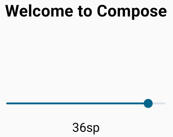
After performing a preview rebuild and refresh, the user interface should appear as originally shown in Figure 3-1.
|
You are reading a sample chapter from an old edition of the Jetpack Compose Essentials book. Purchase the fully updated Jetpack Compose 1.7 Essentials edition of this book in eBook or Print format. The full book contains 67 chapters and over 700 pages of in-depth information. Buy the full book now in Print or eBook format. Learn more. |
Adjusting preview settings
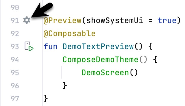
The showSystemUi preview property is only one of many preview configuration options provided by Android Studio. In addition, properties are available to change configuration settings, such as the device type, screen size, orientation, API level, and locale. To access these configuration settings, click on the Preview configuration picker button located in the gutter to the left of the @Preview line in the code editor, as shown in Figure 4-4:
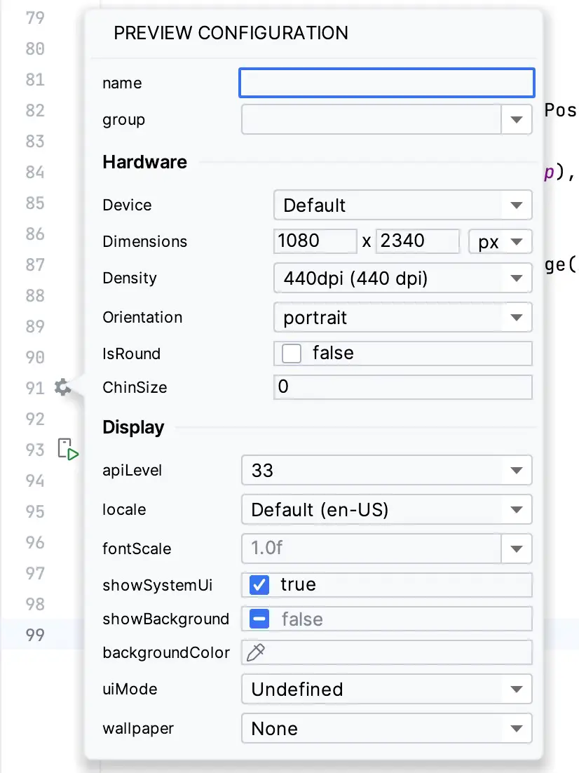
When the button is clicked, the panel shown in Figure 4-5 will appear, from which the full range of preview configuration settings is available:
Testing in interactive mode
At this stage, we know that the user interface layout for our activity looks how we want it to, but we don’t know if it will behave as intended. One option is to run the app on an emulator or physical device (topics covered in later chapters). A quicker option, however, is to switch the preview panel into interactive mode. To start interactive mode, hover the mouse pointer over the area above the preview canvas so that the two buttons shown in Figure 4-6 appear and click on the left-most button:
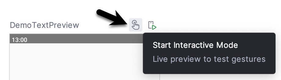
When clicked, there will be a short delay when interactive mode starts, after which it should be possible to move the slider and watch the two Text components update:
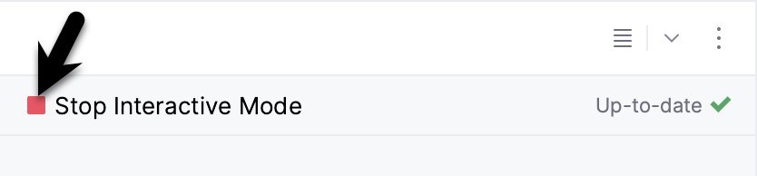
Click the button (highlighted in Figure 4-8 below) to exit interactive mode:
|
You are reading a sample chapter from an old edition of the Jetpack Compose Essentials book. Purchase the fully updated Jetpack Compose 1.7 Essentials edition of this book in eBook or Print format. The full book contains 67 chapters and over 700 pages of in-depth information. Buy the full book now in Print or eBook format. Learn more. |
Completing the project
The final step is to make sure that the DemoScreen composable is called from within the Surface function located in the onCreate() method of the MainActivity class. Locate this method and modify it as follows:
.
.
class MainActivity : ComponentActivity() {
    override fun onCreate(savedInstanceState: Bundle?) {
        super.onCreate(savedInstanceState)
        setContent {
            ComposeDemoTheme {
                Surface(
                    modifier = Modifier.fillMaxSize(),
                    color = MaterialTheme.colorScheme.background
                ) {
                    DemoScreen()
                }
            }
        }
    }
}Code language: Kotlin (kotlin)
This will ensure that, in addition to appearing in the preview panel, our user interface will also be displayed when the app runs on a device or emulator (a topic that will be covered in later chapters).
Summary
In this chapter, we have extended our ComposeDemo project to include some additional user interface elements in the form of two Text composables, a Spacer, and a Slider. These components were arranged vertically using a Column composable. We also introduced the concept of mutable state variables and explained how they are used to ensure that the app remembers state when the Compose runtime performs recompositions. The example also demonstrated how to use event handlers to respond to user interaction (in this case, the user moving a slider). Finally, we made use of the Preview panel in interactive mode to test the app without the need to compile and run it on an emulator or physical device.