
The preceding chapter demonstrated how to detect some common types of gestures, including dragging, tapping, pinching, and scrolling. Detecting swipe gestures is a little more complicated than other gesture types, which is why we are dedicating an entire chapter to the subject. This chapter will explain exactly what swipe gestures are and demonstrate how they can be detected.
Swipe gestures and anchors
A swipe gesture is a horizontal or vertical motion of a point of contact on the device screen. This motion is usually associated with a user interface component that moves in coordination with the swipe motion.
In Compose, a swiping motion serves to move a component from one anchor to another where an anchor is a fixed position on the screen along the axis of the swipe. A point between two anchors is declared as the threshold. If the swipe ends before the threshold is reached, the swiped component will return to the starting anchor. If, on the other hand, the swipe ends after passing the transition point, the component will continue moving until it reaches the destination anchor. These threshold-related movements can be configured to be instant (snapped) or animated.
Detecting swipe gestures
Swipe gestures are detected by applying the swipeable() modifier to the composable in which the gesture is to be detected. The following example shows the minimum requirements when calling the swipeable() modifier:
Box(
    modifier = Modifier
        .swipeable(
            state = <swipeable state>,
            anchors = <anchors>,
            thresholds = { _, _ -> FractionalThreshold(<value>) },
            orientation = <horizontal or vertical>
        )
)Code language: Kotlin (kotlin)
Important parameters that can be specified when calling the swipeable() modifier can be summarized as follows:
 |
You are reading a sample chapter from an old edition of the Jetpack Compose Essentials book. Purchase the fully updated Jetpack Compose 1.7 Essentials edition of this book in eBook or Print format. The full book contains 67 chapters and over 700 pages of in-depth information. Buy the full book now in Print or eBook format. Learn more. |
- state: SwipeableState – Used to store the swipeable state through recompositions and obtained via a call to the rememberSwipeableState() function. This state contains the current offset of the swipe motion which can be used to change the position of the current or other composables.
- anchors: Map – A Map declaration that pairs anchor points and states. Anchor points are specified as pixels defining positions in the horizontal or vertical plane depending on the orientation setting.
- orientation: Orientation – The orientation of the swipe gesture. Must be set to either Orientation.Horizontal or Orientation.Vertical.
- enabled: Boolean – An optional setting that defaults to true and controls whether swipe detection is active.
- reverseDirection: Boolean – An optional setting that defaults to false. When set to true, this setting reverses the effect of the swipe direction. In other words, a downward swipe will behave as an upward swipe, a rightward swipe as a leftward swipe, and so on.
- thresholds: (from, to) – Specifies the position of thresholds between anchors. Declared as a lambda containing a call to either FractionalThreshold(Float) when declaring the transition point as a percentage of the distance between anchors, or FixedThreshold(Dp) when specifying a fixed position.
- resistance: ResistanceConfig? – An optional setting that defines the resistance that will be applied when the swiping motion passes beyond the first or last final anchor in the anchor map (referred to as the bounds). By default, the swipe will be allowed to move slightly beyond the bounds before springing back to the anchor. When set to null, the swipe cannot extend beyond the bounds.
- velocityThreshold: Dp – An optional setting defining the speed in dp per second that the swipe velocity has to exceed to move to the next state.
Declaring the anchors map
As previously outlined, swipe anchors are declared as map objects containing pairs of anchor positions and states. The anchors are declared using floating-point pixel values that correspond to a position along either the x or y-axis relative to the composable to which the swipeable() modifier is being applied. The corresponding state can be any valid state type that is supported by the Bundle class. For example, as each anchor point is reached, the text displayed on a text component may need to change. In this case, each state in an anchor pair would be a different string value setting. The anchor map can be declared using the Kotlin mapOf() function. Consider, for example, the following anchor declaration:
val swipeableState = rememberSwipeableState("On")
val anchors = mapOf(0f to "On", 150f to "Off", 300f to "Locked")Code language: Kotlin (kotlin)
When the swipe reaches the anchors at the 150px and 300px position, the current value of the swipeableState will be set to “Off” and “Locked” respectively. A Text composable might be configured to display this current state as follows:
Text(swipeableState.currentValue)Code language: Kotlin (kotlin)Declaring thresholds
Thresholds are declared as lambdas which will be passed from and to states when called and must return a ThresholdConfig value. This ThresholdConfig instance can be generated via a call to either the FractionalThreshold() or FixedThreshold() function. The following code, for example, declares a threshold at a point 50% of the distance between two anchors:
{ _, _ -> FractionalThreshold(0.5f) }Code language: Kotlin (kotlin)The following declaration, on the other hand, sets a threshold at a fixed point 20dp along the distance between two anchors:
{ _, _ -> FixedThreshold(20.dp) }Code language: Kotlin (kotlin)Moving a component in response to a swipe
As with many of the gesture detection modifiers covered in the previous chapter, a swipe does not automatically move a component. Any position changes within the layout must therefore be programmed. Fortunately, this is simply a case of using the offset value of the swipeable state with the offset() modifier of any components in the layout that need to be moved in response to the gesture. If, for example, we need the Text view in the above example to move horizontally in response to the swipe gesture, we could do so with the following code change:
|
You are reading a sample chapter from an old edition of the Jetpack Compose Essentials book. Purchase the fully updated Jetpack Compose 1.7 Essentials edition of this book in eBook or Print format. The full book contains 67 chapters and over 700 pages of in-depth information. Buy the full book now in Print or eBook format. Learn more. |
Text(
    swipeableState.currentValue,
    modifier = Modifier
          .offset { IntOffset(swipeableState.offset.value.roundToInt() , 0)
})Code language: Kotlin (kotlin)
When executed, the Text component will now move in concert with the swiping motion.
With the basics of Compose swipe gesture detection covered, in the rest of this chapter we will create an example project that will help to clarify the information provided so far.
About the SwipeDemo project
The project created in the remainder of this chapter will implement horizontal swipe detection designed to move a Box between three anchor positions. At each anchor, the box will display a different letter signifying left (L), center (C), and right (R). Figure 48-1 shows the completed user interface:
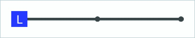
Figure 48-1
Creating the SwipeDemo project
Launch Android Studio and create a new Empty Compose Activity project named SwipeDemo, specifying com.example.swipedemo as the package name, and selecting a minimum API level of API 26: Android 8.0 (Oreo). Within the MainActivity.kt file, delete the Greeting function and add a new empty composable named MainScreen:
|
You are reading a sample chapter from an old edition of the Jetpack Compose Essentials book. Purchase the fully updated Jetpack Compose 1.7 Essentials edition of this book in eBook or Print format. The full book contains 67 chapters and over 700 pages of in-depth information. Buy the full book now in Print or eBook format. Learn more. |
@Composable
fun MainScreen() {

}Code language: Kotlin (kotlin)
Next, edit the onCreateActivity() method and DefaultPreview function to call MainScreen instead of Greeting.
Setting up the swipeable state and anchors
Before designing the user interface layout, we need to set up some size constants, create the swipeable state and declare the anchor map. With the MainActivity.kt file loaded into the editor, locate and make the following changes to the MainScreen function:
.
.
import androidx.compose.material.*
import androidx.compose.ui.platform.LocalDensity
import androidx.compose.ui.unit.dp
.
.
@Composable
fun MainScreen() {
    val parentBoxWidth = 320.dp
    val childBoxSides = 30.dp

    val swipeableState = rememberSwipeableState("L")
    val widthPx = with(LocalDensity.current) {
               (parentBoxWidth - childBoxSides).toPx() }

    val anchors = mapOf(0f to "L", widthPx / 2 to "C", widthPx to "R")
}Code language: Kotlin (kotlin)
In the above code, the parentBoxWidth value represents the width of the top-level Box within the component hierarchy we will be creating later in the tutorial. This is the component to which the swipeable() modifier will be applied. The parent box will contain a child box, the side lengths of which are defined via the childBoxSides declaration. Finally, the width in pixels of the swipeable area is calculated by taking the density of the display on which the app is running, then subtracting the width of the child box from the width of the parent box:
val widthPx = with(LocalDensity.current) {
               (parentBoxWidth - childBoxSides).toPx() }Code language: Kotlin (kotlin)
The child box width is subtracted above to account for the fact that the child box will be centered on the anchor points, leaving an overhang equivalent to half the width of the child on the first and last anchors (these two halves combining to create a full child box width).
Finally, anchor points are configured at the start, mid-point, and end of the swipeable area. The states for these anchors are declared as strings set to “L”, “C”, and “R”.
|
You are reading a sample chapter from an old edition of the Jetpack Compose Essentials book. Purchase the fully updated Jetpack Compose 1.7 Essentials edition of this book in eBook or Print format. The full book contains 67 chapters and over 700 pages of in-depth information. Buy the full book now in Print or eBook format. Learn more. |
val anchors = mapOf(0f to "L", widthPx / 2 to "C", widthPx to "R")Code language: Kotlin (kotlin)At the time of writing, the rememberSwipeableState() function was an experimental feature. If the editor reports this error, add the @ExperimentalMaterialApi annotation above the @Composable directive for the MainScreen as shown below:
@OptIn(ExperimentalMaterialApi::class)
@Composable
fun MainScreen() {Code language: Kotlin (kotlin)
Designing the parent Box
The next step is to design the composable hierarchy that makes up the user interface layout. As previously described, the layout will consist of a parent Box on which the swipeable modifier will be applied. Remaining within the MainScreen function add this component now:
.
.
import androidx.compose.foundation.gestures.Orientation
import androidx.compose.foundation.layout.*
.
.
Composable
fun MainScreen() {
.
.
    val anchors = mapOf(0f to "L", widthPx / 2 to "C", widthPx to "R")

    Box {
        Box(
            modifier = Modifier
                .padding(20.dp)
                .width(parentBoxWidth)
                .height(childBoxSides)
                .swipeable(
                    state = swipeableState,
                    anchors = anchors,
                    thresholds = { _, _ -> FractionalThreshold(0.5f) },
                    orientation = Orientation.Horizontal
                )
        ) {
        }
    }
}Code language: Kotlin (kotlin)
Note that the thresholds are set to the halfway points between anchors.
The next step is to add the line graphic which is, itself, comprised of four Box components:
.
.
import androidx.compose.foundation.background
import androidx.compose.foundation.shape.CircleShape
import androidx.compose.ui.Alignment
import androidx.compose.ui.graphics.Color
.
.
Box(
    modifier = Modifier
        .padding(20.dp)
        .width(parentBoxWidth)
        .height(childBoxSides)
.
.
) {
    Box(Modifier.fillMaxWidth().height(5.dp).
         background(Color.DarkGray).align(Alignment.CenterStart))
    Box(Modifier.size(10.dp).background(Color.DarkGray,
         shape = CircleShape).align(Alignment.CenterStart))
    Box(Modifier.size(10.dp).background(Color.DarkGray,
         shape = CircleShape).align(Alignment.Center))
    Box(Modifier.size(10.dp).background(Color.DarkGray,
         shape = CircleShape).align(Alignment.CenterEnd))
}
.
.Code language: Kotlin (kotlin)
Take this opportunity to review the layout in the Preview panel where the line should now appear as shown in Figure 48-2:
|
You are reading a sample chapter from an old edition of the Jetpack Compose Essentials book. Purchase the fully updated Jetpack Compose 1.7 Essentials edition of this book in eBook or Print format. The full book contains 67 chapters and over 700 pages of in-depth information. Buy the full book now in Print or eBook format. Learn more. |
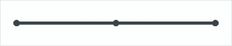
Figure 48-2
Work on the parent Box implementation is now complete and we are ready to add the child box:
.
.
import androidx.compose.ui.unit.sp
import androidx.compose.ui.unit.IntOffset
import kotlin.math.roundToInt
.
.
Box(
    modifier = Modifier
        .padding(20.dp)
        .width(parentBoxWidth)
        .height(childBoxSides)
.
.
    Box(Modifier.size(10.dp).background(Color.DarkGray,
         shape = CircleShape).align(Alignment.CenterEnd))

        Box(
            Modifier
                .offset { IntOffset(swipeableState.offset.value.roundToInt(), 0) }
                .size(childBoxSides)
                .background(Color.Blue),
            contentAlignment = Alignment.Center
        ) {
            Text(
                swipeableState.currentValue,
                color = Color.White,
                fontSize = 22.sp
           )
        }
    }
.
.
}Code language: Kotlin (kotlin)
Before we try out the swiping behavior, some of the above code needs some explanation. First, the offset modifier is applied to the child Box to control the horizontal position. This is achieved by using the current offset value stored in swipeableState to control the position of the Box along the x-axis.
.offset { IntOffset(swipeableState.offset.value.roundToInt(), 0) }Code language: Kotlin (kotlin)The child Box contains a single child in the form of a Text component. The text displayed on this component is set based on the state value for the current anchor (in other words “L”, “C” or “R”):
Text(
    swipeableState.currentValue,
    color = Color.White,
    fontSize = 22.sp
)Code language: Kotlin (kotlin)
With the coding work completed, all that remains is to test that the swipe gesture detection works as intended.
|
You are reading a sample chapter from an old edition of the Jetpack Compose Essentials book. Purchase the fully updated Jetpack Compose 1.7 Essentials edition of this book in eBook or Print format. The full book contains 67 chapters and over 700 pages of in-depth information. Buy the full book now in Print or eBook format. Learn more. |
Testing the project
With this phase of the project complete, we can now try out the swiping behavior. Using either the Preview panel in interactive mode or a device or emulator, click and swipe right anywhere within the bounds of the parent box. As you swipe, the child box will also move to the right. If you stop swiping before the child box reaches the mid-point between the first two anchors, it will animate back to the start anchor. Move the box beyond the midpoint, however, and the box will automatically animate to the second anchor, at which point the text will change from “L” to “C”. From this point, the box can be swiped in either direction with the same threshold behavior.
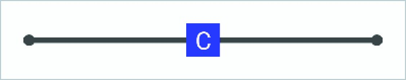
Figure 48-3
Summary
Swiping in Compose involves the movement of a component from one anchor point to another combined with a transition between different states. Swipe gestures are detected using the swipeable() modifier in conjunction with a map of anchors and state pairs. A threshold point is also declared between anchor points. If the swipe gesture ends before reaching the threshold, the target component moves back to the starting anchor, while the component will continue to the destination anchor if the swipe ends after the threshold.