
Following on from the overview provided previously in the chapter entitled Screen Navigation in Jetpack Compose this chapter will create a project that integrates navigation into an activity using the Compose BottomNavigation component. The project will also provide a brief introduction to the Scaffold component and demonstrate how it can be used to create a standard screen layout that conforms to the Material theme guidelines.
Creating the BottomBarDemo project
Launch Android Studio and create a new Empty Compose Activity project named BottomBarDemo, specifying com.example.bottombardemo as the package name, and selecting a minimum API level of API 26: Android 8.0 (Oreo). Within the MainActivity.kt file, delete the Greeting function and add a new empty composable named MainScreen:
@Composable
fun MainScreen() {

}Code language: Kotlin (kotlin)
Next, edit the onCreateActivity() method and DefaultPreview function to call MainScreen instead of Greeting.
Before proceeding, we will also need to add the Compose navigation library to the project build settings, which will, in turn, require us to increase the compilation SDK to API 34. Within the Project tool window, locate and open the module-level Gradle build file (app -> Gradle Scripts -> build.gradle.kts (Module: app) file and make the following changes (keeping in mind that a more recent version of the navigation library may now be available):
.
    compileSdk = 34
.
.
dependencies {
.
.
    implementation("androidx.navigation:navigation-compose:2.7.1")
.
.Code language: Gradle (gradle)
Declaring the navigation routes
When the project is completed, it will include a bottom bar containing three items which, when clicked, will navigate to different screens, each represented by a composable. The first step we need to complete is to add the routes for the three destinations which will be declared using a sealed class. Begin by right-clicking on the app -> java -> com.example.bottombardemo entry in the Project tool window and selecting the New -> Kotlin File/ Class menu option. In the new class dialog, name the class NavRoutes, select the Sealed Class entry in the list and press the keyboard return key to generate the file. Edit the new file to add the destination routes as follows:
 |
You are reading a sample chapter from an old edition of the Jetpack Compose Essentials book. Purchase the fully updated Jetpack Compose 1.7 Essentials edition of this book in eBook or Print format. The full book contains 67 chapters and over 700 pages of in-depth information. Buy the full book now in Print or eBook format. Learn more. |
package com.example.bottombardemo

sealed class NavRoutes(val route: String) {
    object Home : NavRoutes("home")
    object Contacts : NavRoutes("contacts")
    object Favorites : NavRoutes("favorites")
}Code language: Kotlin (kotlin)
Designing bar items
Each item in the bottom bar will need a title string, an icon image, and the route to which the app should navigate when the item is clicked. To keep the MainActivity.kt file as simple as possible, we will also declare the bar item class as a separate file. Using the steps outlined above, add a new Kotlin Class file named BarItem, this time using the Data Class option, to the project and modify it so that it reads as follows:
package com.example.bottombardemo

import androidx.compose.ui.graphics.vector.ImageVector

data class BarItem(
    val title: String,
    val image: ImageVector,
    val route: String
)Code language: Kotlin (kotlin)
Creating the bar item list
Now that we have the BarItem class providing a template for each bar item, the next step is to create a list containing the three bar items, each configured with the appropriate string, image, and route properties. Add another Kotlin class using the Object option, this time named NavBarItems, and implement the list as follows:
package com.example.bottombardemo

import androidx.compose.material.icons.*
import androidx.compose.material.icons.filled.Home
import androidx.compose.material.icons.filled.Favorite
import androidx.compose.material.icons.filled.Face

object NavBarItems {
    val BarItems = listOf(
        BarItem(
            title = "Home",
            image = Icons.Filled.Home,
            route = "home"
        ),
        BarItem(
            title = "Contacts",
            image = Icons.Filled.Face,
            route = "contacts"
        ),
        BarItem(
            title = "Favorites",
            image = Icons.Filled.Favorite,
            route = "favorites"
        )
    )
}Code language: Kotlin (kotlin)
Note that the above declaration makes use of the built-in Material theme icons for the images. Although not as extensive as the Clip Art list available via the Resource Manager used in earlier chapters, these icons provide a quick and convenient way to add graphics to your project.
Adding the destination screens
Each of the three destinations now needs a composable. These will be simple functions that do nothing more than display the icon for the corresponding bar item selection. Each screen composable will be declared in a separate file, each of which will be placed in a new package named com.example.bottombardemo.screens. Create this package now by right-clicking on the com.example.bottombardemo entry in the Project tool window and selecting the New package menu option. In the resulting dialog, name the package com.example.bottombardemo. screens as shown in Figure 46-1 before tapping the keyboard enter key:

Right-click on the new package entry in the Project tool window, select the option to create a new Kotlin class named Home, and modify it so that it reads as follows:
|
You are reading a sample chapter from an old edition of the Jetpack Compose Essentials book. Purchase the fully updated Jetpack Compose 1.7 Essentials edition of this book in eBook or Print format. The full book contains 67 chapters and over 700 pages of in-depth information. Buy the full book now in Print or eBook format. Learn more. |
.
.
import androidx.compose.foundation.layout.Box
import androidx.compose.foundation.layout.fillMaxSize
import androidx.compose.foundation.layout.size
import androidx.compose.material.Icon
import androidx.compose.material.icons.Icons
import androidx.compose.material.icons.filled.Home
import androidx.compose.runtime.Composable
import androidx.compose.ui.Alignment
import androidx.compose.ui.Modifier
import androidx.compose.ui.graphics.Color
import androidx.compose.ui.tooling.preview.Preview
import androidx.compose.ui.unit.dp

@Composable
fun Home() {

    Box(
        modifier = Modifier.fillMaxSize()
    ) {
        Icon(
            imageVector = Icons.Filled.Home,
            contentDescription = "home",
            tint = Color.Blue,
            modifier = Modifier.size(150.dp)
                .align(Alignment.Center)
        )
    }
}Code language: Kotlin (kotlin)
Repeat these steps to add class files for the two remaining screens named Contacts and Favorites using the same code as that used for the home screen above, but changing the icon import, imageVector property, and contentDescription accordingly. In the case of the Contacts composable the following changes apply:
.
.
import androidx.compose.material.icons.filled.Face
.
.
@Composable
fun Contacts() {

    Box(
        modifier = Modifier.fillMaxSize()
    ) {
        Icon(
            imageVector = Icons.Filled.Face,
            contentDescription = "contacts",
            tint = Color.Blue,
            modifier = Modifier.size(150.dp)
                .align(Alignment.Center)
        )
    }
}Code language: Kotlin (kotlin)
Similarly, the following changes will be needed for the Favorites.kt file:
.
.
import androidx.compose.material.icons.filled.Favorite
.
.
@Composable
fun Favorites() {

    Box(
        modifier = Modifier.fillMaxSize()
    ) {
        Icon(
            imageVector = Icons.Filled.Favorite,
            contentDescription = "favorites",
            tint = Color.Blue,
            modifier = Modifier.size(150.dp)
                .align(Alignment.Center)
        )
    }
}Code language: Kotlin (kotlin)
Creating the navigation controller and host
Now that the basic elements of the project have been created, the next step is to create both the navigation controller (NavHostController) and navigation host (NavHost) instances. Edit the MainActivity.kt file and make the following modifications:
.
.
import androidx.navigation.compose.NavHost
import androidx.navigation.compose.composable
import androidx.navigation.compose.rememberNavController
import androidx.navigation.NavHostController
import com.example.bottombardemo.screens.Contacts
import com.example.bottombardemo.screens.Favorites
import com.example.bottombardemo.screens.Home
.
.
@Composable
fun MainScreen() {

    val navController = rememberNavController()
}

@Composable
fun NavigationHost(navController: NavHostController) {

    NavHost(
        navController = navController,
        startDestination = NavRoutes.Home.route,
    ) {
        composable(NavRoutes.Home.route) {
            Home()
        }

        composable(NavRoutes.Contacts.route) {
            Contacts()
        }

        composable(NavRoutes.Favorites.route) {
            Favorites()
        }
    }
}Code language: Kotlin (kotlin)
Designing the navigation bar
The bottom navigation bar will be implemented in a separate composable named BottomNavBar which will need to be passed the navigation controller instance created in the NavSetup function. It will, of course, consist of a BottomNavigation component and a BottomNavigationItem child for each of the three destination screens. Start by adding the BottomNavBar function to the MainActivity.kt file as follows:
.
.
import androidx.compose.material.*
import androidx.compose.runtime.getValue
import androidx.navigation.compose.currentBackStackEntryAsState
import androidx.navigation.NavGraph.Companion.findStartDestination
.
.
@Composable
fun BottomNavigationBar(navController: NavHostController) {

    BottomNavigation {

    }
}Code language: Kotlin (kotlin)
Within the BottomNavigation call, we will need to be able to identify the route of the currently selected navigation destination. We do this by calling the currentBackStackEntryAsState() method of the navigation controller to obtain the current back stack entry from which we can access the route:
|
You are reading a sample chapter from an old edition of the Jetpack Compose Essentials book. Purchase the fully updated Jetpack Compose 1.7 Essentials edition of this book in eBook or Print format. The full book contains 67 chapters and over 700 pages of in-depth information. Buy the full book now in Print or eBook format. Learn more. |
@Composable
fun BottomNavigationBar(navController: NavHostController) {

    BottomNavigation {
        val backStackEntry by navController.currentBackStackEntryAsState()
        val currentRoute = backStackEntry?.destination?.route

    }
}Code language: Kotlin (kotlin)
All that remains is to iterate through the items located in BarItems and use the title, image, and route settings for each item to configure BottomNavigationItem instances for each destination:
@Composable
fun BottomNavigationBar(navController: NavHostController) {

    BottomNavigation {
        val backStackEntry by navController.currentBackStackEntryAsState()
        val currentRoute = backStackEntry?.destination?.route

        NavBarItems.BarItems.forEach { navItem ->

            BottomNavigationItem(
                selected = currentRoute == navItem.route,
                onClick = {
                    navController.navigate(navItem.route) {
                       popUpTo(navController.graph.findStartDestination().id) {
                           saveState = true
                       }
                        launchSingleTop = true
                        restoreState = true
                    }
                },

                icon = {
                    Icon(imageVector = navItem.image,
                           contentDescription = navItem.title)
                },
                label = {
                    Text(text = navItem.title)
                },
            )
        }
    }
}Code language: Kotlin (kotlin)
Working with the Scaffold component
The final task before testing the project is to complete the layout in the MainScreen function. For this, we will be making use of the Compose Scaffold component. This component provides a template layout structure for the standard Material screen layout. Scaffold includes slots for standard layout elements including a top bar, content area, bottom bar, floating action button, snackbar, and a navigation drawer. For this example, we will be using the top bar, content area, and bottom bar scaffold slots. Edit the MainScreen function and add the Scaffold call as follows:
@Composable
fun MainScreen() {
    val navController = rememberNavController()

    Scaffold(
        topBar = { TopAppBar(title = {Text("Bottom Navigation Demo")})  },
        content = { NavigationHost(navController = navController) },
        bottomBar = { BottomNavigationBar(navController = navController)}
    )
}Code language: Kotlin (kotlin)
For the top bar, we are using the TopAppBar component configured to display a Text composable while our NavigationHost composable is used for the content area of the screen. Finally, the bottom bar position is occupied by our BottomNavigationBar component.
Testing the project
At the time of writing, the Compose features used in this example were not supported in the Preview panel. To test the app, therefore, you will need to compile and run the project on a device or emulator where it should match the screen shown in Figure 46-2:
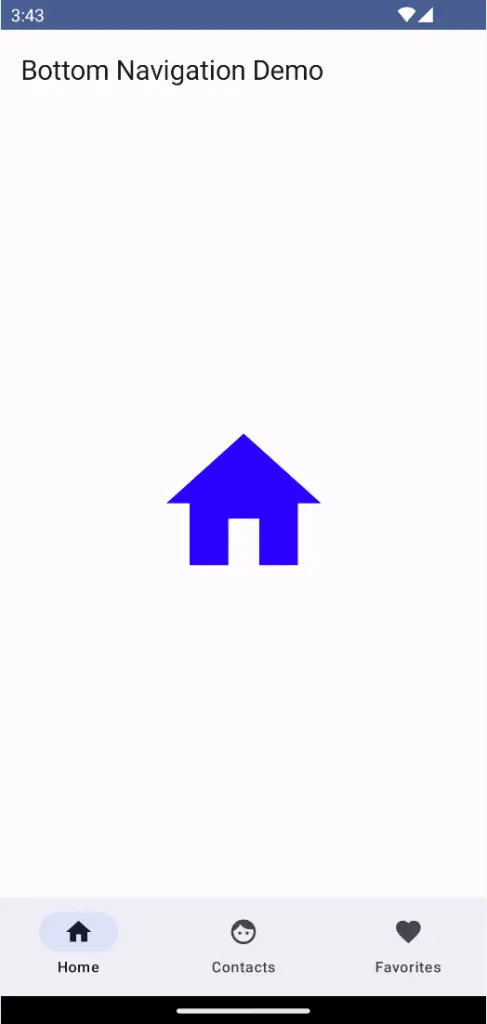
Test that the navigation works by clicking on the bottom bar items and verifying that the correct screen appears in each case. Also, check that the code to prevent duplicate back stack entries is working by clicking multiple times on the Contacts bar item followed by the back button (or a rightward swipe on newer Android versions). If the code is working as intended, the app should navigate back to the Home screen.
|
You are reading a sample chapter from an old edition of the Jetpack Compose Essentials book. Purchase the fully updated Jetpack Compose 1.7 Essentials edition of this book in eBook or Print format. The full book contains 67 chapters and over 700 pages of in-depth information. Buy the full book now in Print or eBook format. Learn more. |
Summary
In this chapter, we have used the Compose BottomNavigation component to implement navigation between screens within an activity. This involves creating a BottomNavigationItem child for each screen together with a navigation controller and NavHost. A key step in implementing bottom bar navigation involves keeping track of the current destination route, a task which is achieved by accessing the current back stack entry via a call to the currentBackStackEntryAsState() method of the navigation controller. The project also made use of the Scaffold composable to create a layout that conforms to Material theme standards.