
With the basics of multitasking in iOS covered in the previous chapter, this chapter will involve the creation of a simple example app that uses multitasking within an app when running on an iPad device. In addition to using size classes, the example will also demonstrate how the UIStackView class can be of particular use when implementing multitasking user interface adaptability.
Creating the Multitasking Example Project
Begin by launching Xcode and creating a new project using the iOS App template with the Swift and Storyboard options selected, entering MultitaskingDemo as the product name.
Adding the Image Files
The completed app will include two images that need to be added to the project’s asset catalog. Both image files are contained within the multitasking_images folder of the sample code download.
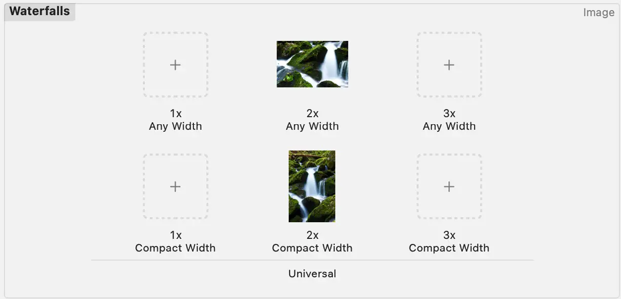
Within Xcode, locate and select the Assets entry within the Project Navigator panel to load the asset catalog into the main panel. Then, in the left-hand panel, Ctrl-click immediately beneath the existing AppIcon entry and select New Image Set from the resulting menu. Next, double-click on the new image set entry (which will default to the name image) and change the name to Waterfalls.
Open a Finder window, locate the multitasking_images folder from the code sample download, and drag and drop the [email protected] file onto the 2x placeholder within the image asset catalog. This portrait image will be displayed within the app when it is displayed using a regular width size class.
 |
You are reading a sample chapter from Building iOS 17 Apps using Xcode Storyboards.
Buy the full book now in eBook or Print format. The full book contains 96 chapters and 760 pages of in-depth information. |
Remaining within the asset catalog and with the Waterfalls image set still selected, display the Attributes Inspector panel and change the Width Class property from Any to Any & Compact. The second row of image placeholders will now appear within the image set. Drag and drop the [email protected] image file from the Finder window onto the 2x Compact Width placeholder within the image set. On completion of these steps, the image set within the asset catalog should match that shown in Figure 34-1:
Designing the Regular Width Size Class Layout
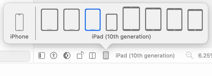
The baseline user interface layout will be used for the regular width size class. In the next section, trait variations will be made to the layout for the compact width size class. Begin, therefore, by selecting the Main.storyboard file, displaying the device configuration bar (Figure 34-2), and selecting an iPad configuration:
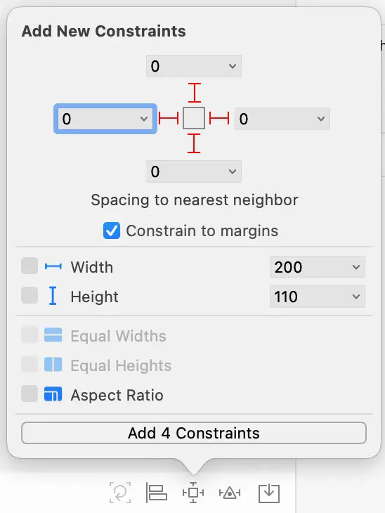
For this example, the layout will be controlled by a UIStackView instance, so drag and drop a Horizontal Stack View from the Library panel onto the scene canvas. With the Stack View selected, display the Auto Layout Add New Constraints menu and set Spacing to nearest neighbor constraints on all four sides of the view with the spacing set to 0 and the Constrain to margins option enabled as illustrated in Figure 34-3:
Display the Document Outline panel and select the Stack View entry. Then, using the Attributes Inspector panel, set the Alignment to Center and the Distribution property to Fill Equally.
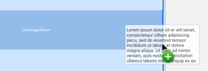
Drag an Image object and drop it onto the stack view instance in the storyboard scene canvas. Locate the Text View object within the Library panel and drag it to the right-hand edge of the Image view within the scene canvas. When a bold blue vertical line appears (referenced by the arrow in Figure 34-4) indicating that the Text View will be placed to the right of the Image view in the stack, drop the Text View to add it to the scene:
|
You are reading a sample chapter from Building iOS 17 Apps using Xcode Storyboards.
Buy the full book now in eBook or Print format. The full book contains 96 chapters and 760 pages of in-depth information. |
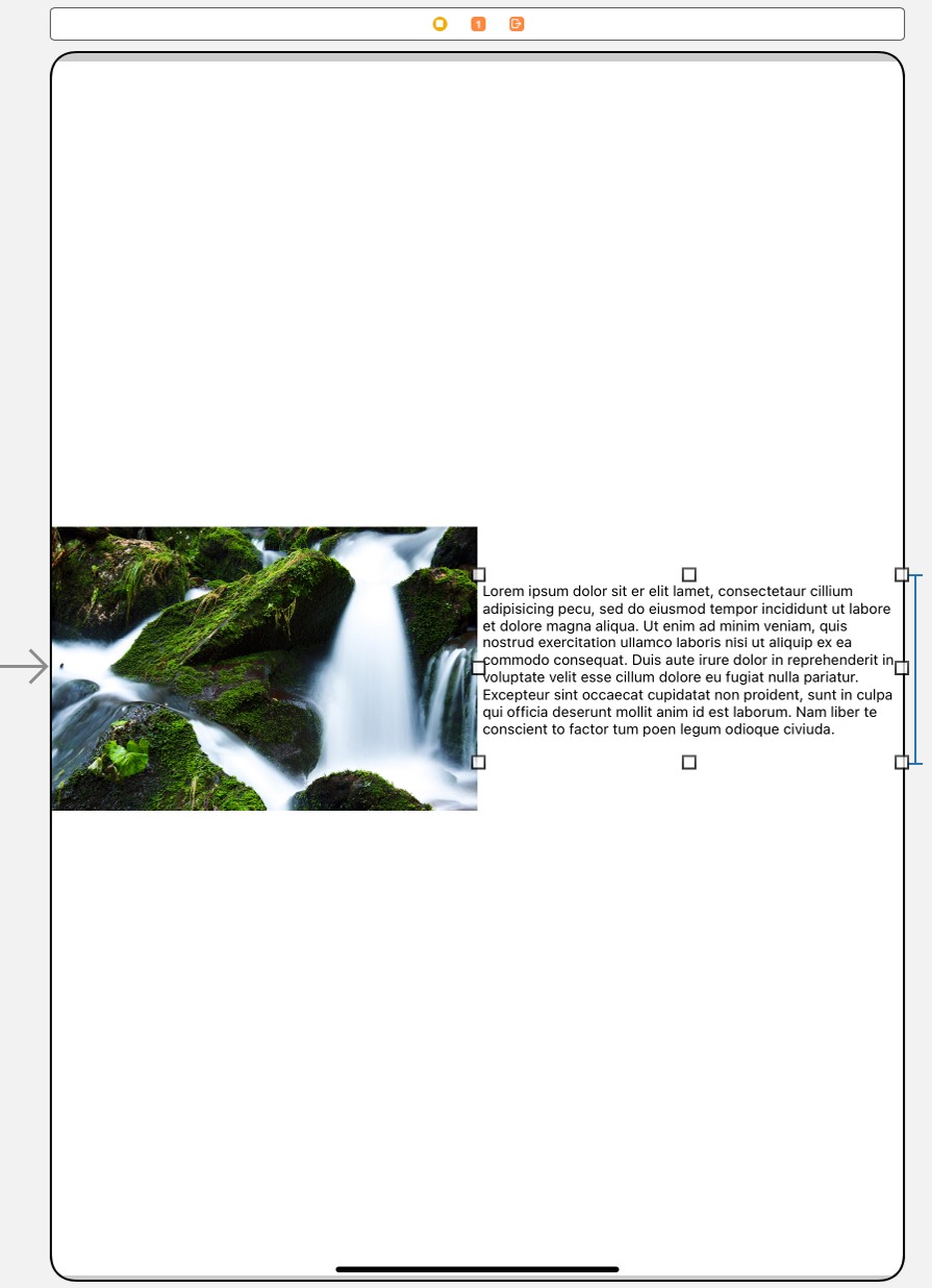
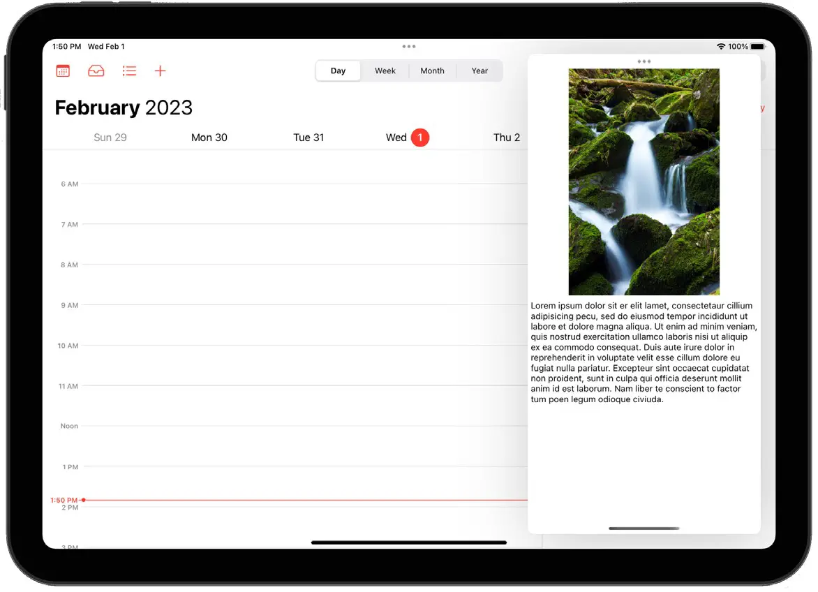
With the Image View selected, use the Attributes Inspector panel to set the Content Mode attribute to Aspect Fit and the Image menu to Waterfalls. Next, select the Text View object and stretch it vertically so that all the Latin text is visible. Finally, with the Text View object still selected, display the Auto Layout Add New Constraints menu and enable the Height constraint option based on the current value before clicking on the Add 1 Constraint button. At this point, the user interface layout should resemble Figure 34-5:
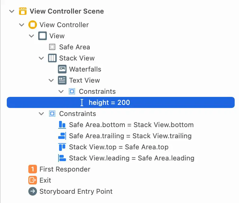
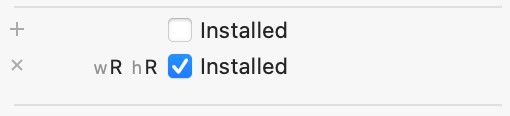
The height constraint we have applied to the Text View is only required in regular width size class configurations. Therefore, we need to use a trait variation to prevent the height from being constrained in compact-width environments. Within the Document Outline panel, locate and select the height constraint as illustrated in Figure 34-6 below:
Next, refer to the Size inspector panel and add a wR hR variation as shown in Figure 34-7:
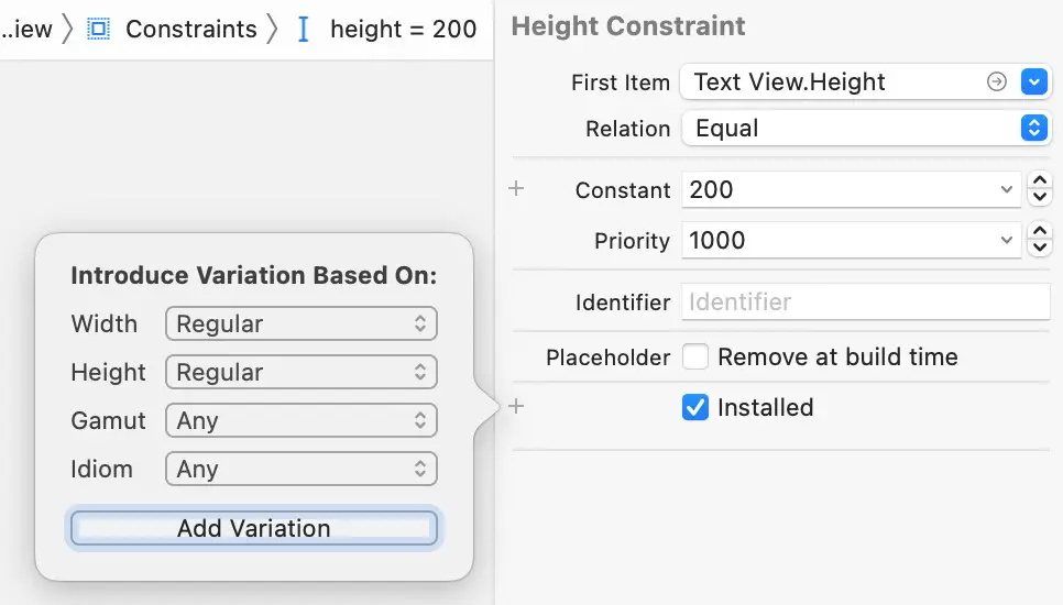
Finally, turn off the Installed checkbox for the default variation, and enable the new variation:
Designing the Compact Width Size Class
The compact size class will be used to arrange the scene layout when the app is displayed in Slide Over and specific Split View configurations. This size class must be designed within the project to ensure that the scene appears correctly. With the Main.storyboard file still loaded into Interface Builder, select the iPhone 14 device from the device configuration bar.
|
You are reading a sample chapter from Building iOS 17 Apps using Xcode Storyboards.
Buy the full book now in eBook or Print format. The full book contains 96 chapters and 760 pages of in-depth information. |
With Interface Builder now displaying the compact width, and regular height size class, the stack view needs to be configured to use vertical orientation to accommodate the narrower width available for the subviews.
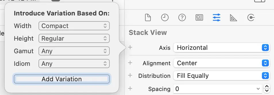
Select the Stack View object within the Document Outline panel and display the Attributes Inspector panel. When the app is displayed in compact width, the axis orientation of the stack view object needs to change An iPadOS Multitasking Example from horizontal to vertical. To configure this, click on the + button located to the left of the Axis setting in the Attributes Inspector and, from the resulting panel, set the Width option to Compact and Height option to Regular, leaving the Gamut set to Any. Once the options have been selected, click on the Add Variation button:
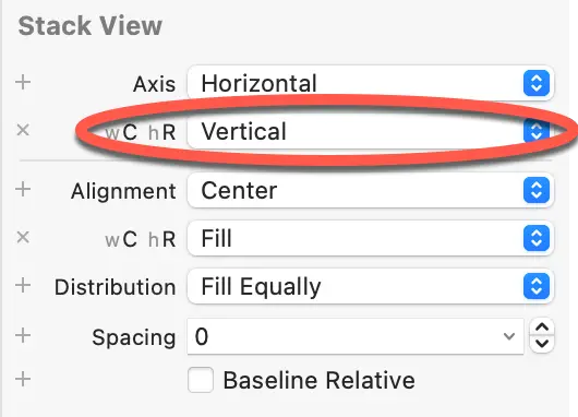
Once selected, a new Axis property setting will be added to the attributes list for the current size class labeled wC hR, as highlighted in Figure 34-10. Change the setting for this property to Vertical, and note that the scene’s orientation has changed in the storyboard canvas.
Repeat these steps to add an Alignment setting for the compact width and regular height size class set to Fill:
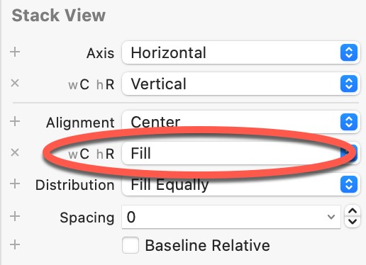
This setting will ensure that the Text View object expands to fill the width of the display in compact width mode.
|
You are reading a sample chapter from Building iOS 17 Apps using Xcode Storyboards.
Buy the full book now in eBook or Print format. The full book contains 96 chapters and 760 pages of in-depth information. |
Testing the Project in a Multitasking Environment
With the project completed, it is time to test that the layouts associated with the size classes work within the various multitasking modes. First, compile and run the app on an iPad model which supports multitasking or a suitable iOS simulator session.
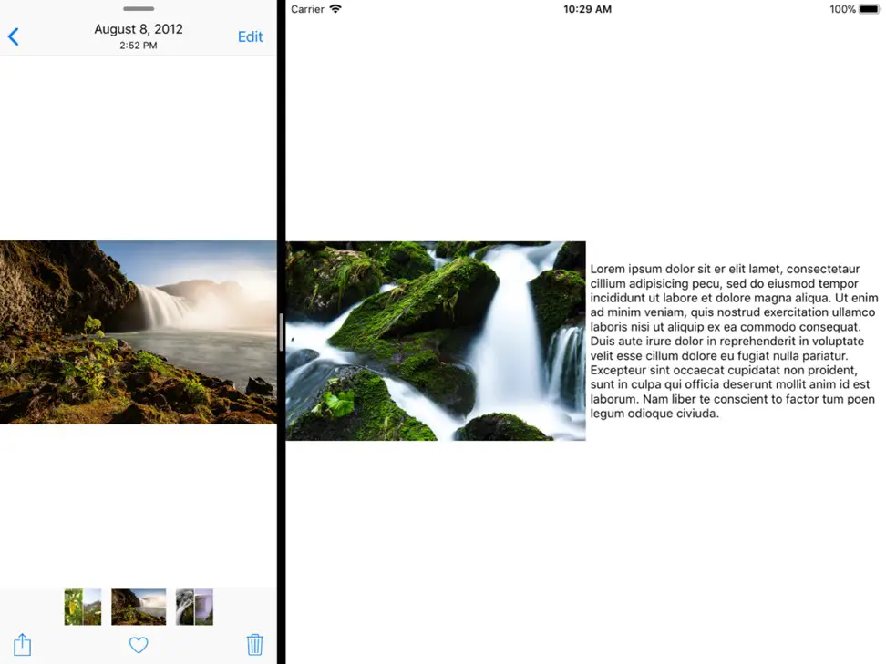
Using the steps outlined in the previous chapter, display the app in a Slide Over window so that it appears, as shown in Figure 34-12. Note that the app is displayed using the compact width layout configuration:
Next, display the app in Split View mode and drag the divider to adjust the size of the example app. Note that the layout switches between the regular and compact width configurations depending on the size of the panel in which it is running:
Summary
In this chapter, we have created an example iPadOS project that uses size classes to display a user interface scene appropriately configured for both compact and regular width categories of size class. Once implemented, the app could adopt different layouts in various multitasking modes on an iPad.