
The SwiftUI ProgressView, as the name suggests, provides a way to visually indicate the progress of a task within an app. An app might, for example, need to display a progress bar while downloading a large file. This chapter will work through an example project demonstrating how to implement a ProgressView-based interface in a SwiftUI app including linear, circular and indeterminate styles in addition to creating your own custom progress views.
ProgressView Styles
The ProgressView can be displayed in three different styles. The linear style displays progress in the form of a horizontal line as shown in Figure 38-1 below:
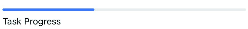
Figure 38-1
Alternatively, progress may be displayed using the circular style as shown in Figure 38-2:
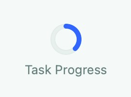
Figure 38-2
 |
You are reading a sample chapter from an old edition of iOS App Development Essentials. Purchase the fully updated iOS 18 App Development Essentials book. The full book contains 71 chapters, over 612 pages of in-depth information, downloadable source code, and access to over 50 SwiftUI knowledge test quizzes. |
Finally, for indeterminate progress, the spinning animation shown in Figure 38-3 below is used. This style is useful for indicating to the user that progress is being made on a task when the percentage of work completed is unknown.
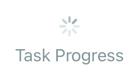
Figure 38-3
As we will see later in the chapter, it is also possible to design a custom style by creating declarations conforming to the ProgressViewStyle protocol.
Creating the ProgressViewDemo Project
Launch Xcode and create a new project named ProgressViewDemo using the Multiplatform App template.
Adding a ProgressView
The content view for this example app will consist of a ProgressView and a Slider. The Slider view will serve as a way to change the value of a State property variable, such that changes to the slider position will be reflected by the ProgressView.
|
You are reading a sample chapter from an old edition of iOS App Development Essentials. Purchase the fully updated iOS 18 App Development Essentials book. The full book contains 71 chapters, over 612 pages of in-depth information, downloadable source code, and access to over 50 SwiftUI knowledge test quizzes. |
Edit the ContentView.swift file and modify the view as follows:
struct ContentView: View {

    @State private var progress: Double = 1.0

    var body: some View {

        VStack {
            ProgressView("Task Progress", value: progress, total: 100)
                .progressViewStyle(LinearProgressViewStyle())
            Slider(value: $progress, in: 1...100, step: 0.1)
        }
        .padding()
    }
}Code language: Swift (swift)
Note that the ProgressView is passed a string to display as the title, a value indicating the current progress and a total used to define when the task is complete. Similarly, the Slider is configured to adjust the progress state property between 1 and 100 in increments of 0.1.
Use Live Preview to test the view and verify that the progress bar moves in unison with the slider:
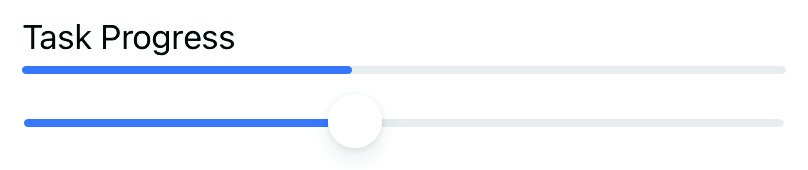
Figure 38-4
The color of the progress line may be changed using the tint argument as follows:
|
You are reading a sample chapter from an old edition of iOS App Development Essentials. Purchase the fully updated iOS 18 App Development Essentials book. The full book contains 71 chapters, over 612 pages of in-depth information, downloadable source code, and access to over 50 SwiftUI knowledge test quizzes. |
ProgressView("Task Progress", value: progress, total: 100)
    .progressViewStyle(LinearProgressViewStyle(tint: Color.red))Code language: Swift (swift)
Using the Circular ProgressView Style
To display a circular ProgressView, the progressViewStyle() modifier needs to be called and passed an instance of CircularProgressViewStyle as follows:
struct ContentView: View {

    @State private var progress: Double = 1.0

    var body: some View {

        VStack {
            ProgressView("Task Progress", value: progress, total: 100)
                .progressViewStyle(CircularProgressViewStyle())
            Slider(value: $progress, in: 1...100, step: 0.1)
        }
        .padding()
    }
}Code language: Swift (swift)
When the app is now previewed, the progress will be shown using the circular style. Note that a bug in all versions of iOS 14 up to and including iOS 14.2 causes the circular style to appear using the intermediate style. This bug has been reported to Apple and will hopefully be resolved in a future release. In the meantime, the behavior can be tested by targeting macOS instead of iOS when running the app.
Although the progressViewStyle() modifier was applied directly to the ProgressView in the above example, it may also be applied to a container view such as VStack. When used in this way, the style will be applied to all child ProgressView instances. In the following example, therefore, all three ProgressView instances will be displayed using the circular style:
VStack {
    ProgressView("Task 1 Progress", value: progress, total: 100)
        .progressViewStyle(CircularProgressViewStyle())
    ProgressView("Task 2 Progress", value: progress, total: 100)
        .progressViewStyle(CircularProgressViewStyle())
    ProgressView("Task 3 Progress", value: progress, total: 100)
        .progressViewStyle(CircularProgressViewStyle())
}
.progressViewStyle(CircularProgressViewStyle())Code language: Swift (swift)
Declaring an Indeterminate ProgressView
The indeterminate ProgressView displays the spinning indicator shown previously in Figure 38-3 and is declared using the ProgressView without including a value binding to indicate progress:
ProgressView()Code language: Swift (swift)If required, text may be assigned to appear alongside the view:
|
You are reading a sample chapter from an old edition of iOS App Development Essentials. Purchase the fully updated iOS 18 App Development Essentials book. The full book contains 71 chapters, over 612 pages of in-depth information, downloadable source code, and access to over 50 SwiftUI knowledge test quizzes. |
Progress("Working...")Code language: Swift (swift)ProgressView Customization
The appearance of a ProgressView may be changed by declaring a structure conforming to the ProgressViewStyle protocol and passing an instance through to the progressViewStyle() modifier.
To conform with the ProgressViewStyle protocol, the style declaration must be structured as follows:
struct MyCustomProgressViewStyle: ProgressViewStyle {
    func makeBody(configuration: Configuration) -> some View {
        ProgressView(configuration)
            // Modifiers here to customize view
    }
}Code language: Swift (swift)
The structure contains a makeBody() method which is passed the configuration information for the ProgressView on which the custom style is being applied. One option is to simply return a modified ProgressView instance. The following style, for example, applies accent color and shadow effects to the ProgressView:
import SwiftUI

struct ContentView: View {

    @State private var progress: Double = 1.0

    var body: some View {

        VStack {
            ProgressView("Task Progress", value: progress, total: 100)
                 .progressViewStyle(ShadowProgressViewStyle())

            Slider(value: $progress, in: 1...100, step: 0.1)
        }
        .padding()
    }
}

struct ShadowProgressViewStyle: ProgressViewStyle {
    func makeBody(configuration: Configuration) -> some View {
        ProgressView(configuration)
            .accentColor(.red)
            .shadow(color: Color(red: 0, green: 0.7, blue: 0),
                    radius: 5.0, x: 2.0, y: 2.0)
    }
}
.
.Code language: Swift (swift)
The ProgressView will now appear with a green shadow with the progress line appearing in red. A closer inspection of the makeBody() method will reveal that it can return a View instance of any type, meaning that the method is not limited to returning a ProgressView instance. We could, for example, return a Text view as shown below. The Configuration instance passed to the makeBody() method contains a property named fractionComplete, we can use this to display the progress percentage in the Text view:
.
.
        VStack {
            ProgressView("Task Progress", value: progress, total: 100)
                 .progressViewStyle(MyCustomProgressViewStyle())
.
.
    }
}

struct MyCustomProgressViewStyle: ProgressViewStyle {
    func makeBody(configuration: Configuration) -> some View {
        let percent = Int(configuration.fractionCompleted! * 100)
        return  Text("Task \(percent)% Complete")
    }
}Code language: Swift (swift)
When previewed, the custom style will appear as shown in Figure 38-5:
|
You are reading a sample chapter from an old edition of iOS App Development Essentials. Purchase the fully updated iOS 18 App Development Essentials book. The full book contains 71 chapters, over 612 pages of in-depth information, downloadable source code, and access to over 50 SwiftUI knowledge test quizzes. |
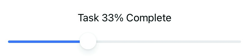
Figure 38-5
In fact, custom progress views of any level of complexity may be designed using this technique. Consider, for example, the following custom progress view implementation:
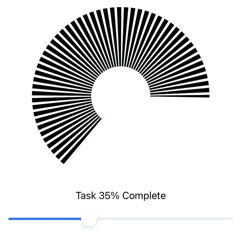
Figure 38-6
The above example was created using a Shape declaration to draw a dashed circular path based on the fractionComplete property:
struct MyCustomProgressViewStyle: ProgressViewStyle {
    func makeBody(configuration: Configuration) -> some View {

        let degrees = configuration.fractionCompleted! * 360
        let percent = Int(configuration.fractionCompleted! * 100)

        return VStack {

            MyCircle(startAngle: .degrees(1), endAngle: .degrees(degrees))
                .frame(width: 200, height: 200)
                .padding(50)
            Text("Task \(percent)% Complete")
        }
    }
}

struct MyCircle: Shape {
    var startAngle: Angle
    var endAngle: Angle

    func path(in rect: CGRect) -> Path {
        var path = Path()
        path.addArc(center: CGPoint(x: rect.midX, y: rect.midY),
                 radius: rect.width / 2, startAngle: startAngle,
                              endAngle: endAngle, clockwise: true)

        return path.strokedPath(.init(lineWidth: 100, dash: [5, 3],
                 dashPhase: 10))
    }
}Code language: Swift (swift)
Summary
The SwiftUI ProgressView provides a way for apps to visually convey to the user the progress of a long running task such as a large download transaction. ProgressView instances may be configured to display progress either as a straight bar or using a circular style, while the indeterminate style displays a spinning icon that indicates the task is running but without providing progress information. The prevailing style is assigned using the progressViewStyle() modifier which may be applied either to individual ProgressView instances, or to all of the instances within a container view such as a VStack
|
You are reading a sample chapter from an old edition of iOS App Development Essentials. Purchase the fully updated iOS 18 App Development Essentials book. The full book contains 71 chapters, over 612 pages of in-depth information, downloadable source code, and access to over 50 SwiftUI knowledge test quizzes. |
By adopting the ProgressViewStyle protocol, custom progress view designs of almost any level of complexity can be created.