
The NavigationStack and NavigationLink views outlined in the previous chapters are ideal for adding navigation when each destination view needs to fill the entire device screen. While this is generally the preferred navigation paradigm when working on most iOS devices, it doesn’t take advantage of larger display configurations available on the iPad or the iPhone Pro Max in landscape orientation. To take advantage of wider displays, SwiftUI includes the NavigationSplitView component which is designed to provide multicolumn-based navigation.
In this chapter, we will explain how to use NavigationSplitView in preparation for the next chapter titled A SwiftUI NavigationSplitView Tutorial.
Introducing NavigationSplitView
The purpose of NavigationSplitView is to provide multicolumn-based navigation on wide displays. It supports a maximum of three columns consisting of the sidebar (marked A in Figure 1-1), content (B), and detail (C) columns. A selection in one column controls the content displayed in the next column. The screen in Figure 1-1 shows the example app we will create in the next chapter. In this case, the app is running on an iPhone Pro Max in landscape orientation:
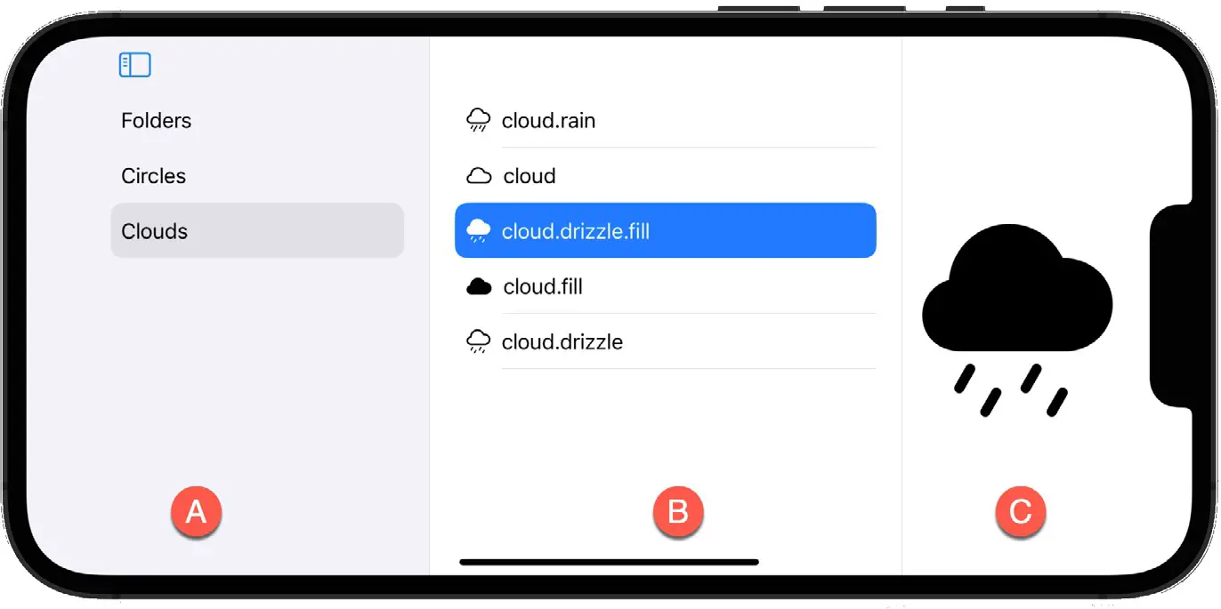
Figure 1-1
When a NavigationSplitView instance runs on narrower displays it behaves similarly to the NavigationStack where each destination view fully occupies the screen.
 |
You are reading a sample chapter from an old edition of iOS App Development Essentials. Purchase the fully updated iOS 18 App Development Essentials book. The full book contains 71 chapters, over 612 pages of in-depth information, downloadable source code, and access to over 50 SwiftUI knowledge test quizzes. |
Using NavigationSplitView
NavigationSplitView uses a simple syntax that differs depending on whether you need two or three-column navigation. The following syntax is for two-column navigation, which consists of the sidebar and detail columns:
NavigationSplitView {
    // Sidebar List here
}  detail: {
    // Detail view here
}Code language: Swift (swift)
Three-column navigation consists of sidebar, content, and detail columns declared using the following syntax:
NavigationSplitView {
    // Sidebar List here
} content: {
    // Content List here
} detail: {
    // Detail view here
}Code language: Swift (swift)
Handling List Selection
Both the sidebar and content columns will typically contain a List view from which the user will choose the content to be displayed in the next column. Selections made in a column are tracked by declaring a state variable and passing it to the List view via the selection parameter, for example:
@State private var colors = ["Red", "Green", "Blue"]
@State private var selectedColor: String?

var body: some View {
    NavigationSplitView {
        List(colors, id: \.self, selection: $selectedColor) { color in
            Text(color).tag(color)
        }
    } detail: {
        Text( selectedColor ?? "No color selected")
    }
}Code language: Swift (swift)
In the code above, for example, the selection made within the List of color names controls the content displayed by the detail column via the selectedColor state variable. Note that the tag() modifier has been applied to the
Text list item. This is used by SwiftUI to differentiate between selectable items in views such as List, Picker, and TabView.
|
You are reading a sample chapter from an old edition of iOS App Development Essentials. Purchase the fully updated iOS 18 App Development Essentials book. The full book contains 71 chapters, over 612 pages of in-depth information, downloadable source code, and access to over 50 SwiftUI knowledge test quizzes. |
NavigationSplitView Configuration
Several options are available to customize the appearance of a NavigationSplitView. For example, the width of an individual column can be controlled using the navigationSplitViewColumnWidth() modifier. In the following code the sidebar column has been assigned a fixed width of 100 points:
NavigationSplitView {
    List(colors, id: \.self, selection: $selectedColor) { color in
        Text(color).tag(color)
    }
    .navigationSplitViewColumnWidth(100)
} detail: {
    Text( selectedColor ?? "No color selected")
}Code language: Swift (swift)
Style options can also be configured by applying the navigationSplitViewStyle() modifier to the NavigationSplitView parent declaration as follows:
NavigationSplitView {
    List(colors, id: \.self, selection: $selectedColor) { color in
        Text(color).tag(color)
    }
} detail: {
    Text( selectedColor ?? "No color selected")
}Code language: Swift (swift)
NavigationSplitView supports the following style options:
- automatic – This style allows the navigation view to decide how to present columns based on factors such as current content, screen size, and column selections.
- balanced – The balanced style reduces the width of the detail column when necessary to provide space for the sidebar and content columns.
- prominentDetail – This style prevents the size of the detail column from changing when the sidebar and content columns are added and removed from view. This style usually results in the sidebar and content columns overlapping the detail column.
Controlling Column Visibility
Column visibility can be controlled programmatically by passing an appropriately configured state value to the NavigationSplitView via its columnVisibility initialization parameter. Changes to the state value will dynamically update the column visibility. Visibility options are provided by the NavigationSplitViewVisibility structure which includes the following options:
- automatic – Allows the navigation view to decide which columns should be visible based on the available screen space.
- all – Displays the sidebar, content, and detail columns.
- doubleColumn – In a two-column configuration, this setting displays the sidebar and detail columns. In a three-column configuration, only the content and detail columns will be visible.
- detailOnly – Only the detail column is visible.
The following code provides an example of setting column visibility based on a state variable set to detailOnly:
|
You are reading a sample chapter from an old edition of iOS App Development Essentials. Purchase the fully updated iOS 18 App Development Essentials book. The full book contains 71 chapters, over 612 pages of in-depth information, downloadable source code, and access to over 50 SwiftUI knowledge test quizzes. |
.
.
@State private var colors = ["Red", "Green", "Blue"]
@State private var selectedColor: String?
@State private var columnVisibility = NavigationSplitViewVisibility.detailOnly

var body: some View {
    NavigationSplitView(columnVisibility: $columnVisibility) {
        List(colors, id: \.self, selection: $selectedColor) { color in
            Text(color).tag(color)
        }
    } detail: {
        Text( selectedColor ?? "No color selected")
    }
    .navigationSplitViewStyle(.automatic)
}Code language: Swift (swift)
Summary
The NavigationSplitView component allows you to build multicolumn-based navigation into your SwiftUI apps. When enough screen width is available, the NavigationSplitView will display up to three columns consisting of sidebar, content, and detail columns. The sidebar and content panels contain List view items that, when selected, control the content in the next column. Selection handling is implemented by passing a state variable to the selection parameter of the column’s List view. The column widths and style of a split navigation user interface can be configured using the navigationSplitViewColumnWidth() and navigationSplitViewStyle() modifiers. Several combinations of column visibility may be configured programmatically using the NavigationSplitView columnVisibility initialization parameter.