
One of the best ways to present data is to do so in the form of a chart or graph. While it has always been possible, given sufficient time and skills, to generate charts in SwiftUI by writing your own data handling and drawing code, it was not until the introduction of the SwiftUI Charts API that it became a simple as writing a few lines of code. In this chapter, we will explore the more commonly used features of SwiftUI Charts before creating a project in the next chapter that will allow you to see Charts in action and experiment with the main features of this API.
Introducing SwiftUI Charts
SwiftUI Charts consists of views and modifiers that allow you to visually present data, typically with just a few lines of code. The API is highly configurable and includes options to present data in the form of area, line, point, rectangle, bar, and stacked bar graphs. The Chart view also includes the rule mark which draws a straight line between specified start and end coordinates. The top-level view in any chart implementation is the Chart view. Each data point within a Chart takes the form of a mark view. The type of mark view used will depend on the chart style. For example, a bar chart will be made up of instances of BarMark, while an area graph will contain AreaMark instances. The Charts API supports the following mark types:
- AreaMark
- BarMark
- LineMark
- PointMark
- RectangleMark
- RuleMark
Each mark must be initialized with x and y values, each of which is represented by an instance of the PlottableValue class. The following declaration, for example, creates an area chart consisting of three marks (note that the Charts library must be imported when working with this API):
.
.
import Charts
.
.
Chart {
    AreaMark(
        x: PlottableValue.value("Month", "Jan"),
        y: PlottableValue.value("Temp", 50)
    )
    AreaMark(
        x: PlottableValue.value("Month", "Feb"),
        y: PlottableValue.value("Temp", 43)
    )
    AreaMark(
        x: PlottableValue.value("Month", "Mar"),
        y: PlottableValue.value("Temp", 61)
    )
}Code language: Swift (swift)
For tidier code, the PlottableValue.value declarations can be abbreviated to .value, for example:
AreaMark(
    x: .value("Month", "Jan"),
    y: .value("Temp", 50)
)Code language: Swift (swift)
The above example will generate a chart matching that shown in Figure 1-1 below:
 |
You are reading a sample chapter from an old edition of iOS App Development Essentials. Purchase the fully updated iOS 18 App Development Essentials book. The full book contains 71 chapters, over 612 pages of in-depth information, downloadable source code, and access to over 50 SwiftUI knowledge test quizzes. |
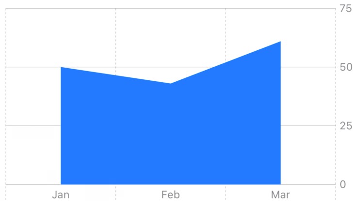
Figure 1-1
Passing Data to the Chart
In the previous example, we manually coded each point on the chart. It is more likely, however, that the data to be plotted exists outside of the chart. In this situation we can pass the data as a parameter to the Chart view as follows:
struct MonthlyTemp: Identifiable {
    var id = UUID()
    var month: String
    var degrees: Int
}

let tempData: [MonthlyTemp] = [
    MonthlyTemp(month: "Jan", degrees: 50),
    MonthlyTemp(month: "Feb", degrees: 43),
    MonthlyTemp(month: "Mar", degrees: 61)
]

Chart(tempData) { data in
    AreaMark(
        x: .value("Month", data.month),
        y: .value("Temp", data.degrees)
    )
}Code language: Swift (swift)
The above code will create the same chart illustrated in Figure 1-1. A ForEach loop will produce the same result:
Chart {
    ForEach(tempData) { data in
        AreaMark(
            x: .value("Month", data.month),
            y: .value("Temp", data.degrees)
        )
    }
}Code language: Swift (swift)
Combining Mark Types
So far in this chapter, we have only displayed data using one type of graph. We can display the same data in different ways within the same chart. In the following example, our temperature data appears in both rectangle and line format:
Chart(tempData) { data in
    RectangleMark(
        x: .value("Month", data.month),
        y: .value("Temp", data.degrees)
    )
    LineMark(
        x: .value("Month", data.month),
        y: .value("Temp", data.degrees)
    )
}Code language: Swift (swift)
This code will generate the graph shown in Figure 1-2:
|
You are reading a sample chapter from an old edition of iOS App Development Essentials. Purchase the fully updated iOS 18 App Development Essentials book. The full book contains 71 chapters, over 612 pages of in-depth information, downloadable source code, and access to over 50 SwiftUI knowledge test quizzes. |
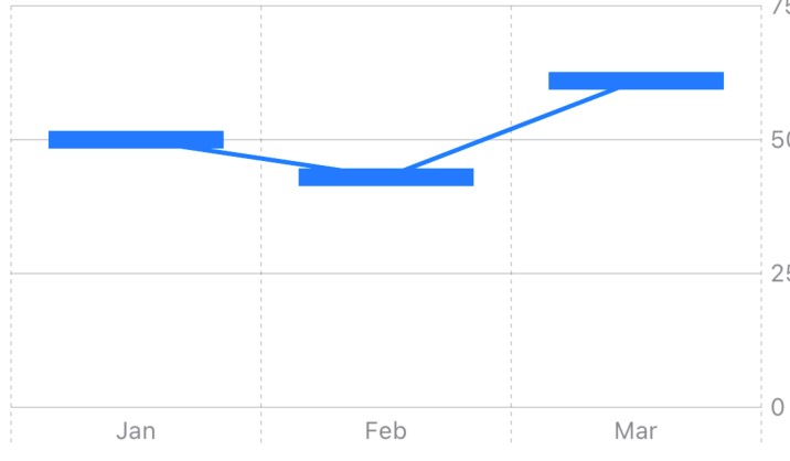
Figure 1-2
Filtering Data into Multiple Graphs
If the data contains information that allows it to be filtered into categories, the foregroundStyle() modifier can be used to generate multiple graphs within a single chart instance. Suppose, for example, that our temperature data includes values for more than one year. This data might be declared as follows:
struct MonthlyTemp: Identifiable {
    var id = UUID()
    var month: String
    var degrees: Int
    var year: String
}

let tempData: [MonthlyTemp] = [
    MonthlyTemp(month: "Jan", degrees: 50, year: "2021"),
    MonthlyTemp(month: "Feb", degrees: 43, year: "2021"),
    MonthlyTemp(month: "Mar", degrees: 61, year: "2021"),

    MonthlyTemp(month: "Jan", degrees: 30, year: "2022"),
    MonthlyTemp(month: "Feb", degrees: 38, year: "2022"),
    MonthlyTemp(month: "Mar", degrees: 29, year: "2022")
]Code language: Swift (swift)
The only change required to the Chart code is to apply the foregroundStyle() modifier to the mark declaration and pass it a PlottableValue instance configured to separate the data by year:
Chart {
    ForEach(tempData) { data in
        LineMark(
            x: .value("Month", data.month),
            y: .value("Temp", data.degrees)
        )
        .foregroundStyle(by: .value("Year", data.year))
    }
}Code language: Swift (swift)
The chart will now separate the data into two lines, each rendered in a different color. Note also that a scale appears at the bottom of the chart showing the correspondence between colors and years:
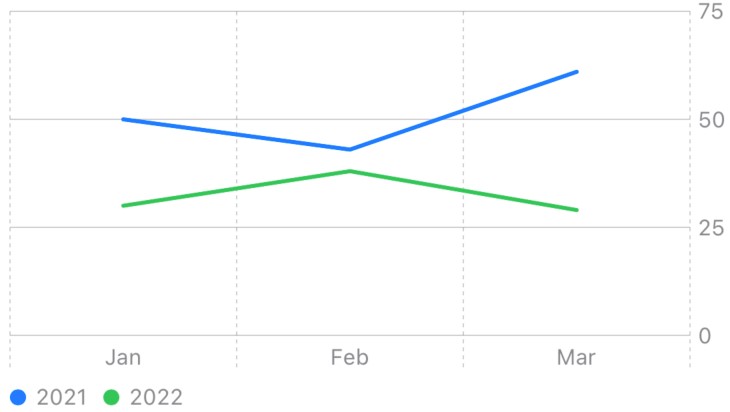
Figure 1-3
|
You are reading a sample chapter from an old edition of iOS App Development Essentials. Purchase the fully updated iOS 18 App Development Essentials book. The full book contains 71 chapters, over 612 pages of in-depth information, downloadable source code, and access to over 50 SwiftUI knowledge test quizzes. |
Presenting Data with SwiftUI Charts In addition to the line colors, we can also add symbols at each mark point to further differentiate the data categories. We do this by applying the symbol() modifier to the mark declaration passing as a parameter an appropriately configured PlottableValue instance as outlined above for the foregroundStyle() modifier:
Chart {
    ForEach(tempData) { data in
        LineMark(
            x: .value("Month", data.month),
            y: .value("Temp", data.degrees)
        )
        .foregroundStyle(by: .value("Year", data.year))
        .symbol(by: .value("Year", data.year))
    }
}Code language: Swift (swift)
A close inspection of the two lines in our chart will show that the lines are using different symbols for the mark points:
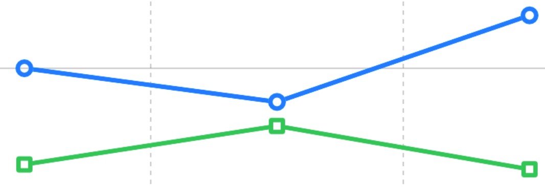
Figure 1-4
Changing the Chart Background
The background of the Chart view can be changed using the chartPlotStyle() modifier. This modifier is used with a trailing closure to which it passes a reference to the plot area on which the graph is being drawn. This reference may then be used to change properties such as the background color:
Chart {
.
.
}
.chartPlotStyle { plotArea in
    plotArea
        .background(.gray.opacity(0.3))
}
.
.Code language: Swift (swift)
Changing the Interpolation Method
Interpolation refers to how lines are drawn to connect the data points in a graph. The interpolation method used by a chart can be changed by applying the interpolationMethod() modifier to mark declarations. The list of interpolation options is as follows:
|
You are reading a sample chapter from an old edition of iOS App Development Essentials. Purchase the fully updated iOS 18 App Development Essentials book. The full book contains 71 chapters, over 612 pages of in-depth information, downloadable source code, and access to over 50 SwiftUI knowledge test quizzes. |
- cardinal
- catmullRom
- linear
- monotone
- stepCenter
- stepEnd
- stepStart
The following code example configures our example chart to use stepStart interpolation:
Chart {
    ForEach(tempData) { data in
        LineMark(
            x: .value("Month", data.month),
            y: .value("Temp", data.degrees)
        )
        .interpolationMethod(.stepStart)
        .foregroundStyle(by: .value("Year", data.year))
        .symbol(by: .value("Year", data.year))
    }
}Code language: Swift (swift)
The resulting chart using stepStart interpolation will appear as shown below:
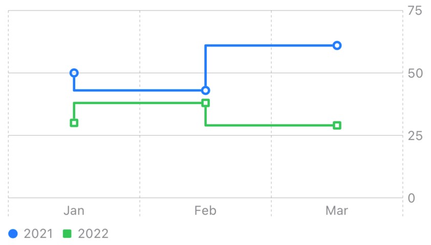
Figure 1-5
Summary
SwiftUI Charts provides an intuitive way to visualize data in the form of charts and graphs with minimal coding. This is achieved using a parent Chart view containing data points in the form of mark instances. Marks are available for several graph types including area, line, bar, plot, and rectangle. The x and y data for each mark is, in turn, contained within a PlottableValue instance. Graphs can be combined and configured using modifiers including changing the interpolation style and adding point symbol markers.