
Now that some of the fundamentals of SwiftUI development have been covered, this chapter will begin to put this theory into practice by building an example SwiftUI-based project.
This chapter aims to demonstrate using Xcode to design a simple interactive user interface using views, modifiers, state variables, and some basic animation effects. This tutorial will use various techniques to add and modify views. While this may appear inconsistent, the objective is to gain familiarity with the options available.
Creating the Example Project
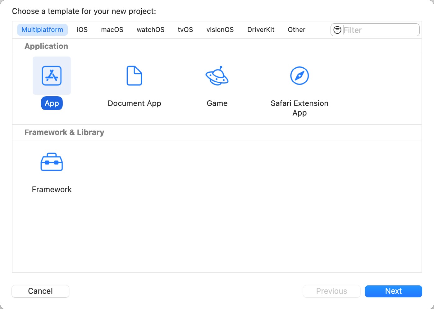
Start Xcode and select the option to create a new project. Then, on the template selection screen, make sure Multiplatform is selected and choose the App option, as shown in Figure 23-1, before proceeding to the next screen:
On the project options screen, name the project SwiftUIDemo before clicking Next to proceed to the final screen. Choose a suitable filesystem location for the project and click the Create button.
Reviewing the Project
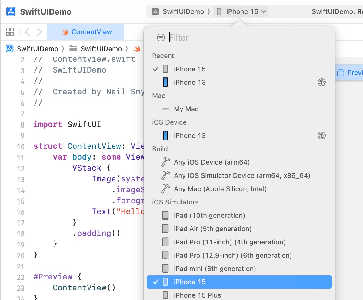
Once the project has been created, it will contain the SwiftUIDemoApp.swift file along with a SwiftUI View file named ContentView.swift, which should have loaded into the editor and preview canvas ready for modification (if it has not loaded, select it in the project navigator panel). Next, from the target device menu (Figure 23-2), select an iPhone 15 simulator:
 |
You are reading a sample chapter from an old edition of iOS App Development Essentials. Purchase the fully updated iOS 18 App Development Essentials book. The full book contains 71 chapters, over 612 pages of in-depth information, downloadable source code, and access to over 50 SwiftUI knowledge test quizzes. |
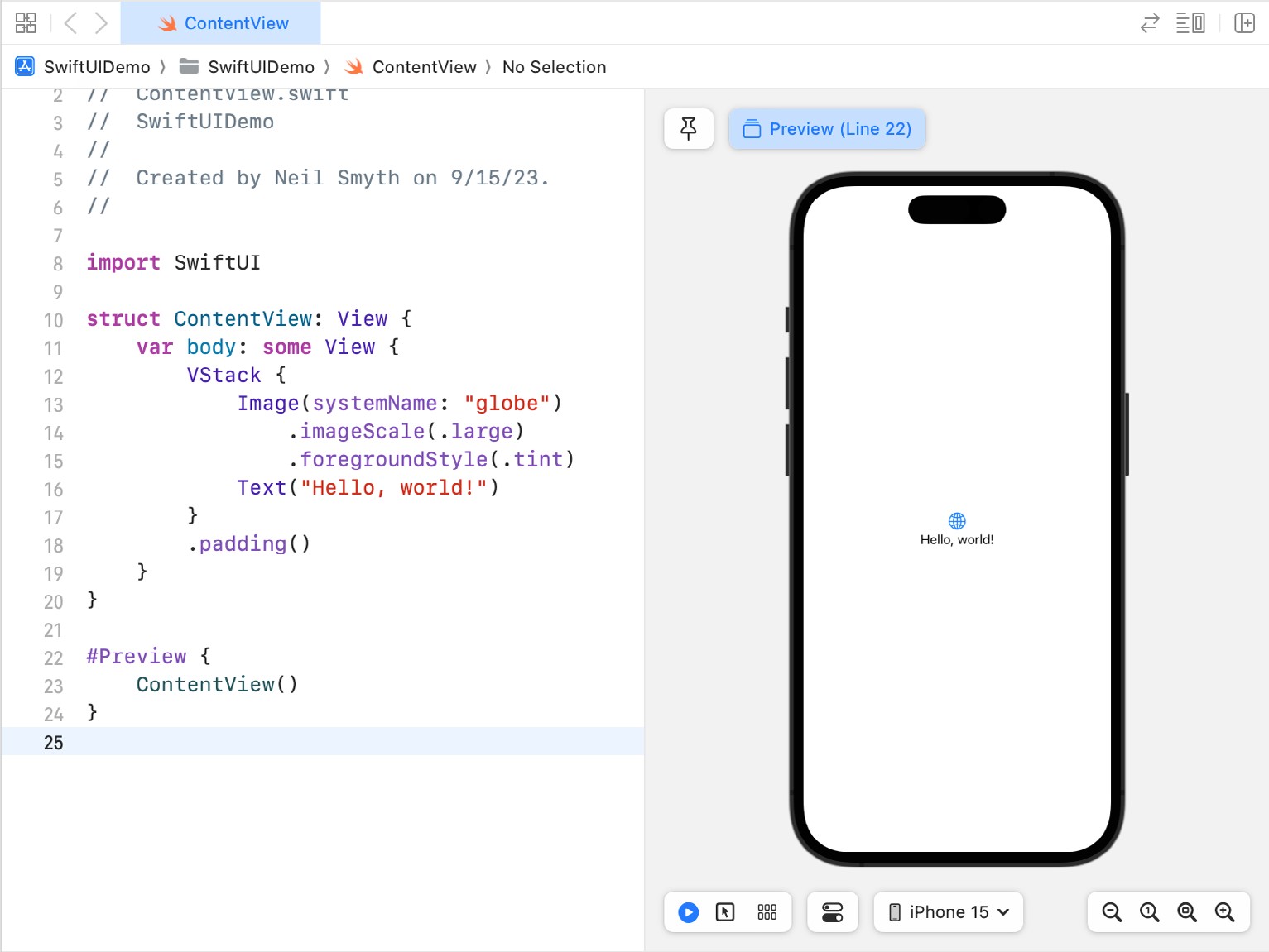
If the preview canvas is in the paused state, click on the Resume button to build the project and display the preview:
Modifying the Layout
The view body currently consists of a vertical stack layout (VStack) containing an Image and a Text view. Although we could reuse some of the existing layout for our example, we will learn more by deleting the current views and starting over. Within the Code Editor, delete the existing views from the ContentView body:
import SwiftUI

struct ContentView: View {
    var body: some View {

    }
} Code language: JavaScript (javascript)
Next, add a Text view to the layout as follows:
struct ContentView: View {
var body: some View {
Text("Hello, world!")
}
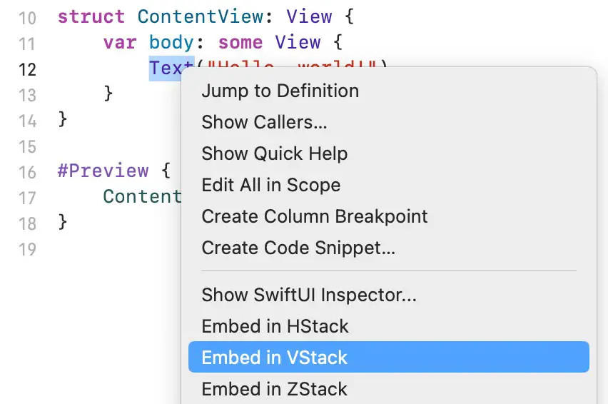
}Code language: Swift (swift)Right-click on the Text view entry within the code editor, and select the Embed in VStack option from the resulting menu:
Once the Text view has been embedded into the VStack, the declaration will read as follows:
|
You are reading a sample chapter from an old edition of iOS App Development Essentials. Purchase the fully updated iOS 18 App Development Essentials book. The full book contains 71 chapters, over 612 pages of in-depth information, downloadable source code, and access to over 50 SwiftUI knowledge test quizzes. |
struct ContentView: View {
    var body: some View {
        VStack {
            Text("Hello, world!")
        }
    }
}Code language: Swift (swift)
Adding a Slider View to the Stack
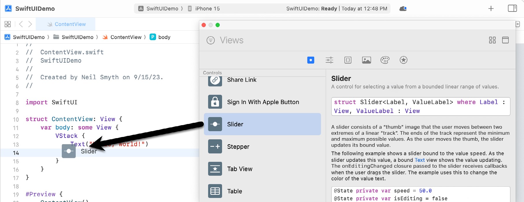
The next item to be added to the layout is a Slider view. Display the Library panel by clicking on the ‘+’ button highlighted in Figure 23-5, locating the Slider in the View list, and dragging it into position beneath the Text view in the editor. Ensure that the Slider view will be inserted into the existing stack before dropping the view into place:
Once the slider has been dropped into place, the view implementation should read as follows:
struct ContentView: View {
    var body: some View {
        VStack {
            VStack {
                Text("Hello, world!")
                Slider(value: Value)
            }
        }
    }
}Code language: Swift (swift)
Adding a State Property
The Slider will control the degree to which the Text view will be rotated. As such, a binding must be established between the Slider view and a state property into which the current rotation angle will be stored. Within the code editor, declare this property and configure the Slider to use a range between 0 and 360 in increments of 0.1:
struct ContentView: View {

    @State private var rotation: Double = 0

    var body: some View {
        VStack {
            VStack {
                Text("Hello, world!")
                Slider(value: $rotation, in: 0 ... 360, step: 0.1)
            }
        }
    }
}Code language: Swift (swift)
Note that since we declare a binding between the Slider view and the rotation state property, it is prefixed by a ‘$’ character.
Adding Modifiers to the Text View
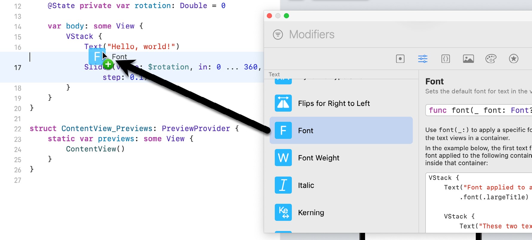
The next step is to add some modifiers to the Text view to change the font and adopt the rotation value stored by the Slider view. Begin by displaying the Library panel, switch to the modifier list, and drag and drop a font modifier onto the Text view entry in the code editor:
|
You are reading a sample chapter from an old edition of iOS App Development Essentials. Purchase the fully updated iOS 18 App Development Essentials book. The full book contains 71 chapters, over 612 pages of in-depth information, downloadable source code, and access to over 50 SwiftUI knowledge test quizzes. |
Select the modifier line in the editor, refer to the Attributes inspector panel, and change the font property from Title to Large Title, as shown in Figure 23-7:
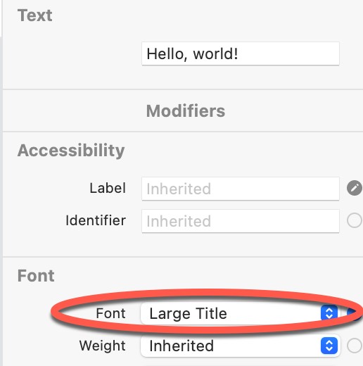
Note that the modifier added above does not change the font weight. Since modifiers may also be added to a view from within the Attributes inspector, take this opportunity to change the setting of the Weight menu from Inherited to Heavy.
On completion of these steps, the View body should read as follows:
var body: some View {
    VStack {
        VStack {
            Text("Hello, world!")
                .font(.largeTitle)
                .fontWeight(.heavy)
                Slider(value: $rotation, in: 0 ... 360, step: 0.1)
        }
    }
}Code language: Swift (swift)
Adding Rotation and Animation
The next step is to add the rotation and animation effects to the Text view using the value stored by the Slider (animation is covered in greater detail in the SwiftUI Animation and Transitions chapter). This can be implemented using a modifier as follows:
Text("Hello, world!")
    .font(.largeTitle)
    .fontWeight(.heavy)
    .rotationEffect(.degrees(rotation))Code language: Swift (swift)
Note that since we are simply reading the value assigned to the rotation state property, instead of establishing a binding, the property name is not prefixed with the ‘$’ sign notation.
|
You are reading a sample chapter from an old edition of iOS App Development Essentials. Purchase the fully updated iOS 18 App Development Essentials book. The full book contains 71 chapters, over 612 pages of in-depth information, downloadable source code, and access to over 50 SwiftUI knowledge test quizzes. |
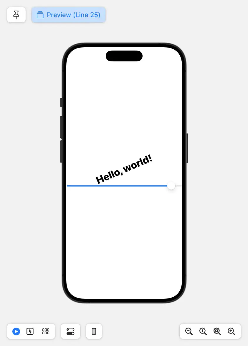
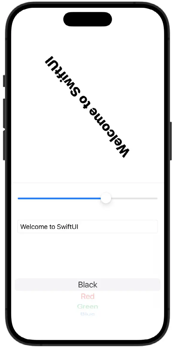
Click on the Live button (indicated by the arrow in Figure 23-8), wait for the code to compile, then use the slider to rotate the Text view:
Next, add an animation modifier to the Text view to animate the rotation over 5 seconds using the Ease In Out effect:
Text("Hello, world!")
    .font(.largeTitle)
    .fontWeight(.heavy)
    .rotationEffect(.degrees(rotation))
    .animation(.easeInOut(duration: 5), value: rotation)Code language: Swift (swift)
Use the slider once again to rotate the text, and note that rotation is now smoothly animated.
Adding a TextField to the Stack
In addition to supporting text rotation, the app will allow custom text to be entered and displayed on the Text view. This will require the addition of a TextField view to the project. To achieve this, either directly edit the View structure or use the Library panel to add a TextField so that the structure reads as follows (also note the addition of a state property in which to store the custom text string and the change to the Text view to use this property):
struct ContentView: View {

    @State private var rotation: Double = 0
    @State private var text: String = "Welcome to SwiftUI"

    var body: some View {
        VStack {
            VStack {
                Text(text)
                    .font(.largeTitle)
                    .fontWeight(.heavy)
                    .rotationEffect(.degrees(rotation))
                    .animation(.easeInOut(duration: 5))

                Slider(value: $rotation, in: 0 ... 360, step: 0.1)

                TextField("Enter text here", text: $text)
                    .textFieldStyle(RoundedBorderTextFieldStyle())
            }
        }
    }
}Code language: Swift (swift)
When the user enters text into the TextField view, that text will be stored in the text state property and will automatically appear on the Text view via the binding. Return to the preview canvas and ensure that the changes work as expected.
|
You are reading a sample chapter from an old edition of iOS App Development Essentials. Purchase the fully updated iOS 18 App Development Essentials book. The full book contains 71 chapters, over 612 pages of in-depth information, downloadable source code, and access to over 50 SwiftUI knowledge test quizzes. |
Adding a Color Picker
A Picker view is the final view to be added to the stack before we tidy up the layout. This view will allow the user to choose the foreground color of the Text view from a range of color options. Begin by adding some arrays of color names and Color objects, together with a state property to hold the current array index value as follows:
import SwiftUI

struct ContentView: View {

    var colors: [Color] = [.black, .red, .green, .blue]
    var colornames = ["Black", "Red", "Green", "Blue"]

    @State private var colorIndex = 0
    @State private var rotation: Double = 0
    @State private var text: String = "Welcome to SwiftUI"Code language: Swift (swift)
With these variables configured, display the Library panel, locate the Picker in the Views screen, and drag and drop it beneath the TextField view in the code editor to embed it in the existing VStack layout. Once added, the view entry will read as follows:
Picker(selection: .constant(1), label: Text("Picker") {
    Text("1").tag(1)
    Text("2").tag(2)
}Code language: Swift (swift)
The Picker view needs to be configured to store the current selection in the colorIndex state property and to display an option for each color name in the colorNames array. In addition, to make the Picker more visually appealing, we will change the background color for each Text view to the corresponding color in the colors array.
To iterate through the colorNames array, the code will use the SwiftUI ForEach structure. At first glance, ForEach looks like just another Swift programming language control flow statement. In fact, ForEach differs greatly from the Swift forEach() array method outlined earlier in the book.
ForEach is a SwiftUI view structure designed to generate multiple views by looping through a data set such as an array or range. We may also configure the Picker view to display the color choices in various ways. For this project, we must select the WheelPickerStyle (.wheel) style via the pickerStyle() modifier. Within the editor, modify the Picker view declaration so that it reads as follows:
|
You are reading a sample chapter from an old edition of iOS App Development Essentials. Purchase the fully updated iOS 18 App Development Essentials book. The full book contains 71 chapters, over 612 pages of in-depth information, downloadable source code, and access to over 50 SwiftUI knowledge test quizzes. |
Picker(selection: $colorIndex, label: Text("Color")) {
    ForEach (0 ..< colornames.count, id:\.self)  { color in
        Text(colornames[color])
            .foregroundColor(colors[color])
    }
}
.pickerStyle(.wheel)Code language: Swift (swift)
In the above implementation, ForEach is used to loop through the elements of the colornames array, generating a Text view for each color and setting the displayed text and background color on each view accordingly.
The ForEach loop in the above example is contained within a closure expression. As outlined in the “Swift Functions, Methods, and Closures” chapter, this expression can be simplified using shorthand argument names. Using this technique, modify the Picker declaration so that it reads as follows:
Picker(selection: $colorIndex, label: Text("Color")) {
    ForEach (0 ..< colornames.count, id:\.self) { color in
        Text(colornames[$0])
            .foregroundColor(colors[$0])
    }
}
.pickerStyle(.wheel)Code language: Swift (swift)
Remaining in the code editor, locate the Text view and add a foreground color modifier to set the foreground color based on the current Picker selection value:
Text(text)
    .font(.largeTitle)
    .fontWeight(.heavy)
    .rotationEffect(.degrees(rotation))
    .animation(.easeInOut(duration: 5), value: rotation)
    .foregroundColor(colors[colorIndex])Code language: Swift (swift)
Test the app in the preview canvas and confirm that the Picker view appears with all of the color names using the corresponding foreground color and that color selections are reflected in the Text view.
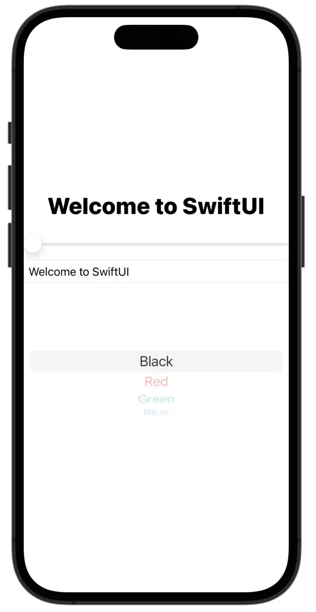
Tidying the Layout
Until this point, the focus of this tutorial has been on the appearance and functionality of the individual views. Aside from making sure the views are stacked vertically, however, no attention has been paid to the overall appearance of the layout. At this point, the layout should resemble that shown in Figure 23-9:
|
You are reading a sample chapter from an old edition of iOS App Development Essentials. Purchase the fully updated iOS 18 App Development Essentials book. The full book contains 71 chapters, over 612 pages of in-depth information, downloadable source code, and access to over 50 SwiftUI knowledge test quizzes. |
The first improvement needed is to add some space around the Slider, TextField, and Picker views so that they are not so close to the edge of the device display. To implement this, we will add some padding modifiers to the views:
Slider(value: $rotation, in: 0 ... 360, step: 0.1)
    .padding()

TextField("Enter text here", text: $text)
    .textFieldStyle(RoundedBorderTextFieldStyle())
    .padding()

Picker(selection: $colorIndex, label: Text("Color")) {
    ForEach (0 ..< colornames.count, id:\.self) {
        Text(colornames[$0])
            .foregroundColor(colors[$0])
    }
}
.pickerStyle(.wheel)
.padding()Code language: Swift (swift)
Next, the layout would look better if the Views were evenly spaced. One way to implement this is to add some Spacer views before and after the Text view:
.
.
VStack {
    Spacer()
    Text(text)
        .font(.largeTitle)
        .fontWeight(.heavy)
        .rotationEffect(.degrees(rotation))
        .animation(.easeInOut(duration: 5), value: rotation)
        .foregroundColor(colors[colorIndex])
    Spacer()
    Slider(value: $rotation, in: 0 ... 360, step: 0.1)
            .padding()
.
.Code language: Swift (swift)
The Spacer view provides a flexible space between views that will expand and contract based on the requirements of the layout. If a Spacer is contained in a stack, it will resize along the stack axis. A Spacer view can resize horizontally and vertically when used outside a stack container.
To make the separation between the Text view and the Slider more obvious, also add a Divider view to the layout:
.
.
VStack {
    Spacer()
    Text(text)
        .font(.largeTitle)
        .fontWeight(.heavy)
        .rotationEffect(.degrees(rotation))
        .animation(.easeInOut(duration: 5), value: rotation)
        .foregroundColor(colors[colorIndex])
    Spacer()
    Divider()
.
.Code language: Swift (swift)
The Divider view draws a line to indicate the separation between two views in a stack container.
|
You are reading a sample chapter from an old edition of iOS App Development Essentials. Purchase the fully updated iOS 18 App Development Essentials book. The full book contains 71 chapters, over 612 pages of in-depth information, downloadable source code, and access to over 50 SwiftUI knowledge test quizzes. |
With these changes made, the layout should now appear in the preview canvas, as shown in Figure 23-10:
Summary
The goal of this chapter has been to put into practice some of the theory covered in the previous chapters through the creation of an example app project. In particular, the tutorial used various techniques for adding views to a layout and using modifiers and state property bindings. The chapter also introduced the Spacer and Divider views and used the ForEach structure to generate views from a data array dynamically.