
The appearance of an Android app is intended to conform to a set of guidelines defined by Material Design. Google developed Material Design to provide a level of design consistency between different apps while also allowing app developers to include their own branding in terms of color, typography, and shape choices (a concept referred to as Material theming). In addition to design guidelines, Material Design also includes a set of UI components for use when designing user interface layouts, many of which we have used throughout this book.
This chapter will provide an overview of how theming works within an Android Studio project and explore how the default design configurations provided for newly created projects can be modified to meet your branding requirements.
Material Design 2 vs. Material Design 3
Before beginning, it is important to note that Google is transitioning from Material Design 2 to Material Design 3 and that Android Studio Giraffe projects default to Material Design 3. Material Design 3 provides the basis for Material You, a feature introduced in Android 12 that allows an app to automatically adjust theme elements to complement preferences configured by the user on the device. For example, dynamic color support provided by Material Design 3 allows the colors used in apps to adapt automatically to match the user’s wallpaper selection.
Understanding Material Design Theming
We know that Android app user interfaces are created by assembling components such as layouts, text fields, and buttons. These components appear using default colors unless we specifically override a color attribute in the XML layout resource file or by writing code. The project’s theme defines these default colors. The theme consists of a set of color slots (declared in themes.xml files) which are assigned color values (declared in the colors.xml file). Each UI component is programmed internally to use theme color slots as the default color for specific attributes (such as the foreground and background colors of the Text widget). It follows, therefore, that we can change the application-wide theme of an app by changing the colors assigned to specific theme slots. When the app runs, the new default colors will be used for all widgets when the user interface is rendered.
Material Design 3 Theming
Before exploring Material Design 3, we must consider how it is used in an Android Studio project. The theme used by an application project is declared as a property of the application element within the AndroidManifest.xml file, for example:
 |
You are reading a sample chapter from an old edition of the Android Studio Essentials – Kotlin Edition book.
Purchase the fully updated Android Studio Ladybug Kotlin Edition of this publication in eBook or Print format. The full book contains 100 chapters and over 878 pages of in-depth information. |
<?xml version="1.0" encoding="utf-8"?>
<manifest xmlns:android="http://schemas.android.com/apk/res/android"
    xmlns:tools="http://schemas.android.com/tools">

    <application
.
.
        android:supportsRtl="true"
        android:theme="@style/Theme.MyDemoApp"
        tools:targetApi="31">
        <activity
.
.Code language: HTML, XML (xml)
As previously discussed, all of the files associated with the project theme are contained within the colors.xml and themes.xml files located in the res -> values folder, as shown in Figure 91-1:
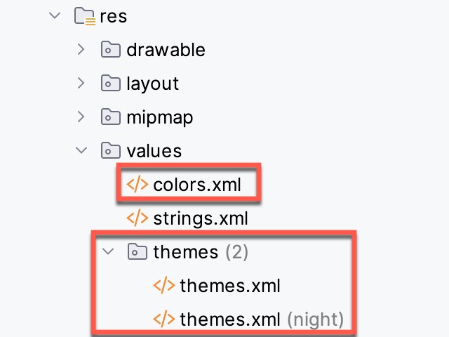
The theme itself is declared in the two themes.xml files located in the themes folder. These resource files declare different color palettes containing Material Theme color slots for use when the device is in light or dark (night) mode. Note that the style name property in each file must match that referenced in the AndroidManifest.xml file, for example:
<resources xmlns:tools="http://schemas.android.com/tools">
    <!-- Base application theme. -->
    <style name="Base.Theme.MyDemoApp" parent="Theme.Material3.DayNight.NoActionBar">
        <!-- Customize your light theme here. -->
        <!-- <item name="colorPrimary">@color/my_light_primary</item> -->
    </style>

    <style name="Theme.MyDemoApp" parent="Base.Theme.MyDemoApp" />
</resources>Code language: HTML, XML (xml)
These color slots (also referred to as color attributes) are used by the Material components to set colors when they are rendered on the screen. For example, the colorPrimary color slot is used as the background color for the Material Button component.
Color slots in MD3 are grouped as Primary, Secondary, Tertiary, Error, Background, and Surface. These slots are further divided into pairs consisting of a base color and an “on” base color. This generally translates to the background and foreground colors of a Material component.
The particular group used for coloring will differ between widgets. A Material Button widget, for example, will use the colorPrimary base color for the background color and colorOnPrimary for its content (i.e., the text or icon it displays). The FloatingActionButton component, on the other hand, uses colorPrimaryContainer as the background color and colorOnPrimaryContainer for the foreground. The correct group for a specific widget type can usually be identified quickly by changing color settings in the theme files and reviewing the rendering in the layout editor.
|
You are reading a sample chapter from an old edition of the Android Studio Essentials – Kotlin Edition book.
Purchase the fully updated Android Studio Ladybug Kotlin Edition of this publication in eBook or Print format. The full book contains 100 chapters and over 878 pages of in-depth information. |
Suppose that we need to change colorPrimary to red. We achieve this by adding a new entry to the colors.xml file for the red color and then assigning it to the colorPrimary slot in the themes.xml file. The colorPrimary slot in an MD3 theme night, therefore, read as follows:
<resources xmlns:tools="http://schemas.android.com/tools">
    <!-- Base application theme. -->
    <style name="Base.Theme.MyDemoApp" parent="Theme.Material3.DayNight.NoActionBar">
        <item name="colorPrimary">@color/my_bright_primary</item>
    </style>

    <style name="Theme.MyDemoApp" parent="Base.Theme.MyDemoApp" />
</resources>
This color is then declared in the colors.xml file:
<?xml version="1.0" encoding="utf-8"?>
<resources>
.
.
    <color name="my_bright_primary">#FC0505</color>
</resources>Code language: HTML, XML (xml)
Building a Custom Theme
As we have seen, the coding work in implementing a theme is relatively simple. The difficult part, however, is often choosing complementary colors to make up the theme. Fortunately, Google has developed a tool that makes it easy to design custom color themes for your apps. This tool is called the Material Theme Builder and is available at:
https://m3.material.io/theme-builder#/custom
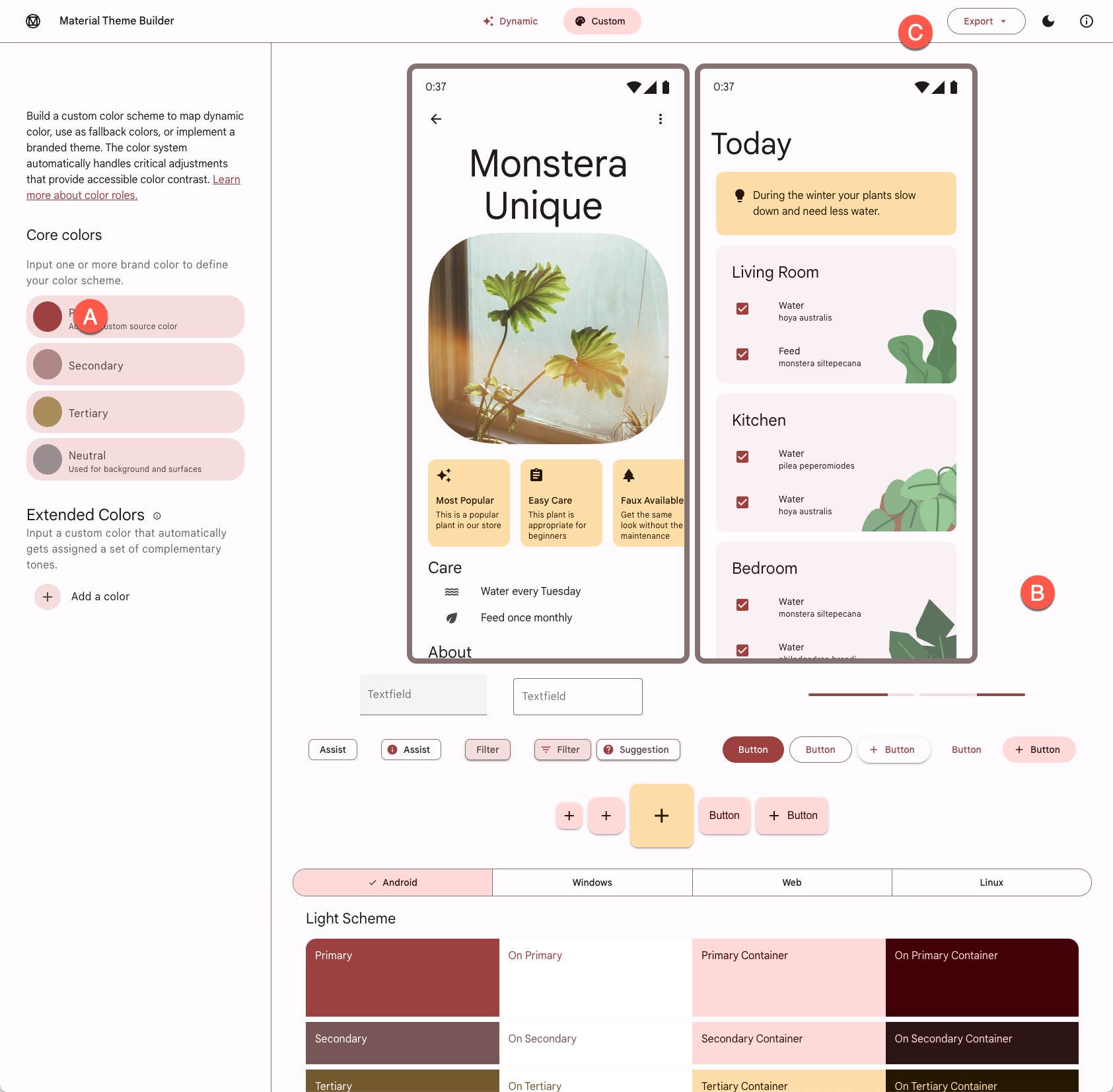
On the custom screen (Figure 91-2), make a color selection for the primary color key (A) by clicking on the color circle to display the color selection dialog. Once a color has been selected, the preview (B) will change to reflect the recommended colors for all MD3 color slots, along with example app interfaces and widgets. In addition, you can override the generated colors for the Secondary, Tertiary, and Neutral slots by clicking on the corresponding color circles to display the color selection dialog.
The area marked B displays example app interfaces, light and dark color scheme charts, and widgets that update to preview your color selections. Since the panel is longer than the typical browser window, you must scroll down to see all the information.
|
You are reading a sample chapter from an old edition of the Android Studio Essentials – Kotlin Edition book.
Purchase the fully updated Android Studio Ladybug Kotlin Edition of this publication in eBook or Print format. The full book contains 100 chapters and over 878 pages of in-depth information. |
To incorporate the theme into your design, click the Export button (C) and select the Android View (XML) option. Once downloaded, the colors.xml and themes.xml files can be used to replace the existing files in your project. Note that the theme name in the two exported themes.xml files must be changed to match your project.
Summary
Material Design provides guidelines and components defining how Android apps appear. Individual branding can be applied to an app by designing themes that specify the colors, fonts, and shapes used when displaying the app. Google recently introduced Material Design 3, which replaces Material Design 2 and supports the new features of Material You, including dynamic colors. Google also provides the Material Theme Builder for designing your own themes, which eases the task of choosing complementary theme colors. Once this tool has been used to design a theme, the corresponding files can be exported and used within an Android Studio project.