
This chapter will show you how to create a new Material Design 3 theme using the Material Theme Builder tool and integrate it into an Android Studio project. The tutorial will also demonstrate how to add support for and test dynamic theme colors to an app.
Creating the ThemeDemo Project
Select the New Project option from the welcome screen and, within the resulting new project dialog, choose the Empty Views Activity template before clicking on the Next button.
Enter ThemeDemo into the Name field and specify com.ebookfrenzy.themedemo as the package name. Before clicking on the Finish button, change the Minimum API level setting to API 26: Android 8.0 (Oreo) and the Language menu to Kotlin.
Designing the User Interface
The main activity will consist of a simple layout containing some user interface components that will enable us to see the effects of the theming work performed later in the chapter. For information on MD3 components, refer to the following web page:
https://material.io/blog/migrating-material-3
 |
You are reading a sample chapter from an old edition of the Android Studio Essentials – Kotlin Edition book.
Purchase the fully updated Android Studio Ladybug Kotlin Edition of this publication in eBook or Print format. The full book contains 100 chapters and over 878 pages of in-depth information. |
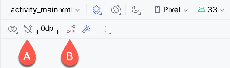
The layout will be designed within the activity_main.xml file, which currently contains a single Text view. Open this file in the layout editor, delete the Text view, turn off Autoconnect mode (marked A in Figure 92-1), and click on the button to clear all constraints from the layout (B).
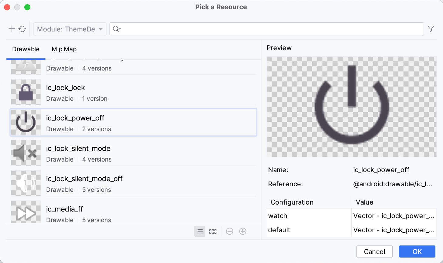
From the Buttons section of the Palette, drag Chip, CheckBox, Switch, and Button views onto the layout canvas. Next, drag a FloatingActionButton onto the layout canvas to position it beneath the Button component. When prompted to choose an icon to appear on the FloatingActionButton, select the ic_lock_power_off icon from within the resource tool window, as illustrated in Figure 92-2:
Change the text attribute for the Chip widget to “This is my chip” and set the chipIcon attribute to @ android:drawable/ic_btn_speak_now so that the layout resembles that shown to the left in Figure 92-3:
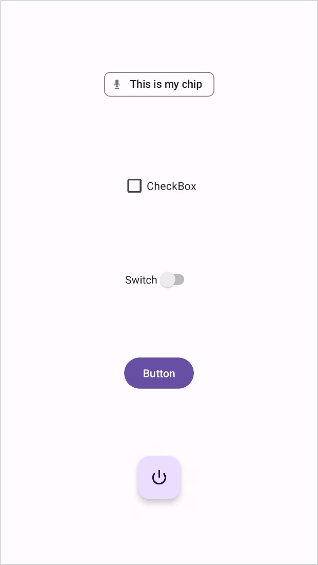
To set up the constraints, select all the components, right-click on the Chip view, and select Chains -> Create Vertical Chain from the resulting menu. Repeat this step, this time selecting the Center -> Horizontally in Parent menu option.
Compile and run the app on a device or emulator and verify that the user interface matches that shown in Figure 92-3 above. The next step is to create a custom theme and apply it to the project.
|
You are reading a sample chapter from an old edition of the Android Studio Essentials – Kotlin Edition book.
Purchase the fully updated Android Studio Ladybug Kotlin Edition of this publication in eBook or Print format. The full book contains 100 chapters and over 878 pages of in-depth information. |
Building a New Theme
Begin by opening a browser window and navigating to the following URL to access the builder tool:
https://m3.material.io/theme-builder#/custom
Once you have loaded the builder, select a wallpaper followed by the Custom button at the top of the screen, and then click on the Primary color circle in the Core Colors section to display the color selector. From the color selector, choose any color as the basis for your theme:
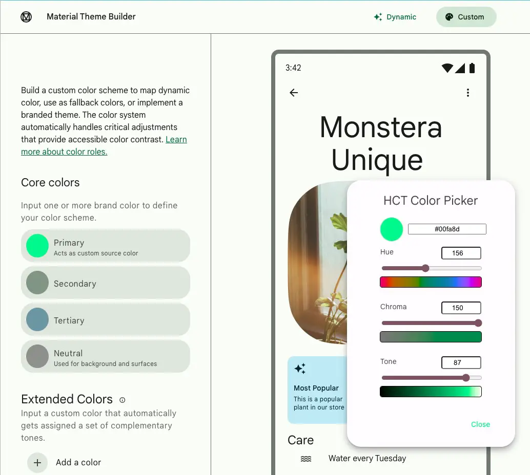
Review the color scheme in the Your Theme panel and make any necessary color adjustments using the Core colors settings until you are happy with the color slots. Once the theme is ready, click the Export button in the top right-hand corner and select the Android Views (XML) option. When prompted, save the file to a suitable location on your computer filesystem. The theme will be saved as a compressed file named material-theme.zip.
Using the appropriate tool for your operating system, unpack the theme file, which should contain the following folders and files in a folder named material-theme:
|
You are reading a sample chapter from an old edition of the Android Studio Essentials – Kotlin Edition book.
Purchase the fully updated Android Studio Ladybug Kotlin Edition of this publication in eBook or Print format. The full book contains 100 chapters and over 878 pages of in-depth information. |
- values/colors.xml – The color definitions.
- values/themes.xml – The theme for the light mode.
- values-night/themes.xml – The theme for dark mode.
Now that the theme files have been generated, they need to be integrated into the Android Studio project.
Adding the Theme to the Project
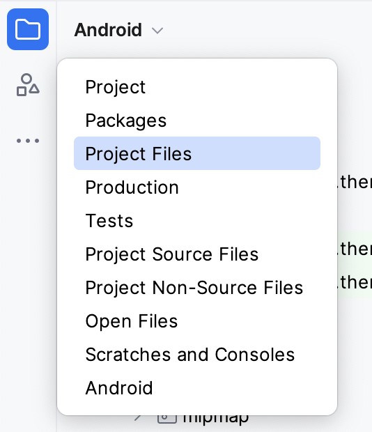
Before adding the new theme to the project, we first need to remove the old theme files. This is easier if the Project tool window is in Project Files mode. To switch mode, use the menu at the top of the tool Project tool window as shown below and select the Project Files option:
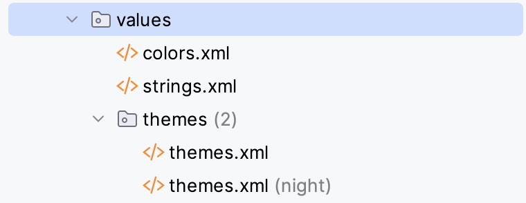
With Project Files mode selected, navigate to the app -> src -> main -> res -> values folder and select and delete the colors.xml and themes.xml files. Also, delete the themes.xml file located in the values-night folder.
Open the filesystem navigation tool for your operating system, locate the colors.xml and themes.xml files in the values folder of the new material theme, and copy and paste them into the values folder within the Project tool window. Repeat this step to copy the themes.xml file in the values-night folder, this time pasting it into the values-night folder.
Switch the Project tool window back to Android mode, at which point the value resource files section should match Figure 92-6:
|
You are reading a sample chapter from an old edition of the Android Studio Essentials – Kotlin Edition book.
Purchase the fully updated Android Studio Ladybug Kotlin Edition of this publication in eBook or Print format. The full book contains 100 chapters and over 878 pages of in-depth information. |
Next, modify the light themes.xml file to match the current project as follows:
<resources>
    <style name="Base.Theme.ThemeDemo" parent="Theme.Material3.Light.NoActionBar">
        <item name="colorPrimary">@color/md_theme_light_primary</item>
        <item name="colorOnPrimary">@color/md_theme_light_onPrimary</item>
.
.
    </style>

    <style name="Theme.ThemeDemo" parent="Base.Theme.ThemeDemo" />

</resources>Code language: HTML, XML (xml)
Repeat these steps to make the same modifications to the themes.xml (night) file.
Return to the activity_main.xml file or rerun the app to confirm that the user interface is rendered using the custom theme colors.
Enabling Dynamic Color Support
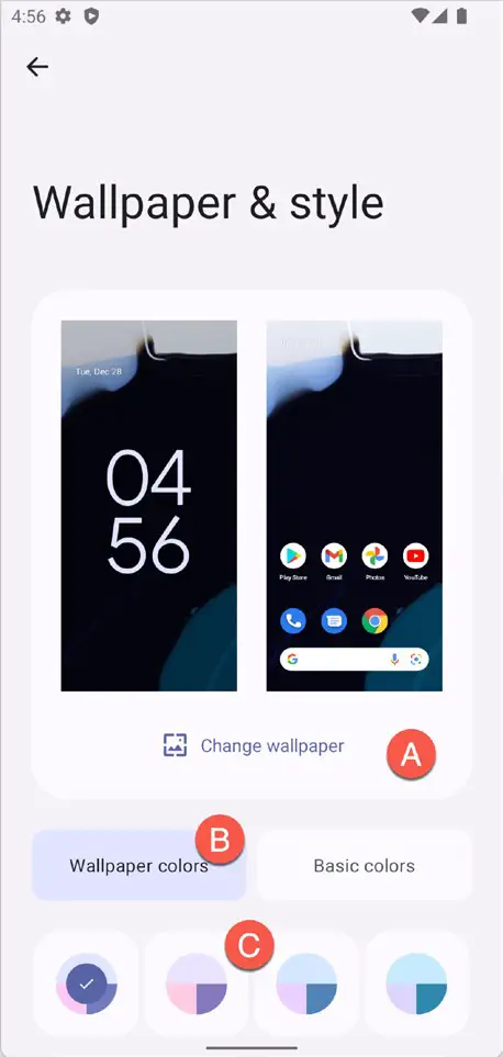
The app will need to be run on a device or emulator running Android 12 or later with the correct Wallpaper settings to test dynamic colors. On the device or emulator, launch the Settings app and select Wallpaper & style from the list of options. On the wallpaper settings screen, click the option to change the wallpaper (marked A in Figure 92-7) and select a wallpaper image containing colors that differ significantly from the colors in your theme. Once selected, assign the wallpaper to the Home screen.
Return to the Wallpaper & styles screen and make sure that the Wallpaper colors option is selected (B) before choosing an option from the color scheme buttons (C). As each option is clicked, the wallpaper example will change to reflect the selection:
|
You are reading a sample chapter from an old edition of the Android Studio Essentials – Kotlin Edition book.
Purchase the fully updated Android Studio Ladybug Kotlin Edition of this publication in eBook or Print format. The full book contains 100 chapters and over 878 pages of in-depth information. |
To enable dynamic colors, we need to call the applyToActivitiesIfAvailable() method of the DynamicColors class. To enable dynamic color support for the entire app, this needs to be called from within the onCreate() method of a custom Application instance. Begin by adding a new Kotlin class file to the project under app -> kotlin+java -> com. ebookfrenzy.themedemo named ThemeDemoApplication.kt and modifying it so that it reads as follows:
package com.ebookfrenzy.themedemo

import android.app.Application
import com.google.android.material.color.DynamicColors

class ThemeDemoApplication: Application() {
    override fun onCreate() {
        super.onCreate()
        DynamicColors.applyToActivitiesIfAvailable(this)
    }
}Code language: Kotlin (kotlin)
With the custom Application class created, we must configure the project to use this class instead of the default Application instance. To do this, edit the AndroidManifest.xml file and add an android:name element referencing the new class:
<?xml version="1.0" encoding="utf-8"?>
<manifest xmlns:android="http://schemas.android.com/apk/res/android"
    package="com.ebookfrenzy.themedemo">

    <application
        android:name=".ThemeDemoApplication"
        android:allowBackup="true"
.
.Code language: HTML, XML (xml)
Build and run the app and note that the layout uses a theme matching the wallpaper color. Place the ThemeDemo app into the background, return to the Wallpaper & styles settings screen, and choose a different wallpaper. Bring the ThemeDemo app to the foreground again. At this point, it will have dynamically adapted to match the new wallpaper.
Previewing Dynamic Colors
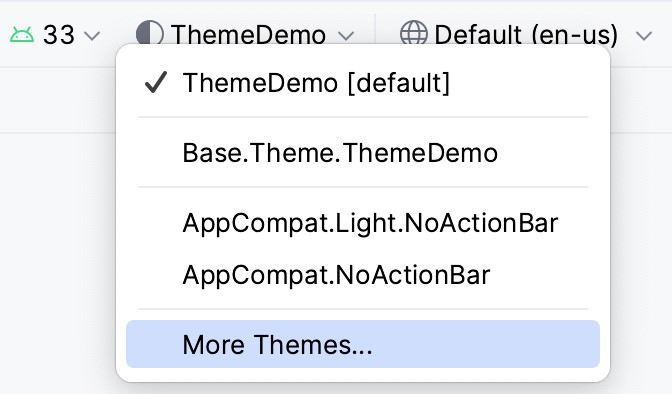
Dynamic color behavior can also be previewed within the Android Studio layout editor. To try this, open the activity_main.xml file, click on the theme menu, and select the More Themes option, as shown in Figure 92-8:
Next, use the search field in the theme selection dialog to list dynamic themes:
|
You are reading a sample chapter from an old edition of the Android Studio Essentials – Kotlin Edition book.
Purchase the fully updated Android Studio Ladybug Kotlin Edition of this publication in eBook or Print format. The full book contains 100 chapters and over 878 pages of in-depth information. |
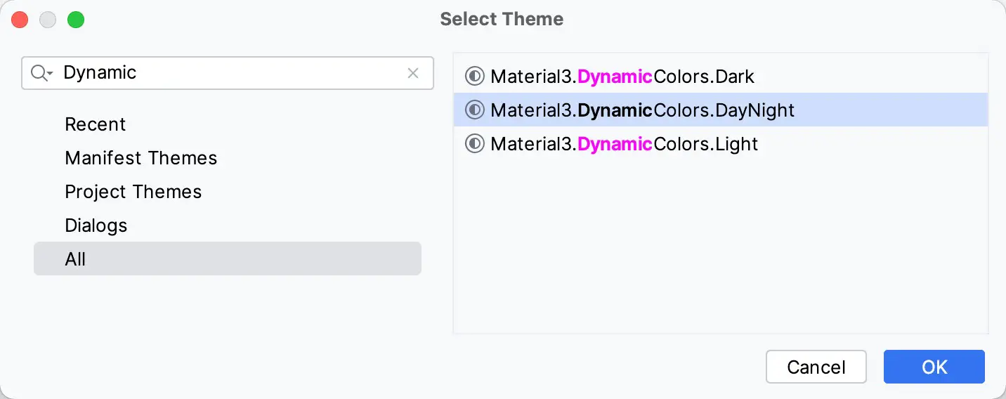
Select the Material3.DynamicColors.DayNight theme before clicking on the OK button. On returning to the layout editor, select the System UI Mode menu and choose one of the wallpaper options as highlighted in Figure 92-10:
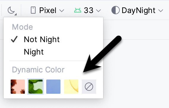
Once a wallpaper has been selected, the colors of the components in the layout will change accordingly.
Summary
In this chapter, we have used the Material Theme Builder to design a new theme and explained the steps to integrate the generated theme files into an Android Studio project. Finally, the chapter demonstrated how to implement and use the Material You dynamic colors feature.