
Composable functions are the building blocks used to create user interfaces for Android apps when developing with Jetpack Compose. In the ComposeDemo project created earlier in the book, we made use of both the built-in compose functions provided with Compose and also created our own functions. In this chapter, we will explore composable functions in more detail, including topics such as stateful and stateless functions, function syntax, and the difference between foundation and material composables.
What is a composable function?
Composable functions (also referred to as composables or components) are special Kotlin functions that are used to create user interfaces when working with Compose. A composable function is differentiated from regular Kotlin functions in code using the @Composable annotation.
When a composable is called, it is typically passed some data and a set of properties that define how the corresponding section of the user interface is to behave and appear when rendered to the user in the running app. In essence, composable functions transform data into user interface elements. Composables do not return values in the traditional sense of the Kotlin function, but instead, emit user interface elements to the Compose runtime system for rendering.
Composable functions can call other composables to create a hierarchy of components as demonstrated in the ComposeDemo project. While a composable function may also call standard Kotlin functions, standard functions may not call composable functions.
A typical Compose-based user interface will be comprised of a combination of built-in and custom-built composables.
 |
You are reading a sample chapter from an old edition of the Jetpack Compose Essentials book. Purchase the fully updated Jetpack Compose 1.7 Essentials edition of this book in eBook or Print format. The full book contains 67 chapters and over 700 pages of in-depth information. Buy the full book now in Print or eBook format. Learn more. |
Stateful vs. stateless composables
Composable functions are categorized as being either stateful or stateless. State, in the context of Compose, is defined as being any value that can change during the execution of an app. For example, a slider position value, the string entered into a text field, or the current setting of a check box are all forms of state.
As we saw in the ComposeDemo project, a composable function can store a state value which defines in some way how the composable function, or those that it calls appear or behave. This is achieved using the remember keyword and the mutableStateOf function. Our DemoScreen composable, for example, stored the current slider position as state using this technique:
@Composable
fun DemoScreen() {

    var sliderPosition by remember { mutableStateOf(20f) }
.
.
}
Code language: Kotlin (kotlin)
Because the DemoScreen contains state, it is considered to be a stateful composable. Now consider the DemoSlider composable which reads as follows:
@Composable
fun DemoSlider(sliderPosition: Float, onPositionChange : (Float) -> Unit ) {
    Slider(
        modifier = Modifier.padding(10.dp),
        valueRange = 20f..40f,
        value = sliderPosition,
        onValueChange = onPositionChange
    )
}Code language: Kotlin (kotlin)
Although this composable is passed and makes use of the state value stored by the DemoScreen, it does not itself store any state value. DemoSlider is, therefore, considered to be a stateless composable function.
The topic of state will be covered in greater detail in the chapter entitled An Overview of Compose State and Recomposition.
|
You are reading a sample chapter from an old edition of the Jetpack Compose Essentials book. Purchase the fully updated Jetpack Compose 1.7 Essentials edition of this book in eBook or Print format. The full book contains 67 chapters and over 700 pages of in-depth information. Buy the full book now in Print or eBook format. Learn more. |
Composable function syntax
Composable functions, as we already know, are declared using the @Composable annotation and are written in much the same way as a standard Kotlin function. We can, for example, declare a composable function that does nothing as follows:
@Composable
fun MyFunction() {
}Code language: Kotlin (kotlin)
We can also call other composables from within the function:
@Composable
fun MyFunction() {
    Text("Hello")
}Code language: Kotlin (kotlin)
Composables may also be implemented to accept parameters. The following function accepts text, font weight, and color parameters and passes them to the built-in Text composable. The fragment also includes a preview composable to demonstrate how the CustomText function might be called:
@Composable
fun CustomText(text: String, fontWeight: FontWeight, color: Color) {
    Text(text = text, fontWeight = fontWeight, color = color)
}

@Preview(showBackground = true)
@Composable
fun DefaultPreview() {
    CustomText(text = "Hello Compose", fontWeight = FontWeight.Bold,
                               color = Color.Magenta)
}Code language: Kotlin (kotlin)
When previewed, magenta-colored bold text reading “Hello Compose” will be rendered in the preview panel.
Just about any Kotlin logic code may be included in the body of a composable function. The following composable, for example, displays different text within a Column depending on the setting of a built-in Switch composable:
|
You are reading a sample chapter from an old edition of the Jetpack Compose Essentials book. Purchase the fully updated Jetpack Compose 1.7 Essentials edition of this book in eBook or Print format. The full book contains 67 chapters and over 700 pages of in-depth information. Buy the full book now in Print or eBook format. Learn more. |
@Composable
fun CustomSwitch() {

    val checked = remember { mutableStateOf(true) }

    Column {
        Switch(
            checked = checked.value,
            onCheckedChange = { checked.value = it }
        )
        if (checked.value) {
            Text("Switch is On")
        } else {
            Text("Switch is Off")
        }
    }
}Code language: Kotlin (kotlin)
In the above example, we have declared a state value named checked initialized to true and then constructed a Column containing a Switch composable. The state of the Switch is based on the value of checked and a lambda assigned as the onCheckedChanged event handler. This lambda sets the checked state to the current Switch setting. Finally, an if statement is used to decide which of two Text composables are displayed depending on the current value of the checked state. When run, the text displayed will alternate between “Switch is on” and “Switch is off”:
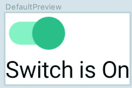
Figure 19-1
Similarly, we could use looping syntax to iterate through the items in a list and display them in a Column separated by instances of the Divider composable:
@Composable
fun CustomList(items: List<String>) {
    Column {
        for (item in items) {
            Text(item)
            Divider(color = Color.Black)
        }
    }
}Code language: Kotlin (kotlin)
The following composable could be used to preview the above function:
@Preview(showBackground = true)
@Composable
fun DefaultPreview() {
    MyApplicationTheme {
        CustomList(listOf("One", "Two", "Three", "Four", "Five", "Six"))
    }
}Code language: Kotlin (kotlin)
Once built and refreshed, the composable will appear in the Preview panel as shown in Figure 19-2 below:
|
You are reading a sample chapter from an old edition of the Jetpack Compose Essentials book. Purchase the fully updated Jetpack Compose 1.7 Essentials edition of this book in eBook or Print format. The full book contains 67 chapters and over 700 pages of in-depth information. Buy the full book now in Print or eBook format. Learn more. |
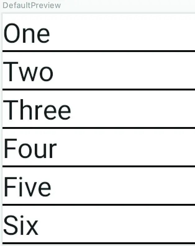
Figure 19-2
Foundation and Material composables
When developing apps with Compose we do so using a mixture of our own composable functions (for example the CustomText and CustomList composables created earlier in the chapter) combined with a set of ready to use components provided by the Compose development kit (such as the Text, Button, Column and Slider composables).
The composables bundled with Compose fall into three categories, referred to as Layout, Foundation, and Material Design components.
Layout components provide a way to define both how components are positioned on the screen, and how those components behave in relation to each other. The following are all layout composables:
- Box
- BoxWithConstraints
- Column
- ConstraintLayout
- Row
Foundation components are a set of minimal components that provide basic user interface functionality. While these components do not, by default, impose a specific style or theme, they can be customized to provide any look and behavior you need for your app. The following lists the set of Foundation components:
|
You are reading a sample chapter from an old edition of the Jetpack Compose Essentials book. Purchase the fully updated Jetpack Compose 1.7 Essentials edition of this book in eBook or Print format. The full book contains 67 chapters and over 700 pages of in-depth information. Buy the full book now in Print or eBook format. Learn more. |
- BaseTextField
- Canvas
- Image
- LazyColumn
- LazyRow
- Shape
- Text
The Material Design components, on the other hand, have been designed so that they match Google’s Material theme guidelines and include the following composables:
- AlertDialog
- Button
- Card
- CircularProgressIndicator
- DropdownMenu
- Checkbox
- FloatingActionButton
- LinearProgressIndicator
- ModalDrawer
- RadioButton
- Scaffold
- Slider
- Snackbar
- Switch
- TextField
- TopAppBar
- BottomNavigation
When choosing components, it is important to note that the Foundation and Material Design components are not mutually exclusive. You will inevitably use components from both categories in your design since the Material Design category has components for which there is no Foundation equivalent and vice versa.
Summary
In this chapter, we have looked at composable functions and explored how they are used to construct Android-based user interfaces. Composable functions are declared using the @Composable annotation and use the same syntax as standard Kotlin functions, including the passing and handling of parameters. Unlike standard Kotlin functions, composable functions do not return values. Instead, they emit user interface units to be rendered by the Compose runtime. A composable function can be either stateful or stateless depending on whether the function stores a state value. The built-in composables are categorized as either Layout, Foundation, or Material Design components. The Material Design components conform with the Material style and theme guidelines provided by Google to encourage consistent UI design.
One type of composable we have not yet introduced is the Slot API composable, a topic that will be covered later in the chapter entitled An Overview of Jetpack Compose Slot APIs.