
As outlined in the previous chapter, we use ViewModels to separate an activity’s data and associated logic from the code responsible for rendering the user interface. Having covered the theory of modern Android app architecture, this chapter will create an example project demonstrating the use of a ViewModel within an example project.
About the project
The project created in this chapter involves a simple app designed to perform temperature conversions between Celsius and Fahrenheit. Once the app is complete, it will appear as illustrated in Figure 46-1 below:
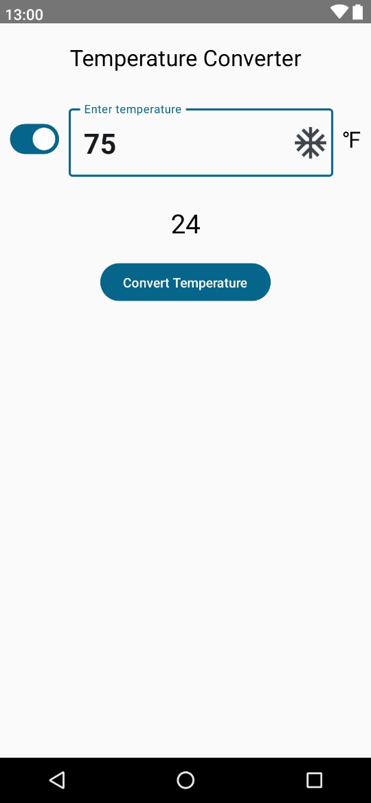
When a temperature value is entered into the OutlinedTextField, and the button is clicked, the converted value will appear in a result Text component. In addition, the Switch component indicates whether the entered temperature is Fahrenheit or Celsius. The current switch setting, conversion result, and conversion logic will all be contained within a ViewModel.
Creating the ViewModelDemo project
Launch Android Studio and create a new Empty Activity project named ViewModelDemo, specifying com. example.viewmodeldemo as the package name and selecting a minimum API level of API 26: Android 8.0 (Oreo).
Within the MainActivity.kt file, delete the Greeting function and add a new empty composable named ScreenSetup, which, in turn, calls a function named MainScreen:
 |
You are reading a sample chapter from an old edition of the Jetpack Compose Essentials book. Purchase the fully updated Jetpack Compose 1.7 Essentials edition of this book in eBook or Print format. The full book contains 67 chapters and over 700 pages of in-depth information. Buy the full book now in Print or eBook format. Learn more. |
@Composable
fun ScreenSetup() {
    MainScreen()
}

@Composable
fun MainScreen() {

}Code language: Kotlin (kotlin)
Edit the OnCreate() method function to call ScreenSetup instead of Greeting (we will modify the GreetingPreview composable later).
Next, modify the build.gradle.kts (Module: app) file to add the Compose view model library to the dependencies section and click the Sync Now link to commit the change:
.
.
dependencies {
.
.
    implementation("androidx.lifecycle:lifecycle-viewmodel-compose:2.6.1")
.
.Code language: Gradle (gradle)
Adding the ViewModel
Within the Android Studio Project tool window, locate and right-click on the app -> java -> com.example. viewmodeldemo entry and select the New -> Kotlin Class/File menu option. In the resulting dialog, name the class DemoViewModel before tapping the keyboard Enter key.
The ViewModel needs to contain state values in which to store the conversion result and current switch position as follows:
package com.example.viewmodeldemo

import androidx.compose.runtime.getValue
import androidx.compose.runtime.mutableStateOf
import androidx.compose.runtime.setValue
import androidx.lifecycle.ViewModel

class DemoViewModel : ViewModel() {

    var isFahrenheit by mutableStateOf(true)
    var result by mutableStateOf("")
}Code language: Kotlin (kotlin)
The class also needs to contain the logic for the model, starting with a function to perform the temperature unit conversion. Since the user enters the temperature into a text field it is passed to the function as a String. In addition to performing the calculation, code is also needed to convert between string and integer types. This code must also ensure that the user has entered a valid number. Remaining in the DemoViewModel.kt file, add a new function named convertTemp() so that it reads as follows:
|
You are reading a sample chapter from an old edition of the Jetpack Compose Essentials book. Purchase the fully updated Jetpack Compose 1.7 Essentials edition of this book in eBook or Print format. The full book contains 67 chapters and over 700 pages of in-depth information. Buy the full book now in Print or eBook format. Learn more. |
.
.
import java.lang.Exception
import kotlin.math.roundToInt

class DemoViewModel : ViewModel() {
.
.
    fun convertTemp(temp: String) {

        result = try {
            val tempInt = temp.toInt()

            if (isFahrenheit) {
                ((tempInt - 32) * 0.5556).roundToInt().toString()
            } else {
                ((tempInt * 1.8) + 32).roundToInt().toString()
            }
        } catch (e: Exception) {
            "Invalid Entry"
        }
    }
.
.
Code language: Kotlin (kotlin)
The above function begins by converting the temperature string value to an integer. This is performed within the context of a try… catch statement, which reports invalid input if the text does not equate to a valid number. Next, the appropriate conversion is performed depending on the current isFahrenheit setting, and the result is rounded to a whole number and converted back to a string before being assigned to the result state variable.
The other function that needs to be added to the view model will be called when the switch setting changes and inverts the current isFahrenheit state setting:
fun switchChange() {
    isFahrenheit = !isFahrenheit
}Code language: plaintext (plaintext)
The implementation of the view model is now complete and is ready to be used from within the main activity.
Accessing DemoViewModel from MainActivity
Now that we have declared a view model class, the next step is to create an instance and integrate it with the composables that make up our MainActivity. This project will involve creating a DemoViewModel instance as a parameter to the ScreenSetup function and then passing through the state variables and function references to the MainScreen function. First, open the MainActivity.kt file in the code editor and make the following changes:
.
.
import androidx.lifecycle.viewmodel.compose.viewModel
.
.
@Composable
fun ScreenSetup(viewModel: DemoViewModel = viewModel()) {
    MainScreen(
        isFahrenheit = viewModel.isFahrenheit,
        result = viewModel.result,
        convertTemp = { viewModel.convertTemp(it) },
        switchChange = { viewModel.switchChange() }
    )
}

@Composable
fun MainScreen(
    isFahrenheit: Boolean,
    result: String,
    convertTemp: (String) -> Unit,
    switchChange: () -> Unit
) {

}
.
.Code language: Kotlin (kotlin)
Before starting work on the user interface design, the GreetingPreview function also needs to be modified to make use of the view model:
|
You are reading a sample chapter from an old edition of the Jetpack Compose Essentials book. Purchase the fully updated Jetpack Compose 1.7 Essentials edition of this book in eBook or Print format. The full book contains 67 chapters and over 700 pages of in-depth information. Buy the full book now in Print or eBook format. Learn more. |
@Preview(showBackground = true, showSystemUi = true)
@Composable
fun GreetingPreview(model: DemoViewModel = viewModel()) {
    ViewModelDemoTheme {
        MainScreen(
            isFahrenheit = model.isFahrenheit,
            result = model.result,
            convertTemp = { model.convertTemp(it) },
            switchChange = { model.switchChange() }
        )
    }
}Code language: Kotlin (kotlin)
Designing the temperature input composable
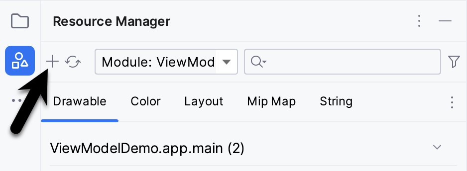
A closer look at the completed user interface screenshot shown in Figure 46-1 above will reveal the presence of a snowflake icon on the right-hand side of the OutlinedTextField component. Before writing any more code, we need to add this icon to the project. Within Android Studio, display the Resource Manager tool window. Within the tool window click on the `+` button indicated by the arrow in Figure 46-2 and select the Vector Asset menu option to add a new resource to the project:
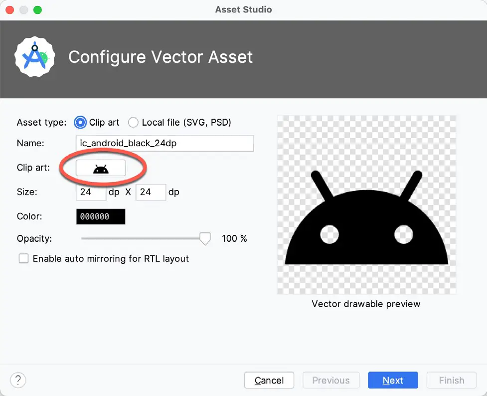
In the resulting dialog, click on the Clip Art box as shown in Figure 46-3 below:
When the icon selection dialog appears, enter “ac unit” into the search field to locate the clip art icon to be used in the project:
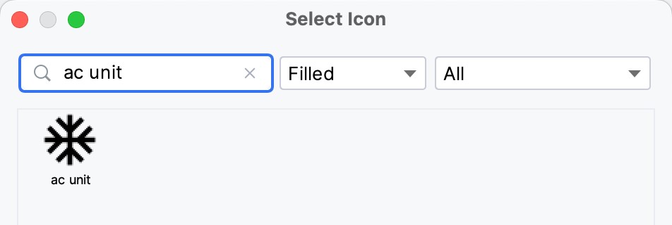
Select the icon and click on the OK button to return to the vector asset configuration dialog, where the selected icon will now appear. Click Next followed by Finish to complete the addition of the icon to the project resources.
Designing the temperature input composable
In the interests of avoiding the MainScreen function becoming cluttered, the Switch, OutlinedTextField, and unit indicator Text component will be placed in a separate composable named InputRow, which can now be added to the MainActivity.kt file:
|
You are reading a sample chapter from an old edition of the Jetpack Compose Essentials book. Purchase the fully updated Jetpack Compose 1.7 Essentials edition of this book in eBook or Print format. The full book contains 67 chapters and over 700 pages of in-depth information. Buy the full book now in Print or eBook format. Learn more. |
.
.
import androidx.compose.animation.Crossfade
import androidx.compose.animation.core.tween
import androidx.compose.foundation.layout.*
import androidx.compose.foundation.text.KeyboardOptions
import androidx.compose.material3.*
import androidx.compose.ui.Alignment
import androidx.compose.ui.res.painterResource
import androidx.compose.ui.text.TextStyle
import androidx.compose.ui.text.font.FontWeight
import androidx.compose.ui.text.input.KeyboardType
import androidx.compose.ui.unit.dp
import androidx.compose.ui.unit.sp
.
.
@Composable
fun InputRow(
    isFahrenheit: Boolean,
    textState: String,
    switchChange: () -> Unit,
    onTextChange: (String) -> Unit
) {
    Row(verticalAlignment = Alignment.CenterVertically) {

        Switch(
            checked = isFahrenheit,
            onCheckedChange = { switchChange() }
        )

        OutlinedTextField(
            value = textState,
            onValueChange = { onTextChange(it) },
            keyboardOptions = KeyboardOptions(
                keyboardType = KeyboardType.Number
            ),
            singleLine = true,
            label = { Text("Enter temperature")},
            modifier = Modifier.padding(10.dp),
            textStyle = TextStyle(fontWeight = FontWeight.Bold,
                                     fontSize = 30.sp),
            trailingIcon = {
                Icon(
                    painter = painterResource(R.drawable.baseline_ac_unit_24),
                    contentDescription = "frost",
                    modifier = Modifier
                        .size(40.dp)
                )
            }
        )

        Crossfade(
            targetState = isFahrenheit,
            animationSpec = tween(2000)
        ) { visible ->
            when (visible) {
                true -> Text(
                      "\u2109", style = MaterialTheme.typography.headlineSmall)
                false -> Text(
                      "\u2103", style = MaterialTheme.typography.headlineSmall)
            }
        }
    }
}Code language: Kotlin (kotlin)
If the editor reports that OutlinedTextField is experimental, add the following OptIn declaration to the function:
@OptIn(ExperimentalMaterial3Api::class)
@Composable
fun InputRow(
    isFahrenheit: Boolean,
    textState: String,Code language: Kotlin (kotlin)
The InputRow function expects as parameters the state values and functions contained within the view model together with a textState state variable and onTextChange event handler. These last two parameters are used to display the text typed by the user into the text field and will be “hoisted” to the MainScreen function later in the chapter. The current textState value is also what gets passed to the convertTemp() function when the user clicks the button.
The composables that make up this section of the layout are contained within a Row that is configured to center its children vertically. The first child, the Switch component, simply calls the switchChange() function on the model to toggle the isFahrenheit state.
While many of the properties applied to the OutlinedTextField will be familiar from previous chapters, some require additional explanation. For example, since the temperature can only be entered as a number, the keyboardOptions keyboard type property is set to KeyboardType.Number. This ensures that when the user taps within the text field, only the numeric keyboard will appear on the screen:
keyboardOptions = KeyboardOptions(
    keyboardType = KeyboardType.Number
)Code language: Kotlin (kotlin)
Other keyboard type options include email address, password, phone number, and URI inputs.
|
You are reading a sample chapter from an old edition of the Jetpack Compose Essentials book. Purchase the fully updated Jetpack Compose 1.7 Essentials edition of this book in eBook or Print format. The full book contains 67 chapters and over 700 pages of in-depth information. Buy the full book now in Print or eBook format. Learn more. |
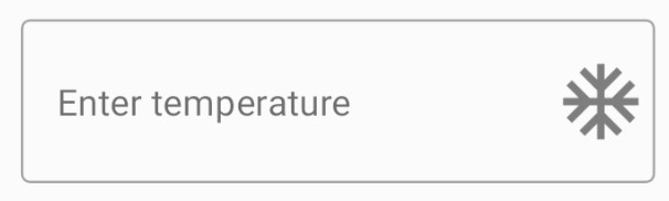
The input is also limited to a single line of text using the singleLine property. As the name suggests, the OutlinedTextField component draws an outline around the text input area. When the component is not selected by the user (in other words, it does not have “focus”), the text assigned to the label property appears in slightly faded text within the text field, as shown in Figure 46-5:
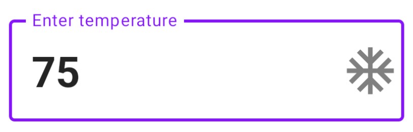
When the field has focus, however, the label appears as a title positioned within the outline:
The result of a call to the TextStyle function is assigned to the textStyle property of the OutlinedTextField. TextStyle is used to group style settings into a single object that can be applied to other composables in a single operation. In this instance, we are only setting font weight and font style, but TextStyle may also be used to configure style settings including color, background, font family, shadow, text alignment, letter spacing, and text indent.
The trailingIcon property is used to position the previously added icon at the end of the text input area:
trailingIcon = {
    Icon(
        painter = painterResource(R.drawable.ic_baseline_ac_unit_24),
        contentDescription = "frost",
        modifier = Modifier
            .size(40.dp)
    )
}Code language: Kotlin (kotlin)
Finally, crossfade animation (covered in the chapter titled Jetpack Compose Visibility Animation Tutorial) is used when switching the unit Text field between °F and °C (represented by Unicode values \u2109 and \u2103, respectively) based on the current isFahrenheit setting.
|
You are reading a sample chapter from an old edition of the Jetpack Compose Essentials book. Purchase the fully updated Jetpack Compose 1.7 Essentials edition of this book in eBook or Print format. The full book contains 67 chapters and over 700 pages of in-depth information. Buy the full book now in Print or eBook format. Learn more. |
Completing the user interface design
The final task before testing the app is to complete the MainScreen function, which now needs to read as follows:
.
.
import androidx.compose.runtime.getValue
import androidx.compose.runtime.mutableStateOf
import androidx.compose.runtime.setValue
import androidx.compose.runtime.remember
.
.
@Composable
fun MainScreen(
    isFahrenheit: Boolean,
    result: String,
    convertTemp: (String) -> Unit,
    switchChange: () -> Unit
) {
    Column(horizontalAlignment = Alignment.CenterHorizontally,
         modifier = Modifier.fillMaxSize()) {

        var textState by remember { mutableStateOf("") }

        val onTextChange = { text : String ->
            textState = text
        }

        Text("Temperature Converter",
            modifier = Modifier.padding(20.dp),
            style = MaterialTheme.typography.headlineSmall
        )

        InputRow(
            isFahrenheit = isFahrenheit,
            textState = textState,
            switchChange = switchChange,
            onTextChange = onTextChange
        )

        Text(result,
            modifier = Modifier.padding(20.dp),
            style = MaterialTheme.typography.headlineMedium
        )

        Button(
            onClick = { convertTemp(textState) }
        )
        {
            Text("Convert Temperature")
        }
    }
}Code language: Kotlin (kotlin)
The MainScreen composable declares the textState state variable and an onTextChange event handler. The first child of the Column layout is a static Text component displaying a title. Next, the InputRow is called and passed the necessary parameters. The third child is another Text component, this time configured to display the content of the view model result state variable. Finally, a Button composable is configured to call the view model convertTemp() function, passing it textState. The convertTemp() function will calculate the converted temperature and assign it to the result state variable, thereby triggering a recomposition of the composable hierarchy.
Testing the app
Test the activity by enabling interactive mode in the preview panel and tapping on the OutlinedTextField component. Note that the “Enter temperature” label moves to the outline leaving the input field clear to enter a temperature value. Verify that when the keyboard appears, it only allows numerical selections. Enter a number and click on the Button at which point the converted temperature should be displayed.
Use the Switch to change from Fahrenheit to Centigrade, and note the unit text to the right of the text field changes using cross-fade animation. Finally, test that attempting a conversion with a blank text field causes the Invalid Entry text to appear.
Summary
This chapter has demonstrated the use of a view model to separate the data and logic of an application from the code responsible for displaying the user interface. The chapter also introduced the OutlinedTextField component and covered customization options, including adding an icon, restricting keyboard input to numerical values, and setting style attributes using the TextStyle function.
|
You are reading a sample chapter from an old edition of the Jetpack Compose Essentials book. Purchase the fully updated Jetpack Compose 1.7 Essentials edition of this book in eBook or Print format. The full book contains 67 chapters and over 700 pages of in-depth information. Buy the full book now in Print or eBook format. Learn more. |