
When creating a new project, Xcode now provides a choice of creating either a Storyboard or SwiftUI-based user interface for the project. When creating a SwiftUI project, Xcode appears and behaves significantly differently when designing an app project’s user interface than the UIKit Storyboard mode.
When working in SwiftUI mode, most of your time as an app developer will be spent in the code editor and preview canvas, which will be explored in detail in this chapter.
Starting Xcode 15
As with all the examples in this book, the development of our example will take place within the Xcode 15 development environment. If you have not already installed this tool together with the latest iOS SDK, refer first to the Installing Xcode 15 and the iOS 17 SDK chapter of this book. Assuming the installation is complete, launch Xcode either by clicking on the icon on the dock (assuming you created one) or using the macOS Finder to locate Xcode in the Applications folder of your system.
When launched for the first time, and until you turn off the Show this window when Xcode launches toggle, the screen illustrated in Figure 17-1 will appear by default:
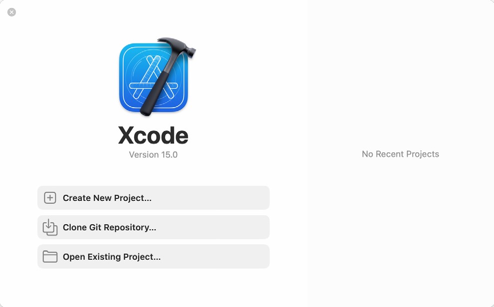
If you do not see this window, select the Window -> Welcome to Xcode menu option to display it. From within this window, click on Create New Project.
 |
You are reading a sample chapter from an old edition of iOS App Development Essentials. Purchase the fully updated iOS 18 App Development Essentials book. The full book contains 71 chapters, over 612 pages of in-depth information, downloadable source code, and access to over 50 SwiftUI knowledge test quizzes. |
Creating a SwiftUI Project
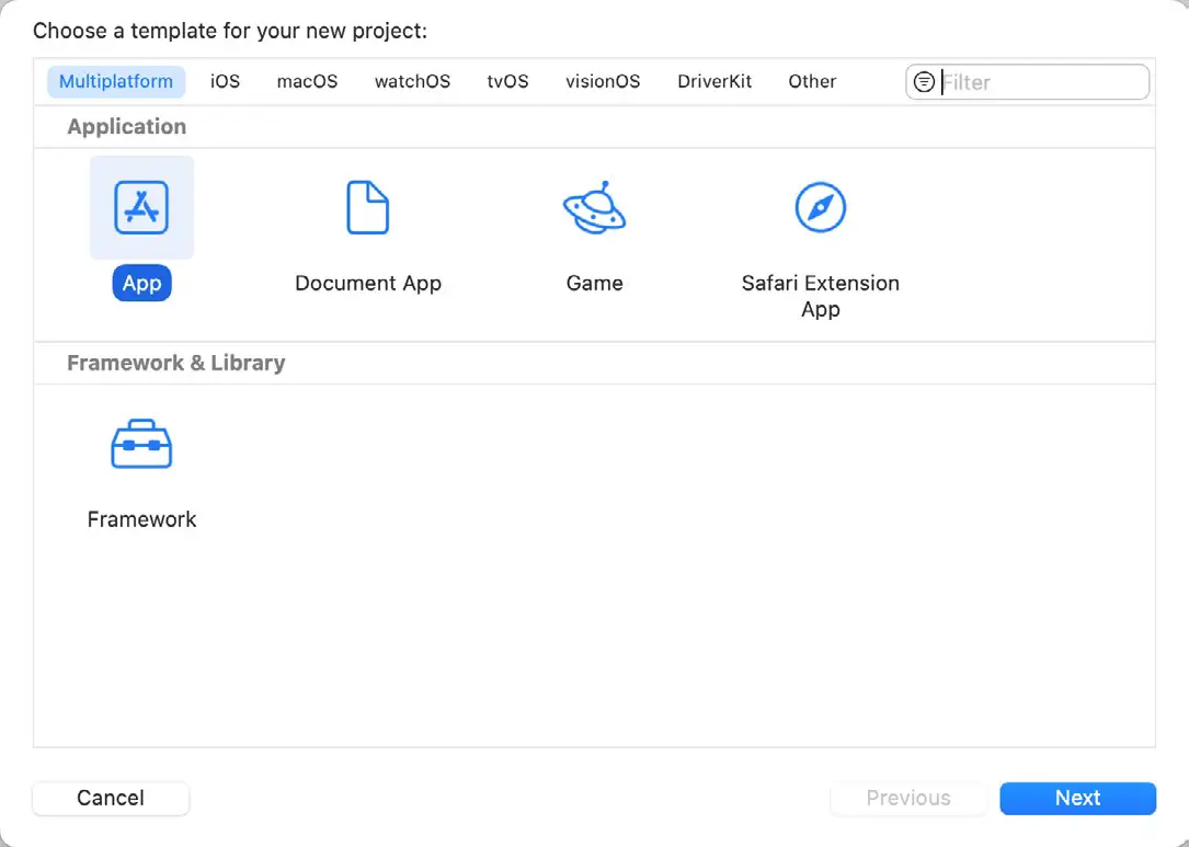
When creating a new project, the project template screen includes options to select how the app project is to be implemented. Options are available to design an app for a specific Apple platform (such as iOS, watchOS, macOS, DriveKit, or tvOS) or to create a multiplatform project. Selecting a platform-specific option will also provide the choice of creating either a Storyboard (UIKit) or a SwiftUI-based project.
A multiplatform project allows an app to be designed for multiple Apple platforms with a minimum of platform-specific code. Even if you plan to initially only target iOS, the multiplatform option is still recommended since it provides the flexibility to make the app available on other platforms in the future without having to restructure the project.
Templates are also available for creating a basic app, a document-based app, or a game project. For this chapter, use the multiplatform app option:
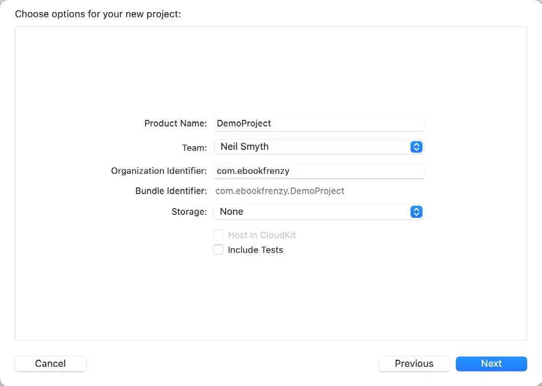
Clicking Next will display the project options screen where the project name needs to be entered (in this case, name the project DemoProject).
The Organization Identifier is typically the reversed URL of your company’s website, for example, “com. mycompany”. This will be used when creating provisioning profiles and certificates to enable the testing of advanced features of iOS on physical devices. It also serves to uniquely identify the app within the Apple App Store when the app is published:
|
You are reading a sample chapter from an old edition of iOS App Development Essentials. Purchase the fully updated iOS 18 App Development Essentials book. The full book contains 71 chapters, over 612 pages of in-depth information, downloadable source code, and access to over 50 SwiftUI knowledge test quizzes. |
Click Next again and choose a location on your filesystem to place the project before clicking the Create button.
Once a new project has been created, the main Xcode panel will appear with the default layout for SwiftUI development displayed.
Xcode in SwiftUI Mode
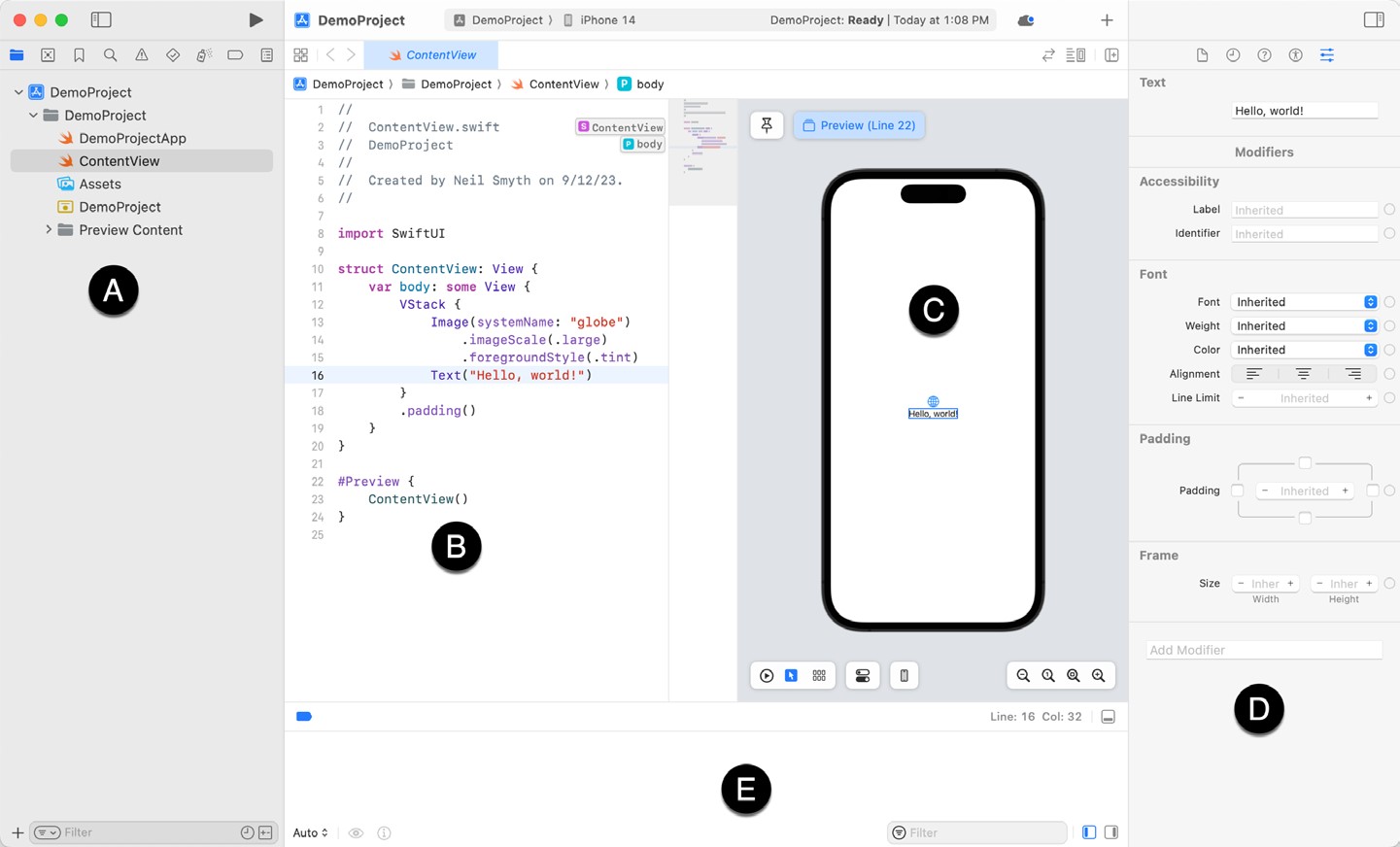
Before beginning work on a SwiftUI user interface, it is worth taking some time to gain familiarity with how Xcode works in SwiftUI mode. A newly created multiplatform “app” project includes two SwiftUI View files named <app name>App.swift (in this case DemoProjectApp.swift) and ContentView.swift, which, when selected from the project navigation panel, will appear within Xcode as shown in Figure 17-4 below:
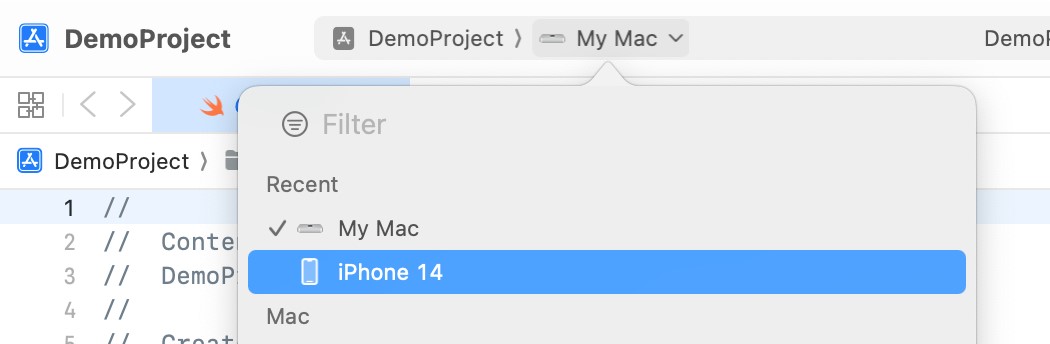
When the project loads for the first time, Xcode may default to macOS as the destination platform for building and testing your app. Before continuing, use the run destination chooser to select an iPhone device, as illustrated in Figure 17-5 below:
Located to the right of the project navigator (A) is the code editor (B). To the right is the preview canvas (C), where any changes made to the SwiftUI layout declaration will appear in real-time.
|
You are reading a sample chapter from an old edition of iOS App Development Essentials. Purchase the fully updated iOS 18 App Development Essentials book. The full book contains 71 chapters, over 612 pages of in-depth information, downloadable source code, and access to over 50 SwiftUI knowledge test quizzes. |
Selecting a view in the canvas will automatically select and highlight the corresponding entry in the code editor and vice versa. Attributes for the currently selected item will appear in the attributes inspector panel (D).
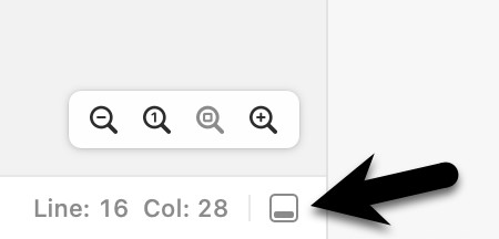
During debugging, the debug panel (E) will appear, containing debug output from both the iOS frameworks and any diagnostic print statements you have included in your code. If the console is not currently visible, display it by clicking on the button indicated by the arrow in Figure 17-6:
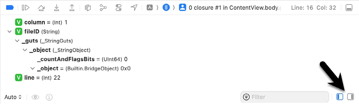
The debug panel can be configured to show a Variables view or a Console view. The variables view displays variables within the app at the point that the app crashes or reaches a debugging breakpoint. The console view, on the other hand, displays print output and messages from the running app. Figure 17-7 shows the variables view with an arrow indicating the buttons used to switch views:
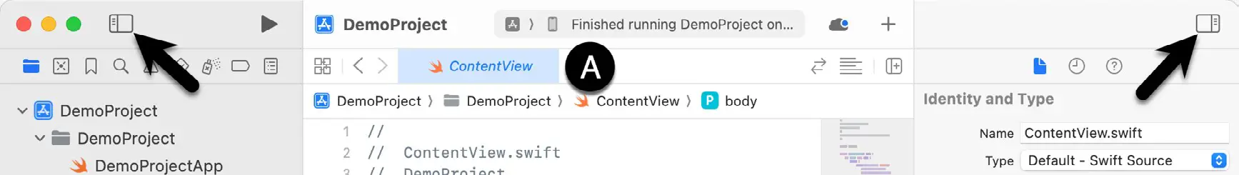
The button indicated in Figure 17-6 above may be used to hide the debug panel (E), while the two buttons highlighted in Figure 17-8 below hide and show the project navigator and inspector panels:
The tab bar (marked A above) displays a tab for each currently open file. When a tab is clicked, the corresponding file is loaded into the editor. Hovering the mouse pointer over a tab will display an “X” button within the tab which will close the file when clicked.
|
You are reading a sample chapter from an old edition of iOS App Development Essentials. Purchase the fully updated iOS 18 App Development Essentials book. The full book contains 71 chapters, over 612 pages of in-depth information, downloadable source code, and access to over 50 SwiftUI knowledge test quizzes. |
The area marked F in Figure 17-4 is called the Minimap. This map provides a miniaturized outline of the source code in the editor. Particularly useful when working with large source files, the minimap panel provides a quick way to move to different areas of the code. Hovering the mouse pointer of a line in the Minimap will display a label indicating the class, property, or function at that location, as illustrated in Figure 17-9:
Clicking on the label or within the map will take you to that line in the code editor. Holding down the Command key while hovering will display all of the elements contained within the source file, as shown in Figure 17-10:
The Minimap can be displayed and hidden by toggling the Editor -> Minimap menu option.
The Preview Canvas
The preview canvas provides both a visual representation of the user interface design and a tool for adding and modifying views within the layout design. The canvas may also be used to perform live testing of the running app without launching an iOS simulator. Figure 17-11 illustrates a typical preview canvas for a newly created project:
If the canvas is not visible, it can be displayed using the Xcode Editor -> Canvas menu option.
|
You are reading a sample chapter from an old edition of iOS App Development Essentials. Purchase the fully updated iOS 18 App Development Essentials book. The full book contains 71 chapters, over 612 pages of in-depth information, downloadable source code, and access to over 50 SwiftUI knowledge test quizzes. |
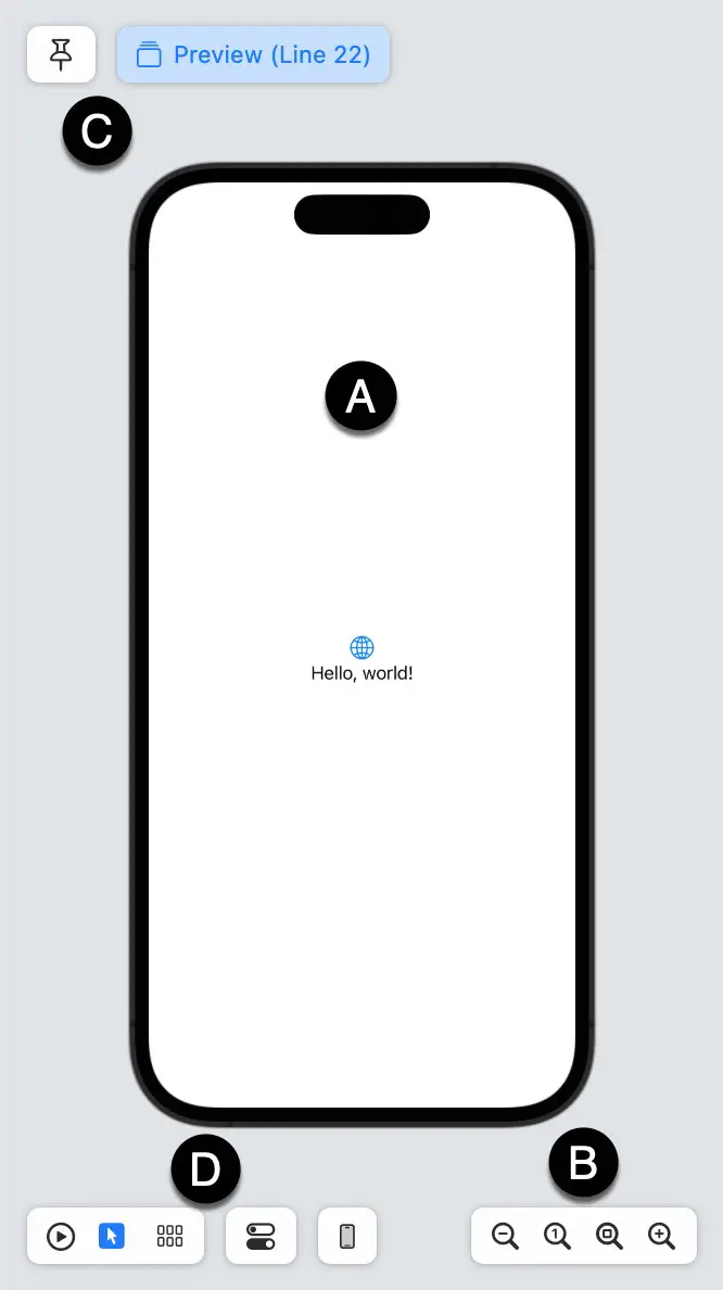
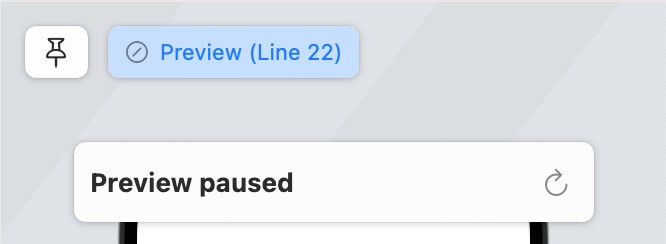
The main canvas area (A) represents the current view as it will appear when running on a physical device (also referred to as the canvas device). When changes are made to the code in the editor, those changes are reflected within the preview canvas. To avoid continually updating the canvas, and depending on the nature of the changes being made, the preview will occasionally pause live updates. When this happens, the Resume button will appear, which, when clicked, will once again begin updating the preview:
The size buttons (B) will zoom in and out of the canvas, zoom to 100%, and fit the available space.
Preview Pinning
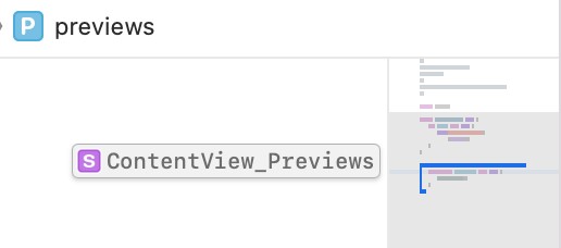
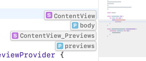
Building an app in Xcode will likely consist of several SwiftUI View files in addition to the default ContentView. swift file. When a SwiftUI View file is selected from the project navigator, both the code editor and preview canvas will change to reflect the currently selected file. Sometimes, you may want the user interface layout for one SwiftUI file to appear in the preview canvas while editing the code in a different file. This can be particularly useful if the layout from one file is dependent on or embedded in another view. The pin button (labeled C in Figure 17-11 above) pins the current preview to the canvas so that it remains accessible on the canvas after navigating to a different view. Switch between pinned views by clicking on the view buttons along the top of the preview panel. In Figure 17-13, for example, buttons are provided to switch between two views:

The #Preview macro can be used to apply more meaningful names to the views as follows:
#Preview("Content View") {
    ContentView()
}

#Preview("Sales View") {
    SalesView()
}Code language: Swift (swift)
When the above changes are applied to the ContentView.swift and SalesView.swift files, the view buttons in the preview canvas will appear as illustrated below:
|
You are reading a sample chapter from an old edition of iOS App Development Essentials. Purchase the fully updated iOS 18 App Development Essentials book. The full book contains 71 chapters, over 612 pages of in-depth information, downloadable source code, and access to over 50 SwiftUI knowledge test quizzes. |

The Preview Toolbar
The preview toolbar (marked D in Figure 17-11 above and shown below) provides several options for changing the preview panel:
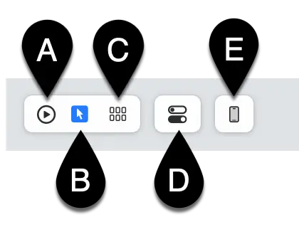
The preview panel can display the current view in either live or selectable mode. In live mode, the app runs interactively within the canvas and allows you to interact with it as if running on a device or simulator. Selectable mode allows you to select items in the canvas view to edit attributes and also to add and remove components. To switch between modes, use the buttons marked A (for live mode) and B (for selectable mode) as marked in the above figure.
The current version of the app may also be previewed on different device models by clicking on the Preview Device button (E). If you have a physical device connected to Xcode, selecting it from the menu will launch the app on that device. As with the preview canvas, the running app on the device will update dynamically as changes are made to the code in the editor.
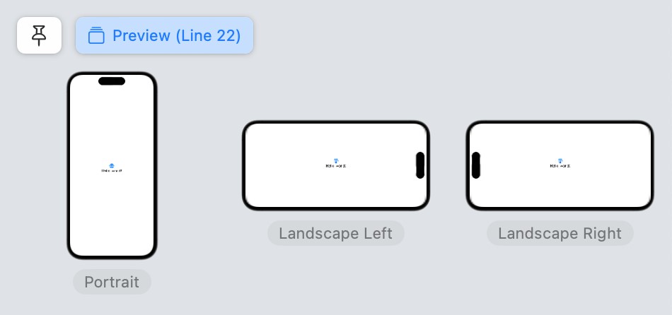
The Variants button (C) allows the view to be previewed in a variety of dynamic text sizes, color schemes, and device orientations:
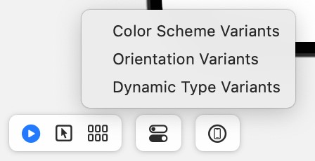
Figure 17-17, for example, shows the result of selecting the orientation variations option:
|
You are reading a sample chapter from an old edition of iOS App Development Essentials. Purchase the fully updated iOS 18 App Development Essentials book. The full book contains 71 chapters, over 612 pages of in-depth information, downloadable source code, and access to over 50 SwiftUI knowledge test quizzes. |
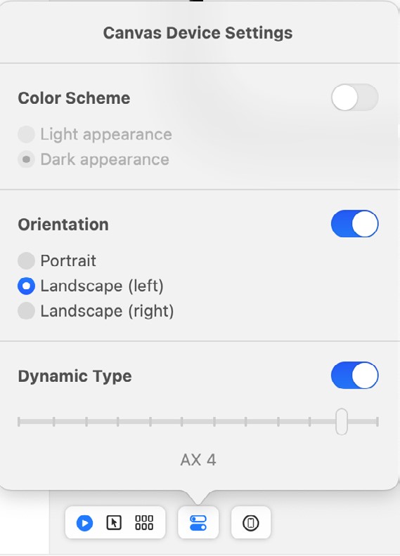
The Device Settings button (D) controls the color scheme (light or dark), orientation (portrait or landscape), and dynamic font size of the canvas device:
Modifying the Design
Working with SwiftUI primarily involves adding additional views, customizing those views using modifiers, adding logic, and interacting with state and other data instance bindings. All of these tasks can be performed exclusively by modifying the structure in the code editor. The font used to display the “Hello, world!” Text view, for example, can be changed by adding the appropriate modifier in the editor:
Text("Hello, world!")
    .font(.largeTitle)Code language: Swift (swift)
An alternative to this is to change the SwiftUI views by dragging and dropping items from the Library panel. The Library panel is displayed by clicking on the toolbar button highlighted in Figure 17-19:
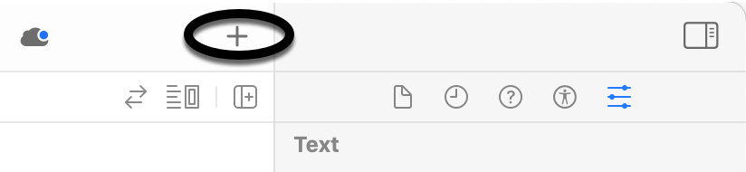
When displayed, the Library panel will appear as shown in Figure 17-20:
When launched this way, the Library panel is transient and will disappear either after a selection or a click is performed outside of the panel. Hold down the Option key when clicking on the Library button to keep the panel displayed.
|
You are reading a sample chapter from an old edition of iOS App Development Essentials. Purchase the fully updated iOS 18 App Development Essentials book. The full book contains 71 chapters, over 612 pages of in-depth information, downloadable source code, and access to over 50 SwiftUI knowledge test quizzes. |
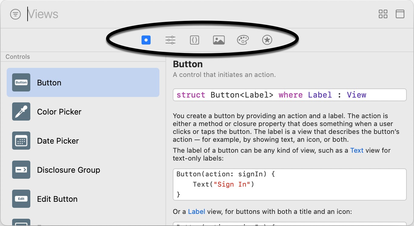
When first opened, the panel displays a list of views available for inclusion in the user interface design. The list can be browsed, or the search bar used to narrow the list to specific views. The toolbar (highlighted in the above figure) can be used to switch to other categories, such as modifiers, commonly used code snippets, images, color resources, and symbols.
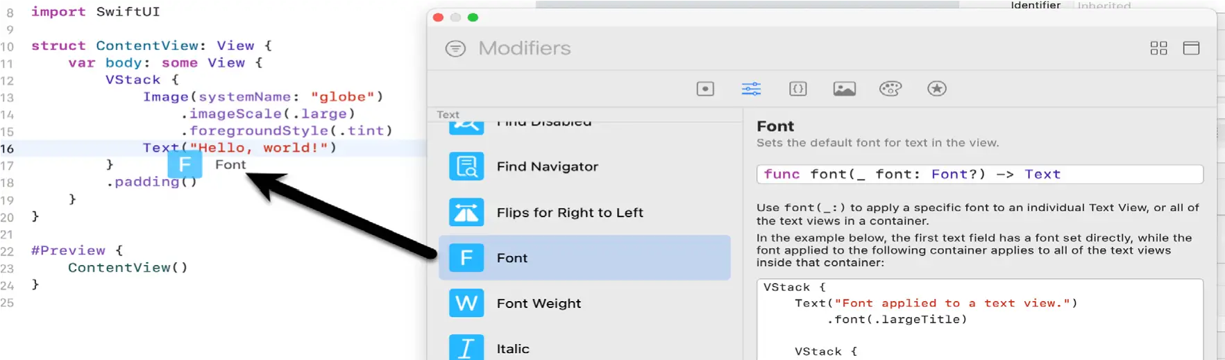
An item within the library can be applied to the user interface design in several ways. To apply a font modifier to the “Hello, world!” Text view, one option is to place the cursor in the code editor where the code is to be added, locate the font modifier in the Library panel, and double-click on it. Xcode will then automatically insert the font modifier at the cursor position.
Another option is to locate the Library item and then drag and drop it onto the desired location either in the code editor or the preview canvas. In Figure 17-21 below, for example, the font modifier is being dragged to the Text view within the canvas (note that the canvas must be in selectable mode):
Once a view or modifier has been added to the SwiftUI view file, some customization will likely be necessary, such as specifying the color for a foreground modifier. One option is, of course, to make the changes within the editor, for example:
Text("Hello, world!")
    .font(.largeTitle)
    .foregroundColor(.red)Code language: Swift (swift)
Another option is to select the view in either the editor or preview panel and then make the necessary changes within the Attributes Inspector panel:
|
You are reading a sample chapter from an old edition of iOS App Development Essentials. Purchase the fully updated iOS 18 App Development Essentials book. The full book contains 71 chapters, over 612 pages of in-depth information, downloadable source code, and access to over 50 SwiftUI knowledge test quizzes. |
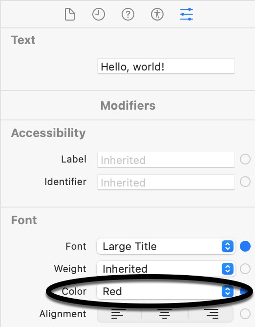
The Attributes inspector will provide the option to change any modifiers already applied to the selected view.
Before moving on to the next topic, it is also worth noting that the Attributes inspector provides yet another way to add modifiers to a view via the Add Modifier menu, located at the bottom of the panel. When clicked, this menu will display a long list of modifiers available for the current view type. To apply a modifier, simply select it from the menu. An entry for the new modifier will subsequently appear in the inspector, where it can be configured with the required properties.
Editor Context Menu
Right-clicking on an item in the code editor will display the menu shown in Figure 17-23:
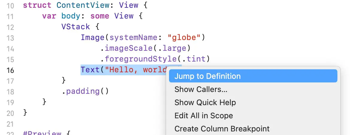
This menu provides a list of options that will vary depending on the type of item selected. Options typically include a shortcut to a popup version of the Attributes inspector for the current view, together with options to embed the current view in a stack or list container. This menu is also useful for extracting part of a view into its own self-contained subview. Creating subviews is strongly encouraged to promote reuse, improve performance, and unclutter complex design structures.
Running the App on a Simulator
Although much can be achieved using the preview canvas, there is no substitute for running the app on physical devices and simulators during testing.
|
You are reading a sample chapter from an old edition of iOS App Development Essentials. Purchase the fully updated iOS 18 App Development Essentials book. The full book contains 71 chapters, over 612 pages of in-depth information, downloadable source code, and access to over 50 SwiftUI knowledge test quizzes. |
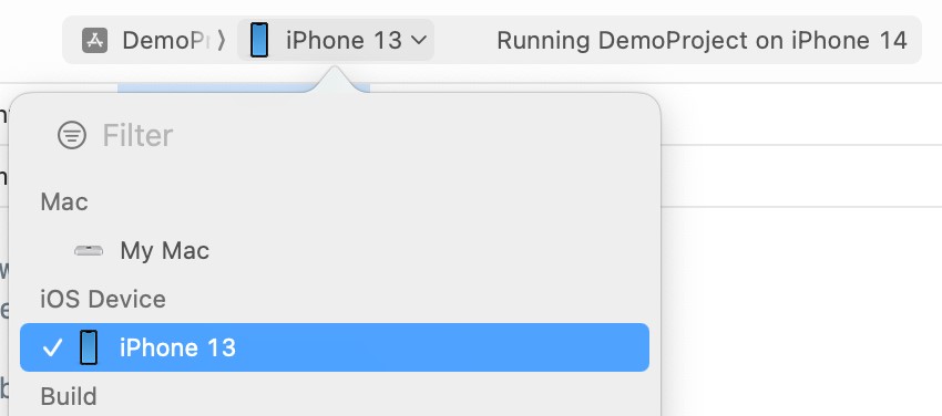
Within the main Xcode project window, the menu marked C in Figure 17-24 is used to choose a target simulator. This menu will include simulators that have been configured and any physical devices connected to the development system:

Clicking on the Run toolbar button (marked B in Figure 17-24 above) will compile the code and run the app on the selected target. The small panel in the center of the Xcode toolbar (D) will report the progress of the build process together with any problems or errors that cause the build process to fail. Once the app is built, the simulator will start and the app will run. Clicking on the stop button (A) will terminate the running app.
The simulator includes several options not available in the Live Preview for testing different aspects of the app. The Hardware and Debug menus, for example, include options for testing Face ID authentication and simulating geographical location changes for navigation and map-based apps.
Running the App on a Physical iOS Device
Although the Simulator environment provides a useful way to test an app on various iOS device models, it is important to also test on a physical iOS device.
If you have entered your Apple ID in the Xcode preferences screen as outlined in the How to Join the Apple Developer Program chapter and selected a development team for the project, it is possible to run the app on a physical device simply by connecting it to the development Mac system with a USB cable and selecting it as the run target within Xcode.
|
You are reading a sample chapter from an old edition of iOS App Development Essentials. Purchase the fully updated iOS 18 App Development Essentials book. The full book contains 71 chapters, over 612 pages of in-depth information, downloadable source code, and access to over 50 SwiftUI knowledge test quizzes. |
With a device connected to the development system, and an application ready for testing, refer to the device menu located in the Xcode toolbar. There is a reasonable chance that this will have defaulted to one of the iOS Simulator configurations. Switch to the physical device by selecting this menu and changing it to the device name listed under the iOS Devices section, as shown in Figure 17-25:
If the menu indicates that developer mode is disabled on the device, navigate to the Privacy & Security screen in the device’s Settings app, locate the Developer Mode setting, and enable it. You will then need to restart the device. After the device restarts, a dialog will appear in which you will need to turn on developer mode. After entering your security code, the device will be ready for use with Xcode.
With the target device selected, make sure the device is unlocked and click on the run button at which point Xcode will install and launch the app on the device.
As will be discussed later in this chapter, a physical device may also be configured for network testing, whereby apps are installed and tested on the device via a network connection without needing a USB cable.
Managing Devices and Simulators
Currently connected iOS devices and the simulators configured for use with Xcode can be viewed and managed using the Xcode Devices window which is accessed via the Window -> Devices and Simulators menu option. Figure 17-26, for example, shows a typical Device screen on a system where an iPhone has been detected:
|
You are reading a sample chapter from an old edition of iOS App Development Essentials. Purchase the fully updated iOS 18 App Development Essentials book. The full book contains 71 chapters, over 612 pages of in-depth information, downloadable source code, and access to over 50 SwiftUI knowledge test quizzes. |
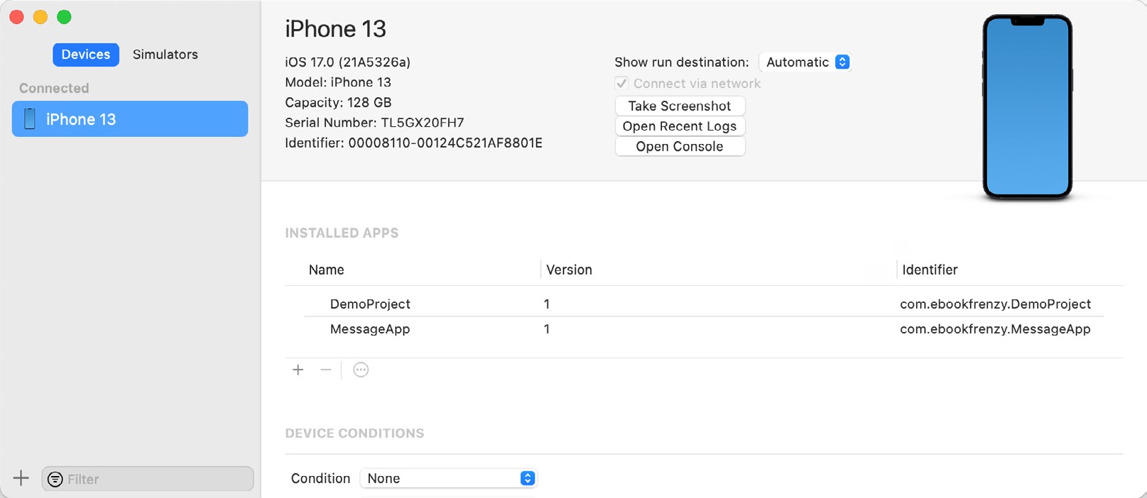
A wide range of simulator configurations are set up within Xcode by default and can be viewed by selecting the Simulators button at the top of the left-hand panel. Other simulator configurations can be added by clicking on the + button located in the bottom left-hand corner of the window. Once selected, a dialog will appear, allowing the simulator to be configured in terms of the device model, iOS version, and name.
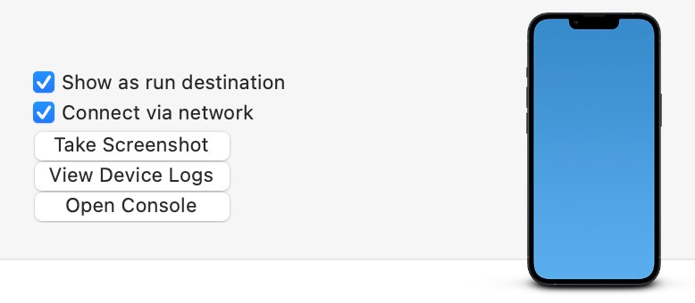
Enabling Network Testing
In addition to testing an app on a physical device connected to the development system via a USB cable, Xcode also supports testing via a network connection. This option is enabled on a per-device basis within the Devices and Simulators dialog introduced in the previous section. With the device connected via the USB cable, display this dialog, select the device from the list, and enable the Connect via network option as highlighted in Figure 17-27:
Once the setting has been enabled, the device may continue to be used as the run target for the app even when the USB cable is disconnected. The only requirement is that both the device and development computer be connected to the same WiFi network. Assuming this requirement has been met, clicking on the run button with the device selected in the run menu will install and launch the app over the network connection.
Dealing with Build Errors
If, for any reason, a build fails, the status window in the Xcode toolbar will report that an error has been detected by displaying “Build” together with the number of errors detected and any warnings. In addition, the left-hand panel of the Xcode window will update with a list of the errors. Selecting an error from this list will take you to the location in the code where corrective action needs to be taken.
Monitoring Application Performance
Another helpful feature of Xcode is the ability to monitor the performance of an application while it is running, either on a device or simulator or within the Live Preview canvas. This information is accessed by displaying the Debug Navigator.
|
You are reading a sample chapter from an old edition of iOS App Development Essentials. Purchase the fully updated iOS 18 App Development Essentials book. The full book contains 71 chapters, over 612 pages of in-depth information, downloadable source code, and access to over 50 SwiftUI knowledge test quizzes. |
When Xcode is launched, the project navigator is displayed in the left-hand panel by default. Along the top of this panel is a bar with various other options. The seventh option from the left displays the debug navigator when selected, as illustrated in Figure 17-28. When displayed, this panel shows real-time statistics relating to the performance of the currently running application such as memory, CPU usage, disk access, energy efficiency, network activity, and iCloud storage access.
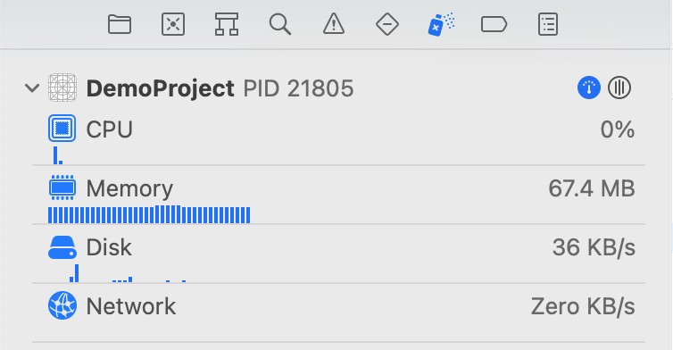
When one of these categories is selected, the main panel (Figure 17-29) updates to provide additional information about that particular aspect of the application’s performance:
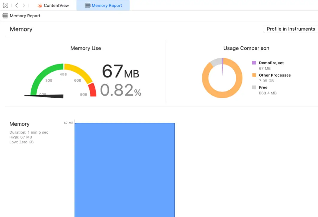
Yet more information can be obtained by clicking on the Profile in Instruments button in the top right-hand corner of the panel.
Exploring the User Interface Layout Hierarchy
Xcode also provides an option to render the user interface layout into a rotatable 3D view that shows how the view hierarchy for a user interface is constructed. This can be particularly useful for identifying situations where one view instance is obscured by another appearing on top of it or a layout is not appearing as intended. This is also useful for learning how SwiftUI works behind the scenes to construct a SwiftUI layout if only to appreciate how much work SwiftUI is saving us from having to do.
To access the view hierarchy in this mode, the app must be running on a device or simulator. Once the app is running, click on the Debug View Hierarchy button indicated in Figure 17-30:
|
You are reading a sample chapter from an old edition of iOS App Development Essentials. Purchase the fully updated iOS 18 App Development Essentials book. The full book contains 71 chapters, over 612 pages of in-depth information, downloadable source code, and access to over 50 SwiftUI knowledge test quizzes. |

Once activated, a 3D “exploded” view of the layout will appear. Clicking and dragging within the view will rotate the hierarchy allowing the layers of views that make up the user interface to be inspected:
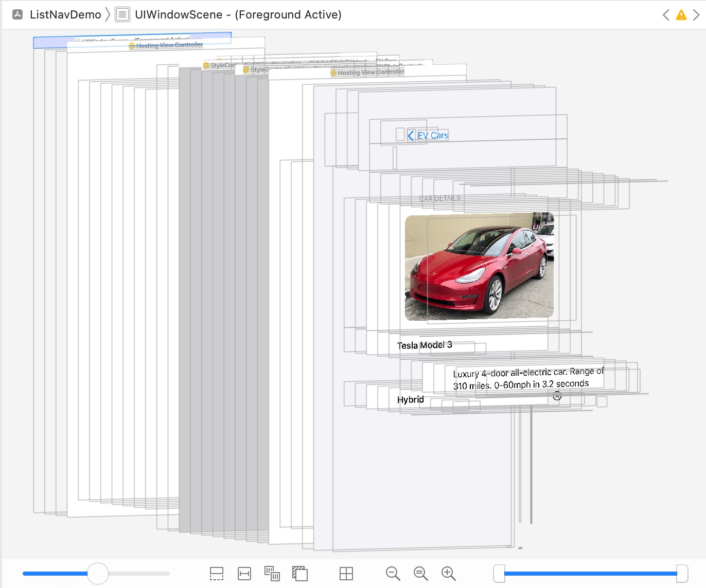
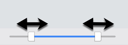
Moving the slider in the bottom left-hand corner of the panel will adjust the spacing between the different views in the hierarchy. The two markers in the right-hand slider (Figure 17-32) may also be used to narrow the range of views visible in the rendering. This can be useful, for example, to focus on a subset of views located in the middle of the hierarchy tree:
While the hierarchy is being debugged, the left-hand panel will display the entire view hierarchy tree for the layout as shown in Figure 17-33 below:
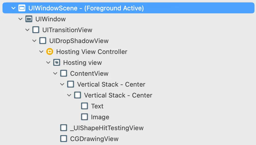
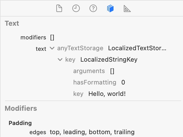
Selecting an object in the hierarchy tree will highlight the corresponding item in the 3D rendering and vice versa. The far right-hand panel will also display the attributes of the selected object. Figure 17-34, for example, shows the inspector panel while a Text view is selected within the view hierarchy.
Summary
When creating a new project, Xcode provides the option to use either UIKit Storyboards or SwiftUI as the basis of the app’s user interface. In SwiftUI mode, most of the work involved in developing an app occurs in the code editor and the preview canvas. New views can be added to the user interface layout and configured by typing into the code editor or dragging and dropping components from the Library onto the editor or the preview canvas.
|
You are reading a sample chapter from an old edition of iOS App Development Essentials. Purchase the fully updated iOS 18 App Development Essentials book. The full book contains 71 chapters, over 612 pages of in-depth information, downloadable source code, and access to over 50 SwiftUI knowledge test quizzes. |
The preview canvas will usually update in real-time to reflect code changes as they are typed into the code editor. However, it will occasionally pause updates in response to more significant changes. When in the paused state, clicking the Resume button will restart updates. The Attribute inspector allows the properties of a selected view to be changed and new modifiers added. Holding down the Command key while clicking on a view in the editor or canvas displays the context menu containing a range of options, such as embedding the view in a container or extracting the selection to a subview.
The preview structure at the end of the SwiftUI View file allows previewing on multiple device models simultaneously and with different environment settings.