
Now that the basics of MotionLayout have been covered, this chapter will provide an opportunity to try out MotionLayout in an example project. In addition to continuing to explore the main features of MotionLayout, this chapter will also introduce the MotionLayout editor and explore how it can be used to construct and modify MotionLayout animations visually.
The project created in this chapter will use start and end ConstraintSets, gesture handlers, and Attribute and Position Keyframes.
Creating the MotionLayoutDemo Project
Click the New Project button in the welcome screen and choose the Empty Views Activity template within the resulting new project dialog before clicking the Next button.
Enter MotionLayoutDemo into the Name field and specify com.ebookfrenzy.motionlayoutdemo as the package name. Before clicking on the Finish button, change the Minimum API level setting to API 26: Android 8.0 (Oreo) and the Language menu to Java.
ConstraintLayout to MotionLayout Conversion
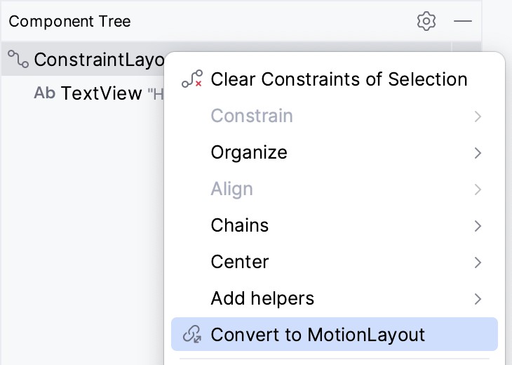
Android Studio will have placed a ConstraintLayout container as the parent view within the activity_main.xml layout file. The next step is to convert this container to a MotionLayout instance. Within the Component Tree, right-click on the ConstraintLayout entry and select the Convert to MotionLayout menu option:
 |
Get the Updated BookYou are reading a sample chapter from an old edition of the Android Studio Essentials – Java Edition book. Purchase the fully updated Android Studio Jellyfish – Java Edition of this book in eBook or Print format. The full book contains 92 chapters and over 830 pages of in-depth information. |
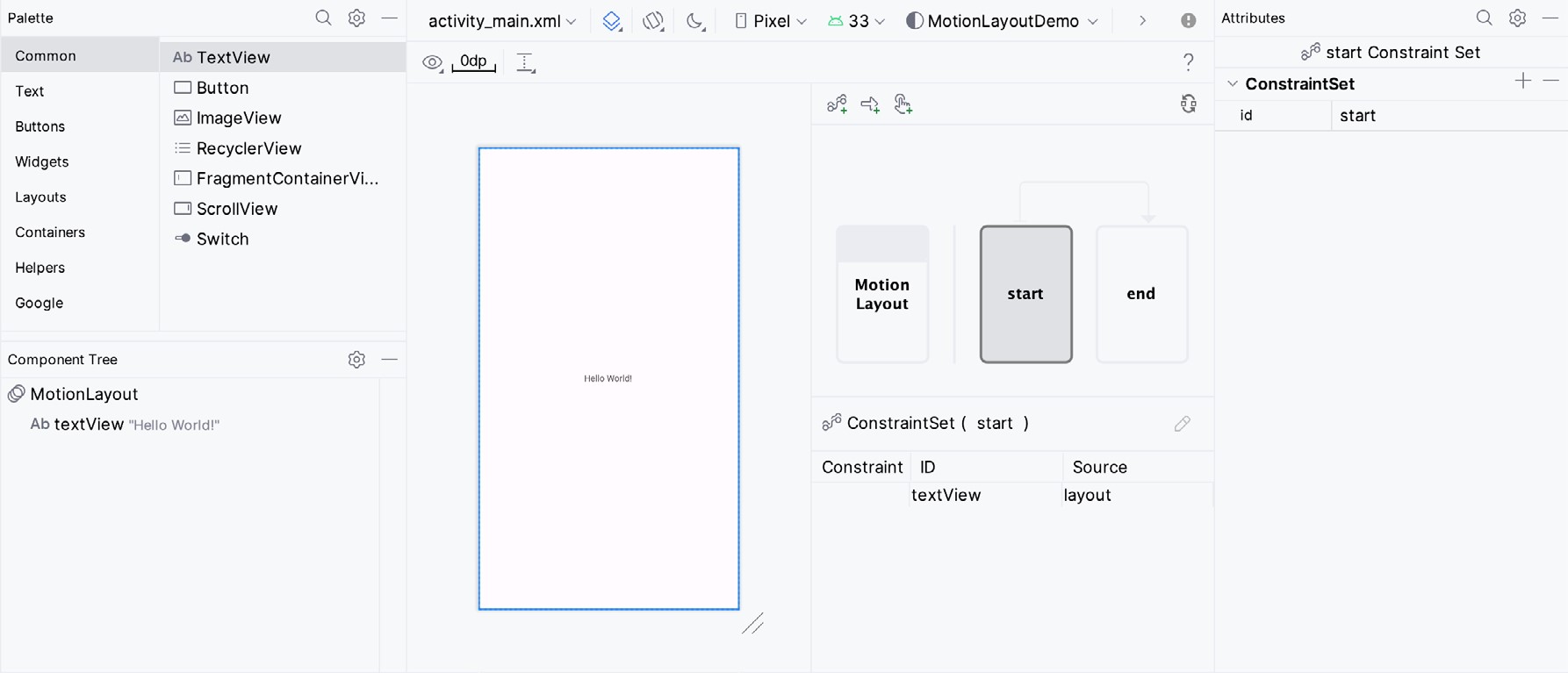
After making the selection, click the Convert button in the confirmation dialog. Once the conversion is complete, the MotionLayout editor will appear within the main Android Studio window, as illustrated in Figure 43-2:
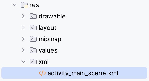
As part of the conversion process, Android Studio will create a new folder named res -> xml and place within it a MotionLayout scene file named activity_main_scene.xml:
This file contains a top-level MotionScene element containing the ConstraintSet and Transition entries that will define the animations within the main layout. By default, the file will contain empty elements for the start and end constraint sets and an initial transition:
<?xml version="1.0" encoding="utf-8"?>
<MotionScene
    xmlns:android="http://schemas.android.com/apk/res/android"
    xmlns:motion="http://schemas.android.com/apk/res-auto">

    <Transition
        motion:constraintSetEnd="@+id/end"
        motion:constraintSetStart="@id/start"
        motion:duration="1000">
       <KeyFrameSet>
       </KeyFrameSet>
    </Transition>

    <ConstraintSet android:id="@+id/start">
    </ConstraintSet>

    <ConstraintSet android:id="@+id/end">
    </ConstraintSet>
</MotionScene>Code language: HTML, XML (xml)
Any changes made within the MotionLayout editor will be stored within this file. Similarly, this file may be edited directly to implement and modify animation settings outside the MotionLayout editor.
The animations will be implemented primarily using the MotionLayout editor interface in this tutorial. However, we will review how these changes are reflected in the underlying MotionScene file at each stage. As we progress through the chapter, it will become clear that the MotionScene XML syntax is simple and easy to learn.
|
Get the Updated BookYou are reading a sample chapter from an old edition of the Android Studio Essentials – Java Edition book. Purchase the fully updated Android Studio Jellyfish – Java Edition of this book in eBook or Print format. The full book contains 92 chapters and over 830 pages of in-depth information. |
The first phase of this tutorial will demonstrate the use of MotionLayout to animate a Button object, including motion (including following a path), rotation, and size scaling.
Configuring Start and End Constraints
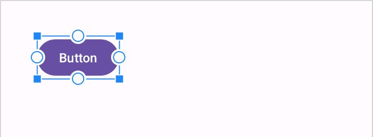
With the activity_main.xml file loaded into the MotionLayout editor, make sure that the Motion Layout box (marked E in Figure 43-5 below) is selected, then delete the default TextView before dragging and dropping a Button view from the palette to the top left-hand corner of the layout canvas as shown in Figure 43-4:
With the button selected, use the Attributes tool window to change the id to myButton.
As outlined in the previous chapter, MotionLayout animation is primarily a case of specifying how a view transitions between two states. Therefore, the first step in implementing animation is to specify the constraints that define these states.
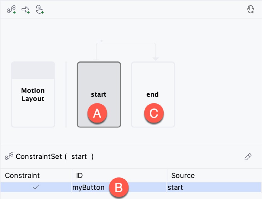
For this example, the start point will be the top center of the layout view. To configure these constraints, select the start constraint set entry in the editor window (marked A in Figure 43-5):
|
Get the Updated BookYou are reading a sample chapter from an old edition of the Android Studio Essentials – Java Edition book. Purchase the fully updated Android Studio Jellyfish – Java Edition of this book in eBook or Print format. The full book contains 92 chapters and over 830 pages of in-depth information. |
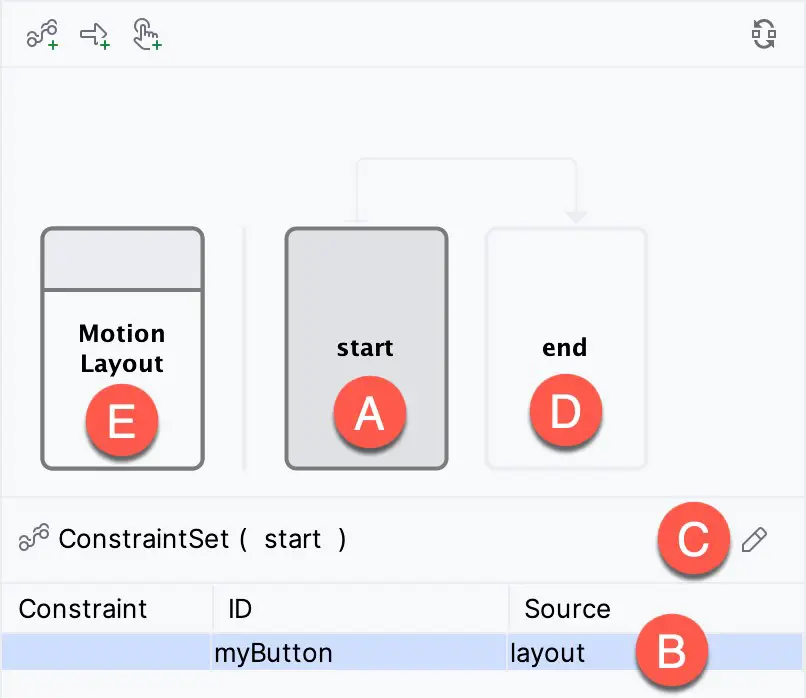
When the start box is selected, all constraint and layout changes will be made to the start point constraint set. To return to the standard constraints and properties for the entire layout, click on the Motion Layout box (E).
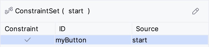
Next, select the myButton entry within the ConstraintSet list (B). Note that the Source column shows that the button is positioned based on constraints within the layout file. Instead, we want the button positioned based on the start constraint set. With the myButton entry still selected, click on the Edit button (C) and select Create Constraint from the menu, after which the button entry will indicate that the view is to be positioned based on the start constraint set:
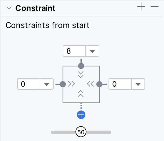
The start constraint set must position the button at the top of the layout with an 8dp offset and centered horizontally. With myButton still selected, use the Attributes tool window to set constraints on the top, left, and right sides of the view as follows:
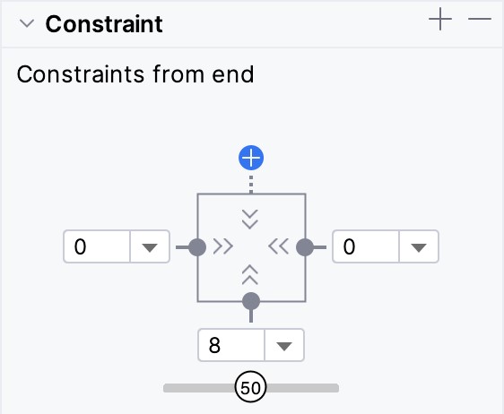
Select the end constraint set entry (marked D in Figure 43-5 above) and repeat the steps to create a new constraint, this time placing the button in the horizontal center of the layout but with an 8p offset from the bottom edge of the layout:
With the start and end constraints configured, open the activity_main_scene.xml file and note that the constraints have been added to the file:
|
Get the Updated BookYou are reading a sample chapter from an old edition of the Android Studio Essentials – Java Edition book. Purchase the fully updated Android Studio Jellyfish – Java Edition of this book in eBook or Print format. The full book contains 92 chapters and over 830 pages of in-depth information. |
<?xml version="1.0" encoding="utf-8"?>
<MotionScene
    xmlns:android="http://schemas.android.com/apk/res/android"
    xmlns:motion="http://schemas.android.com/apk/res-auto">
.
.
    <ConstraintSet android:id="@+id/start">
        <Constraint
            android:id="@+id/myButton"
            android:layout_width="wrap_content"
            android:layout_height="wrap_content"
            motion:layout_constraintTop_toTopOf="parent"
            android:layout_marginTop="8dp"
            motion:layout_constraintStart_toStartOf="parent"
            motion:layout_constraintEnd_toEndOf="parent" />
    </ConstraintSet>

    <ConstraintSet android:id="@+id/end">
        <Constraint
            android:id="@+id/myButton"
            android:layout_width="wrap_content"
            android:layout_height="wrap_content"
            motion:layout_constraintStart_toStartOf="parent"
            motion:layout_constraintEnd_toEndOf="parent"
            motion:layout_constraintBottom_toBottomOf="parent"
            android:layout_marginBottom="8dp" />
    </ConstraintSet>
</MotionScene>Code language: HTML, XML (xml)
Note also that the Transition element has already been preconfigured to animate the transition between the start and end points over 1000 milliseconds. Although we have yet to add an action to initiate the transition, previewing the animation from within the MotionLayout editor is still possible.
Previewing the MotionLayout Animation
To preview the animation without building and running the app, select the transition arrow within the MotionLayout editor marked A in Figure 43-9 below. This will display the animation timeline panel (marked B):
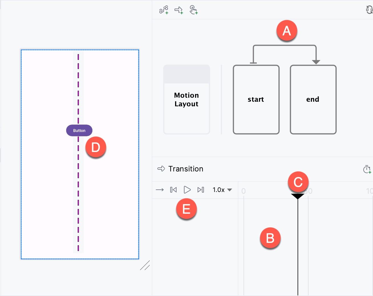
To test the animation, click on the slider (C) and drag it along the timeline. As the slider moves, the button in the layout canvas will move along the dashed path line (D). Use the toolbar button (E) to perform a full animation to repeat the animation continuously at different speeds (either forwards, backward or toggling back and forth).
Adding an OnClick Gesture
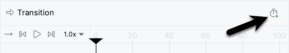
Although a simple MotionLayout animation transition has been created, we still need a way to start the animation from within the running app. This can be achieved by assigning either a click or swipe handler. For this example, we will configure the animation to start when the user clicks the button. Within the MotionLayout editor, pause the timeline animation if it runs on a loop setting. Next, select the Transition arrow (marked A in Figure 43-9 above), locate the OnClick attribute section in the Attributes tool window and click on the + button indicated by the arrow in Figure 43-10 below:
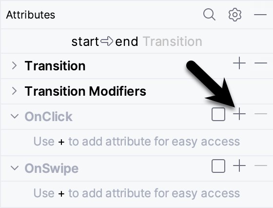
An empty row will appear in the OnClick panel for the first property. For the property name, enter targetId; for the value field, enter the button’s id (@id/myButton). In the next empty row, enter app:clickAction into the property name field. In the value field, click the down arrow to display a menu of valid options:
|
Get the Updated BookYou are reading a sample chapter from an old edition of the Android Studio Essentials – Java Edition book. Purchase the fully updated Android Studio Jellyfish – Java Edition of this book in eBook or Print format. The full book contains 92 chapters and over 830 pages of in-depth information. |
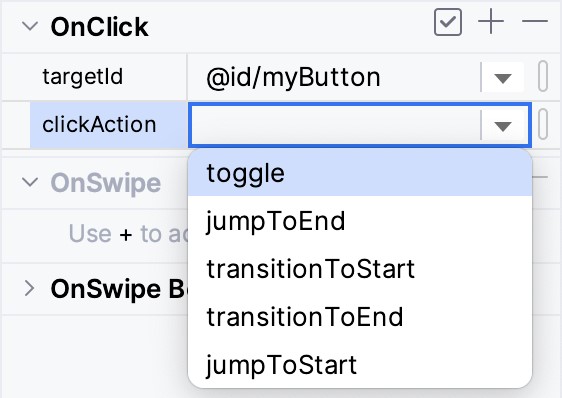
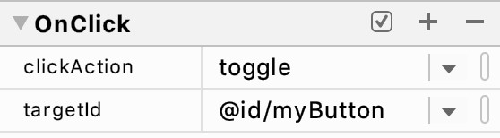
For this example, select the toggle action. This will cause the view to animate to the opposite position when clicked. Once these settings have been entered, they should match those shown in Figure 43-12:
Once again, open the activity_main_scene.xml file and review the OnClick property defined within the Transition entry:
.
.
   <Transition
        motion:constraintSetEnd="@+id/end"
        motion:constraintSetStart="@id/start"
        motion:duration="1000">
       <KeyFrameSet>
       </KeyFrameSet>
        <OnClick motion:targetId="@id/myButton"
            motion:clickAction="toggle" />
    </Transition>
.
.Code language: HTML, XML (xml)
Compile and run the app on a device or emulator and confirm that clicking on the button causes it to transition back and forth between the start and end points as defined in the MotionScene file.
Adding an Attribute Keyframe to the Transition
So far, the example project is only animating the motion of the button view from one location on the screen to another. Attribute keyframes (KeyAttribute) provide a way to specify points within the transition timeline at which other attribute changes are to have taken effect. A KeyAttribute could, for example, be defined such that the view must have increased in size by 50% by the time the view has moved 30% through the timeline. For this example, we will add a rotation effect positioned at the mid-point of the animation.
Begin by opening the activity_main.xml file in the MotionLayout Editor, selecting the transition connector arrow to display the timeline, then click on the button highlighted in Figure 43-13:
|
Get the Updated BookYou are reading a sample chapter from an old edition of the Android Studio Essentials – Java Edition book. Purchase the fully updated Android Studio Jellyfish – Java Edition of this book in eBook or Print format. The full book contains 92 chapters and over 830 pages of in-depth information. |
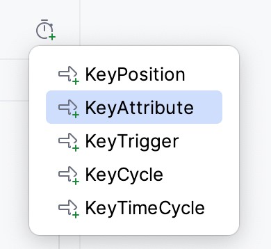
From the menu, select the KeyAttribute option:
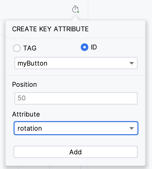
Once selected, the dialog shown in Figure 43-15 will appear. Within the dialog, make sure the ID option is selected and that myButton is referenced. In the position field, enter 50 (this is specified as a percentage where 0 is the start point and 100 is the end). Finally, select the rotation entry from the Attribute drop-down menu before clicking on the Add button:
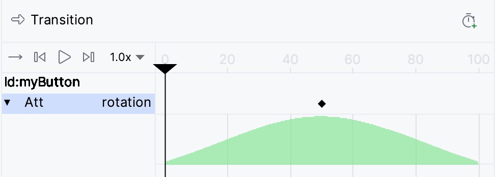
Once the KeyAttribute has been added, a row will appear within the timeline for the attribute. Click on the row to highlight it, then click on the disclosure arrow on the far left edge of the row to unfold the attribute transition graph. Note that a small diamond marker appears in the timeline (as indicated in Figure 43-16 below), indicating the location of the key. The graph indicates the linearity of the effect. In this case, the button will rotate steadily up to the specified number of degrees, reaching maximum rotation at the location of the keyframe. The button will then rotate back to 0 degrees by the time it reaches the end point:
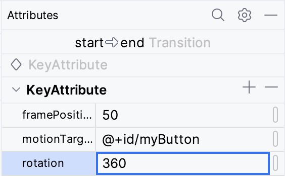
To change the properties of a KeyAttribute, select it in the timeline and then refer to the Attributes tool window. Within the KeyAttribute panel, change the rotation property to 360 degrees:
Check that the attribute works by moving the slider back and forth and watching the button rotate as it traverses the animation path in the layout canvas. Refer to the activity_main_scene.xml file, which should appear as follows:
|
Get the Updated BookYou are reading a sample chapter from an old edition of the Android Studio Essentials – Java Edition book. Purchase the fully updated Android Studio Jellyfish – Java Edition of this book in eBook or Print format. The full book contains 92 chapters and over 830 pages of in-depth information. |
.
.
   <Transition
        motion:constraintSetEnd="@+id/end"
        motion:constraintSetStart="@id/start"
        motion:duration="1000">
       <KeyFrameSet>
           <KeyAttribute
               motion:motionTarget="@+id/myButton"
               motion:framePosition="50"
               android:rotation="360" />
       </KeyFrameSet>
        <OnClick motion:targetId="@id/myButton"
            motion:clickAction="toggle" />
    </Transition>
.
.Code language: HTML, XML (xml)
Test the animation using the transition slider or by compiling and running the app and verify that the button now rotates during the animation.
Adding a CustomAttribute to a Transition
The KeyAttribute property is limited to built-in effects such as resizing and rotation. Additional changes are also possible by declaring CustomAttributes. Unlike KeyAttributes, which are stored in the Transition element, CustomAttributes are located in the start and end constraint sets. As such, these attributes can only be declared to take effect at start and end points (in other words, you cannot specify an attribute keyframe at a position partway through a transition timeline).
For this example, we will configure the button to gradually change color from red to green. Begin by selecting the start box marked A in Figure 43-18, followed by the myButton view constraint set (B):
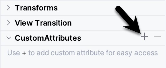
Referring to the Attributes tool window, click on the + button in the CustomAttributes section as highlighted below:
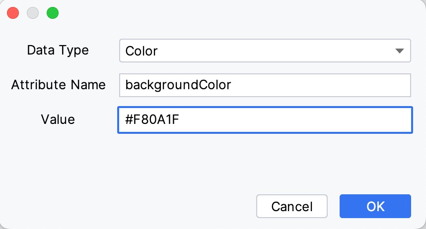
In the resulting dialog (Figure 43-20), change the attribute type to Color and enter backgroundColor into the Attribute Name field. Finally, set the value to #F80A1F:
|
Get the Updated BookYou are reading a sample chapter from an old edition of the Android Studio Essentials – Java Edition book. Purchase the fully updated Android Studio Jellyfish – Java Edition of this book in eBook or Print format. The full book contains 92 chapters and over 830 pages of in-depth information. |
Click on OK to commit the changes, then select the end constraint set (marked C in Figure 43-18 above) and repeat the steps to add a custom attribute, this time specifying #33CC33 as the RGB value for the color.
Using the timeline slider or running the app, make sure the button changes color during the animation. The addition of these CustomAttributes will be reflected in the activity_main_scene.xml file as follows:
.
.
   <ConstraintSet android:id="@+id/start">
        <Constraint
.
.
            <CustomAttribute
                motion:attributeName="backgroundColor"
                motion:customColorValue="#F80A1F" />
        </Constraint>
    </ConstraintSet>

    <ConstraintSet android:id="@+id/end">
        <Constraint
.
.
            <CustomAttribute
                motion:attributeName="backgroundColor"
                motion:customColorValue="#33CC33" />
        </Constraint>
    </ConstraintSet>
.
.Code language: HTML, XML (xml)
Adding Position Keyframes
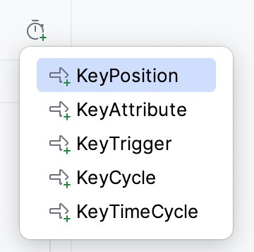
The final task for this tutorial is to add two position keyframes (KeyPosition) to the animation path to introduce some lateral movement into the animation. With the transition timeline visible in the MotionLayout editor, click on the button to create a keyframe as highlighted in Figure 43-13 above, and select the KeyPosition option from the menu, as shown in Figure 43-21 below:
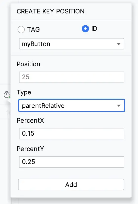
In the resulting dialog, set the properties as illustrated in Figure 43-22:
Click on the Add button to commit the change, then repeat the above steps to add a second position keyframe configured as follows:
|
Get the Updated BookYou are reading a sample chapter from an old edition of the Android Studio Essentials – Java Edition book. Purchase the fully updated Android Studio Jellyfish – Java Edition of this book in eBook or Print format. The full book contains 92 chapters and over 830 pages of in-depth information. |
- Position: 75
- Type: parentRelative
- PercentX: 0.85
- PercentY: 0.75
On completion of these changes, the following keyframe entries will have been added to the transition element in the activity_main_scene.xml file:
<KeyFrameSet>
.
.
<KeyPosition
motion:motionTarget="@+id/myButton"
motion:framePosition="25"
motion:keyPositionType="parentRelative"
motion:percentX="0.15"
motion:percentY="0.25" />
<KeyPosition
motion:motionTarget="@+id/myButton"
motion:framePosition="75"
motion:keyPositionType="parentRelative"
motion:percentX="0.85"
motion:percentY="0.75" />
</KeyFrameSet>
.
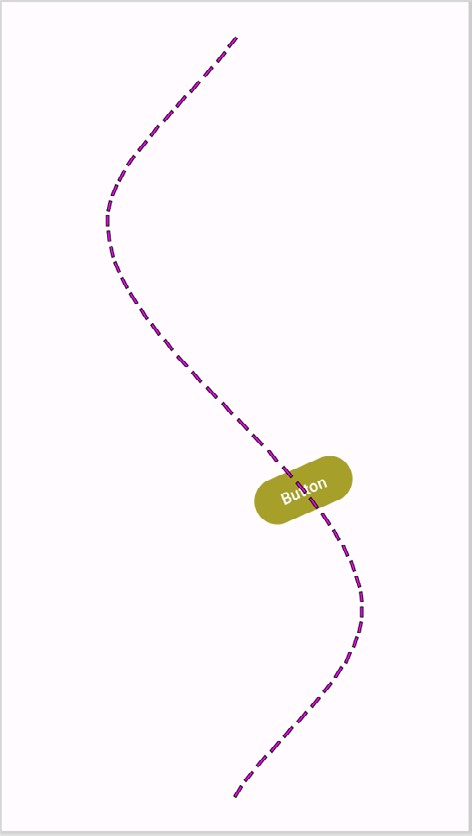
.Code language: HTML, XML (xml)Test the app one last time and verify that the button now follows the path shown below while still rotating and changing color:
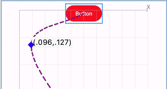
Position keyframes are represented by diamond-shaped markers on the dotted line representing the motion path within the preview canvas as indicated in Figure 43-24 (if the markers are not visible, make sure that the Button view is selected in the preview):
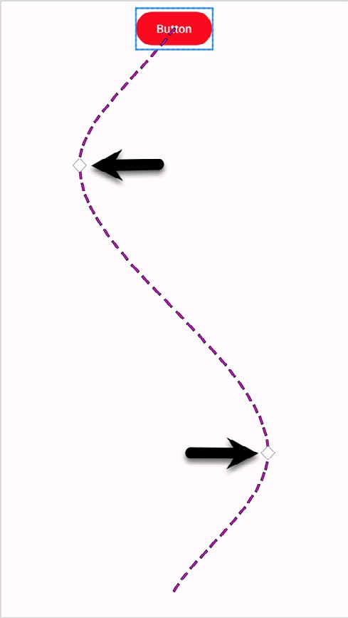
To visually adjust the position of a keyframe, click on the marker and drag it to a new position. As the marker moves, the Motion Layout editor will display a grid together with the current x and y coordinates:
Summary
This chapter has introduced the MotionLayout editor built into Android Studio and explored how it can be used to add animation to the user interface of an Android app without having to write XML declarations manually. Examples covered in this chapter included the conversion of a ConstraintLayout container to MotionLayout, creating start and end constraint sets and transitions in the MotionScene file, and adding an OnClick handler. The animation previewer, custom attributes, and position keyframes were also covered.
|
Get the Updated BookYou are reading a sample chapter from an old edition of the Android Studio Essentials – Java Edition book. Purchase the fully updated Android Studio Jellyfish – Java Edition of this book in eBook or Print format. The full book contains 92 chapters and over 830 pages of in-depth information. |