One of the objectives of this chapter is to provide an overview of the concepts of material design. Originally introduced as part of Android 5.0, material design is a set of design guidelines that dictate how the Android user interface, and that of the apps running on Android, appear and behave.
As part of implementing the material design concepts, Google also introduced the Android Design Support Library. This library contains several components that allow many of the key features of material design to be built into Android applications. Two of these components, the floating action button and the Snackbar, will also be covered in this chapter before introducing many of the other components in subsequent chapters.
The Material Design
The principles of material design define the overall appearance of the Android environment. Material design was created by the Android team at Google and dictates that the elements that make up the user interface of Android and the apps that run on it appear and behave in a certain way in terms of behavior, shadowing, animation, and style. One of the tenets of the material design is that the elements of a user interface appear to have physical depth and a sense that items are constructed in layers of physical material. A button, for example, appears to be raised above the surface of the layout where it resides through shadowing effects. Pressing the button causes the button to flex and lift as though made of a thin material that ripples when released.
Material design also dictates the layout and behavior of many standard user interface elements. A key example is how the app bar located at the top of the screen should appear and how it should behave in relation to scrolling activities taking place within the main content of the activity.
Material design covers a wide range of areas, from recommended color styles to how objects are animated. A full description of the material design concepts and guidelines can be found online at the following link and is recommended reading for all Android developers:
https://material.io/design/introduction
The Design Library
Many of the building blocks needed to implement Android applications that adopt material design principles are contained within the Android Design Support Library. This library contains a collection of user interface components that can be included in Android applications to implement much of the look, feel, and behavior of material design. Two of the components from this library, the floating action button and Snackbar, will be covered in this chapter, while others will be introduced in later chapters.
The Floating Action Button (FAB)
The floating action button appears to float above the surface of the user interface of an app. It generally promotes the most common action within a user interface screen. A floating action button could be placed on a screen to allow the user to add an entry to a list of contacts or to send an email from within the app. Figure 52-1, for example, highlights the floating action button that allows the user to add a new contact within the standard Android Contacts app:
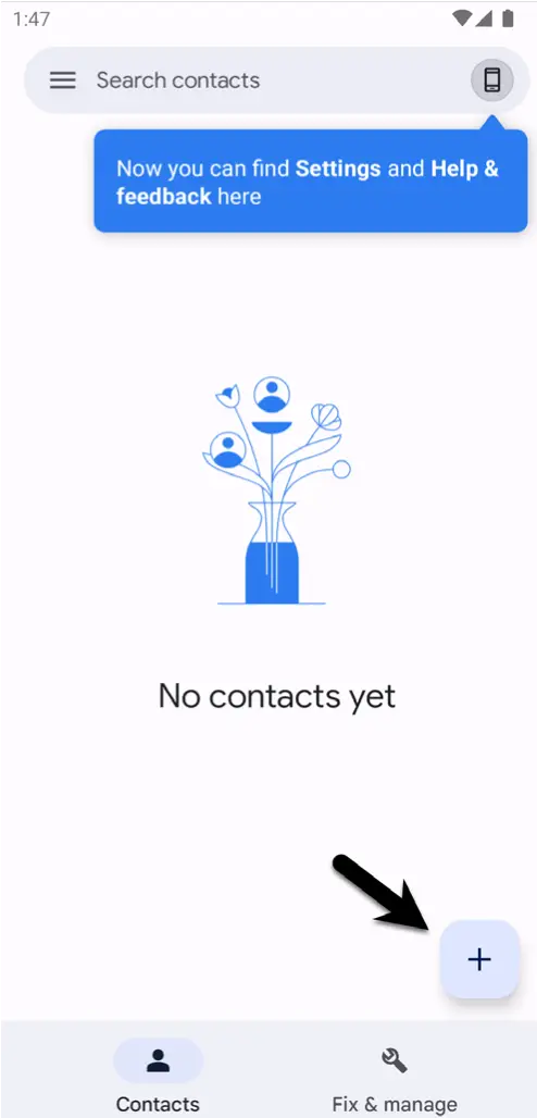
Several rules should be followed when using floating action buttons to conform with the material design guidelines. Floating action buttons must be circular and can be either 56 x 56dp (Default) or 40 x 40dp (Mini) in size. The button should be positioned a minimum of 16dp from the edge of the screen on phones and 24dp on desktops and tablet devices. Regardless of the size, the button must contain an interior icon that is 24x24dp in size, and it is recommended that each user interface screen have only one floating action button.
Floating action buttons can be animated or designed to morph into other items when touched. For example, a floating action button could rotate when tapped or morph into another element, such as a toolbar or panel listing related actions.
The Snackbar
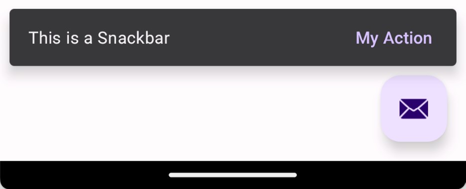
The Snackbar component provides a way to present the user with information as a panel at the bottom of the screen, as shown in Figure 52-2. Snackbar instances contain a brief text message and an optional action button that will perform a task when tapped by the user. Once displayed, a Snackbar will either timeout automatically or can be removed manually by the user via a swiping action. During the appearance of the Snackbar, the app will continue to function and respond to user interactions normally.
In the remainder of this chapter, an example application will be created that uses the basic features of the floating action button and Snackbar to add entries to a list of items.
Creating the Example Project
Select the New Project option from the welcome screen and, within the resulting new project dialog, choose the Basic Views Activity template before clicking on the Next button.
Enter FabExample into the Name field and specify com.ebookfrenzy.fabexample as the package name. Before clicking on the Finish button, change the Minimum API level setting to API 26: Android 8.0 (Oreo) and the Language menu to Kotlin.
Reviewing the Project
Since the Basic Views Activity template was selected, the activity contains four layout files. The activity_main.xml file consists of a CoordinatorLayout manager containing entries for an app bar, a Material toolbar, and a floating action button.
The content_main.xml file represents the layout of the content area of the activity and contains a NavHostFragment instance. This file is embedded into the activity_main.xml file via the following include directive:
<include layout="@layout/content_main" />Code language: HTML, XML (xml)The floating action button element within the activity_main.xml file reads as follows:
<com.google.android.material.floatingactionbutton.FloatingActionButton
    android:id="@+id/fab"
    android:layout_width="wrap_content"
    android:layout_height="wrap_content"
    android:layout_gravity="bottom|end"
    android:layout_marginEnd="@dimen/fab_margin"
    android:layout_marginBottom="16dp"
    app:srcCompat="@android:drawable/ic_dialog_email" />Code language: HTML, XML (xml)
This declares that the button is to appear in the bottom right-hand corner of the screen with margins represented by the fab_margin identifier in the values/dimens.xml file (which, in this case, is set to 16dp). The XML further declares that the interior icon for the button is to take the form of the standard drawable built-in email icon.
The blank template has also configured the floating action button to display a Snackbar instance when tapped by the user. The code to implement this can be found in the onCreate() method of the MainActivity.kt file and reads as follows:
binding.fab.setOnClickListener { view ->
    Snackbar.make(view, "Replace with your own action", Snackbar.LENGTH_LONG)
        .setAction("Action", null).show()
}Code language: Kotlin (kotlin)
The code accesses the floating action button via the view binding and adds an onClickListener handler to be called when the button is tapped. This method displays a Snackbar instance configured with a message but no actions.
When the project is compiled and run, the floating action button will appear at the bottom of the screen, as shown in Figure 52-3:

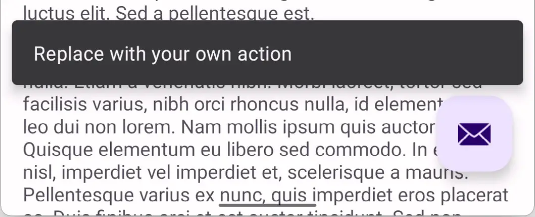
Tapping the floating action button will trigger the onClickListener handler method causing the Snackbar to appear at the bottom of the screen:
Removing Navigation Features
As A Guide to the Android Studio Layout Editor Tool outlines, the Basic Views Activity template contains multiple fragments and buttons to navigate from one fragment to the other. These features are unnecessary for this tutorial and will cause problems later if not removed. Before moving ahead with the tutorial, modify the project as follows:
- Within the Project tool window, navigate to and double-click on the app -> res -> navigation -> nav_graph.xml file to load it into the navigation editor.
- Select the SecondFragment entry in the Component Tree panel within the editor and tap the keyboard delete key to remove it from the graph.
- Locate and delete the SecondFragment.kt (app -> kotlin+java -> <package name> -> SecondFragment) and fragment_second.xml (app -> res -> layout -> fragment_second.xml) files.
- Locate the FirstFragment.kt file, double-click on it to load it into the editor, and remove the code from the onViewCreated() method so that it reads as follows:
override fun onViewCreated(view: View, savedInstanceState: Bundle?) {
    super.onViewCreated(view, savedInstanceState)

    // binding.buttonFirst.setOnClickListener {
    //    findNavController().navigate(R.id.action_FirstFragment_to_SecondFragment)
    // }
}Code language: Kotlin (kotlin)
Changing the Floating Action Button
Since the objective of this example is to configure the floating action button to add entries to a list, the email icon currently displayed on the button needs to be changed to something more indicative of the action being performed. The icon that will be used for the button is named ic_add_entry.png and can be found in the project_ icons folder of the sample code download available from the following URL:
https://www.ebookfrenzy.com/web/giraffekotlin/index.php
Locate this image in the file system navigator for your operating system and copy the image file. Right-click on the app -> res -> drawable entry in the Project tool window and select Paste from the menu to add the file to the folder:

Next, edit the activity_main.xml file and change the image source for the icon from @android:drawable/ic_ dialog_email to @drawable/ic_add_entry as follows:
<com.google.android.material.floatingactionbutton.FloatingActionButton
    android:id="@+id/fab"
    android:layout_width="wrap_content"
    android:layout_height="wrap_content"
    android:layout_gravity="bottom|end"
    android:layout_margin="@dimen/fab_margin"
    android:layout_marginBottom="16dp"
    app:srcCompat="@drawable/ic_add_entry" />Code language: HTML, XML (xml)
Within the layout preview, the interior icon for the button will have changed to a plus sign.
We can also make the floating action button do just about anything when clicked by adding code to the OnClickListener. The following changes to the MainActivity.kt file, for example, calls a method named displayMessage() to display a toast message each time the button is clicked:
.
.
import android.widget.Toast
.
.
binding.fab.setOnClickListener { view ->
    displayMessage("Fab clicked")
    Snackbar.make(view, "Replace with your own action", Snackbar.LENGTH_LONG)
        .setAction("Action", null).show()
}
.
.
fun displayMessage(message: String) {
    Toast.makeText(this@MainActivity,message,Toast.LENGTH_SHORT).show()
}Code language: Kotlin (kotlin)
Adding an Action to the Snackbar
An action may also be added to the Snackbar, which performs a task when tapped by the user. Edit the MainActivity.kt file and modify the Snackbar creation code to add an action titled “My Action” configured with an onClickListener named actionOnClickListener which, in turn, displays a toast message:
binding.fab.setOnClickListener { view ->
    displayMessage("FAB clicked")
    Snackbar.make(view, "Action complete", Snackbar.LENGTH_LONG)
        .setAction("My Action", actionOnClickListener).show()
}Code language: Kotlin (kotlin)
Within the MainActivity.kt file, add the listener handler:
.
.
import android.view.View
.
.
var actionOnClickListener: View.OnClickListener = View.OnClickListener { view ->
    displayMessage("Action clicked")
    Snackbar.make(view, "Action complete", Snackbar.LENGTH_LONG)
            .setAction("My Action", null).show()
}Code language: Kotlin (kotlin)
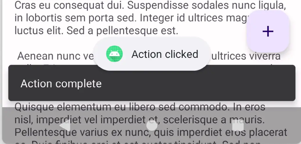
Run the app and tap the floating action button, at which point both the toast message and Snackbar should appear. While the Snackbar is visible, tap the My Action button in the Snackbar and verify that the text on the Snackbar changes to “Action Complete”:
Summary
Before working through an example project that uses these features, this chapter has provided a general overview of material design, the floating action button, and the Snackbar.
The floating action button and the Snackbar are part of Android’s material design approach to user interface implementation. The floating action button provides a way to promote the most common action within a particular screen of an Android application. The Snackbar provides a way for an application to present information to the user and allow the user to act upon it.

